Integrate characters into your work
Junichi Tsuneoka walks through how to incorporate your character designs with custom type to create a two-colour poster
- Software Illustrator CS5
- Time needed 3-5 hours
- Skills-Use the Pen and Pathfinder tools-Create custom vector lettering-Design balanced compositions
Characters can be very strong communication tools when successfully used as part of a design application. In this tutorial, I’ll explain how to create a unique character and build up its background, incorporating custom type to make a stunning, visually consistent composition.
Using a character design that I created as part of a two-colour screenprinted poster for Washington’s Sasquatch Music Festival, we’ll cover the process from initial sketches through to producing the final vector design, using the Pathfinder palette to noticeably speed up your workflow.
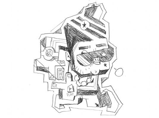
01 First brainstorm your character. I designed this one to feature on a poster for rapper Kid Cudi, so I used the artist as my inspiration and came up with a B-Boy type of character. Make a rough sketch. Don’t worry too much about quality because we’ll clean it up with the Pen tool later.
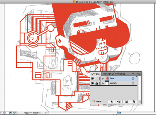
02 Next, scan in your image and open a new document in Illustrator. From the File menu, place the scanned image into the document and lower the opacity a little. Then create a new layer on top of the image and start tracing the lines with the Pen tool. I usually use a red colour at this stage for better visibility, and edit and develop the sketch as I trace the lines.
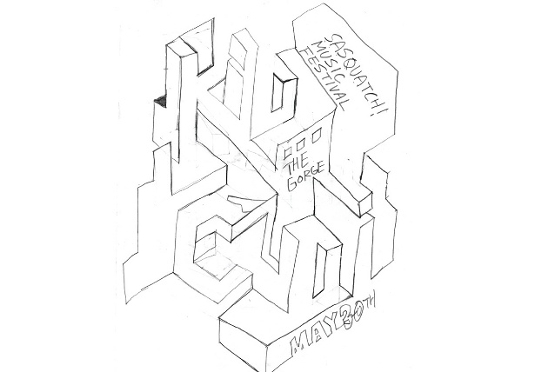
03 Now for the type element. I decided that the main type would integrate more successfully with the character if I treated it as part of the illustration, rather than using an existing font. Working on paper again, look at the style of your character and transfer the aesthetic to the type. In this case, the solution was to distort the perspective to create the look of an optical illusion.
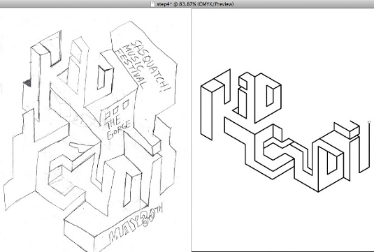
04 Scan in your handmade type, and create a vector version. As before, these don’t have to be identical – now is a good opportunity to fine-tune your design. Notice that my digital type has a different composition from the original sketch.
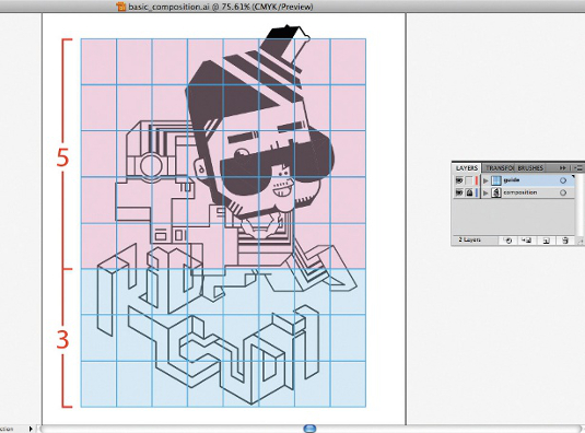
05 Position both your character and type in a new document, changing the size of the two components for the best composition. I usually go for a 5:3 ratio, which is a comfortable size relationship. This process is very important: it’s the basis of your final design, so make sure that you’re happy before continuing.
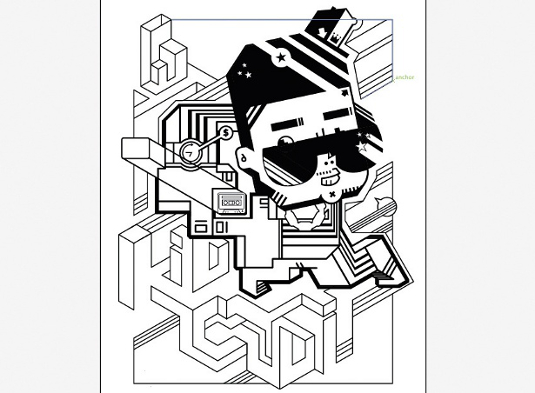
06 Once you’ve figured out the basic composition, add some supporting graphics around the main images. I came up with some simple elements that have a similar style to the type, and added these all over the document to help connect the character and the type, and increase the overall consistency. I also adjusted the line width, based on the image hierarchy, making it thicker where I wanted to put emphasis.
Get the Creative Bloq Newsletter
Daily design news, reviews, how-tos and more, as picked by the editors.
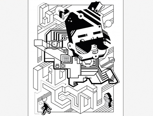
07 Now add more details – I’ve included symbols, for example. A strong composition is often made up of distinctive large, medium and small elements: here, the character is the large element; type, medium; and everything else is small. By following this system, I’ve given the image a strong hierarchy, to which I can add a lot of details to inject depth into the design without losing the strength of the composition.
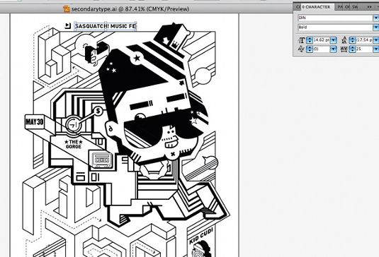
08 Now to add any secondary type. As before, it’s important to position these within the composition where they won’t interfere with other elements. However, make sure you don’t lose the readability of the text.
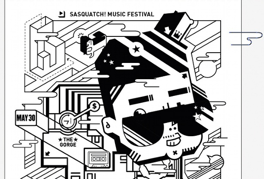
09 To help blend the character further with the rest of the image and add depth, I created one more layer of smaller elements – the clouds. I carefully positioned them to create a nice interaction between the foreground and background.
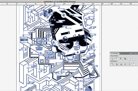
10 When you’ve laid out all the parts and finalised the composition, convert the strokes into an outline stroke (Object>Path>Outline stroke) and create an outline for the type (Type>Create outline). Then select all and go to Effect> Pathfinder>Divide. Click anywhere on the black area, and go to Select>Same>Fill color. Lock the selection and delete everything else. Now unlock the selection, and navigate to Pathfinder>Unite. This will make the file as simple as possible, and it will also look clean.
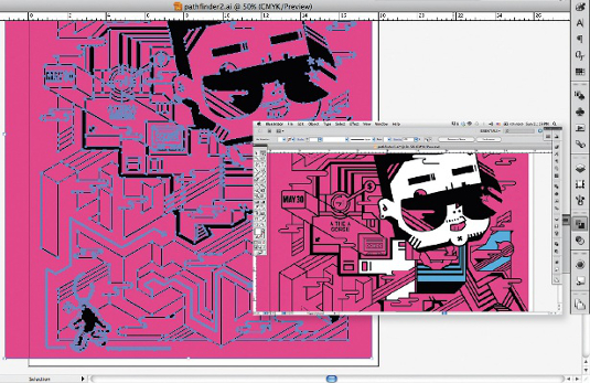
11 We’re ready to add colour. I created a magenta rectangle big enough to cover the whole graphic, and went to Object>Arrange>Send to Back. Select all, and go to Pathfinder>Divide. Ungroup the objects. Now you can individually select any section to change the fill colour. It’s possible to achieve the same result by using Object>Live paint, but since we’re working on a two-colour design with over-print for the third colour, this is a much faster process.
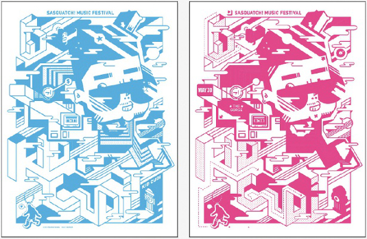
12 Once you’ve decided on your two colours, make two layers and copy all the parts in your first colour (cyan, here) onto one layer, and all of your second colour (magenta, here) onto the other layer. Next, copy the original black parts to the two layers. This will be the over-print area to create the third colour. To move a selection from one layer to the other, select all of that colour using Select>Same>Fill color. You’ll see a small square on your Layers panel, which you can grab to move the selection into another layer.
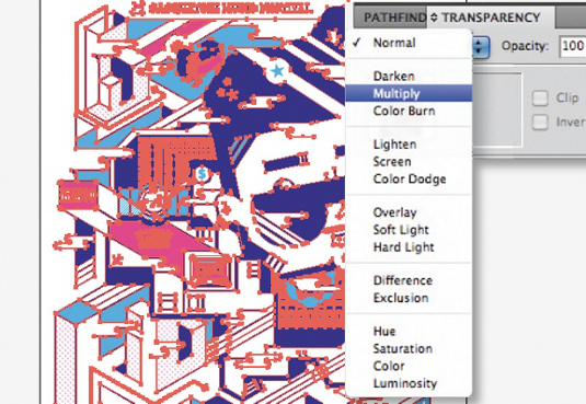
13 Select your top-colour layer (magenta). Open the Transparency window and select Multiply as your blending mode. This will make the magenta become translucent without losing its opacity – showing the over-print area as dark purple – so that you can simulate how the two inks will print on top of each other. In this way, you can then set up the file for screenprinting and simulate the finalised image digitally at the same time.

Junichi Tsuneoka
Japan-born, USA-based Junichi is the founder of the Stubborn Sideburn studio, and specialises in illustrative design using characters. His clients include Adidas, Microsoft, Publicis and more.
www.stubbornsideburn.com

Thank you for reading 5 articles this month* Join now for unlimited access
Enjoy your first month for just £1 / $1 / €1
*Read 5 free articles per month without a subscription

Join now for unlimited access
Try first month for just £1 / $1 / €1

The Creative Bloq team is made up of a group of art and design enthusiasts, and has changed and evolved since Creative Bloq began back in 2012. The current website team consists of eight full-time members of staff: Editor Georgia Coggan, Deputy Editor Rosie Hilder, Ecommerce Editor Beren Neale, Senior News Editor Daniel Piper, Editor, Digital Art and 3D Ian Dean, Tech Reviews Editor Erlingur Einarsson, Ecommerce Writer Beth Nicholls and Staff Writer Natalie Fear, as well as a roster of freelancers from around the world. The ImagineFX magazine team also pitch in, ensuring that content from leading digital art publication ImagineFX is represented on Creative Bloq.
