Why you should be excited about zero UI
Imagine a possible future in which we don’t need complicated interfaces to interact with our products.
Zero UI doesn't mean getting rid of the interface entirely. Rather, it's a process where many of the visual interfaces we spend so much time with recede into the background, leaving us open to engage with the stuff that is important and useful to us. It is analogous to inbox zero, where we strive to achieve a blissful state in which everything is dealt with, calm and invisible.
This shift away from the very controllable environment of screen and pointer means the things we are trying to do are becoming more complex. They now have to take into account a lot more ideas around human behaviours, motivations and emotions. Want to keep things simple? Try a website builder.
We’ve always had to bring aspects of psychology and perception into our work, as understanding what would make someone click a button, how users would retain information, and the barriers to committing to a decision, is important (this kind of feedback is a feature of some of the best web hosting providers). But for all the elegance of the interfaces we have designed, they are two-dimensional, with simplistic cues and triggers.
Why design Zero UI?

As we move into a connected world where objects, people and environments are all joined together by a mesh of invisible electronic tethers, the decision making, the services we want, and the results we expect from our interactions become exponentially more complicated. A system will have to predict what someone wants to do next. But it will also need to know where they are, where they're heading and what their intent is. It will be about how we as humans interact with entire systems.
I don’t think there is a huge groundswell of opinion bemoaning the terribleness of interactive systems, products and devices. Quite the opposite in fact: we seem to be entranced by them all. And why not? The devices are beautiful, the systems are intelligent and the services make life so much easier. There are pretty strong arguments for the social and emotional discord that our addiction to electronic media causes, but the benefits of the digital world still exceed the problems.
Nevertheless, we can all agree that removing the complexity that these devices bring into our lives would genuinely improve the state of things. Not just for the older generations, who try as they might are often confounded by the intricacy and closed-shop paradigms of software, but for all of us who have ever struggled with an update or service switch.
Designing intuitive interactions

The phrase ‘Zero UI’ is designed to provoke designers, who spend a lot of time thinking about the way things look, and not much time thinking about anything else. We are primarily visual animals, so we sometimes forget how important all of those other senses are in conveying experience, and how important a part of our memory and identity they are.
If we think of the ways in which we can make use of those other senses, we can start creating interactions that become easier, more intuitive, more pleasurable, and more subtle. The objective is to be able to spend less time fiddling around with computers, but to still achieve the same outcomes and enjoy their content.
Interaction design was originally designed to help us understand how a computer or a machine works and to provide an interface for us to operate it. When I was younger, I was the only one in the family who could program the VCR. I would think: this is really bad, why can’t it be easier? That is the motivation of any designer.
A lot of those purely functional parts of the UI have been solved now, with the help of patterns that are pretty good for simple kinds of interface problems. You could design a whole different set of patterns, but they probably wouldn’t be as good and would require people to learn new ways of interacting.
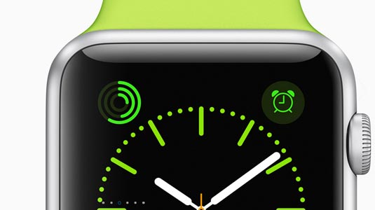
However, there is a whole set of more complex things we are trying to do now. One example is the Uber app for Apple watches. In principle it's a genius simplification of the experience – just open the app and call a car. But if a flaky GPS sends the car two blocks away, the extremely simple interface gives the user no way to fix the information. They have to use their phone, and the magic is killed.
We will need multiple layers of failsafe and redundancy in systems to allow these types of interactions to become commonplace.
Zero UI to coordinate systems

Imagine a Zero UI scenario where the user wants to travel to the other side of the country. Leaving aside the booking of the plane ticket for now (the complexity of which requires a detailed visual interface), all the systems that enable you to get to your destination could coordinate. This would link the alarm that gets you up in the morning, to your coffee machine grinding a double shot, to the alert that tells you when to leave and that you need to take the subway, to the system that allows you to walk straight through the pay barrier at the train station, and so on.
Recently Matías Duarte, Google’s VP of design, talked about how atomised apps are the future of the mobile experience, and how even computer power will be distributed into smaller units, away from the device.
This is very close to the vision I have for Zero UI, but perhaps a bit more conservative (necessarily). I would love to see a world where we can go about our daily business without having to waste valuable brain cycles on trivial things like making sure the cab finds our exact GPS coordinate.
Building a site? Keep your design files secure and shareable with cloud storage.
This article originally appeared in issue 279 of net magazine.
Learn more about adaptive interfaces with Aaron Gustafson at Generate London. The conference for web designers will return to the Royal Institution on 20-22 September for talks covering web animation, accessibility, performance, conversational UIs and more, while workshops will cover UX strategy, building scalable responsive components, design and content sprints, idea generation and the selling of the idea. Save £95 on a conference & workshop bundle. Reserve yours today.
Related articles:

Thank you for reading 5 articles this month* Join now for unlimited access
Enjoy your first month for just £1 / $1 / €1
*Read 5 free articles per month without a subscription

Join now for unlimited access
Try first month for just £1 / $1 / €1
Get the Creative Bloq Newsletter
Daily design news, reviews, how-tos and more, as picked by the editors.
