Why you can switch to Affinity Designer for all your professional needs
Discover how one agency is fully harnessing the power of the popular Illustrator rival.
Mother Volcano is an independent design studio based in Portugal. Founded in 2013, the team has worked with global clients including Sony, YouTube, Deutsche Bahn, Samsung and eBay.
Comprising a team of illustrators with extended skills, Mother Volcano approaches illustration with an interactive and generative thinking to create beautiful, relevant and exciting work.
Since 2014, Mother Volcano’s work has been created almost exclusively in Affinity Designer – proving that it is possible for creatives to work with the software that suits them best, and not be tied to the ‘industry standard’.
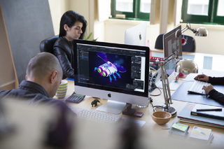
Here, agency head Eduardo Barbosa explains how simple it was to switch to Affinity Designer – and picks the app’s top tools.
Tell us a little bit about the history of the agency
Mother Volcano started as a vision — which we will endlessly pursue — of what the illustration studio of the future should be. Our story isn't much different from that of any other company: struggling at first to find the right people that shared our vision and to make the ends meet. Seizing opportunities, proving ourselves, achieving, failing, trying again and slowly growing and evolving. It's a never ending journey.
What tools were you using when you started?
Adobe's creative suite, the same as pretty much anyone else. I can't recall exactly where we found Affinity Designer but we were actively looking for an alternative to Illustrator. I think it might have been an article in some blog. We found Affinity because we were looking for it – we just didn't know it existed!
What impressed you most about it?
How it felt usable and intuitive like a modern app and not the bloated mongrels that most design applications that came out of the nineties are these days (except good old Freehand, may it rest in peace).
So how did you go about moving all your work onto Affinity?
We were just a three-person studio back then. Learning was very easy and intuitive. Each one of us got it pretty fast. No training needed. The switch couldn't be easier, honestly. The only slightly troubling thing was to figure out how to install it in all the machines with one single purchase and invoice because of the way the Mac App Store works.
What are the advantages?
How light and responsive it is and how it got the basics so well. We love that the most fundamental tools and operations are so well designed and that most of its good defaults are the ones that suits us best eg. you click on a path, you add a point.
The price is also unbelievable because, you know, we'd gladly pay ten times more for it, and of course there’s no subscription – you own the software for a one-off payment, you don’t rent it.
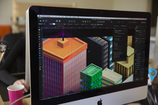
What’s been the response from clients?
They don't notice any difference and that's the point I guess. Usually clients don't care so much about tools as they care about the results. On the positive side, we have received some compliments for the smoothness of the gradients which we know Affinity Designer is to be credited for.
Can you give us an example of a campaign you’ve done in Affinity?
Most of the projects we have now on our portfolio were made – or remade – using Affinity.
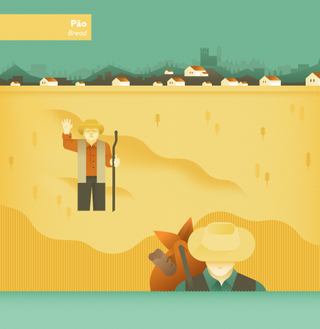
We were commissioned to illustrate an interactive website for the Museum in Mogadouro, dedicated to the heritage of the region. Our illustrations show the processes of making honey, wine, bread, olive oil and harvesting mushrooms.

This is one of the projects where we really used a lot of the features in Affinity Designer:
What would you say to other agencies who think they couldn’t make the switch?
Productivity boost. Need we say more? It’s the sum of the small decisions and details in Affinity Designer that make our work not only faster, but also more enjoyable.
As a studio the main reason that made us adopt Affinity is not so much that you can do everything in it — that’s just an extra for us — as it is the fact that working in Affinity, we can slice off a considerable amount of our production time thanks to the usability.
It’s the ease and speed of the most mundane and repetitive tasks that we do hundreds times a day that, when looking at the project reports, make the difference.
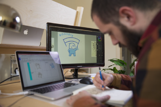
Mother Volcano’s top 6 Affinity Designer tools:
- The corner tool because it makes our vector drawing faster and help us to easily tweak the ’softness’ of our drawing.
- The personas is also a major time saver. It allows us to quickly apply hand drawn pixel brushes on our vector artwork to quickly test for finishing possibilities or, in reverse, make a brush sketch before doing the vector artwork. The fact that we can do all that within the same application is something that not only is convenient and a time saver but also help us stay in our creative flow. This together the export persona allow us to start and deliver a project, from digital sketch to slicing and exporting, without leaving the app. Being able to connect slices to layers or groups is also a great feature.
- The fact that we can combine opacity gradients with colour gradients allow to achieve effects we needed photoshop for before. We also find the custom shapes and the way they stay editable very useful.
- The amount of snapping options and the granular control we have for them allow us to have different snapping profiles and make elements snap to where we want to no matter the stage of the project we’re working on: drawing, layout, finishing, etc.
- Advanced grids. Life saver … we can do isometry based projects so much faster than we can in Illustrator – or at very least set the workspace up. The grid options in Affinity Designer not only allow us flexibility for different kind of projects but also help us with precision. Same for infinite zoom.
- The way artboards work and the fact that they can have their own grid and guides help us to organise our work specially on bigger scope projects.
What we particularly think is great about Affinity – and what at the end of the day really matters to us – is the overall usability of the application.
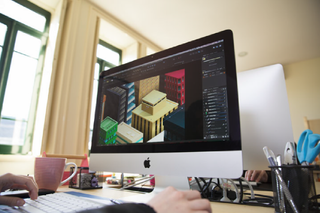
The only use we have now for Illustrator is when we copy-paste the vector artwork from Affinity Designer to be able to deliver everything correctly and neatly organised for animators who work with After Effects.

Thank you for reading 5 articles this month* Join now for unlimited access
Enjoy your first month for just £1 / $1 / €1
*Read 5 free articles per month without a subscription

Join now for unlimited access
Try first month for just £1 / $1 / €1
Get the Creative Bloq Newsletter
Daily design news, reviews, how-tos and more, as picked by the editors.
The Creative Bloq team is made up of a group of design fans, and has changed and evolved since Creative Bloq began back in 2012. The current website team consists of eight full-time members of staff: Editor Georgia Coggan, Deputy Editor Rosie Hilder, Ecommerce Editor Beren Neale, Senior News Editor Daniel Piper, Editor, Digital Art and 3D Ian Dean, Tech Reviews Editor Erlingur Einarsson and Ecommerce Writer Beth Nicholls and Staff Writer Natalie Fear, as well as a roster of freelancers from around the world. The 3D World and ImagineFX magazine teams also pitch in, ensuring that content from 3D World and ImagineFX is represented on Creative Bloq.
