Turn inspiration into innovation in 3 steps
There are inspiration galleries in every crevice of the web, but little on how to actually be inspired. Rita DeRaedt shares her tips on nurturing your creativity.
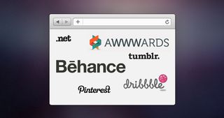
The design world is as full of inspiration as it ever has been. Sites like Dribbble and Behance serve up gorgeous screenshots of other designers' work every hour of every day.
Search online for any idea, concept, or colour scheme and hundreds of results pile in. In this world where the clichéd 'design rockstar' reins supreme, designers jump on the bandwagon of trends faster than ever before. Along with trends, the good, the bad, and the ugly, come the hordes of imitators.
With a quick glance at another designer's portfolio, and an hour or two in Photoshop, a mid-range designer can duplicate just about anything. In turn, imitation has become one of the most common design offences.
The problem
Imitation, both intentional and unintentional, has become the state of the web. More and more designs are starting to look like one another. Slowly but surely, designers' portfolios are incurring severe cases of déjà vu. It's important to remember that one project's design solution isn't every project's design solution. In addition, just because something looks good doesn't mean it functions in the best way possible.
The most important thing I've learned in recent years is how important it is to consider the user.
Imitation is different from inspiration
When I was 15 years old, I began my design career through a crowdsourcing website. Because it is what got me started as a designer, I can't hate on crowdsourcing as much as I'd like to. Crowdsourcing made me truly appreciate my first real project. The whole 'getting paid' part was pretty novel, too. However, design without any regard for the audience or purpose runs rampant in the crowdsourcing community.
The crowdsourcing community's goal is to put out the flashiest design in hope that a buyer will pick it and you will actually get paid. Sometimes, the designers participating in these projects would spot a high rating on another design in the project and proceed to make a version of that design.
Occassionally, I would spot a copy of an established website (such as MailChimp, with monkey and all) being submitted to a project. The tech-illiterate buyer would be attracted by the glowing buttons and 'hip' gradients and the designer would be awarded the money.
The big issue lies in the fact that the contributing designers didn't seem to really know what they were doing. Perhaps because they had seen a design they liked, they wrongly came to the conclusion that they could manipulate it a little and then call it their own? Not only does this result in a bad design aesthetically, but it is also intrinsically bad for the intended audience.
I've even come across portfolio sites being copied with just a different logo. A word to the wise (and the up-and-coming designer): don't get started by pirating a site. Generally speaking, it's bad form. Instead of helping build your portfolio as you start out as a designer, you run the risk of butchering your reputation before you've even fully established one.
Imitation and Apple: iOS7
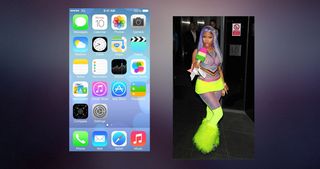
I like to be super-original, so I'm going to pick on Apple's iOS7. Besides a whole slew of colour, balance and spacing issues, Apple got caught up in a design trend.
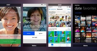
There are minor tweaks in colour and sizing between Microsoft Metro and iOS7, but all of the elements have the same feel to them. When Apple stayed true to skeuomorphism, it had a good thing. Yes, it needed an update to enhance usability, but it was unique to Apple. If a person were to see a piece of Apple's UI, it could most likely identify the company it was from.
iOS7 is one of the first times Apple has become a follower of a design trend. It's now easy to draw comparisons between Apple and Microsoft's design style. Its aesthetic has become watered down and has lost a lot of its signature.
How to be inspired
To help sharpen the line between inspiration and imitation, here are the three steps:
01. Find out what you really need
For your site to be a success, what will it require? As it is widely touted these days, content first is key. Your design's main job is to give the user a quick and effective path through the website's content. All of the elements that follow need to add to this experience. Sites that toss in superfluous elements in efforts to be 'super cool' are easy to spot. Taking function and usability out of the equation, results in an over-stylised, purposeless website that's impossible to navigate.
Before you even begin browsing the web looking for great designs, define what you are about to create. This step will guide the rest of the creative process and help you establish your end goal.
Answer these questions:
- Why am I looking for inspiration?
- What is it I'm really trying to design?
- For the design to be a success, what will the user need?
02. Look at things
Explore. Flick through magazines. Read Blogs. Get offline. Get online. One of the biggest benefits to being a designer today is that the possibilities are close to endless. HTML5 has pushed some websites to groundbreaking levels of cross-browser incompatibility. Even if you can only view it Chrome Canary, download Chrome Canary and view it.
You just may notice an effect or detail that you never picked up on before. Check if a site is responsive. If so, notice how the site transforms to fit certain devices. Does it do so gracefully, or do you feel all the content and purpose for the site disappears as it scales down?
When looking for quality design, these are my top three go-to sites:
03. Break it down
Examine why certain styles work and others don't. Once you've spent your time observing designs, go ahead and dissect them. Try to figure out what made the designs so successful. Or, even better, figure out why something should have worked, but just didn't. Inspiration isn't duplicating a callout box from Dribbble. Inspiration is seeing something kickass and not copying it. And then, on the flip side, recognising what tanked an otherwise excellent concept.
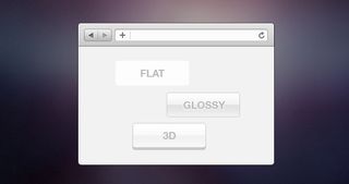
Before jumping into Photoshop, appreciate the light one pixel border along UI elements. Observe how colours can be paired in a different way. Understand how whitespace influenced the overall feel. When you start looking at a certain design as the only way to execute a trend, that's when the problem starts.
It's impossible to innovate when you are focused on something that's already been done.
Instead, do your research. Discover the drivers behind the trends. The reason that skeuomorphism worked for Apple's original interface was it accurately targeted the user. Steve Jobs' goal was to merge extremely high-tech items with everyday life. By referencing everyday items, such as notebooks, in its operating system and applications; Apple products became extremely intuitive to the even least tech-savvy.
Now that so many people own a piece of smart technology, the need for skeuomorphic design has faded.
Instead of cluttering up the screen with life-like elements, designers need to accommodate for users who are more than comfortable with their devices. Design no longer needs graphic depth, but interactive depth. Trends and styles aren't meant to be followed blindly. They have a distinctive purpose.
'Flat' design is all the rage because it simply makes sense for this generation of tech users. That being said, the needs of the user are constantly changing. Five years from now, we all will sit back and roll our eyes at the designs we loved today.
Conclusion: real inspiration leads to innovation
Once you know you know why a button looks great, you can pioneer your own. Craft your design with a direct intention and it will show. Using all three steps, get excited and get inspired. Work from the bottom up. Understand the end goal and then work on getting there.
While you are scrolling through countless designs, always keep in mind that these are just trends. Sure, they may be the most breathtaking collection of pixels you've ever seen. But, before you start obsessing over some element that just works so well on that design, pause and let yourself get back to your wireframe (or whatever it is that grounds you). You can answer the question: is that super-flat parallax design with horizontal scrolling and more shades of grey than EL James design really what this website needs?
Find the best solution for your user and you will have the ultimate design. Forcing another designer's concept into a different project results in an awkward-at-best design and ends up diluting a designer's credibility. In short, inspiration is not imitation.
Soak up good design - and then go do your own thing.
Words: Rita DeRaedt
Rita DeRaedt is a Pixel Enthusiast based out of Toledo, OH. She has worked extensively in the web design field and was runner up for net magazine's Young Designer of the Year award. You can follow her on Twitter @ritaderaedt.

Thank you for reading 5 articles this month* Join now for unlimited access
Enjoy your first month for just £1 / $1 / €1
*Read 5 free articles per month without a subscription

Join now for unlimited access
Try first month for just £1 / $1 / €1
Get the Creative Bloq Newsletter
Daily design news, reviews, how-tos and more, as picked by the editors.
The Creative Bloq team is made up of a group of design fans, and has changed and evolved since Creative Bloq began back in 2012. The current website team consists of eight full-time members of staff: Editor Georgia Coggan, Deputy Editor Rosie Hilder, Ecommerce Editor Beren Neale, Senior News Editor Daniel Piper, Editor, Digital Art and 3D Ian Dean, Tech Reviews Editor Erlingur Einarsson and Ecommerce Writer Beth Nicholls and Staff Writer Natalie Fear, as well as a roster of freelancers from around the world. The 3D World and ImagineFX magazine teams also pitch in, ensuring that content from 3D World and ImagineFX is represented on Creative Bloq.
