The 7 best student portfolio sites of 2017
We present our favourite portfolios from student designers over the last 12 months.
It’s natural to expect a student portfolio to fall somewhat below the standard of a professional designer with years of experience under their belt. But every now and again, you see something that makes you stop and pause.
These 2017 students all have top-quality portfolio websites that truly mark them out as ones to watch. Check them out, and see just what the next generation is capable of...
01. Raoul Gaillard

Raoul Gaillard is a web developer and UI student at Hetic in Paris. His portfolio site shows off his coding smarts from the word go, with colourful, undulating geometric shapes making the transition between each page a delight for the user.
Visually, it’s beautifully crafted, too, with a keen understanding of the power of whitespace and nice typographical choices. With each case study, you’re not bombarded by information but you are provided with the basics, and more details are available at the click of a button. Overall, this site is a great showcase for both Gaillard’s visual and interactive design skills.
02. Chrissen Rajathurai

Another student at Hectic in Paris, Chrissen Rajathurai is a 24-year-old junior digital designer and freelancer who says he likes to design “simple and friendly interfaces”. And yes, his portfolio site is indeed simple in function, but its visual design still comes across as fresh and original.
The use of a darkened, blurry version of each image as page background is implemented perfectly, and really adds an inventive feel to the site. Also, Rajathurai has taken the time to be thoughtful with his microcopy, which means you’re never at a loss in terms of where to go or what to do. If only all portfolio sites could master this trick...
03. Sean Valies

Sean Valies is a 25-year-old in his final year of his Masters in Graphic Design at the Royal Academy of Arts in The Hague. We’re not huge fans of the idea of personal logos, to be honest, but his own wordmark – which stays in a fixed position as you navigate the site – is simple and clever enough to work effectively.
Presenting your work in an asymmetrical grid is another device that doesn’t always work, but here it succeeds brilliantly in drawing you into Valies’ varied and intriguing projects. All in all, this portfolio site demonstrates that it doesn’t necessarily matter what design choices you make, it’s about how well you implement them.
04. Gemma Mahoney

Gemma Mahoney is currently studying a bachelor’s degree in Communication Design in Melbourne, although you wouldn’t necessarily know that from her portfolio site, which focuses on her work as a freelancer and an intern designer at Confetti Studio.
Although her image-based layout isn’t particularly original, it’s been constructed in a solid and professional way that does a great job in presenting Mahoney’s high-quality work.
05. Benjamin Hunt

Studio Ben is the online home of Benjamin Hunt, an industrial design student currently training at Rhode Island School of Design. If students are sometimes perceived as lazy, Hunt’s website disabuses you of that notion straight away, with footage of him actually making stuff as full-screen video. It’s an interesting approach, and definitely grabs the attention.
Click through to the portfolio proper and you’ll find a visually enticing, nicely balanced presentation that makes effective use of colour, light and space to sell the skills of this talented student.
06. Ben Chan and Malone Chen

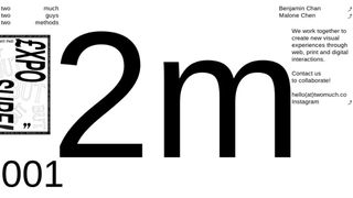
Ben Chan and Malone Chen have been studying graphic design at Central Saint Martins in London for three years, and collaborating as a duo for the last two. So it makes sense to have a joint website, and a very cool and contemporary one it is too.
Lovingly art-directed, with a monochrome, minimalist feel, their homepage introduces the duo and provides contact details, while clicking on each name takes you through to their respective individual portfolios. Deceptively simple and evoking the feeling of an old-school zine, this is one of the most original and imaginative portfolio presentations we’ve seen in a very long time.
07. Hieu Tran

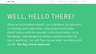
Hieu Tran is a graduate of the Graphic Design MFA program at the Maryland Institute College of Art, and specialises in editorial design, branding, and information visualisation. As you can see from the homepage screengrab above, he addresses the visitor in a personal tone through his portfolio site, which instantly endears him to you.
Design-wise, the stripped-back aesthetic adds an extra of touch of personality and focuses your attention on his work nicely. And we love that Tran has included a ‘graveyard of failures’ under the heading Not Trash. It's an unusual and somewhat brave touch that just makes us like him more.
Related articles:

Thank you for reading 5 articles this month* Join now for unlimited access
Enjoy your first month for just £1 / $1 / €1
*Read 5 free articles per month without a subscription

Join now for unlimited access
Try first month for just £1 / $1 / €1
Get the Creative Bloq Newsletter
Daily design news, reviews, how-tos and more, as picked by the editors.

Tom May is an award-winning journalist and editor specialising in design, photography and technology. Author of the Amazon #1 bestseller Great TED Talks: Creativity, published by Pavilion Books, Tom was previously editor of Professional Photography magazine, associate editor at Creative Bloq, and deputy editor at net magazine. Today, he is a regular contributor to Creative Bloq and its sister sites Digital Camera World, T3.com and Tech Radar. He also writes for Creative Boom and works on content marketing projects.