The 7 best London agency websites of 2017
New for 2017, these London agencies’ websites are all worth checking out.
When it comes to designing your agency’s website, you want to show off your best work, in an easy to navigate portfolio. You want to show clients your digital smarts. You want it to be aesthetically appealing and functionally innovative. And of course, you want it to be fully responsive, mobile-friendly and accessible.
In truth, few agency websites hit all of these notes perfectly (particularly the last one). But that doesn’t mean we can’t learn from the things that they do manage to do well.
In this post, we look at some of the sharpest sites from London design agencies to hit the web this year. We hope they inspire your own agency website builds or redesigns.
01. dn&co

Based in Bermondsey in south-east London, dn&co is a brand and design consultancy founded in 2006 with a client list including Aviva, The Crown Estate and Scottish Widows. Highlights for the agency this year include work for the V&A and a podcast initiative in White City Place.
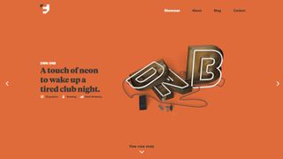
dn&co’s new website curates its eclectic portfolio in a colourful and attractive manner. Because the agency’s various projects don’t fall into neat categories, it has sensibly opted on its homepage for a image-based, modular grid that’s more akin to a blog or news website, with snappy headline-style titles to boot.
The ‘News’ and ‘Studio’ sections, meanwhile, make great use of bold, clear typography and lots of lovely whitespace to provide both a distinctive and readable visual experience.
02. Impero

Impero is an independent, award-winning creative agency that specialises in making “tired brands famous again”. Founded in 2009 and based in Wapping in London's Docklands, it has worked with high-profile brands including Beefeater Gin, Primark, Lindt Chocolate and 7Up.
Its nicely art-directed new website is not scared to make use of big, bold and impactful typography. The design, which the agency describes as “strong, bold and to the point – just like us” – also makes use of vivid and arresting background colours and some smart (but not overpowering) transitions as you click from section to section.
All in all, you get the impression that this agency is less concerned with nuance and subtlety and more about grabbing people’s attention. And we reckon that’s just want a lot of clients will be looking for.
03. Alchemy Digital

With a studio in Borough Market near London Bridge, Alchemy Digital is a web design agency with an ethos of “building relationships (not sales targets)”. Its client list includes TalkTalk, Elle Macpherson’s lingerie brand, and satellite company Inmarsat.
Alchemy’s new website is bright, clean and colourful. We love the device of housing each image in a circle, which brings a distinctive design consistency to the site as a whole, and facilitates a generous use of whitespace in the ‘Projects’ and ‘Articles’ sections that lets everything breathe beautifully.
The site also features a dash of parallax scrolling. But, sensibly, it keeps these parallax effects small and subtle, so they add visual interest without overwhelming or becoming the star of the show themselves.
04. ustwo

ustwo is a global digital studio headquartered in Shoreditch, east London. Founded in 2004, it has worked with some of the leading brands and has been dubbed “the John Lewis of Digital” by Campaign magazine. It has also consistently featured in the annual list of the 30 best UK studios compiled by our sister title, Computer Arts magazine.
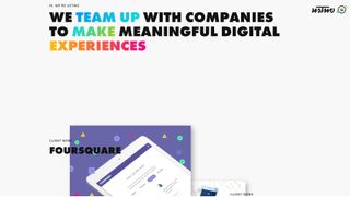
Digital agency websites can sometimes be a little dry, but ustwo’s new website for 2017 is anything but. It’s dominated by eye-popping, child-like colours that seem to pop out of the screen... not just in the imagery and graphics but, unusually, in the typography as well.
As you’d expect from a digitally focused agency, there are some lovely little transitions and animations too, showcasing what it can do without ever going over the top. And there’s a sense of balance and proportion to the design that brings it all together and makes it a real pleasure to peruse.
05. Pollen

Founded in 2005, Pollen is a branding and digital agency based in Regent Street in central London. With clients across London, Paris, New York, LA, Barcelona, Hong, Tokyo & Shanghai, it boasts a truly global outlook, and has won numerous awards for its work.
Going live in April, its new website is packed with lots of beautiful work, much of it for fashion and luxury brands. And the design makes the most of these elegantly shot images, with a magazine-style layout, stylish typography and acres of whitespace creating a high-end feel to the design.
Some gentle scrolling effects and transitions add to the touch of classy professionalism, too.
06. Function and Form

Function and Form is a small creative studio specialising in web and interface design. Founded last September, it’s based in the Hoxton/Shoreditch area of east London and its clients so far include Continental Clothing, NT Government and Banyan House.
When it comes to agencies websites, we constantly hear from clients that what they want to see is the work – and not just pretty pictures, but detailed case studies. So it’s great to see that Function and Form puts this front and centre: case studies begin on the homepage, and feature a good amount of detail about the brief and how the agency solved it.
In short, while this website might not be the most beautiful website design we’ve ever seen, it serves up the information and images you expect to see, with the minimum of fuss, and that’s 90 per cent of the battle won right there.
07. Johnson Banks

Founded in 1992, Johnson Banks is a small agency based in Clapham, south-west London, with some big clients, including Virgin, Mozilla and Unicef. Previously dividing its time between print and identity, its focus today is firmly on identity and branding, with a strong focus on the non-profit and charity sectors – brands that “make a difference,” it says.
There’s something quite different about Johnson Banks’ latest website redesign, too. Its homepage uses a brightly coloured collection of tiles, rapidly diminishing in size from top to bottom, to present its portfolio of work in a highly unusual way. Not to mention that pulling down your scrollbar actually scrolls everything sideways; an effect that could be described as either innovative or annoying, depending on your mood.
The whole site, in fact, could be described as Marmite-like (ie, you either love it or hate it). Happily for the agency (as we reported), there have been plenty of lovers out there in the design community.

Thank you for reading 5 articles this month* Join now for unlimited access
Enjoy your first month for just £1 / $1 / €1
*Read 5 free articles per month without a subscription

Join now for unlimited access
Try first month for just £1 / $1 / €1
Get the Creative Bloq Newsletter
Daily design news, reviews, how-tos and more, as picked by the editors.
Tom May is an award-winning journalist and editor specialising in design, photography and technology. Author of the Amazon #1 bestseller Great TED Talks: Creativity, published by Pavilion Books, Tom was previously editor of Professional Photography magazine, associate editor at Creative Bloq, and deputy editor at net magazine. Today, he is a regular contributor to Creative Bloq and its sister sites Digital Camera World, T3.com and Tech Radar. He also writes for Creative Boom and works on content marketing projects.
