The 7 best logos by design agencies in 2017
Discover the thinking behind these great designs.
Many big brand logos are crafted in-house, and it’s often difficult to find out who worked on the design and what it involved.
But, of course, many are also created by external design agencies. And if we’re lucky, their clients will have given them the freedom to talk about the process and thinking behind the new designs.
In this post we celebrate our favourite big-name logos from design agencies this year, and hear from the people behind them.
01. Giraffe by Ragged Edge

Giraffe World Kitchen is a chain of UK restaurants with a focus on bringing the best of world food to the high street at a reasonable price. In June, the London agency Ragged Edge announced a new logo and identity for the brand.
To help the restaurant stand out in a crowded category, Ragged Edge went back to the founders’ original intentions. ‘Giraffe’ became ‘Giraffe World Kitchen’, and a new identity was rolled out – with a new logo at the centre.
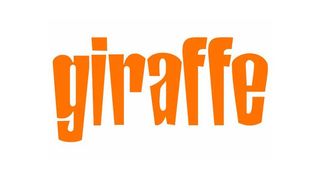
The redesigned logo extends the ‘F’ in a playful way that suggests the neck of a giraffe raising its head above the trees in search of new discoveries (but without being too obvious).
The lettering as a whole has been nicely cleaned up and standardised when compared to the previous, somewhat zanier version (below).
It's a fantastic logo design – a real highlight from 2017. You can learn more about the rebrand on the Ragged Edge website.
02. Sydney School of Entrepreneurship by For the People
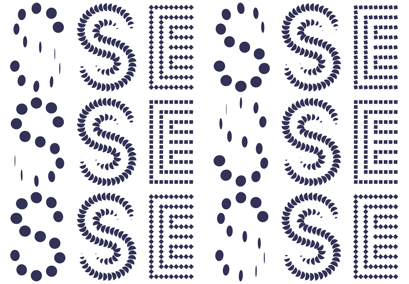
The Sydney School of Entrepreneurship aims to recruiting the cream of the crop from 11 universities and one vocational college in New South Wales, Australia to come together in a new startup campus in Sydney. In order to reflect the “diversity, energy and purpose” of the new school, Sydney agency For The People built then a custom logo generator to create a unique logo on a daily basis.
It sounds like a wacky idea, and it is. But there’s an underlying geometric skeleton underpinning the logos, which are based on the Px Grotesk font, that gives them all a sense of consistency and makes them easy to recognise, even though they’re ever-changing.
Controversial? Perhaps. But it’s a brave experiment that makes you think, which is clearly in keeping with the ethos of the institution.
You can learn more about the logo system here.
03. Eurosport Olympics by Dixon Baxi
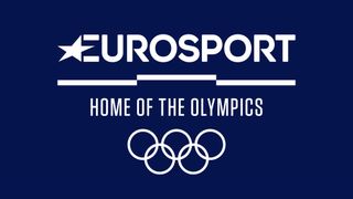
In August, London creative agency DixonBaxi unveiled the new logo, identity and on-air look for TV channel Eurosport’s coverage of the Olympics. The new branding has been designed to run for the next eight years, starting with the 2018 Winter Games in South Korea this February.
“The identity unites two iconic sporting organisations, putting Eurosport’s commitment to be the Home of the Olympics at the heart of the brand,” explains Dan Capstick, creative director at DixonBaxi.
“The podium is the foundation for the brand experience on every platform. The iconic three tiers are used as a simple visual metaphor in hundreds of ways. Layers of vibrant colour – inspired by Olympic venues – and expressive typography create a flexible and distinctive graphic style that is inspired by ultimate ambition of elite athletes to be the best.”
Salman Anjum, head of design at The Institute for Optimum Nutrition, is a big fan. “The designs focus on the ascent to the podium, which is what every athlete at the Olympics (and the watching public) dreams of,” he notes. “And the attention to detail is great. Some commentators have complained that the podium should have three distinct levels. However, the Olympics podium is actually at two levels, as reflected in the logo.
“What I find most appealing about the design is how it combines two very different entities and philosophies, with Eurosport and Olympics, into something not only cohesive but forward thinking.”
04. Juventus by Interbrand
While the current trend to simplify your logo is obvious with big consumer brands like Audi, more traditional organisations such as football clubs have been slower to get on board. So it raised a few eyebrows this January when Italian superclub Juventus released this remarkably minimalist design, created by the Milan office of Interbrand http://interbrand.com.
Based on the team’s black and white stripes, Interbrand have produced a decisively flexible and distinctive identity for the club which works well across the range of environments in which it promotes itself, from digital to retail.
Predictably, thousands of fans took to social media to complain about the loss of their beloved crest (above). But we think by breaking convention and transforming themselves into a more mainstream brand, Juventus are simply leading the pack, and we very much expect other clubs to follow their lead in years to come.
You can learn more about the new logo here.
05. Audi by Strichpunkt and KMS Team
April 2017 saw a new global identity system for Audi (above), based on a flattened version of its previous logo (below).
This strikingly minimalist redesign of the famous rings was the result of a collaboration between German agencies KMS Team and Strichpunkt.
“Working in partnership with Strichpunkt, we took a holistic approach and redesigned the overall brand appearance for all relevant touchpoints,” explains Andreas Zeischegg, design director for KMS Team. “The vision was to create a seamless experience throughout all media and devices; starting from automobile interfaces, online and offline applications, TVC and classical media to print design.
“The flattened Audi logo is not just a formal consequence of technical requirements, but a bold statement,” he adds. “A symbol of a new brand attitude fostering creative diversity and a shift from monologue to dialogue.”
Graphic designer Christopher Colouryum greatly approves. “It's a real sign of status when a logo can drop its wordmark and be globally recognised by its icon,” he points out. “Especially when it's just four circles! Audi is now joining ranks with the likes of Apple and Nike, who have proved that a strong brand icon doesn't need messy letters for people to recognise it. This is a beautifully clean and sharp rebrand and very, well... German.
“All the unnecessary fluff has been stripped away and flat design has been used across both digital and print applications to give a sophisticated and luxurious yet well-engineered feel,” he adds. “The accompanying font family is instantly recognisable as Audi and the brand clearly knows that too, by choosing to not use the logo in some of its material; very bold.”
06. Science Museum by North
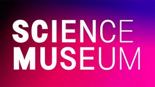
North Design, based in London, courted controversy in October with the release of its new logo and branding for the Science Museum. Many believed it was too soon for a rebrand, and questioned what was wrong with the previous design, before Johnson Banks responded to the redesign.
Love it or loathe it, the logo certainly got people talking. Louis Mikolay, senior designer at North Design, provides some background. “The Science Museum Group is the world’s leading alliance of five science museums around the UK,” he explains.
“To maximise ongoing ROI and leverage funding partnerships, the group has been aligning itself in appropriate areas. To support these strategies and to foster a sense of unity and purpose, North was briefed to create a new group visual language that helps present the sites as a cohesive family.”
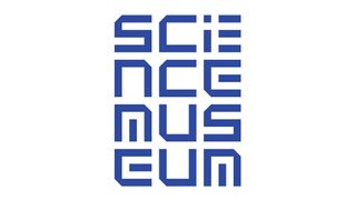
Freelance art director Olly Browning is a big fan of the new identity. “It seems to give the museum a sense of cohesion in a way I hadn’t really seen there before; from wayfinding to shops to those lovely gradient staff T-shirts I want to steal,” he explains.
“The new colour palette and gradients seem sufficiently science-y too, and I hope they won’t tire of them too quickly.”
07. Mozilla by Johnson Banks
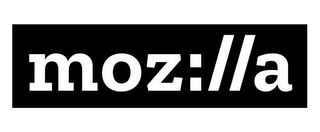
The open source organisation behind the Firefox browser, Mozilla has always been all about the community surrounding it. But it pushed the concept even further recently by throwing the process of designing a new logo open to the public at large.
From June 2016 onwards, Mozilla worked with London agency johnson banks to develop new branding. And it involved the public by documenting the process on its blog, and then releasing a longlist of seven first-round concepts and inviting feedback on the designs.
The winner, shown above, was launched this January. Is it best standalone logo we've ever seen? No. But this boldly basic design, based on custom-made font created in collaboration with Dutch type foundry Typotheque, holds together beautifully, and looks smart and sophisticated while being beautifully flexible.
Is it a ground-breaking approach to apply to logo design? Without a doubt. It wouldn't be right for most logos, of course, but for this client it was perfect. And that's why we've included it here.
You can learn more about the thinking behind the logo in this blog post.
Related articles:

Thank you for reading 5 articles this month* Join now for unlimited access
Enjoy your first month for just £1 / $1 / €1
*Read 5 free articles per month without a subscription

Join now for unlimited access
Try first month for just £1 / $1 / €1
Get the Creative Bloq Newsletter
Daily design news, reviews, how-tos and more, as picked by the editors.
Tom May is an award-winning journalist and editor specialising in design, photography and technology. Author of the Amazon #1 bestseller Great TED Talks: Creativity, published by Pavilion Books, Tom was previously editor of Professional Photography magazine, associate editor at Creative Bloq, and deputy editor at net magazine. Today, he is a regular contributor to Creative Bloq and its sister sites Digital Camera World, T3.com and Tech Radar. He also writes for Creative Boom and works on content marketing projects.

