The 20 best magazine covers of 2016
Yes, we are most definitely are judging a book by its cover in this list of the best mag front page designs from the past year.
Creating a memorable mag covers takes more than just knowing your way around various InDesign tutorials. And 2016 certainly didn't disappoint. In fact, it proved to be a stellar year of innovative, creative and, above-all, inspiring magazine covers that tackled political turmoil, social comment and culture. Here we collect some of our favourites over the past 12 months, including colour-it-yourself, scratch-and-reveal and stand-out photography. Ready for the New Year? Check out these free calendar template designs.
01. Little White Lies – Star Wars
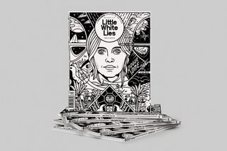
Little White Lies is known for its innovative, illustrated covers and its last of 2016 didn’t disappoint. Celebrating the release of ‘Rogue One: A Star Wars story’, the team produced a colour-it-yourself edition, featuring actress Felicity Jones. The illustration was created by Massachusetts graphic designer Chris Delarenzo, who worked alongside Little White Lies creative director Timba Smits.
02. Printed Pages – Don’t Hug Me I’m Scared
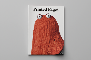
Don’t Hug Me, I’m Scared is the vision of Becky Sloan and Joseph Pelling. An award-winning, surreal series, it first launched in 2011, with the first episode reaching 30 million views. Gaining a huge, cult following over the years, It’s Nice That magazine Printed Pages published three different covers, each featuring the stars of Don’t Hug Me I’m Scared. Photographed by Neil Bedford, the issue included exclusive interviews with the DHMIS puppets themselves.
03. Vice – Borders

The refugee crisis has been one of the most widely covered news stories of 2016, generating a wealth of magazine covers. Vice tackled it with a simple but bold execution, showcasing an every day image of drying wet clothes but with a sinister and thought-provoking stance. Captured by photographer Elliot Ross, his work focuses on the interpersonal, cultural, and economic hardships of human beings in geographic isolation.
04. Frankie
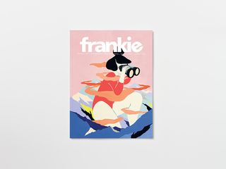
Based in Australia, Frankie magazine is a women’s magazine but not as you know it. Featuring mostly illustrated covers across their bi-monthly publications, the images capture femininity in all its forms. This one brings forth a sense of adventure and of confidence – a female figure looking for answers in a world that cannot contain her.
05. New Scientist
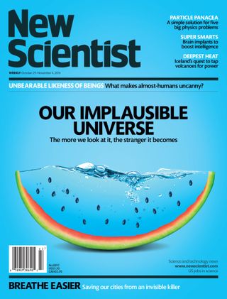
Offering up mind-bending graphic design with every cover, it’s always difficult to pick a stand-out issue when it comes to New Scientist. This one, however, marks the team's ability to create the perfect balance of intrigue and creativity. Its layers offer up more than meets the eye and the font placement allows the image to really speak for itself.
06. The New Yorker

Peter de Sève has created forty magazine covers for The New Yorker. Mostly depicting the interaction between humans and animals with an existential stance, this ‘rat race’ illustration is as thought-provoking as it is charming. When asked about the mouse on the cover, Sève told The New Yorker, “I had an inordinate amount of pets growing up, from puppies to parrots, and I even worked in a pet shop as a teenager.”
07. The Big Issue
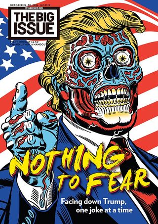
2016 saw one face dominate the magazine covers of the world – Donald Trump. Photographs, illustrations and satirical comment have splashed across political publications, newspapers and magazines, marking the undeniable publishing presence of the President-elect. This one from The Big Issue cleverly comments on the media’s treatment, simultaneously offering up a original and illustrative take.
08. The New York Times Magazine
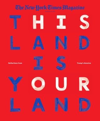
Another comment on Donald Trump, this cover from The New York Times Magazine takes focus away from caricatures and instead makes intelligent use of font and colour. Taking the red, white and blue aesthetic of the United States of America, it highlights the issues raised by such a divided campaign with a poignant and creative flair.
09. Lucky Peach
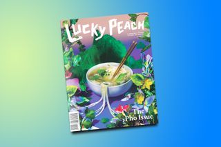
This food and lifestyle journal always produces outstanding covers that focus on food but in a creative and intriguing way that often puts the particular item of food in a brand new world. This Pho cover is particularly inspiring, using colour and shape to explore a deeper meaning beyond the bowl.
10. Creative Review
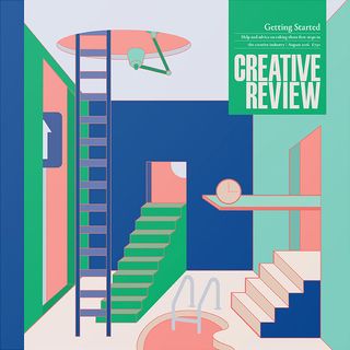
A nostalgic but forward-thinking mirage of illustrations adorns the cover for Creative Review’s August edition. Focusing on “getting started,” signs, steps, ladders and light act as creative metaphors in taking that first step into the career you’ve always dreamt of. The colour palette is a lovely nod to the dream-like nature.
Next page: 10 more of the best magazine covers of 2016...

Thank you for reading 5 articles this month* Join now for unlimited access
Enjoy your first month for just £1 / $1 / €1
*Read 5 free articles per month without a subscription

Join now for unlimited access
Try first month for just £1 / $1 / €1
Get the Creative Bloq Newsletter
Daily design news, reviews, how-tos and more, as picked by the editors.
Sammy Maine was a founding member of the Creative Bloq team way back in the early 2010s, working as a Commissioning Editor. Her interests cover graphic design in music and film, illustration and animation. Since departing, Sammy has written for The Guardian, VICE, The Independent & Metro, and currently co-edits the quarterly music journal Gold Flake Paint.
