The 10 best cursive logos of all time
The best cursive logos use a handwritten style to create iconic design.
Cursive logos aren't the most popular approach in logo design these days. The cursive, handwriting-style, can be more difficult to read than a clean sans serif or even serif typeface. However, the best cursive logos around tend to be timeless, continuing to work well years and even decades after they were designed.
Whether joined up in a smooth, flowing manner or featuring a mixture of joins and pen lifts, a cursive logo can communicate tradition and elegance but can also be a good option for any brand wanting to come across as friendly, approachable, and family oriented. Here we select our favourite examples of cursive logos from global brands (see our pick of handwriting fonts for more inspiration for possible type styles).
The 10 best cursive logos
01. The Harrods logo
Since 1834, Harrods has been the premier department store of London, England. Occupying the high end of the market, the store occupies five acres of land and contains 330 departments. But for many years, that caused a problem, because these all had different visual identities and there was a lack of a consistent brand message.
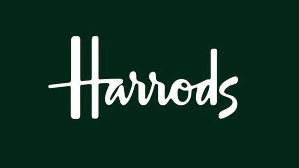
In 1967, Marcello Minale and Brian Tattersfield – aka Minale Tattersfield – were tasked with devising an overarching identity for the store. The understated design they created, based on the store owner Charles Harrods' signature, hits the perfect sweet spot between austere tradition and friendly inclusiveness.
Relatively unchanged since, it now adorns not just the storefront but numerous products, from bags to apparel, so has a high monetary value in its own right.
02. The Virgin logo
In the early days of Virgin Records, its original logo was about as different from its current one as you could imagine. Designed by the great English artist and illustrator Roger Dean, this psychedelic extravagance featured a naked set of Siamese Twins and a suggestive-looking dragon.
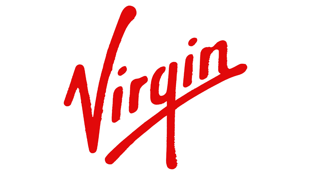
But when owner Richard Branson signed the Sex Pistols to his label in 1977, whose generation-defining slogan was ‘Never Trust a Hippy’, it was clear that a new design was needed. A stark red, graffiti style design was the result, and was much more in keeping with the times.
It’s a sign of how quickly punk style was adopted by the mainstream that it’s survived pretty much intact ever since, and now promotes such mundane fare as fizzy drinks, air travel and insurance services. You can read more about the development of the Virgin logo on the company's website.
03. The Paul Smith logo
Signature-style logos work well when the brand and its owner are inseparable, and that’s certainly the case with the famous logo for British fashion designer Paul Smith.
Known for his idiosyncratic take on traditional English tailoring, Smith has grown an empire of more than 300 shops worldwide with an annual turnover of £200 million (around $263 million). And this quirky but elegant logo fits in well with his ethos of ‘classic with a twist’.
As elegant as his shirts and suits, this cursive logos speaks to the style and panache of the genius behind the brand. So it’s surprising that it’s not actually based on his signature at all: it was designed by a friend of his called Zena.
04. The Kleenex logo
Since Kleenex tissues came on the market in 1924, it has been the number one brand of facial tissue in the world. So it’s not surprising that its logo is so recognisable.
But what you may not know is that one of the best-known iterations of Kleenex’s logo was designed by iconic designer Saul Bass in the 1980s.
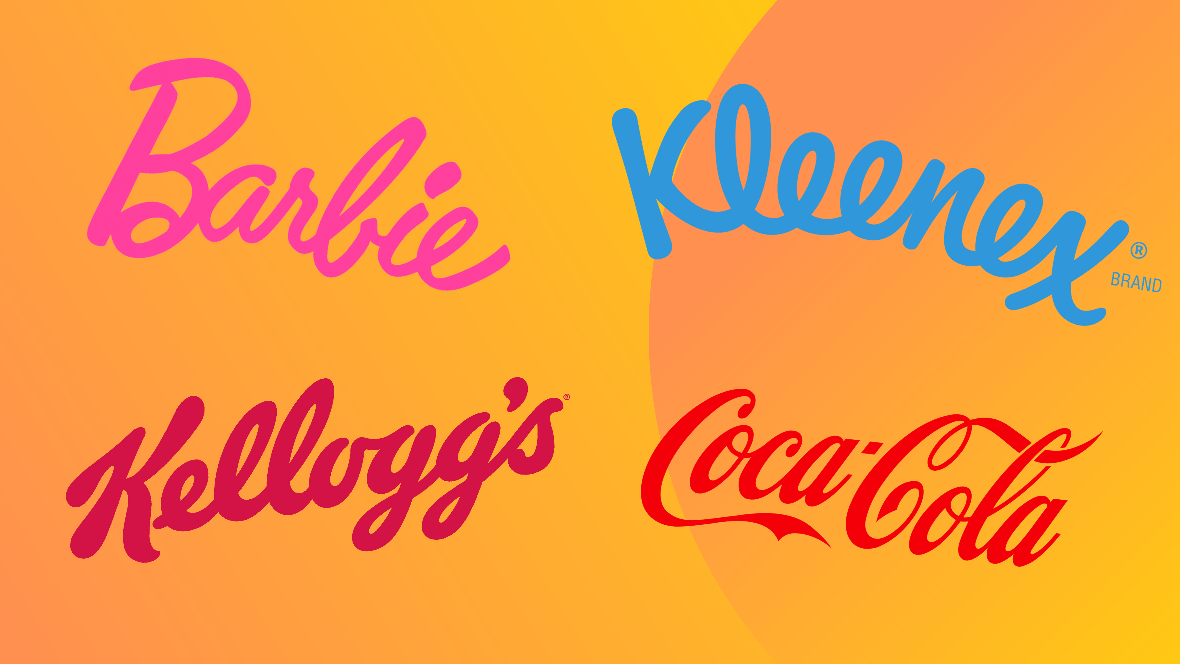
His upbeat and friendly design (above) used a style of joined up lettering that’s subliminally full of ‘smiles’, striking the right emotional note for a product otherwise connected with weeping and illness.
The Bass logo was subtly redesigned in 2008 for owner Kimberly-Clark by Sterling Brands, curving the logo itself to add to the lighthearted sense of bounciness in the design.
05. The Barbie logo
Created in 1959 by Ruth Handler and inspired by a German doll named Bild Lilli, Mattel’s Barbie has been the best-selling toy brand in the world for more than five decades. That’s partly down to a ruthlessly consistent approach to branding. This has resulted in Barbie virtually ‘owning’ the colour pink, while her handwritten logo has become one of the most instantly recognised in the world.
First introduced in 1959 at the New York Toy Show, this cartoony cursive logo has gone through several iterations, but the current version is almost identical to the original, highlighting just what a clever creation that was. There’s a real verve, playfulness and confidence to this design that speaks to the subtle sophistication at the heart of the Barbie brand.
06. The Kellogg's logo
Many cursive logos come with company-approved backstories, and the Kellogg’s logo is no exception. Legend has it that in the early 20th century, founder William Keith Kellogg would sign each packet of his corn flakes personally, as a guarantee of their quality.
This signature style logo began to become standardised in the 1910s and 1920s, and quickly became one of the globe’s most recognised logos. The latest version was created by the Kellogg’s marketing team in collaboration with Interbrand in 2012.
The changes over the years have been so incremental, though, that few people outside the design world (or the very advanced in age) are likely to have noticed any difference. And that’s a good thing. Brand consistency is hugely important with a product like breakfast cereal, where the goal is to sustain people’s love for their favourite brand (often hard-wired during their formative years) throughout their lives.
07. The Ford logo
We like to think multi-tasking is something new, but people had it covered in times past too. Take the classic stylised Ford script, which was developed by the company’s first chief engineer, Childe Harold Wills, in 1909.
Wills, the chief contributor to the design of the Model T Ford, was also known for designing and printing business cards, so used the calligraphy from his own cards to crate the letters of the Ford logo. The oval was added in 1912, and not a huge amount has changed since, the most recent update being carried out by The Partners.
The Ford logo is now inseparable from the brand, and even though the company has never claimed it to be the signature of its founding father, Henry Ford, the cursive style still helps to evokes a warm, friendly and familiar connection to the brand.
08. The Wendy's logo
Founded in 1969 in Columbus, Ohio, Wendy’s has since become the world's third largest hamburger fast food chain, behind Burger King and McDonald's. Its logo has always offered a more family-friendly vibe than those of its rivals, with an emblem based around a stylised portrait of founder Rex David Thomas's daughter Wendy.
Until recently, the wordmark was based on all-caps, classic Western-style lettering. But its most recent redesign in 2013 changed this to a hand-drawn, marker-style cursive logo.
This update makes the logo both simpler and more streamlined, and more personal and family-oriented, and was accompanied by a similar clean-up of the girl-in-pigtails emblem.
09. The Disney logo
So what about Disney’s logo? Surely that was based on founder Walt Disney’s signature, right? Well, yes and no.
Firstly, this now-classic logo didn’t actually come into existence until almost two decades after Walt’s death. And secondly, photos of the founder’s original signature show little similarity between that and the logo.
What it does seem to be based on, though, is his “official” signature, which was signed on his behalf by an employee, Hank Porter, thousands upon thousands of times, to save Walt time and energy that he could better devote to business matters.
Either way, that doesn’t stop Disney’s world-conquering logo being a must-include on our list of world-conquering cursive logos.
10. The Coca-Cola logo
Last up is perhaps the most famous handwriting logo around. Many products that are world-famous now didn’t actually pay much attention to branding in their early days. But for Coca-Cola, it was a key ingredient right from the start. Way back in 1885, just after John Pemberton had come up with a new drink based on kola nuts and coca leaves, his partner and bookkeeper Frank Mason Robinson came up with the name and a logo based on script lettering.
Robinson suggested the name Coca-Cola because he felt that two capital C’s would look good together in advertising. He couldn’t have been more right, and that decades-long headstart means that rival brands have struggled vainly ever since to break Coke’s hold as the world’s go-to cola. At the time when the Coca-Cola logo was created, handwriting-style logos were the norm, but Coca-Cola's design has proved to be one of the most enduring logos around and an example of how cursive logos can become timeless.
See our Coca-Cola logo history for more about the design, and don't miss out pick of the best 3-letter logos for more logo inspiration.

Thank you for reading 5 articles this month* Join now for unlimited access
Enjoy your first month for just £1 / $1 / €1
*Read 5 free articles per month without a subscription

Join now for unlimited access
Try first month for just £1 / $1 / €1
Get the Creative Bloq Newsletter
Daily design news, reviews, how-tos and more, as picked by the editors.

Tom May is an award-winning journalist and author specialising in design, photography and technology. His latest book, The 50th Greatest Designers, was released in June 2025. He's also author of the Amazon #1 bestseller Great TED Talks: Creativity, published by Pavilion Books, Tom was previously editor of Professional Photography magazine, associate editor at Creative Bloq, and deputy editor at net magazine.
- Joe FoleyFreelance journalist and editor
