New Behance concept looks like a killer app
Norah Park has created a desktop app concept of Adobe's go-to creative resource, and we're dying to try it out for real.
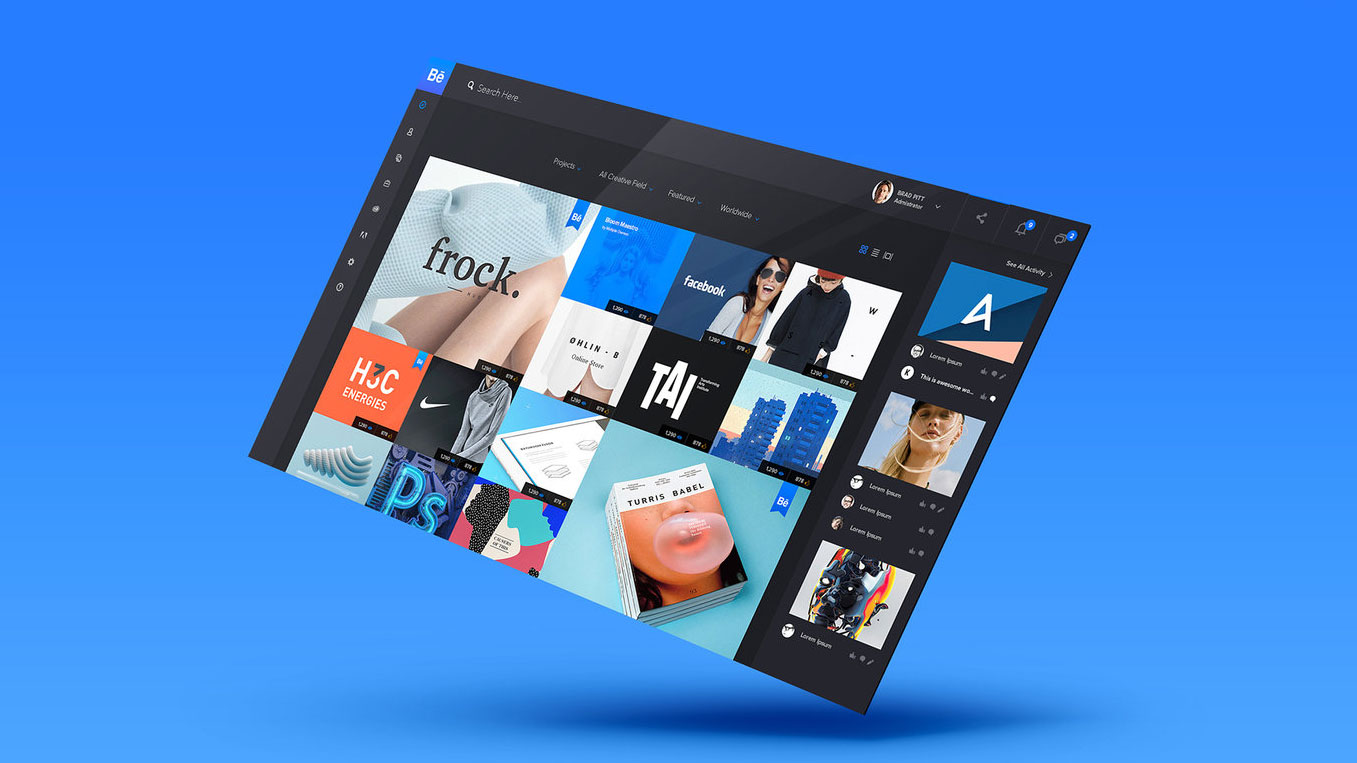
Behance is an essential resource for designers and creatives, whether you want to show off your latest work, find some inspiration or even if you're a creative director looking for your next hire. As a website it does a pretty good job, but if you've ever felt it could be worked a little harder then this project by LA-based designer Norah Park is bound to get you excited.
A frequent user of Behance, Park asked herself how it might work if it was reinvented as a fully fledged desktop app; one that takes advantage of the platform by providing a richer, more seamless and customisable experience. And then she went ahead and designed it, and the results are spectacular.
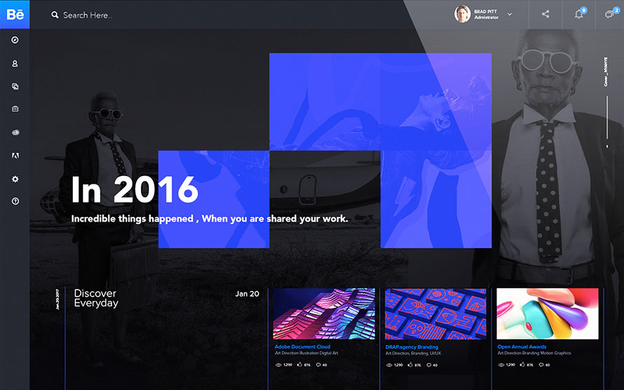
Park's Behance app design features a more intuitive and user-friendly interface, with a simplified navigation framework and improved taxonomy that prioritises the content and functions that are used most. This is most noticeable in the flexible landing page, which uses predictive algorithms to generate customised content and based on what you've looked at previously, so you should always be shown work that you're likely to be interested in.
Article continues below 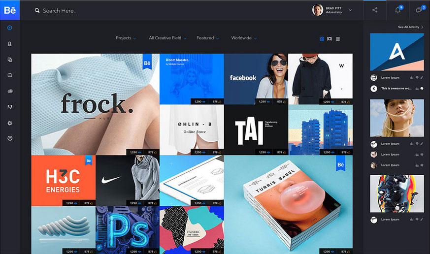
Digging deeper, a dedicated Discover section makes it easier to find inspiring work, with multiple layouts that facilitate different mental models for browsing, discovering and searching. To maximise findability, this uses interaction and engagement patterns to augment each user's preferences.
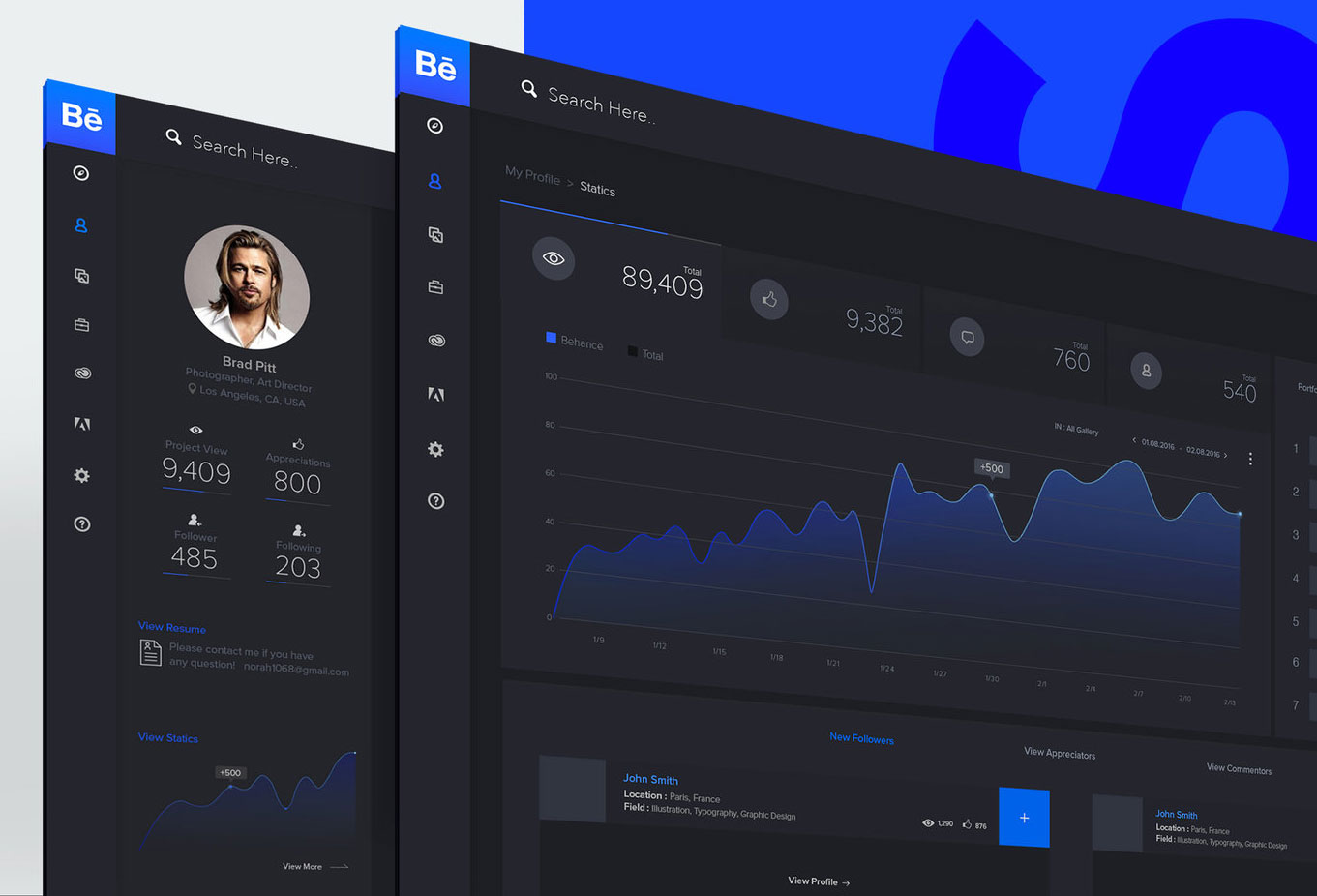
Beyond showing you cool stuff, this new design provides essential tools to help you further your career. The Profile page becomes much more useful, with built-in infographics and analytical dashboards to help you pinpoint what's working in your profile and what isn't.
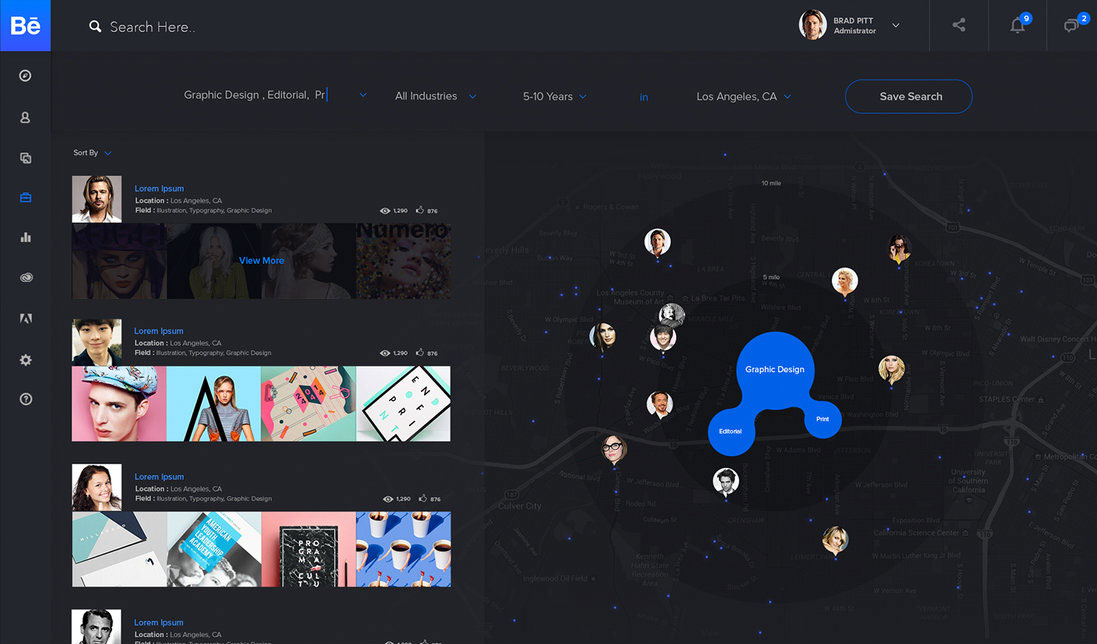
Finding your next job is also made a whole lot easier with a job and creative search section. This combines location-based services with a visual map display to create a more useful, dynamic and engaging tool that assists talent and job searchers alike.
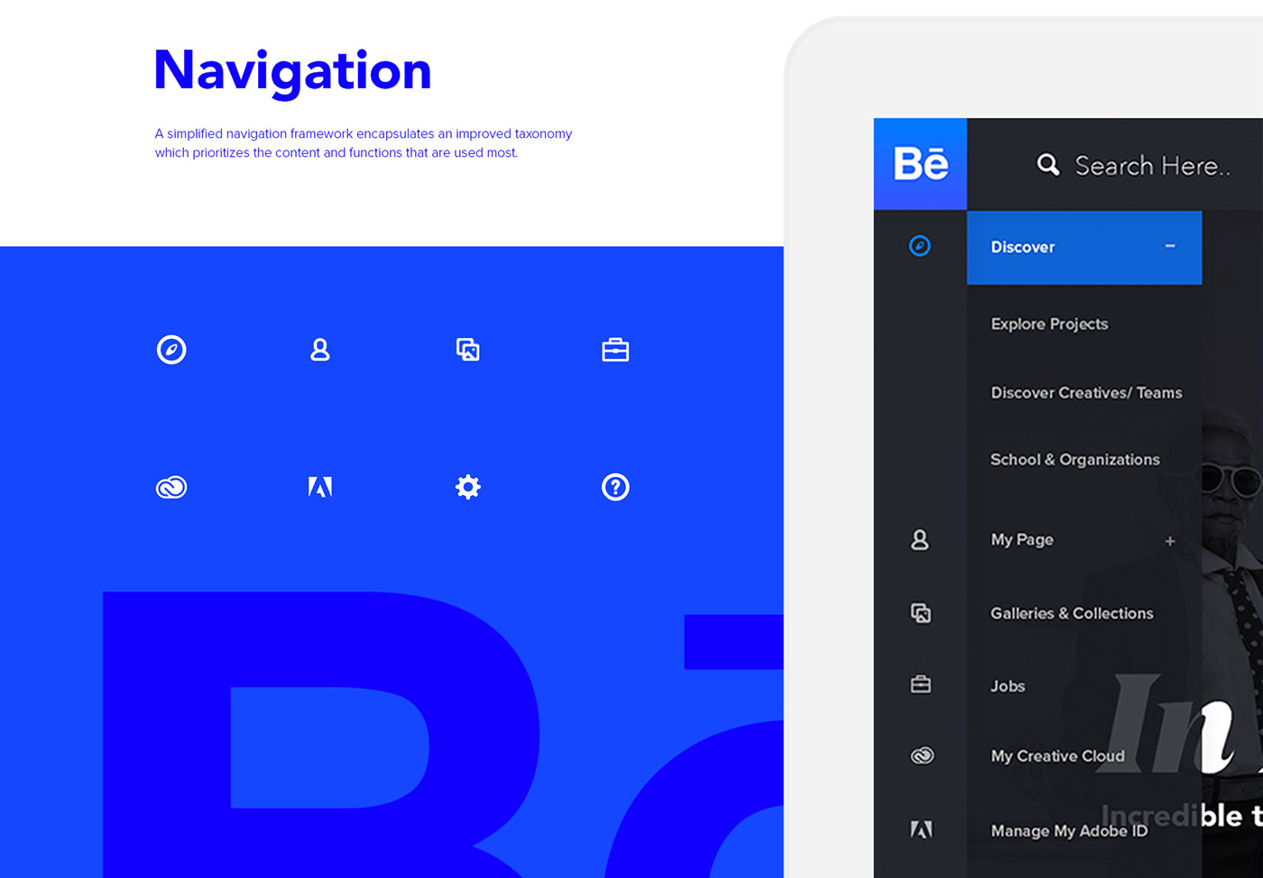
The whole deal is finished off with improved navigation that makes getting around a lot more straightforward, clean typography based around Proxima Nova in three weights, and a minimal blue and black palette informed by colour theory.
Sign up to Creative Bloq's daily newsletter, which brings you the latest news and inspiration from the worlds of art, design and technology.
In all, Park's design seems like a much more attractive way to engage with Behance; we can only hope that someone from Adobe is paying attention. You can see all the details of the redesign here.
Related articles:
Jim McCauley is a writer, performer and cat-wrangler who started writing professionally way back in 1995 on PC Format magazine, and has been covering technology-related subjects ever since, whether it's hardware, software or videogames. A chance call in 2005 led to Jim taking charge of Computer Arts' website and developing an interest in the world of graphic design, and eventually led to a move over to the freshly-launched Creative Bloq in 2012. Jim now works as a freelance writer for sites including Creative Bloq, T3 and PetsRadar, specialising in design, technology, wellness and cats, while doing the occasional pantomime and street performance in Bath and designing posters for a local drama group on the side.
