Learn how to space different types of lettering in this kerning video crash course.
Kerning has a huge impact on how your lettering is read by viewers, so it's important to get it right. Get your kerning wrong and at best you end up with a message that's difficult to read, and at worst you could create a communication that's indecipherable, or possibly offensive.
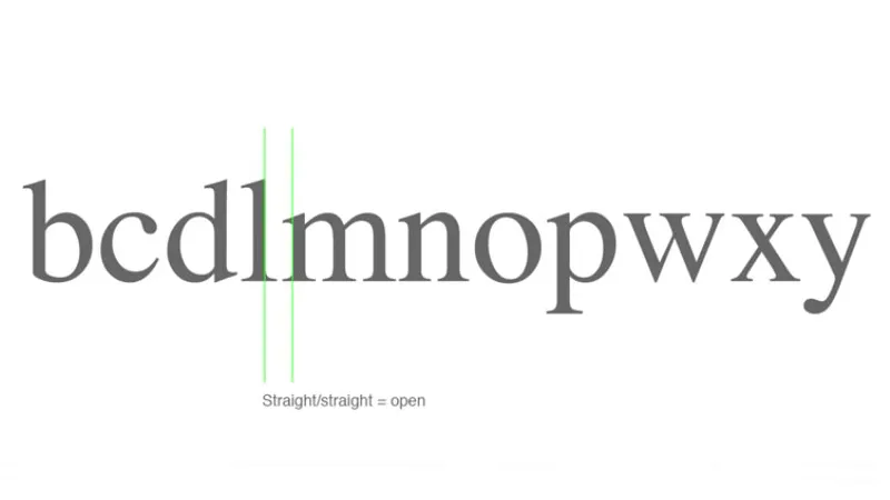
Perhaps the trouble is that there are different rules depending on the shape of the letters in question. Characters with curves need to be positioned together more tightly than letters with straight edges, for example. And letters with diagonal angles have rules of their own when placed beside one another.
To help you brush up on kerning rules and conventions, typography and lettering instructor Nils Lindstrom offers his advice in this crash course video, called 4 Essential Tips for Kerning Type & Lettering. Published by creative pioneers The Futur, it's one of the most concise typography tutorials we've ever seen, given that it outlines the basics of kerning in less than two minutes. Watch it below.
Latest Videos From Creative Bloq
We love this video because it's an instant refresher for typography experts, but it's also a useful and unpretentious introduction for beginners. Given that typography can bring out the most pernickety parts of a designer's personality, this video will give you the knowledge you need to kick back if someone challenges your spacing.
If you're unsure as to why kerning is so important, be sure to check out our post on the latest Zara logo, which was controversial because of its kerning. It might be a subtle art, but kerning can make or break a piece of typography and design. Make no mistake, once people notice that you're kerning's off it doesn't matter how good the rest of the graphics are – the wonky lettering will pull focus for all the wrong reasons.
Luckily, if you listen to Lindstrom's advice, kerning is an area of design that you'll have under control.
Dom Carter is a freelance writer who specialises in art and design. Formerly a staff writer for Creative Bloq, his work has also appeared on Creative Boom and in the pages of ImagineFX, Computer Arts, 3D World, and .net. He has been a D&AD New Blood judge, and has a particular interest in picture books.