How to use mood boards for more than inspiration
Extending the mood board into a valuable workflow tool before, during, and after the design process.
I'm a UX designer. That's fun to say, because it's a job that didn't really exist a few years ago. I've worked with dozens of startups and small teams, so I'm used to my role and tools changing with each new team – and sometimes with each new release.
But when a tool or process stands the test of time, it makes things all the more interesting. Enter mood boards, the secret weapon I've carried from gig to gig for years.
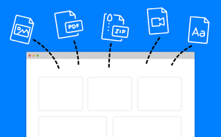
Most simply, a board is a collection of things (photos, designs, illustrations, type, etc), grouped and presented in a way that helps you accomplish a task. This flexible simplicity is the key to teaching this old dog new tricks.
Boards in the open
Beyond the startup thing, I'm a huge sucker for side projects. Tiny, goofy things crammed into nights and weekends and hackathons – I can't get enough.
Most of my projects are open source, being designed and built completely in the open. A few of them have been lucky enough to draw contributors – people who actually want to help.
It's an awesome – and scary – feeling. Suddenly your fun side project involves a dose of documentation, file sharing, project management – all the nitty-gritty things that come from working with a team.
Recently one of my little projects grew up, attracting a handful of helpers. Consider this a mini case study of how boards can be used to improve collaboration with any group.
Meet Chowdown, a plaintext recipe database for hackers. It takes recipes written in plain Markdown format and creates visual, usable pages.
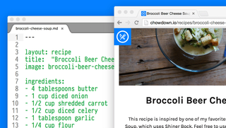
It's built on top of Jekyll, the static site generator, and all the code – plus recipes and photos – are up on GitHub. All content and code are completely open source, hopefully attracting as many participants as possible.
Boards are a perfect tool for spreading design and information around a team – especially with a remote team or group of volunteer contributors.
I use boards for everything: sharing files, defining brand styles, presenting design mockups, and, yes, for good ol' fashioned inspiration. Here are a few ways I've integrated shared boards into my design workflow.
Before the build
Way before I fire up Sketch or write a single line of code, I start collecting photos and bits of design that exude the style I feel is a good fit for the project.
This is probably my most conventional use of mood boards in my design process. I used to work in video games, where I got used to our office being filled with large, physical mood boards.
Entire walls were covered in photos and scraps and character studies that embodied the world the game artists were trying to craft.
It's a practice I've carried with me, rounding up inspiration to study as I decide on a design direction. Chowdown, like all food and cooking products, has a strong focus on photography, so my mood board is chock-full of photos featuring elements from my ideal meal.
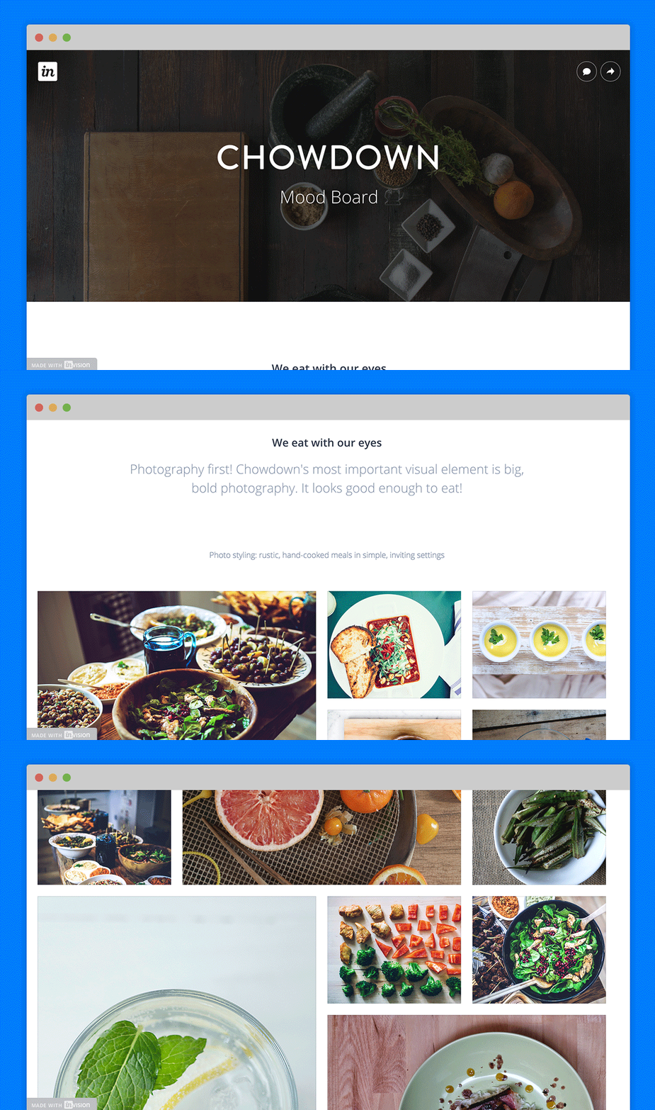
Some of these photos are collected from around the internet, some are photos I've shot myself. Mixing the two allows me to see my work in the context I've aiming to create.
Just like the video game artists I used to work with, I find the trusty mood board a great way for an entire group to set the tone of the design and experience yet to come.
Since Chowdown is an open-source project built with the help of random folks around the world, having a central, shareable mood board is even more important.
Getting everyone's creative energy on the same track, helping to make a more unified product? Yes, please.
During the design process
After we've successfully set the mood and kicked off the design work, boards can be used for quick, organized collaboration.
Gone are the days of monstrous emails with two-dozen attachments – or that mystery meat 1.3GB ZIP file. Creating an online board with a public URL has quickly become my go-to practice when I've got a lot to say.
It's a perfect way to manage quick design presentations, for both live meetings with clients and the take-a-look-at-this-when-you-get-a-chance world of open source.
An organized board can act as a visual aid, replacing slides and PDF files during a meeting, with the added bonus of providing a neatly-packaged takeaway.
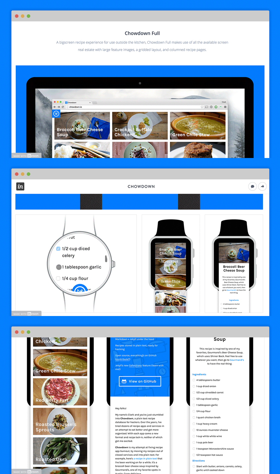
Unlike an inspiration mood board that might continue to evolve over time, I often use presentation boards quickly and incrementally, spinning up a new one for each new discussion.
Use a simple, linear presentation to show the direction of a project. For Chowdown, it means gradual sharing with a wide community of home cooks. But feel free to use it in a high-pressure enterprise meeting.
While creating content
I decided to build Chowdown because I a) love cooking, and b) was already generating a bunch of recipe-related content. I tried a few other recipe apps, and some note-taking apps, and some word processing apps—none of which seemed simple enough for me.
Since this is a spare-time project, my development roadmap is pretty long. Currently I've got templates set up for two basic recipe types: a simple recipe, and a compound recipe that's made up of other simple recipes.
I don't have a blog. I don't have a way to tell stories. Which is a problem, since I love telling stories.
Even on gigs that do have a blog ready to roll, or a marketing department, content handoff can be a sticky situation. Sending another team or organization a bunch of art-directed, organized images isn't a breezy process.
Enter boards, acting as a photo gallery. It's perfect for a complete story (with written bits), or for a set of photos in progress ("Which of these photos from the recent shoot do you want to use?").
I live in Austin, so I've got a pretty severe barbecue addiction. Some places have such a long line that I tend to overbuy at the counter (I'm near the end zone! Score, score, score!). Long-story short: I've spent a lot of time reheating brisket. So much so, that I've shot and written a story about it. With no place on Chowdown to put it, I figured a board was a fitting home.
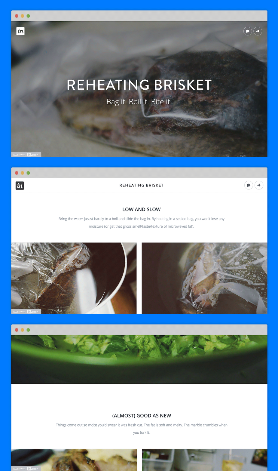
This gallery board has all the photos and copy ready to roll (now I just need my development to catch up)
When my blog is ready, I'll move from board to production. And the process is just as applicable in an enterprise setting, where I find myself sending folders full of images all the time.
Going public
Fast forward to everything being live: breathe, roll in your glorious launch—you've earned it. But don't get too comfortable, because all your hard work has attracted contributors, those awesome people we talked about earlier.
An influx of creative folks presents yet another opportunity for the board, in the form of a style guide.
A style guide is the blueprint of a brand: the visual DNA, the typefaces, the colors, the imagery, and how they all interact.
Some of the best graphic design work takes place under constraints, and that's exactly what a style guide is. It's a set of rules that prescribe the colors, fonts, and relationships that a designer is allowed to use.
The two benefits of a style guide:
- A paint-by-number guide that no-frills contributors can easily follow
- A living framework that facilitates creativity for team members going the extra mile
A shared, public board is an ideal place to house a style guide, especially in an open-source project (or an enterprise with lots of moving teams).
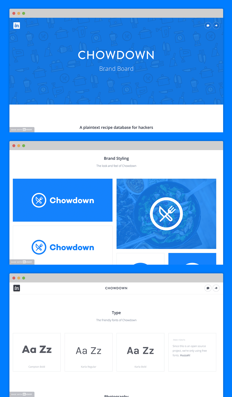
Chairman of the boards
While mood boards might be old news, all these new uses have boards planted firmly into my design workflow.
From sharing files in an organized manner to prescribing brand style rules to a wide audience, boards are as flexible as my daily to-do list.
Words: Clark Wimberly
Clark Wimberly is content and UX designer at InVision.
Like this? Read these!

Thank you for reading 5 articles this month* Join now for unlimited access
Enjoy your first month for just £1 / $1 / €1
*Read 5 free articles per month without a subscription

Join now for unlimited access
Try first month for just £1 / $1 / €1
Get the Creative Bloq Newsletter
Daily design news, reviews, how-tos and more, as picked by the editors.
The Creative Bloq team is made up of a group of design fans, and has changed and evolved since Creative Bloq began back in 2012. The current website team consists of eight full-time members of staff: Editor Georgia Coggan, Deputy Editor Rosie Hilder, Ecommerce Editor Beren Neale, Senior News Editor Daniel Piper, Editor, Digital Art and 3D Ian Dean, Tech Reviews Editor Erlingur Einarsson and Ecommerce Writer Beth Nicholls and Staff Writer Natalie Fear, as well as a roster of freelancers from around the world. The 3D World and ImagineFX magazine teams also pitch in, ensuring that content from 3D World and ImagineFX is represented on Creative Bloq.
Related articles
-

-
-
 Fascinating Super Mario optical illusion gives a surprising new perspective
-
