How to use images more effectively in annual reports
Harness photography and illustration to make your annual report designs sing.
Designing an annual report is part of the bread-and-butter work for many designers. Some may see it as relatively dry, but – as the examples here show – annual reports can provide an opportunity to turn staple work into an imaginative, enticing and attractive design to enhance your design portfolio.
Imagery is a useful tool in this endeavour. There’s no reason why an annual report has to look dry or text-heavy, and the right approach to photography, graphics and/or illustration can really help your design to sing. Here’s how to do it...
01. Choose gorgeous photography or illustration
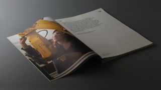
First you need to decide whether to focus your approach on photography, illustration or vector graphics. This choice will depend largely on the brief, the intended audience and the kind of report you wish to produce.
Take for example the Donor Report for the University of Cambridge, shown above and below. Designed by The District, this annual publication is sent to people who donate large amounts of money to the institution.
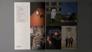
“While many of the projects that benefit are capital projects and investments in technology, our research made it clear that ultimately donors are investing in people,” explains creative director Alun Shooter.
“So we felt photographing the benefactors of the new buildings, equipment and facilities was the best way to go. Simply using typography and colour may have looked great graphically, but would have missed an opportunity and arguably felt sterile.”
Of course, photography isn’t relevant to every annual report. If your report’s focus lies less in personal stories and more in statistical analysis, for example, it may be better to use graphics to bring facts and figures to life in a fun and attractive way.
Alternatively, if your visual goal is to highlight more abstract concepts in the report, such as financial stability or business dynamism, illustration may be the best way forward.
02. Art direct your photography
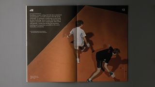
Assuming you decide to use photography, the next step is to plan the visual style you’re going for. Again, this will stem from your overriding aims and objectives.
For the Donor Report, the concept of being human-centric was the prime factor in deciding how to art-direct the photography by Owen Richards, says creative director Matt Bagnall.
“While these were posed portraits, there needed to be a humanity to them,” Bagnall explains. “So the subjects were, for example, shot in their offices surrounded by personal ephemera, rather than in a clinical setting.”
It also tied in to how the images were reproduced in print. “We selected uncoated paper stock to give a warmth to the piece,” he explains. “This supported the people-led imagery and was deliberately less slick than if we’d used a coated paper. It made everything feel coherent and accessible rather than elitist.”
03. Select your illustration style
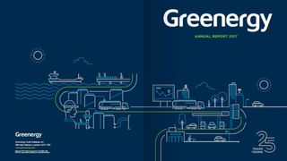
If you opt to use illustration in your annual report, it’s a similar story. Only once you have clear aims and objectives can you make an informed decision about the visual style to pursue.
For example, when Bristol-based creative agency Mr B & Friends designed the annual report for energy company Greenergy (above), it honed in on the fact that it was the company’s 25th anniversary year.
“This was a big deal for Greenergy,” says design director Sheena Mistry. “For a modest-sized company to remain fiercely independent and achieve 25 years of success and growth is nothing to be sneezed at.
"So we worked alongside Spanish artist Mauco Sosa to develop a distinct illustration style for the report, capturing all elements of the business model in an upbeat, forward-looking and interesting way.”

Importantly, while the illustrations in the report are attractive in their simplicity, that doesn’t mean they’re abstract; each has a specific and significant meaning. For example, the main illustration shown above is inspired by Greenergy's business model, which the company describes as “efficient and streamlined with a clear point of direction”.
04. Combine photography and illustration
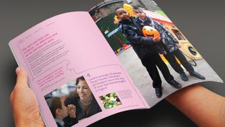
Photography and illustrations aren’t mutually exclusive in annual report design, of course; there’s no reason you can’t use both. Just make sure there’s a clear reason for doing so, or it may look like you’re just throwing a lot of stuff at the wall and hoping something sticks.
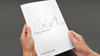
A good example can be seen in the annual report for the Mayor's Fund for London by Consider Creative. This organisation aims to give disadvantaged young Londoners the skills and opportunities they need to climb the career ladder and escape the threat of child poverty.
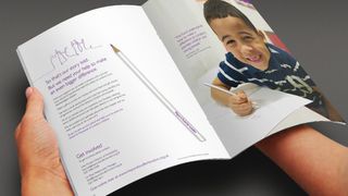
“We were looking for a thread to take us through the successes and highlights of their year; to bring alive a report that could otherwise feel quite static,” says creative director Alistair Kelly. “That thread became quite literal when we struck upon the idea of a pencil line as the continuous visual device, from start to finish.
“Photography and photoshoot was led by showing who the Mayor's fund for London benefits – the disadvantaged children of London. We ended up commissioning a branded pencil that became a key reminder of the annual report and a great leave behind.”
05. Auto-generate your imagery
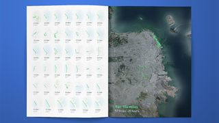
Now here’s a future trend that throws the traditional approach to choosing imagery on its head. Personalised annual reports involve the creation of a bespoke report for each customer, stakeholder or shareholder. That might sound like a mammoth task, but clever software makes it relatively easy to automate the creation of an annual report tailored to each individual’s involvement in a company – and that includes the imagery.
For example, the health app Gyroscope designed and printed customised books for all of its customers. “These annual reports were all auto-generated based upon an individual's content,” explains freelance creative director Shane Mielke, who helped with the layout and design.
“So any photos come from their Instagram; infographics, maps and charts were created based upon actual data the app has gathered from your day-to-day activities.”
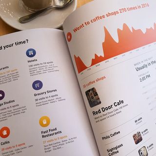
With digital services capturing more and more of our personal data, we’d expect this innovative way to approach annual reports to become a big trend in future. You can read a detailed explanation of how Gyroscope did it on its blog.
06. Seek out inspiration
There are so many ways to approach the visual design of an annual report that it’s easy to end up feeling a little overwhelmed. A good way to get ideas flowing for your own design can be to check out how others have approached the discipline. Here are a few good places to start.
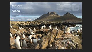
The Wildlife Conservation Society (WCS) has a strong reputation for beautifully designed, photo-led annual reports that are similar in style to a high-end magazine or travel brochure. You can download PDFs of the last few years’ reports from its website.
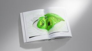
The Zumtobel Group is an Austria-based lighting manufacturer that has made a name for itself within the design community for its beautifully illustrated annual reports. Each issue has been designed and implemented by internationally renowned artists and designers; you can see an overview on its website.
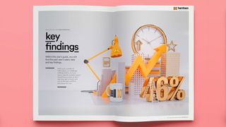
Harnham's Annual Salary Guide for 2016 features trends in the UK for analytics and data professionals and was designed by Brand Nu using some beautiful 3D illustrations by Craig Minchington, which you can see in detail on Behance.
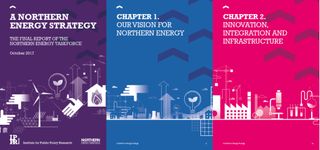
Flow Creative, an award-winning creative studio based in Manchester, was asked to create a report for The Institute for Public Policy Research (IPPR)’s Northern Energy Taskforce. It developed a distinctive vector graphic style for the document based on road signage; you can see more of the designs and read about how it created them on Flow's website.
For more inspiring design, see these 16 imaginative annual report designs.
Liked this? Read these:

Thank you for reading 5 articles this month* Join now for unlimited access
Enjoy your first month for just £1 / $1 / €1
*Read 5 free articles per month without a subscription

Join now for unlimited access
Try first month for just £1 / $1 / €1
Get the Creative Bloq Newsletter
Daily design news, reviews, how-tos and more, as picked by the editors.
Tom May is an award-winning journalist and editor specialising in design, photography and technology. Author of the Amazon #1 bestseller Great TED Talks: Creativity, published by Pavilion Books, Tom was previously editor of Professional Photography magazine, associate editor at Creative Bloq, and deputy editor at net magazine. Today, he is a regular contributor to Creative Bloq and its sister sites Digital Camera World, T3.com and Tech Radar. He also writes for Creative Boom and works on content marketing projects.

