The most beautiful blockchain sites
We take a look at the ICO sites designed to inspire confidence.
When it comes to new blockchain ventures, you may think the look of your website is of secondary importance. If the project is sound, it shouldn’t matter how its site is designed, right? Wrong. A great looking website is essential if you want to encourage investment and inspire public confidence.
Let’s say a hopeful investor is searching every corner of the internet for upcoming Initial Coin Offerings. They look at its whitepapers to discern its concepts, technology, token distributions, techniques and vision, and it all seem promising. But its website looks like it was patched together by amateurs. Instantly, they begin to wonder if it’s a shady venture, and are deterred from investing.
The team behind an ICO can have the most brilliant engineers and visionaries, but unless they present themselves well, they do not give off the impression that they know what they are doing. A well-designed website is imperative for blockchain companies to inspire confidence in both investors and the public (not convinced? Take a look at this article on how to spot and ICO scam).
The stakes are too high, for everyone involved, to put out a mediocre blockchain website. Well-composed sites offer a feeling of legitimacy and potential. Outright stunning websites are even more confidence-inspiring, communicating to audiences that not only does the team behind the project know what they’re doing, they care about the details and users’ experiences.
Here are a few of the most beautiful blockchain websites to look to for inspiration and guidance.
01. Dispatch Labs

Dispatch Labs provides a blockchain application other businesses can use, accounting for network speed and size unlike any venture before them with its Delegated Asynchronous Proof of Stake consensus algorithm. With a version of blockchain that takes the technology a step further (and may be confusing for some), it’s vital Dispatch’s website appears approachable.
The front page of Dispatch’s website works as an introduction to the project. All information is organised horizontally, which immediately puts the viewer at ease. This is one of the chief principles of design: because English speakers read left-to-right, anything else is psychologically disruptive.
The colours are vibrant and contrasting, but the white spaces between give readers’ eyes a break, enabling them to absorb information better. The text is bold, too, to establish the company’s confidence in its mission.
02. Muirfield Investment Partners

Muirfield Investment Partners is a real estate investment firm that uses blockchain to solve prevalent structural issues with typical private equity funds. The company recently redesigned its website to prepare the public for its rumored TAO (Tokenized Asset Offering).
Its website’s monochrome colour scheme (broken up with a few splashes of red), and hero image of a fictional city (the first thing site visitors see), work together to create a futuristic mood. The company aims to revolutionise private equity real estate investment investment, so the suggestion of heralding a new era is appropriate.
03. Cryptfunder

Cryptfunder helps other ICOs acquire funding. Because blockchain is not exactly mainstream yet, many people still consider it to be a futuristic technology, despite the fact it is poised to disrupt multiple industries.
Cryptfunder’s website, like Muirfield’s, opts for a futuristic feel, but this time through a different kind of imagery: microchips, planets, and stars, all washed with cool blues and purples. The sheer artistry of the website’s graphics lets visitors know that a significant amount of time went into the design. If a company puts that much effort and care into its aesthetics, its whitepaper is worth looking into.
04. GeekWrapped

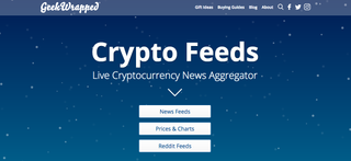
GeekWrapped is not hosting an ICO, but a cryptocurrency news aggregator. Though the website is not trying to convince investors and customers of its legitimacy, it’s helpful for blockchain websites of all kinds to look authentic and considered. GeekWrapped’s main page features various cartoony (but not too cartoony) landscape imagery. The aim here is to create something that feels familiar: while blockchain remains a field many do not fully understand, news resources should appear much more accessible.

Thank you for reading 5 articles this month* Join now for unlimited access
Enjoy your first month for just £1 / $1 / €1
*Read 5 free articles per month without a subscription

Join now for unlimited access
Try first month for just £1 / $1 / €1
Get the Creative Bloq Newsletter
Daily design news, reviews, how-tos and more, as picked by the editors.
The Creative Bloq team is made up of a group of design fans, and has changed and evolved since Creative Bloq began back in 2012. The current website team consists of eight full-time members of staff: Editor Georgia Coggan, Deputy Editor Rosie Hilder, Ecommerce Editor Beren Neale, Senior News Editor Daniel Piper, Editor, Digital Art and 3D Ian Dean, Tech Reviews Editor Erlingur Einarsson and Ecommerce Writer Beth Nicholls and Staff Writer Natalie Fear, as well as a roster of freelancers from around the world. The 3D World and ImagineFX magazine teams also pitch in, ensuring that content from 3D World and ImagineFX is represented on Creative Bloq.


