How to create an identity people can’t forget
Design legend Paula Scher’s top tips, shared at Design Manchester.
Paula Scher is one of the living legends of graphic design. 50 plus years into her career, and she's still making some of the most talked-about and celebrated branding schemes around.
Fittingly, Design Manchester's picked Scher to wrap up its SMART design conference. She rounded off the day with a talk packed with insights into her creative life so far, from her career at Pentagram (which she joined in 1991) and before. Taken from her talk, these are seven insights to help you create a brand that stands out from the crowd and sticks in the memory.
You'll find more inspiration and advice in our roundup of logo design tips, and stunning poster designs. Alternatively, explore more about Design Manchester's incredible programme of events.
- iPad Black Friday deals - The best offers, updated live
01. Harness the power of type

Scher's speciality is typography, and recently she has been working on branding projects that make a statement with using alphabets and visual language. “It’s a fantastic time for typography,” she insists. Some of her most successful recent projects use such distinctive type schemes that mean you can recognise the brand even without the logo – for example, the celebrated rebrands of Parsons (shown above) and Expedia, with its highly distinctive ‘E’s.
02. Simplify your logos
“All things are memorable in repetition, but if a logo is too busy it tends to get in its own way,” Scher explained. “The trick is to keep it simple because it’s got to do complicated things.” That logo needs to be able to appear on everything from signage to stationery to packaging, so your design needs to go with a broad range of things. Still want to keep things interesting? Find a different way – as explained in tip #1, Scher's a master of using a brand's type choices to make an exciting identity.
03. Get flexible

In a project for The Type Directors Club, Scher picked a colour and and character style, then created a whole range of new and different versions of the organisation’s initials. The aim was to see how far your could push things and still remain recognisable as the same brand. Turns out, further than you might expect. That scheme was used for the TDC book and show that year.
04. Consider where people will see it
Scher is well known for her work on New York’s not-for-profit Public Theatre - she has created various identity schemes for the theatre’s show programmes over the years. The first year she created a range of posters using wood type, with the idea that they would appear all over the streets of New York, the residents would come to recognise the typography and it would build brand awareness. In reality, the theatre didn’t have enough money to be putting up posters everywhere, and no one saw the concept unless they were actually seeing a show there. The posters were celebrated by the design community, but weren’t seen by your average New Yorker – not so good for the Public Theatre.
05. Don’t let a city eat your style

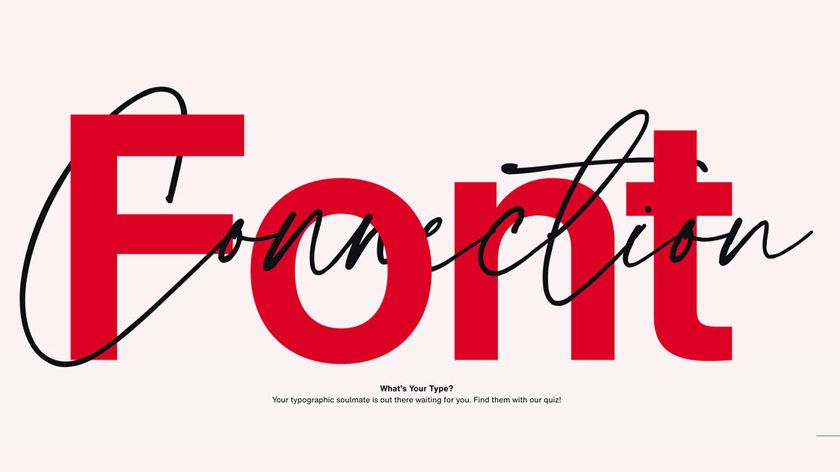
Scher’s scheme for the 1995 Public Theatre season Bring In Da Noise Bring In Da Funk was much more successful. Sort of. People loved the style so much they started copying it. It became a full-blown trend, but no one associated it with the Theatre any more – it came to represent New York itself. “It’s a terrible thing, to design a style and have a city eat it,” said Scher.
06. Keep it in the family

The approach that finally worked for the Public Theatre was to create a flexible style that could be applied to all the posters in a particular season. “I thought, what if I take the poster and turn it into a design manual?” says Scher. Her approach is to create a new identity every year, but to create some continuity and familiarity, it uses the same family of fonts. This repetition means New Yorkers now finally recognise the Public Theatre brand.
07. Make the most of your pro bono work
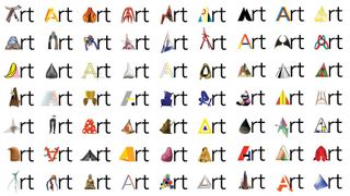
Scher balances big, commercial projects with pro bono work or interesting, less well paid clients. “I use free projects very often to get me to grow and stretch my vocabulary as a designer,” she explains. But just because a job isn’t so well paid doesn’t mean it can’t be useful – a small project for TDC (number #3) laid the foundation for two much more high-profile branding projects: Jazz at Lincoln Centre and the Philadelphia Museum of Art.
And experimental projects are often where the real magic happens. Scher spoke about how important 'accidents' are in having breakthroughs in your work. In big, corporate projects with big budgets and lots of stakeholders, it’s very difficult to have accidents. With small projects you have more freedom. “You do it and you’re not sure if it’s going to work or not. And sometimes things all fall apart, but the doing of it is really an adventure," she smiles.
Read more:

Thank you for reading 5 articles this month* Join now for unlimited access
Enjoy your first month for just £1 / $1 / €1
*Read 5 free articles per month without a subscription

Join now for unlimited access
Try first month for just £1 / $1 / €1
Get the Creative Bloq Newsletter
Daily design news, reviews, how-tos and more, as picked by the editors.
Ruth spent a couple of years as Deputy Editor of Creative Bloq, and has also either worked on or written for almost all of the site's former and current design print titles, from Computer Arts to ImagineFX. She now spends her days reviewing small appliances as the Homes Editor at TechRadar, but still occasionally writes about design on a freelance basis in her spare time.
