How to create a delightful website
In need of a little web design inspiration? We home in on a few examples of delightful design.

On the web there's a whole lot of information coming at us: articles, editorials, tweets, photos, forms, videos, podcasts ... the list goes on. Designer Milton Glaser once said, "The purpose of art is to inform and delight." I’m not saying art is the same as design, but this thought sums up all we try to achieve with design. We base design decisions on content, yet on its own content isn't always the best way to serve information. Delight holds readers' interest and can add to their total visit experience – let’s look at a few examples.
Delight holds readers' interest and can add to their total visit experience
Even the slightest bit of animation can add delight to a design. An element on the page can fade in slowly, feeling sombre and elegant, or a quirkly elastic animation can look playful and friendly. CSS3 animation is key in making this happen. A good approach is to pair the transition and transform properties with some well-made SVGs – the options are endless.
Storytelling is a valuable tool in design that can go beyond the text. Experiment with how photography, colour, and grid can play into a visualised story; give users context as to why they should spend time on the site. Something as simple as introducing a pop of colour or a creating a grid system with content that flows from left to right as they scroll can be delightful.
Whatever the site's goal, connect all the pieces of the experience together to bring delight. If there are GIFs that go along with the copy, or a consistent animation style for hovered elements, weave it through as much of the site as possible.
Here are three great examples:
01. Waaark

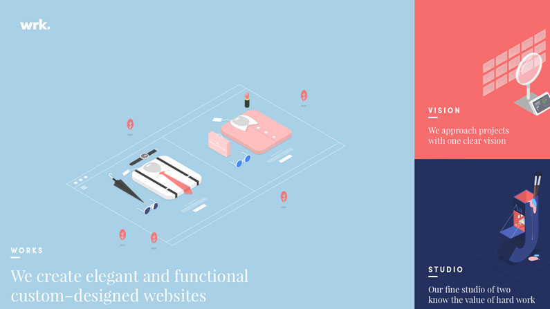
Waaark has quirky mouseover animations along with subtle animations of a floating ship on its homepage.
02. Field Notes

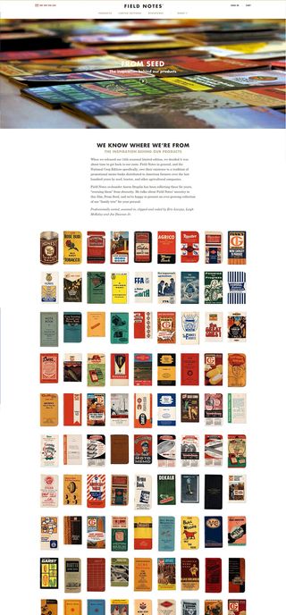
Field Notes shares designer Aaron Draplin’s collection of vintage notebooks – the driving inspiration for the Field Notes notebooks.
03. We Are Nation

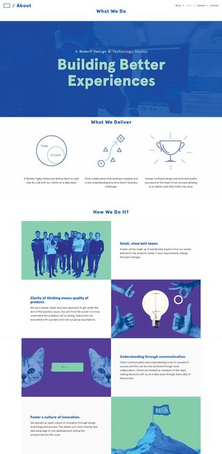
We Are Nation shares its story with clever GIFs to support the narrative.
This article originally appeared in net magazine issue 284; buy it here.

Thank you for reading 5 articles this month* Join now for unlimited access
Enjoy your first month for just £1 / $1 / €1
*Read 5 free articles per month without a subscription

Join now for unlimited access
Try first month for just £1 / $1 / €1
Get the Creative Bloq Newsletter
Daily design news, reviews, how-tos and more, as picked by the editors.
Sam is a designer living in Austin, Texas, who speaks and writes extensively about web and product design, diversity, inclusion, and equity. In 2011, she wrote the first university course on the topic of Responsive Web Design. She is currently Design Director at thoughtbot, and serves on several design advisory boards in Austin.


