How conversational interfaces are innovating banking
Mindy Gold, UX content strategist at Capital One, talks chatbots, human-centered design and ripping up floorboards.

It's probably fair to say banks aren't particularly popular these days. What is Capital One doing to help change people’s feelings about their bank?
The first step is designing for people and keeping humans – with their full, messy stories – at the centre of everything we create. Every year we gather as a company for a TED-style speaker series where we share customer stories and insights, so we never forget who it is that we’re making financial products better for. It’s what drives us, and why so many of the most talented designers I know are working at a bank right now. Money is emotional, and it enables us to live our best lives. What better design challenge is there?
Capital One acquired UX pioneers Adaptive Path a couple of years ago. How is that influencing the design culture at Capital One?
We love Adaptive Path. Even before they joined our design team, Evelyn Huang began to teach and institutionalise design thinking at Capital One, so now you see 350 designers all working for a bank versed in things like human-centred design and service design, doing empathy research, testing early and often with real people.
Steph Hay, the head of conversation design at Capital One, leads what is now a weekly international meeting, where all 350 designers across the US (and a few in the UK) get together on a video conference and talk about our discipline and craft. All of these things together create a culture of empathy that starts with each other and ultimately drives us to create great things for our customers.
Another thing that we’re learning from Adaptive Path is how to be good hosts. Their events like UX Week have been beacons for how to run a good conference. This year, Brandon Schauer, Steph Hay and myself have programmed a new conference called Humanity.AI where we’ll gather people to talk about designing for the future of bots in a human-centred way. And when you have a powerhouse like Adaptive Path behind you, it makes you much more confident that the event will be great.

How does Capital One use conversational interfaces?
Right now we’re really digging into character development, which is particularly interesting in the context of money. How we use data and AI impacts the development of our character and how the character speaks with our customers. Sometimes, there’s a fine line between a character that feels like a stranger (who knows just a little too much about you) and one that you connect with in a meaningful way because it has context about your life and your personal relationship with money. And since we deeply believe that money is emotional, it’s important to get that right.
When we do, we move beyond transactional interactions that sound robotic and cold, to contextually relevant, meaningful conversations that evoke emotion and lead to relationships rooted in trust, empathy and understanding. Through character and conversation, we’re creating an environment where customers are comfortable and an experience that has them paying attention with their hearts as well as their minds. Stay tuned for more on that.
Do you think the industry is finally making headway with chatbots design?
If I’m being honest – and I know my buddy Chris Messina (of hashtag and conversational commerce fame) would agree – we’re not yet at the point of super-awesome best-in-class chatbots. We’re in the phase of exploring the cultural contexts that are making them more prevalent, testing use cases that work well for the new medium and weeding out ones that don’t feel authentic, and figuring out what new job roles this elicits (for example, the head of AI Design at Capital One was producing movies at Pixar not so long ago). So this isn’t me being pessimistic, it’s actually a really fun time of prototyping and it’s okay that not everything’s going to be great.
Could you give any examples of chatbots or conversational UIs that are getting things right? What do they do well?
I’ll throw some opinions out there. I should note that these are not Capital One’s opinions, by the way, just mine.
Slack looked at the way people were already accomplishing tasks on their platform and designed a bot by learning from existing behavior. In this use case the task just happened to be sending the Dawson crying emoji to your coworker who’s complaining about the office being too cold.
Things I like:
- It does one thing, and it does it really well
- It simplifies a user flow by integrating discrete tasks so I only have to do one thing. Instead of going to giphy.com, searching for a GIF, copying and pasting it, and then sending it, it’s all done in one place
- It’s delightful as heck

Digit helps me go on more vacations and that’s all I need to say about that. Kidding. But it does. Digit learns from my behaviour and helps me save money by putting small amounts from my checking into a savings account. And then when I want to go on vacation I have a slush fund to pull from and I feel less guilty!
Things I like:
- It meets me where I am by integrating into my messages. I don’t need to go to a separate app to do things like check my savings balance or transfer money
- It designs for tensions in a thoughtful way. When you’re building a bot you have to think about things like, 'What does this thing do in a push mode vs. pull mode?' and 'What interactions should it have daily vs. less frequently?' I think Digit does this well, and I know that because it rarely annoys me

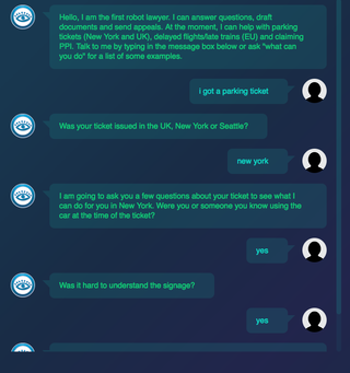
In the fall of 2015, 19-year-old Joshua Browder launched a bot to help reverse parking tickets in London and New York City. So many things are amazing about this, but having chatted with Joshua a little bit (he’ll be speaking at Humanity.AI), he’s totally the heart of this story. In the first six-ish months, the bot had been used 9,000 times for parking tickets, so then Joshua started thinking of new use cases, like helping refugees seek asylum.
Things I like:
- It started with one use case and nailed it before moving on
- It guides you through a complex process, allowing both experts and novices to get the same value out of the experience
- It keeps real human needs at the centre, instead of delivering pizza faster (which, I know, has its own value)
What's the biggest mistake you've made in your career and what have you learned from it?
I received one of the most valuable pieces of feedback early on at IDEO – someone said, “We asked you to come in and help install some windows and instead you started ripping up the floorboards.” And though I didn’t realise it, it was true. I’d be asked to come in and polish some work, and the next thing I knew I was taking it all apart and trying to tell them they were wrong about some of their most foundational stuff. In trying to enforce my own sense of 'truth', I was the brakes and the bulldozer, and I wasn’t helping anyone move forward with momentum.
Now my mantra when it comes to design – especially in teams – is to be generous and generative. Or as one of our design leaders says, “Make stuff before you debate stuff.” I’ve learned recently that one of my top five strengths (according to StrengthsFinder) is 'Arranger'. So I use that to remind myself that often the process is more art than science. Try. Build. Do. Design to prove new things, not disprove them.
What can people expect to take away from your talk at Generate New York?
On the conversation design team at Capital One, we use our expertise in storytelling and communication to bring humanity and clarity to every conversation we design, and that work manifests in happier teams, lower call-volume costs, higher NPS, and – most importantly – healthier customers.
Over the past three years, we’ve coached teams to design more meaningful, tailored experiences that feel like personalized conversations. Now with CUIs, a meaningful conversation isn’t just part of the design, it IS the design.
In this talk I’ll share some conversation design principles, best practices for adapting those to the new medium of CUIs, and some examples of what makes bots successful and not so successful.
What can designers do to make the world a better place in 2017?
If you’re reading this and have an idea and think I can help, please reach out to me. After the 2016 US election, many people were distraught. One thing I read that made me feel better was a Fast.Co article about how designers will be integral over the next four years. We tell the best stories. We structure information in a way that is consumable. We make sense of messes. We are inclusive, empathetic, and we figure out solutions based on real human needs. I think designers are going to be so important in 2017.
I recently saw a project where someone hacked an Amazon Web Services IoT button to make it easy to donate to the ACLU. Let’s do more of that – let’s design for buying toilet paper and also protecting our civil liberties.
If you can't make it to Generate New York, there's also a Generate San Francisco conference on 9 June featuring a talk about conversational interfaces by HUGE's Executive Director for Product and Innovation, Sophie Kleber.

Thank you for reading 5 articles this month* Join now for unlimited access
Enjoy your first month for just £1 / $1 / €1
*Read 5 free articles per month without a subscription

Join now for unlimited access
Try first month for just £1 / $1 / €1
Get the Creative Bloq Newsletter
Daily design news, reviews, how-tos and more, as picked by the editors.
Oliver is an independent editor, content consultant and founder of Pixel Pioneers. Formerly the editor of net magazine, he has been involved with the web design and development industry for more than a decade and helps businesses across the world create content that connects with their customers. He is passionate about content, user experience, accessibility and designing for social good.
