15 ways to get the most out of moodboards
These 15 great tips will help you to get the most out of the moodboarding process.
We all made collages as kids in school. They might have been art projects, or they might have been assigned for other classes – perhaps a collage depicting life in colonial America, for example. We had a central theme and the image selected all related to that theme. Most just found or drew pictures; sometimes, the more creative kids would put objects on their collages for a 3D effect.
Fast forward to the 21st century, and the concept of collages has been transformed into the concept of mood boards, those great tools that designers can use to pitch ideas to a client, before actually producing a design – whether that is graphic design of a website, a logo, fashion, a brochure, or something in the area of interior design.
The moodboard is produced so the client can get a 'feel' for where you are headed. And, now that we are in the digital age, there are lots of great tools and apps that can be used to assist in the creation of mood board. Lest you are a bit skeptical, there are some real benefits to mood board production before you complete a design.
First, it really helps you. Getting some ideas about patterns, colours, textures, images, and so forth will give you inspiration – much more so than staring at a blank screen wondering where to begin.
Second, it will help your client. You create a board, present it, and s/he knows better where you are going and can say yes or no before you and s/he are too far down the path, and the final product is not acceptable.
Here are 15 DIY factors that will help you get the most out of the process of moodboard creation.
01. Establish your baseline
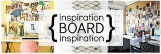
As you begin to think about a design project, start collecting objects, images, and other items that perhaps hold meaning for the ultimate design you will create. Think of this phase as 'mind mapping' – there is no set theme or style. Putting these things together is just for inspiration, to put you in the mind frame. Sometimes these are called inspiration boards, as precursors to moodboards.
Get the Creative Bloq Newsletter
Daily design news, reviews, how-tos and more, as picked by the editors.
02. Focus
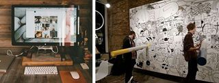
Move toward a clearer concept for your moodboard, beginning to put your theme in place, adding and removing elements, and looking at how best to portray your concept – tactile vs digital – for example.
03. Analyse the subject
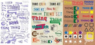
Be certain that you have conducted some analysis and defined the right keywords. What are the trends in this business niche? What insights can you draw from research and from your customer? Conduct a search that is thorough.
04. Pick your client's brain
It is really important that there are no misunderstandings between the overall concept you client has in mind and the concept you will be presenting with your moodboard.
05. Involve everyone

If you are leading a creative team on moodboard creation, be certain to set up continual sharing of ideas and set up digital collaboration, so that all team members can add or subtract elements. Write motivational business memos filled with ideas and send them out.
06. Curating your moodboard
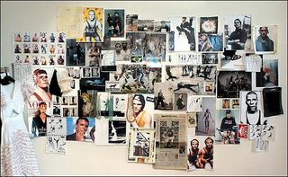
This may be a multi-step process as you continue to add and remove patterns, colours, images, and objects. Don't make the mistake of overdoing this, however, because it is not supposed to be a finished product. You are not presenting a design.
07. Follow these eight guidelines for creating a moodboard
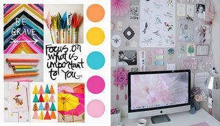
- Match the 'quality' of the client's brand to the content you use – if the brand is quiet and subdued, you will not be using garish patterns or bright colors. If the feel is contemporary, objects, images and patterns must be sleek.
- Use words and typography that 'match' as well. If the brand is very contemporary, obviously the type and vocabulary will be as well.
- Make it casual
- Create more than one board for a project. You and the client may not have exactly the same interpretation, so give him/her choices – three is a good number
- Experiment. A lot. Try different color palettes and textures. Mix up digital images, tactiles, and cut-outs
- Be certain you have a theme well defined. If the ultimate design is for baby clothing, everything must be 'soft' and words must be soothing.
- Don't put limits on what might be included. The project may be for custom-designed clothing, and you may walk through the grocery store and see a food package that just hits you as 'custom-design' in terms of mood. Grab it and just see.
- Collect things – collect things even when you may not use them – you just never know.
08. Think carefully about your overlay
Where will you place each element to be most visually attractive and so that combinations of elements that speak to the same sub-themes are connected? Make a design that will make sense to the client.
09. Colour is extremely important
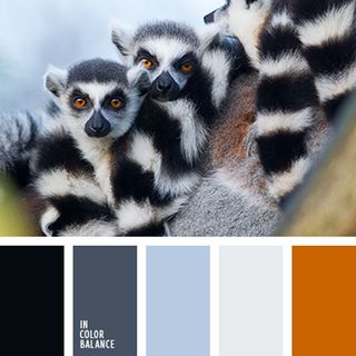
It absolutely must 'match' the brand. There may be several palettes that fit. When you make multiple boards, use different palettes.
10. Use all the space
Utilise negative space around images and objects – they will stand out and give a better visual.
11. Think about print-texture splits
How will you divide up the board between all of your objects, images and print? Will you have very specific grids with sharp vertical and horizontal lines, or does the mood call for things on diagonals and curves as well.
12. Sizes are important
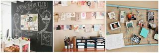
Those images, objects, and words that are more critical to the theme should be larger – the less important concepts smaller.
13. Typography
Don't forget about visual component of the words you use. Working text is both the words that will be used and they type and size of type. You will want to use the correct typography style, of course, but you should experiment with size of text. More important words should probably be larger.
14. Attaching materials
Obviously if your moodboard is all digital, you will have no concerns. However, if it is tactile, securing every element is critical. And you may want some elements to create a greater 3D effect. Mount them to something to raise them off of the board.
15. Live moodboarding session
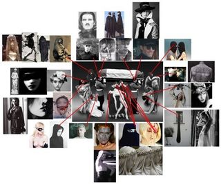
If you created this moodboard and there is to be a live presentation to a client, you must do the presenting. You must be able to explain why each element is there and how it creates the mood that you were capturing for the client. And the client must understand how each element really 'fits'.
Moodboard design is an immensely stimulating activity and can be one of the most enjoyable parts of actual design. If it is done right, the actual design will come together much more smoothly, because so many decisions will have already been made. Just remember these three things:
- You are creating a moodboard, not a design
- It should not be too 'finished' looking
- Don't spend too long on it – you can begin to second-guess yourself!
Words: Laura Callisen
Like this? Read these!
- Great tools for creating mood boards
- How to build an app: try these great tutorials
- Free graphic design software available to you right now!

Thank you for reading 5 articles this month* Join now for unlimited access
Enjoy your first month for just £1 / $1 / €1
*Read 5 free articles per month without a subscription

Join now for unlimited access
Try first month for just £1 / $1 / €1
The Creative Bloq team is made up of a group of design fans, and has changed and evolved since Creative Bloq began back in 2012. The current website team consists of eight full-time members of staff: Editor Georgia Coggan, Deputy Editor Rosie Hilder, Ecommerce Editor Beren Neale, Senior News Editor Daniel Piper, Editor, Digital Art and 3D Ian Dean, Tech Reviews Editor Erlingur Einarsson and Ecommerce Writer Beth Nicholls and Staff Writer Natalie Fear, as well as a roster of freelancers from around the world. The 3D World and ImagineFX magazine teams also pitch in, ensuring that content from 3D World and ImagineFX is represented on Creative Bloq.
