Five skills you need to make AB testing work
Multivariate and split testing can be crucial for sales conversions but how do you get the most out of it? Matthew Bird, the marketing man at Stinkyink.com, looks at five steps every designer need to go through
A/B and multivariate testing, done well, can lead to significant gains in site usability and sales conversions, and constant testing and improvement can literally revolutionise a business.
However, in smaller companies the role of proper split-testing is often given to the web designer, who may not have the additional knowledge that testing requires. Here are five areas that a designer needs to master to grasp the basics of split-testing.
1. Accurate planning
It feels great to jump into a new project, but any good designer needs to have a clear plan on what their testing is trying to achieve and the direction they will take the design, and thus, the business.
For example, imagine this feedback: “I hate the sidebar”, “the sidebar is rubbish” and “the information on the sidebar is unclear”. How do you proceed? Do you test designs without a sidebar? Test variations of the present sidebar design? Or do you invest in a follow-up customer response survey before you do anything? Split-testing is so powerful, but can easily be implemented poorly without a plan.
Knowing the timescale for implementation is also crucial. A plan will reveal if the quoted time for data gathering and testing is realistic or if you need longer.

2. Understanding metrics
Any test needs an outcome, and you need to know what any changes have to achieve. Designers are rightly interested in usability of a website, but they’re often not aware of how metrics can interact with each other and impact their conclusions.
For example, an ecommerce site typically measures success by sales, and the user experience needs to be tailored towards making it easier to buy. Your average designer could easily set up a multi-variate or A/B test on page designs to see which generates the most revenue, but a great designer would know that a test that reports only revenue swings is not enough.
What if there’s been a spike in page views and visitor times from the winning design, but it actually makes it harder to browse? It could be that more sales are actually producing a lower gross margin for the company as the wrong products are selling more. A truly great designer would dive even deeper, to check factors like email opt-in rates, and so on. After all, it’s pointless having higher sales from one design if visitors can’t leave their details for future marketing and conversion opportunities.
An inexperienced designer with a basic test would never look for evidence like this, and a knowledge of test outcomes can really make the difference.

3. Test interference
It’s pointless tracking metrics if there is the possibility your tests can interfere with one another.
Current testing software removes any issue of interference on single-page tests, it simply creates ‘combinations’ of your variations. So if, for example, you changed some button colours, and image locations at the same time, you’d have four combinations.
A The original design
B The altered design just with button colours changed
C The altered design with just image locations changed
D The altered design with both images and buttons changed
However, beware of some testing software that won’t keep different page designs independent of each other, so you’ll need to double check how your chosen method deals with multiple tests running.
Again using our ecommerce website as an example. In addition to a detailed product page there will probably be an overview page, where that item is grouped together with related products for easy browsing and quick ordering.
If you test variations of design on both the overview page and product information page then there’s the chance that the tests will interfere with each other. The whole notion of testing relies on an old Latin quote “ceteris paribus” - loosely translated this means “everything else equal”. There is no point testing if other variables impacting your customers’ performance will change!

4. Testing attribution
To complicate matters further, websites with multiple paths to the same goal create a nightmare for attribution in a test. Even something as simple as forgetting to display a different contact phone number or email for each page design can skew a test far enough to make the data misleading and force the designer into poor conclusions. After all, how do you know which design your customer is contacting you from?
Carrying on with the example ecommerce website with its product page and easy-browse page, which design would you attribute the sales to in the following examples?
- Customer hits new easy-browse page, browses to original product page and adds to basket
- Customer hits new easy-browse page, browses to new product page and adds to basket
- Customer leaves new product page and browses to original easy-browse page and adds to basket
I could go on and on with the variations and if a designer is not aware of this multi-faceted approach to adding to the basket, then any conclusions they make will be at risk of horrendous inaccuracies.

5. Confidence levels
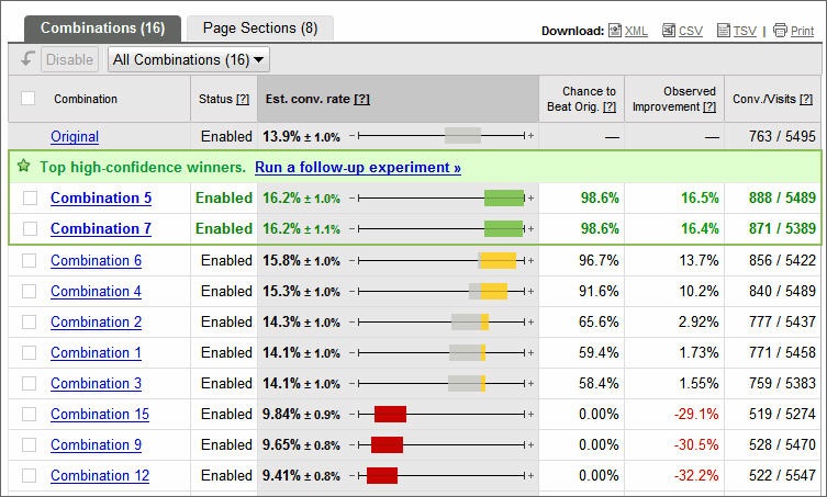
Not many designers have maths degrees, and therefore are unlikely to be familiar with statistical tests and significance levels. The first test they run on any decent testing software will bring up things such as a ‘95 per cent confidence level’, with the test’s winners and losers reliant on the figures.
At the very basic level these are referring to the validity of your results, so in the previously quoted 95 per cent level you are basically saying “I am 95 per cent sure my results have not occurred by chance” or stated another way, “there is a 5 per cent chance these results were caused by chance”.
However, without a slightly deeper understanding of how these figures are calculated, and how they can be misleading, a designer can be tricked into incorrect conclusions. Issues such as ‘false positives’ can result in worse performing designs being declared winners.
Get the Creative Bloq Newsletter
Daily design news, reviews, how-tos and more, as picked by the editors.

I hope this article has opened up your eyes to the pitfalls of poor testing. Ultimately, when a revamped site is launched, but the predicted benefits and extra orders don’t materialise, it's a downer for both designer and company, especially when so much effort has gone into the tests.
If you take heed of these points and implement testing correctly then you should avoid the risk of that, and reap the benefits of some fascinating design insights and changes.

Thank you for reading 5 articles this month* Join now for unlimited access
Enjoy your first month for just £1 / $1 / €1
*Read 5 free articles per month without a subscription

Join now for unlimited access
Try first month for just £1 / $1 / €1

The Creative Bloq team is made up of a group of art and design enthusiasts, and has changed and evolved since Creative Bloq began back in 2012. The current website team consists of eight full-time members of staff: Editor Georgia Coggan, Deputy Editor Rosie Hilder, Ecommerce Editor Beren Neale, Senior News Editor Daniel Piper, Editor, Digital Art and 3D Ian Dean, Tech Reviews Editor Erlingur Einarsson, Ecommerce Writer Beth Nicholls and Staff Writer Natalie Fear, as well as a roster of freelancers from around the world. The ImagineFX magazine team also pitch in, ensuring that content from leading digital art publication ImagineFX is represented on Creative Bloq.
