Five essential Google Analytics tips for web designers
Discover how to fuel your creativity with the wisdom of insight from Google Analytics, and unlock the true potential of your web design talent. Digital marketing specialist Iain Harper shows us how
Designers are born, not made, but it takes more than raw talent to make a great web designer. What really sorts the wheat from the chaff is an intuitive understanding of how to craft an engaging and usable experience. It's seeing the big picture, having the ability to think like a customer (yes, 'customer' not 'user'), and always remembering that a website must fulfil its commercial purpose.
Understanding develops from objective insight, and when it comes to online customer behaviour Google Analytics is an invaluable source. Here are five essential insights that every web designer can learn from:
1. Turn me on
From the moment someone reaches a website, the design has maybe two seconds to make a first impression, and first impressions count. Turn them on with the promise of an easy and enjoyable experience and they'll stay for more. Bore them, irritate them, or make it look like hard work, and they'll be gone forever.
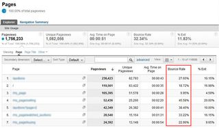
The "Bounce Rate" metric in Google Analytics (Content>Site Content>Pages) is a fundamental barometer of first impressions. It tells you how many people left a page without clicking on a single link. A high bounce rate means the design (and/or the content) is failing to engage. Look at the bounce for all the important pages in a site and figure out which ones need improving. Test different styles and monitor the change.
Check out Content>In-Page Analytics for a visual overlay of how people are interacting with a site design.
The consistent above-the-fold elements are crucial in triggering positive engagement. The header, main navigation, and whatever appears in the top-left of the page, have the most impact. Make them count. Design with flair and originality, but keep things familiar.
2. Happy landings
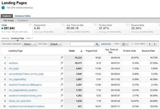
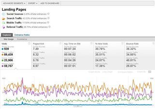
The homepage of a site is important in all sorts of ways, but it's a big mistake to think of it as the starting point for every customer experience. Typically, less than 40 per cent of visitors enter a website at the home page, so optimising the engagement value of all the other major landing pages is essential.
Any page could be a landing page, not just those at the top-level of a site's navigation or those created specifically for individual campaigns.
To find out which pages are the priority using Google Analytics, look under Content>Site Content>Landing Pages and compare volume of visits, time on site and bounce rate to identify what's working and what's not. Think objectively about how the design of high-performing pages is different from those that are struggling. Test and refine your theories.
3. The bottom line
If your design doesn't help a website achieve its commercial purpose then, not only will the business suffer, your reputation will take a battering too. It's in your interests to create a customer journey from landing to conversion that's as streamlined, intuitive and pleasurable as possible.
Whether a site is selling products, generating leads, taking bookings, or offering downloads, the optimisation of conversion is your top priority. From a visual design perspective, less can often be more.
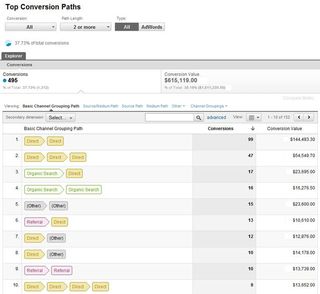
Google Analytics provides two kinds of insight into commercial performance under the "Conversions" tab. "Goals" are non-financial objectives like the completion of an enquiry form. "Ecommerce" conversions relate to actually selling stuff.
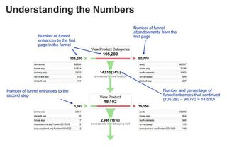
Focus on the top "funnels" for goals and ecommerce transactions and look for the exceptions. Which pages, which stages of the journey, are working especially well or especially badly. Where are customers dropping-out of the funnel? Learn from the successful pages to improve the others.
4. Equal opportunities
Think about the last site you designed. How many people visited it from a mobile device? How did their experience and performance compare to desk-bound visitors?
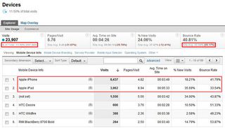
Look under Visitors>Mobile>Devices in Google Analytics and all will become clear.
You'll probably discover that well over 10 per cent of visits were via smartphones and tablets. That's a hefty (and rapidly-growing) proportion of mobile consumption and your design work needs to account for it.
Remind yourself of the average bounce rate, time on the site and the number of pages viewed per visit. Then compare with the data for mobile visitors. You may be surprised by what you find.
It's also important not to think of "mobile" as a single generic medium. Look at the differences in performance between iPad and iPhone users. You'll almost certainly see that iPad visits last longer, view more pages, and bounce less.
If you're involved with App design (or want to be), this kind of insight will be really useful.
5. Divide and conquer
Making comparisons between different kinds of visitor is perhaps the most powerful feature of Google Analytics. It's the art of "segmentation" and it can guide your creativity like nothing else.
As well as mobile visitors, segmentation let's you compare things like new vs returning visitors and organic search vs referrals from other sites. They're all important, but where segmentation can get really clever is with "Custom Segments".
Reports in Google Analytics can be filtered by up to four segments at once. Click the "Advanced Segments" button at the top of any report, then the "New Custom Segment" button on the right.
For example, you might want to investigate the landing page interaction of visitors coming from Facebook and other social channels vs those coming from search. You could define a custom segment for social network referrals and then filter the landing page reports to get a better understanding of visitor behaviour.
Conclusion
Analysing data is unfamiliar territory for most web designers, but for those that can expand their comfort-zone to learn new skills and gain a more objective perspective on how their designs are consumed, the professional dividends can be enormous.
Make sure you can get access to the Google Analytics on all the sites you work with. Absorb all you can. Spot the trends and the exceptions.
Study the step-by-step video lessons provided by Google and take the "Individual Qualification" exam for official certification of your new-found expertise (which looks good on your CV too).
Get the Creative Bloq Newsletter
Daily design news, reviews, how-tos and more, as picked by the editors.
Above all, be proactive. Use the insight from Google Analytics in a creative way to produce more effective designs and become a better web designer.

Thank you for reading 5 articles this month* Join now for unlimited access
Enjoy your first month for just £1 / $1 / €1
*Read 5 free articles per month without a subscription

Join now for unlimited access
Try first month for just £1 / $1 / €1
The Creative Bloq team is made up of a group of design fans, and has changed and evolved since Creative Bloq began back in 2012. The current website team consists of eight full-time members of staff: Editor Georgia Coggan, Deputy Editor Rosie Hilder, Ecommerce Editor Beren Neale, Senior News Editor Daniel Piper, Editor, Digital Art and 3D Ian Dean, Tech Reviews Editor Erlingur Einarsson and Ecommerce Writer Beth Nicholls and Staff Writer Natalie Fear, as well as a roster of freelancers from around the world. The 3D World and ImagineFX magazine teams also pitch in, ensuring that content from 3D World and ImagineFX is represented on Creative Bloq.
