6 fantastic editorial designs and what we can learn from them
Leading creatives share their editorial projects and the lessons they learned from them.
Whether you’re designing a newspaper, newsletter, magazine or digital publication, the principles of good editorial design and layout are universal. But whether it's print design or online, each project comes with unique challenges – and it can be useful to see how other designers have tackled these in their own work.
So here we bring you six stunning examples of editorial design from leading creatives, find out how they created them, and share some lessons that can be applied to all your editorial projects, large and small.
01. Otl Aicher's Isny by dn&co
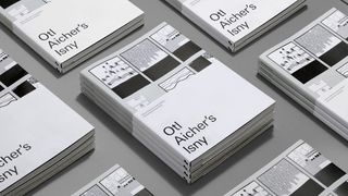
Over 10 years, the iconic German designer Otl Aicher created a poster series based on the small town of Isny im Allgäu. It was groundbreaking in eschewing the typical “colourful postcard” style in favour of a stark, reductive and monochrome approach. In a limited edition book, released this September to accompany a London exhibition of the work, dn&co delves into this groundbreaking project across 116 pages.
"When it came to the layout of the book, the team felt a real sense of responsibility,” says creative director Patrick Eley. “We kept asking ourselves ‘What would Otl do?’ – shorthand for how we could bring rationale and order to the project.
"It was a matter of ensuring the design was consistent with Aicher’s recognisable aesthetic, without being a copycat of it.”
The dn&co team opted for Univers, a typeface that was used as part of Isny’s branding, as well as for the Munich Olympics, the project Aicher is best known for.
“It’s a simple but effective structure – the editorial frames the work, which is printed on an uncoated paper to reflect the material that the Isny posters were originally printed on,” says Eley. “The surrounding narrative is reproduced on a coated stock so the photos of the town pop out.”
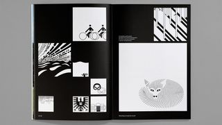
The pictograms only exist as physical prints, not vector artwork, so they had to photograph everything in high resolution to enable us to reproduce it as accurately as possible. And that led to some interesting dilemmas.
“We wanted to reflect Aicher’s strongly gridded approach to his work for Isny,” says Eley, “but the closer we worked with it, the more we noticed the inconsistencies. For example, nothing is actually square as it originally appears and that caused a few headaches with our own grid.”
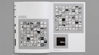
Eley’s main tip for anyone embarking on a similar project? “Good filing is vital,” he says. “Knowing where everything is, who took what photo and whether you’ve got something at a high enough resolution to print it is absolutely key.”
Ultimately, he adds, you have to become really familiar with the book’s content. “Get close to the narrative, and remember that design and typography is a fundamental part of delivering any story.
“In this case, we were very conscious that we didn’t want to ‘out art the art’. The design of this book needed to be recessive to the content, which was the real hero. So it had to be quiet and unopinionated, while acting to frame another designer’s work and give it context. Ultimately it was a question of respect.”
02. This Is Me, Full Stop by Here Design
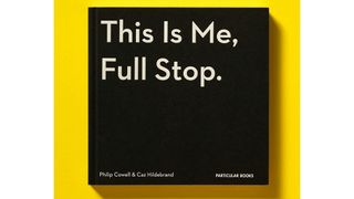
This Is Me, Full Stop: The Art, Pleasures, and Playfulness of Punctuation is a book created by London design agency Here Design that harnesses beautiful design to explore “the secret life of punctuation marks”.
It’s a fun, tongue-in-cheek way to explore a niche topic, and makes great use of simplicity and whitespace to tie everything together; a trick that might look easy but is much harder to achieve in practice.
“When it came to layout,” says Here Design’s Caz Hildebrand, “our biggest decision was to make the text the formal consistent element throughout and allow the illustration and design to spread out and play as much as it wanted to, so that it could support and enhance the text’s meaning. It is always a joy to work with whitespace, though of course it is a challenge to have so much freedom.”
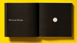
“The book’s text font was chosen to be reasonably friendly and approachable with the authority and strength of character to appeal to a broad audience range,” he continues. “It’s also worth noting that we created all the illustrations and designs using real-life typefaces – over 50 of them from Apple Chancery to Wedding Text; there’s a full list at the back. Championing typefaces both known and unsung was always part of the ambition.”
High production values were also central. “To find the simplest way of expressing our book’s main idea, we used white foil lettering on black substrate, creating a striking contrast between matte and gloss that helps the book stand out,” he says.
“For solidity, we had the book trimmed flush (we love seeing it in bookshops; it stacks up really nicely). And inside we used black end papers and chapter dividers to bring the reader back to the centrality of the cover.”
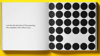
Hildebrand offers the following advice for a designer coming fresh to editorial design: “Think about the experience of the reader."
He continues: “Not all consciously designed things are necessarily friendly to read. So be the designer, but also be the reader – what would you expect to see? What would surprise you in a delightful way? In other words, it’s not just how it looks, it’s how it reads.
“Help the text, don’t hide it. Typography can really endorse the words you are saying. And always remember that books evolve over many pages, so they need to retain an inherent formal structure while being able to break free.”
03. Circular 19 by Pentagram
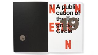
Circular 19, the 12th edition of The Typographic Circle’s magazine, was designed by Pentagram and marks the 40th anniversary of the volunteer-run and not-for-profit organisation, which aims to bring designers with an interest in type and typography together.
“Circular, which comes out every 18 months, is an unusual publication as it does not carry any advertising and therefore is far more independent and we can do as we wish,” says designer Domenic Lippa. “It’s also important it appeals to its core audience of type enthusiasts.”
The design of the publication is most noticeable for its use of big type. “We use this to create impact and to challenge preconceptions around what type is used for,” says Lippa. “For us, it's as important as imagery and is not used purely for information.”
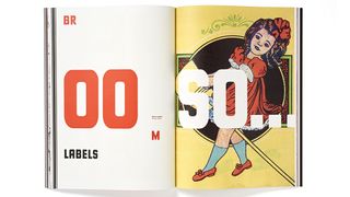
When it comes to the design in general, each issue is a standalone piece, he adds. “We often decide upon an approach before we start designing and this includes the typefaces, the general look and feel and the colour palette. The colours help create a thread for the whole magazine.”
Even within each issue, they aim for variety, he adds. “We want to keep challenging ourselves and stretch ourselves and not get bored, so each spread has a sense of individuality about it – we're not design fascists!”
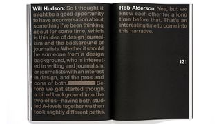
“For me, relationships of scale between various pieces of text is the most important element of editorial design; you should not be afraid to use type confidently,” he says.
“I do believe that as designers we need to keep questioning the status quo; why are we doing it this way? Never stop learning and never stop trying things, otherwise you just dry up as a designer and as a thinker.”
04. Charm, Belligerence & Perversity by GBH
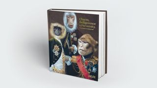
Charm, Belligerence & Perversity: The Incomplete Works of GBH is a monograph written by Jason Gregory, Mark Bonner and Peter Hale, founders of GBH London. And the first thing you notice about it is its striking cover.
“We wanted to make something that supported the idea that we’d only just begun and that we weren’t finished yet,” explains Mark Bonner. “We’re fascinated by our evolution and we loved the twist on the old idea that 100 monkeys in a room, given time, could create the complete works of GBH. We only have 25 at GBH, but give us a chance.”
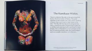
The team wanted the book to do two things, he says. “We needed to explain what went into the design of each project, and we wanted to have a wider dialogue with our readers about the insecurities and bravery that entwine in us all while we are making them.
“We felt no-one had ever spoken about these uncomfortable truths. So many books on design are self-aggrandising, but we wanted to be honest and share the fact that we go through a lot of emotions in making new things.”
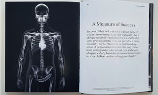
In any editorial design project, Bonner believes it’s important to “read the text, feel it, know it intimately before you even think about trying to lay it all out.”
And with this book especially, the typography needed to be accessible, and feel easy to read, he adds. “So we worked hard to find a typographic system that allowed the 'show and tell’ of the project stories and the psuedo-sycology to co-exist.”
05. Mr B & Friends ‘Comfriendium’ 10 Year book
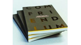
To celebrate 10 years of creative collaborations, Bristol design studio Mr B & Friends produced Comfriendium, a statement piece to send to their clients. It’s an impressive publication with punchy colours and a high quality finish, including a gloss black and white foiling on the cover that adds subtlety and impact.
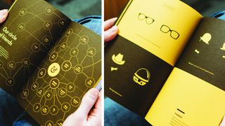
“Editorial permeates everything we do,” says executive creative director Steve Richardson. “From digital magazines and websites to annual reports and books, the content drives the message.
"Gone are the days when an idea could be rolled out to a template; now the reader can click-off, turn the page and move to the next thing, so our goal is to guide the eye with storytelling merging words, graphics and imagery.”
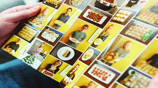
He offers the following tips for anyone working in editorial design: “Invest in the best copywriting you can afford. If the words are brilliant, the design falls out onto the printed or digital page. Work closely with the author to get into their head so you understand the nuances.
“Use wit,” he adds. Be playful with your use of highlights, illustrations, icons and imagery.
Choose typefaces that work well online and in print. Good pairings that give light and shade to all communications, so you can tailor the editorial message to the medium.”
And final tip is to add pace. “Each page and screen view should take the eye on a journey, sometimes punchy and energised, and sometimes subtle and soothing. Choose illustration and imagery to help reflect this.”
06. Photo District News website by James Johnson
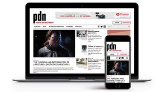
All the examples we’ve included so far are print products, but as Steve Richardson mentions above, editorial design is just as important online; in many ways more so. A good example of editorial design on the web is Photo District News, a photography magazine that was redesigned in 2018 under the art direction of Brooklyn-based designer James Johnson.
There’s an awful lot of information to be uncovered here, but the flexible, responsive layout of the site is designed with generous use of whitespace and elegant proportions that avoid ever feeling cluttered, whichever device you use it on.
“Unlike print, on the web an article is usually designed as a whole, with all of its body copy on one page, and often the designer will not have control over how it's presented,” says Johnson. “It could be a phone, it could be printed out, or something else altogether. So it's important to make the articles flexible and resilient to changing conditions.
“Keep layouts simple and embrace responsive design techniques,” he continues. “Try to get the main ideas across in each format and don't sweat the small differences between them. This is in contrast to the two-page spread of the magazine, where a designer decides exactly how the content will appear and when.
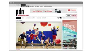
“Aside from that, keeping a page clean, with lots of whitespace and clear, readable typography, is even more important on the web than in print. Reading is hard on a screen so it's best not to distract the readers with a cluttered page.”
The biggest mistakes Johnson sees online often stem from poor typography. “Line widths that are too wide is probably the biggest issue there,” he says. “I also see a lot of sites that try to use a print typeface for body copy.”
Getting it right is partly about effective collaboration, he adds. “The designer's role is to provide a tangible form for the underlying concepts provided by the editor. This can't happen without a good relationship between the designer and editor.
"So I can't stress this enough; work with your editors and really get to know their content and editorial philosophy before attempting to design anything. This will go a long way in ensuring that people want to read the article.”
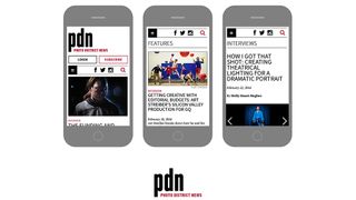
In terms of design, you have to catch the reader’s attention right away and get them interested in the article, he adds. “The title and deck are key to this. Readers should be able to glance at the page and instantly know what the article is about. Write a great title and design it to really stand out. Adding a great photo or illustration that works with the title, conceptually and visually, will really bring it home.
“Once you have their attention, great content backed by solid design will keep it. Pick a good web typeface and set the body copy large enough to be read easily. Break the article into sections and write headlines for each and use strategically placed images, pull quotes and other design elements to encourage readers to scroll.”
You might also like:

Thank you for reading 5 articles this month* Join now for unlimited access
Enjoy your first month for just £1 / $1 / €1
*Read 5 free articles per month without a subscription

Join now for unlimited access
Try first month for just £1 / $1 / €1
Get the Creative Bloq Newsletter
Daily design news, reviews, how-tos and more, as picked by the editors.
Tom May is an award-winning journalist and editor specialising in design, photography and technology. Author of the Amazon #1 bestseller Great TED Talks: Creativity, published by Pavilion Books, Tom was previously editor of Professional Photography magazine, associate editor at Creative Bloq, and deputy editor at net magazine. Today, he is a regular contributor to Creative Bloq and its sister sites Digital Camera World, T3.com and Tech Radar. He also writes for Creative Boom and works on content marketing projects.
