Design sheet for the iconic 1964 Olympic logo unearthed
Discover the design secrets behind the Tokyo 1964 Olympic logo.
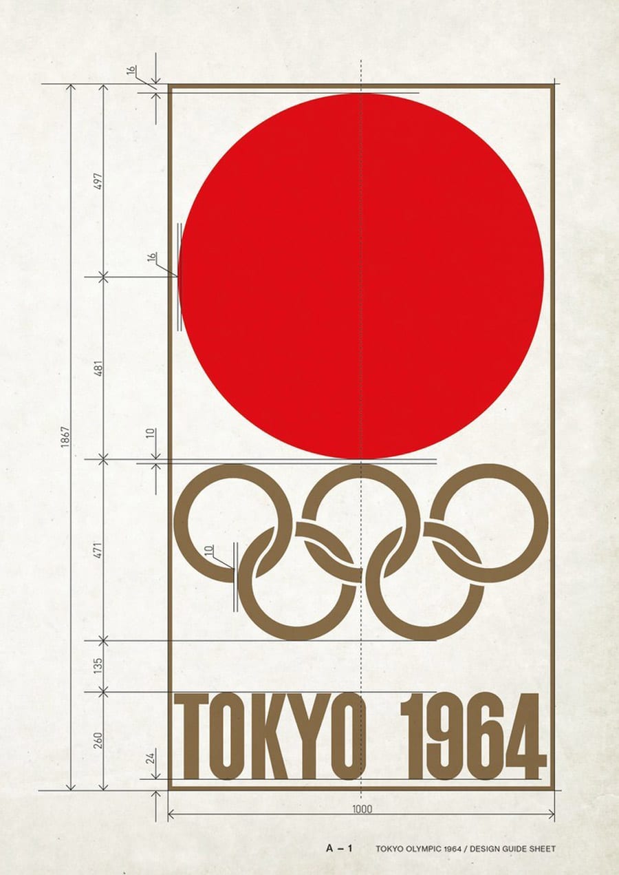
We all enjoy nerding out at a design sheet, and who doesn't love a good Olympic logo? This discovery from the Logo Smith combines the two: the design sheet for the Tokyo 1964 Olympic emblem. This logo was voted by design legend Milton Glaser as his favourite Olympic logo ever.
The Tokyo 1964 Olympic logo was designed by Yusaku Kamekura and features a red sun representing the Japanese flag above the Olympic gold rings, with 'Tokyo 1964' written in Helvetica. Like all the best logos, it's simple, but extremely effective. And of course, drawing the logo required precise measurements in the days before the likes of Illustrator.
You can see the Tokyo 1964 logo's design sheet below.

The Logo Smith has attempted to painstakingly recreate the design sheet, and it turned out not to be easy (read his blog post about the sheet here).
These Olympic circles have been a tad challenging, struggled to get my head around the various interleaving elements, all whilst ensuring a consistent width smooth flowing inner white (cyan for ref) gap… finally done. pic.twitter.com/SeKGcMBls5January 2, 2020
As we head towards the upcoming Tokyo 2020 Olympics, we can't help but wonder how this year's logo will be remembered. The original first logo design was scrapped due to plagiarism accusations, the official logo was then unveiled to a mixed reaction, and a concept logo received a lot of praise, with many saying it was better than the official one. The official recycled medals went down a treat, though.

It remains to be seen just what the legacy of this particular logo is, but we do like the idea of people trying to painstakingly recreate it in years to come. Let's hope there's already a detailed design sheet in circulation.
Read more:

Thank you for reading 5 articles this month* Join now for unlimited access
Enjoy your first month for just £1 / $1 / €1
*Read 5 free articles per month without a subscription

Join now for unlimited access
Try first month for just £1 / $1 / €1
Get the Creative Bloq Newsletter
Daily design news, reviews, how-tos and more, as picked by the editors.

Rosie Hilder is Creative Bloq's Deputy Editor. After beginning her career in journalism in Argentina – where she worked as Deputy Editor of Time Out Buenos Aires – she moved back to the UK and joined Future Plc in 2016. Since then, she's worked as Operations Editor on magazines including Computer Arts, 3D World and Paint & Draw and Mac|Life. In 2018, she joined Creative Bloq, where she now assists with the daily management of the site, including growing the site's reach, getting involved in events, such as judging the Brand Impact Awards, and helping make sure our content serves the reader as best it can.
