Design colourful kimonos in Photoshop
How to transform Photoshop designs onto vibrant silk kimonos.
I’ve been using Photoshop CC since it first came out, and I have done digital retouching for photographers, but before, I never thought of it as a legitimate form of expression. Up to that point, it was merely to sketch drafts.
David Hockney’s iPad artwork gave me the confidence to take this tool seriously. It doesn’t have the texture or voluptuousness of traditional media, but it has its own expressive resource.
I am from Argentina. In my country it’s not so common to see someone ‘painting’ on their computer. In fact, I’ve never had one of the best graphics tablets, I do everything using just the mouse. I like how that gives room for mistakes to happen, conveying more of a human quality. Graphic designers often regard me as odd!
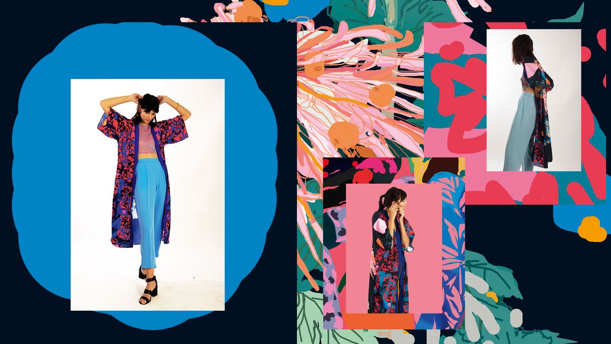
Now, I'm designing kimonos using this software. Here's an overview of my process.
01. Materialise concept
I started designing kimonos digitally due to my fascination with Japan. Then I began to make dresses, and now I’m preparing a whole collection of sweaters for the winter.
The ultra-comfortable and distinguished nature of the kimono was the most amazing starting point for me, because it adapts easily to all body types, represents no gender in particular, and can be used at home or at a fancy dinner party.
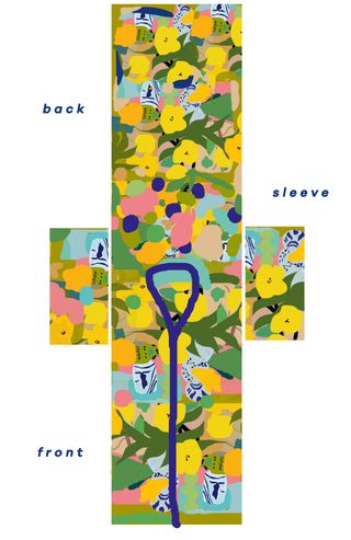
Its structure is also very much like a canvas. It’s mainly a large and wide rectangle that folds in half, representing the front and back. Two more rectangles serve as the sleeves. This way I can think of the kimono as a single piece of work, focusing on the main print on the back, and little ornamental motifs for the front and sleeves. The edges and the belt, which are the same colour, are key to defining the ultimate tone and mood of every design.
I started working on small pattern designs that I intended to repeat geometrically along the cloth. But after making drafts for about 10 different motifs, I realised each one was an accomplished painting in itself. I could not ignore this. It struck me that I had no idea how to develop a traditional rapport pattern; I naturally conceived the painting as a whole image.
02. Establish colours and mood
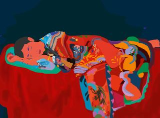
I distribute colours in a messy way, with a big brush stroke, whose edges I trim with the Eraser tool if necessary. I also enjoy using loose, thick, wavy lines, without much concern for detail.
I ponder on the mood I want every piece to convey. For this collection of kimonos, I decided one had to be mostly yellow, recalling a light spring atmosphere. Red would stand for an imperial style, sophisticated and distinguished, whereas dark blue would suit an elegant, nightly look, not sombre but fancy. I also wanted a vibrant orange, only not too garish. A more chaotic, expressive design also appealed to me, with a high-contrast palette and wild, broken lines. And finally a soft pink hue, reminiscent of femininity and intimacy, like a morning ritual.
03. Think about imagery
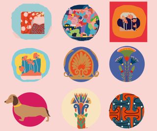
After setting these concepts I started working on the imagery for each. For the red and orange ones, I chose some ikebana paintings I had been working on, with touches of Art Deco motifs. I wanted to convey sensitivity and culture, coupled with a chic feel.
For the chaotic one – or ‘drug dealer’ as a friend of mine likes to call it – I deconstructed one of my original pattern designs into a playful version. Domes of a fantastic Russian city collapse into a distorted landscape with highly contrasting colours. This apparently eclectic print ends up working as a harmonious whole.
The dark blue kimono has a chrysanthemum flower extending from top to bottom, majestic and sombre. I couldn’t help but add sausage dogs on vibrant red and blue doodles, to spice it up with a little absurdity. The soft pink design also has a big floral stamp, striking yet soothing, associated with morning dew and spring.
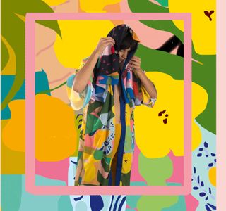
The yellow-green print is less obvious – you can see floral motifs as well as traditional pottery and other elements of Japanese culture, which portrays more of a daily-life energy; optimistic and also a bit messy. As well as these designs, I prepared a separate file for the belts and side prints of every kimono.
04. Transfer paintings to other garments
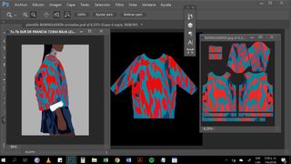
Currently, I am working on an autumn/winter collection, focusing on transferring other paintings I’ve created onto different pieces of clothing. This is turning out to be far more challenging, since I have to find a way of transforming two-dimensional worlds into something that can adapt to a differently-shaped surface, and is also wearable.
To tackle this, I create a template, the measurements of which I add to the computer to adapt the paintings virtually first, trying to stay as true as possible to the original design, without resulting in something no one can wear.
This article was originally published in issue 282 of Computer Arts magazine. Buy issue 282 or subscribe here.
Read more:

Thank you for reading 5 articles this month* Join now for unlimited access
Enjoy your first month for just £1 / $1 / €1
*Read 5 free articles per month without a subscription

Join now for unlimited access
Try first month for just £1 / $1 / €1
Get the Creative Bloq Newsletter
Daily design news, reviews, how-tos and more, as picked by the editors.


