Design and user research insights from NASA
NASA designer reveals how he handles UX design for astronauts.

What do you do at NASA?
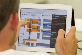
Steve Hillenius: I work as a UX manager and designer in the human-computer interaction group at NASA Ames Research Center, which is located out in Silicon Valley. There I lead a product team that makes mission planning tools, which are used to plan out the daily activities of a mission.
We’ve built mission planning products used in the mission control of several missions, such as the International Space Station and Mars Rover Curiosity, as well as some smaller missions such as LADEE, which was a lunar orbiter.
The tools themselves allow flight controllers to abstractly plan out individual activities for that mission while abiding by all of the mission’s flight rules and constraints. These activities could be something such as running an instrument on a rover, or an experiment the crew needs to run on board the International Space Station.
What are you working on at the moment?
Today my focus is also in actively conducting research and building products on enabling astronauts’ autonomy, by giving them the ability to take on the role of mission control. This is necessary for future deep space missions, where the astronauts will not be able to rely on mission control and contact will be more limited, due to the large distances between Earth and the spacecraft.

What does your typical day look like?
My day involves primarily managing our product and looking at the high-level design and research direction. In the past individual contribution (IC) work used to take up the majority of my time, but this has been replaced by critique sessions and status meetings on the design, research, and technical sides of the product.
Since we’re a small team I still get my hands dirty and get out there in the field. This may mean conducting user research, or supporting operations of our product such as working in mission control or at a remote mission analog site where our product is being tested.

What are the main challenges of designing software for astronauts?
Designing software for astronauts is an interesting niche of UX work that I’ve done at NASA. Historically we designed for expert users such as flight controllers, scientists or engineers, who have very different user needs to the astronauts. They are individuals doing a very specific role on a mission, and they get dedicated training on that role.
Since they’re expert users, it’s all about how can we better support their workflow, as well as how can we make the tools they use in their job more efficient.
How does that different when designing for astronauts?
The use cases and design challenge for astronauts are different. They are extremely busy on board, but they are also generalists in the sense that their day may bounce from activities such as maintenance work, running scientific experiments, public outreach, to conducting a space walk, and so on.
For designing software for astronauts we have to assume that the tool we’re building is just one of many tools they will use throughout their day. Because of this, in our team we prioritise walk-up and use in addition to efficiency and mobility. Walk-up and use in a complex domain is one of the most difficult challenges we face. It takes a lot of time observing and studying our user research to distill these concepts to minimalist, easy-to-use designs.
This is further compounded by the fact that a crew member’s time is extremely valuable and limited. Taking a few extra minutes to get through your tool could be time better spent running more science onboard.

What are your favourite tools to work with?
I’ve really grown an appreciation of moving away from computer tools and drawing/working things out on little paper sketchbooks. Since I also ping pong from design to user research in the field, small sketchbooks that fit in your back pocket have been extremely useful in situations where you need to write down a user observation and you’re in a cramped environment. And it’s great for that idea that might come to you as you're walking down the street.
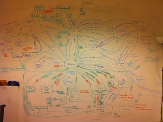
Post-It notes are also essential. Not only do I heavily use them for things like affinity diagrams; the edges of my monitor and laptops are lined with them.
What’s the design process like at NASA?
The design process is more research-oriented than for many of my colleagues at private companies. I’d say the main reason for this is our customer’s work domain is so different from what you or I do on a daily basis that it’s essential to have a strong user research push to really understand all the different tasks a target user group will have to do when we build a new product.
We’re also a very small team, so we end up working cyclically, going from a period of user research where we’re conducting a contextual inquiry, collecting artefacts, observing our users working. Then we iterate on a few design concepts, which will turn into prototypes and eventually full products or features. In areas where we’ve worked with that user group or a similar user group, we’ll forgo a full contextual inquiry and do lighter observations, using those to update existing models or go directly to affinity diagrams and prototyping.
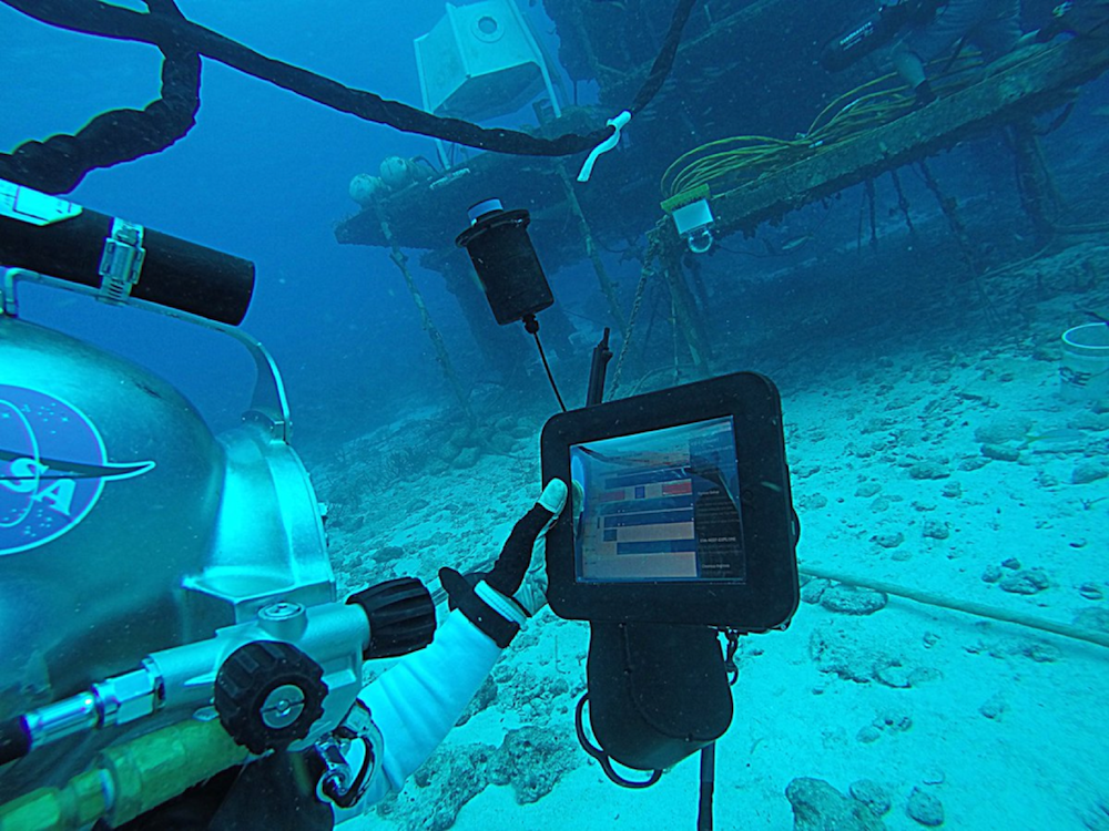
For validating our features we test out our products in mission analogs. These are operational missions that take place on Earth that replicate the conditions of space flight or specific profile of a future mission. It’s important to test our products out here rather than a lab environment since astronauts in the mission analogs are under similar operational pressures as spaceflight.

What is NEEMO?
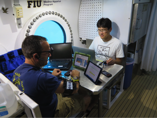
NEEMO (NASA Extreme Environment Mission Operations) is a mission where four crew members live in the underwater habitat Aquarius for weeks at a time. NEEMO is an example of a mission analog where we test and validate our product in an operational environment prior to use on the International Space Station.
How do you convince scientists and engineers of the value of user research, usability and design?
This is a tricky area that we’ve always struggled with. Many of our users have seen us as software developers rather than user researchers or designers. I think that’s common when your customers are outside of the software domain, and that many of the product teams they’ve interacted with in the past have not had dedicated UX folks on staff.
To show our value we first established ourselves as a brand within NASA, in the sense that users at the agency know our products and that we build good tools. Many of them do not know about our process or how we work, but as we work with them more closely we try to give them a primer on our user-centred design process. For the executives and higher ups, I try to associate the value of good design to areas like increased efficiency, science return, and better use of on orbit crew time.
Related articles:

Thank you for reading 5 articles this month* Join now for unlimited access
Enjoy your first month for just £1 / $1 / €1
*Read 5 free articles per month without a subscription

Join now for unlimited access
Try first month for just £1 / $1 / €1
Get the Creative Bloq Newsletter
Daily design news, reviews, how-tos and more, as picked by the editors.

Oliver is an independent editor, content consultant and founder of Pixel Pioneers. Formerly the editor of net magazine, he has been involved with the web design and development industry for more than a decade and helps businesses across the world create content that connects with their customers. He is passionate about content, user experience, accessibility and designing for social good.