Concept site gives the Nokia 3310 an Apple branding makeover
A Behance user has given the Nokia website a crisp redesign to tie in with the relaunch of the Nokia 3310.
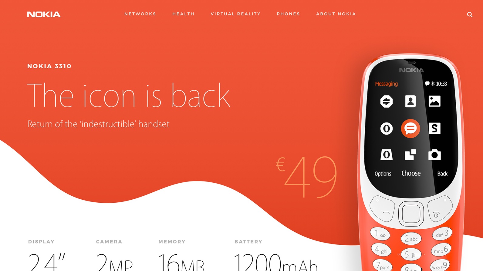
Last month, tech fans and nostalgia addicts were over the moon to learn that Nokia has dusted off its classic 3310 mobile phone and released an upgraded version. Selling points include a revolutionary colour screen, a crystal-clear 2MP camera, and the playground-favourite game Snake (ask your parents).
Nokia isn't the first company to cash in on polished-up retro designs. We've already seen how the Co-op and Natwest have returned to previous logo designs in the last few years instead of creating a new identity from scratch. But besides the phone itself looking like a blast from the past, Nokia's branding for the device on its site has been basic, bordering on boring (although it does feel appropriate that this no-nonsense phone has a no-nonsense web presence).
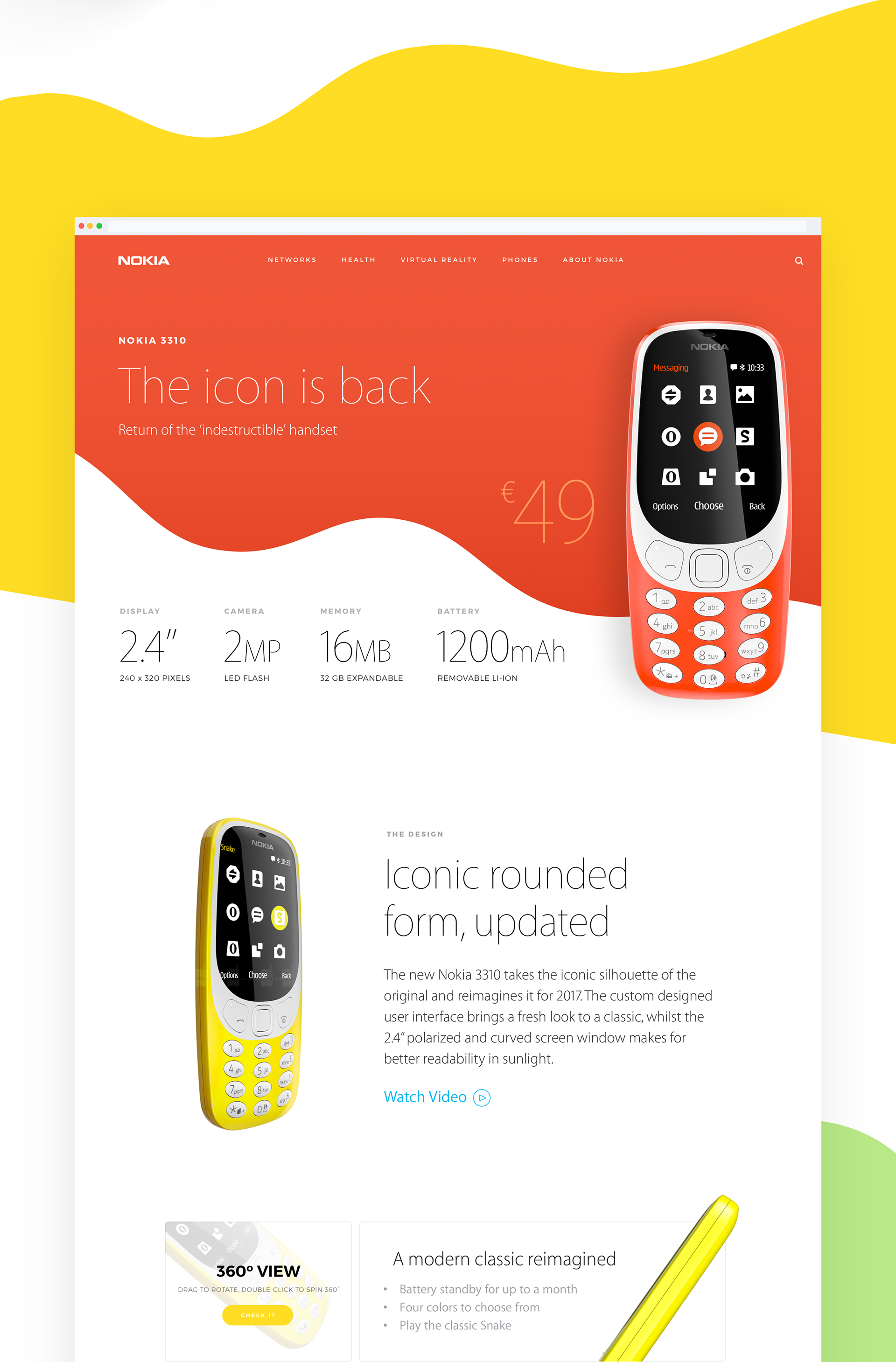
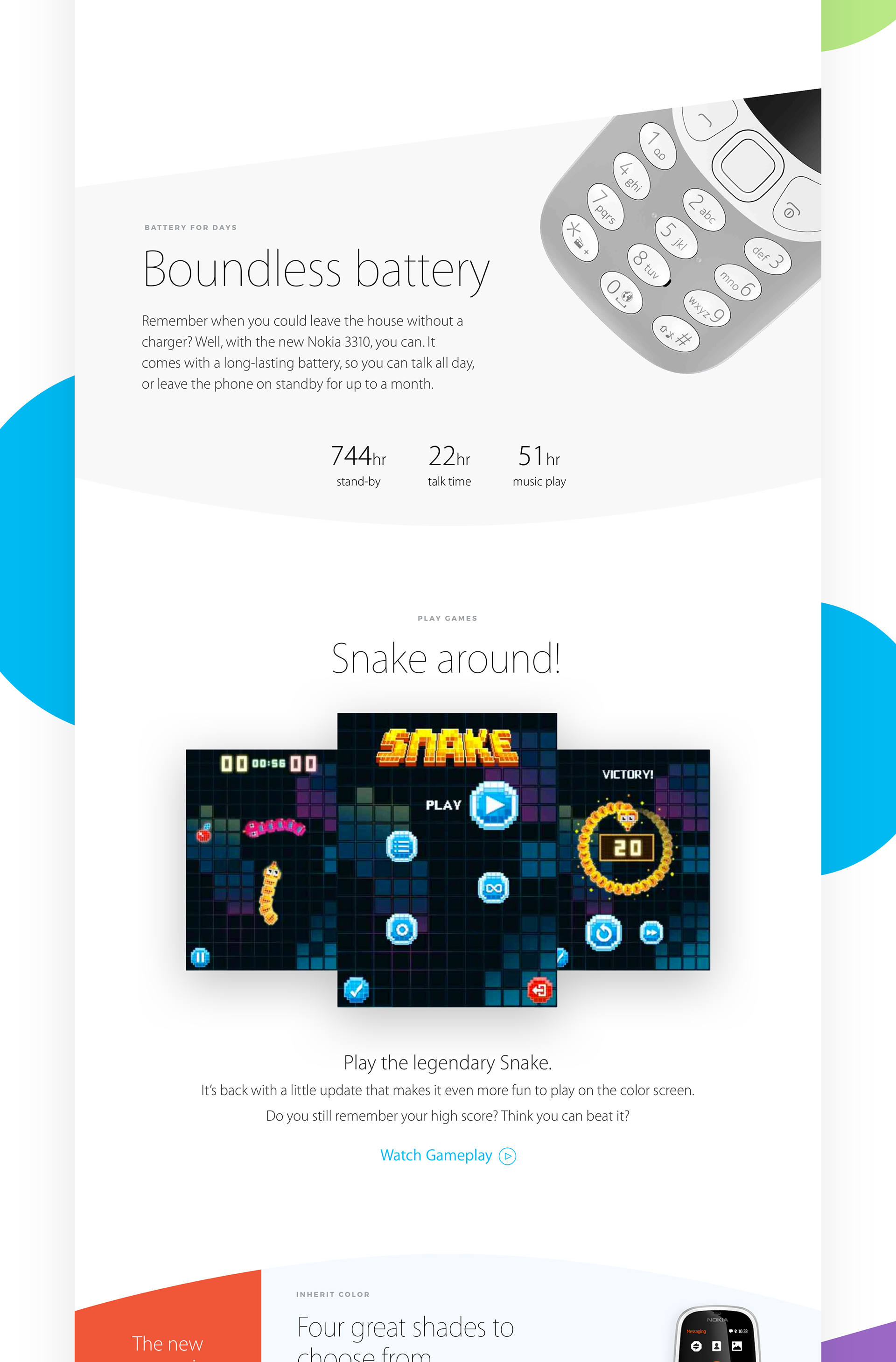
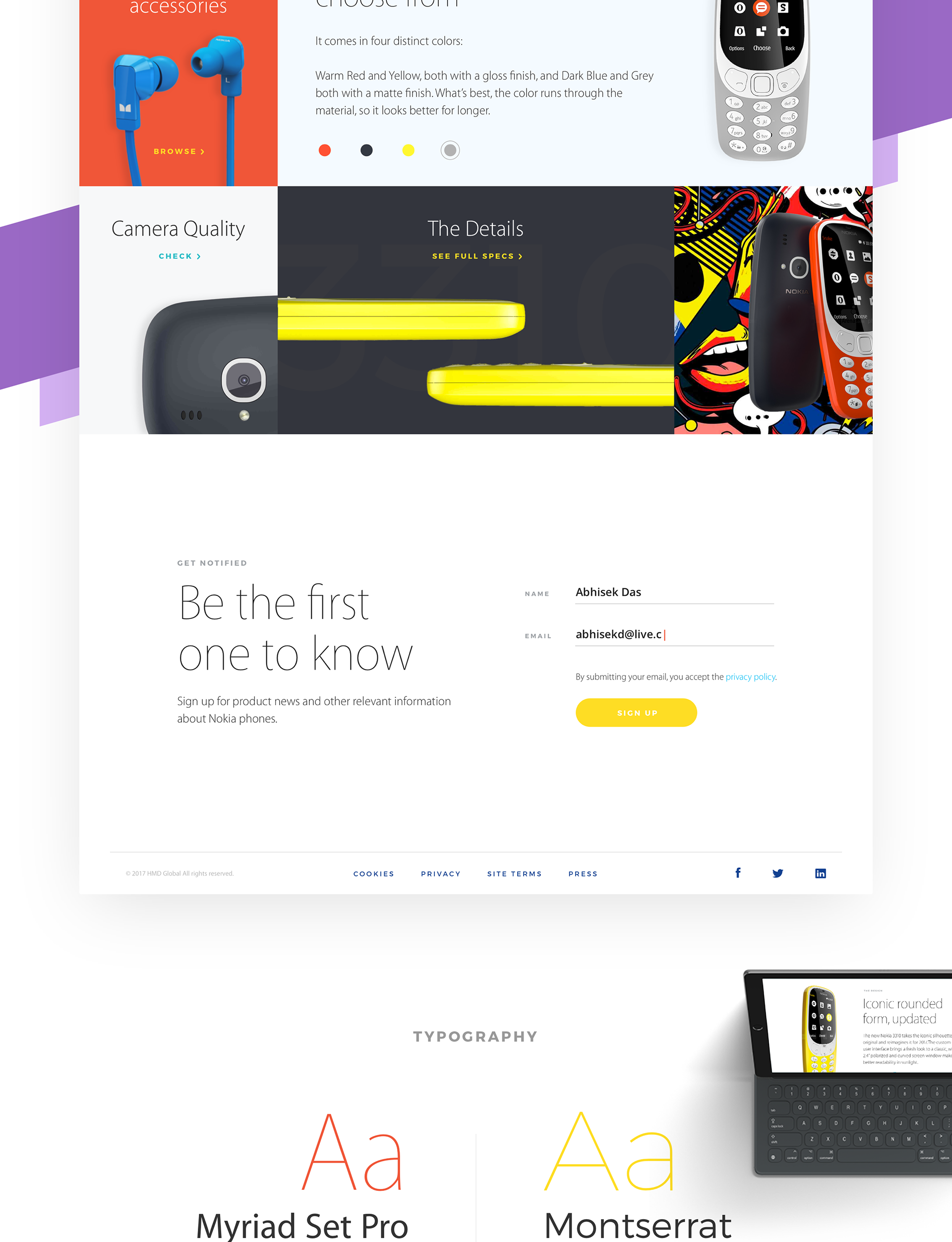
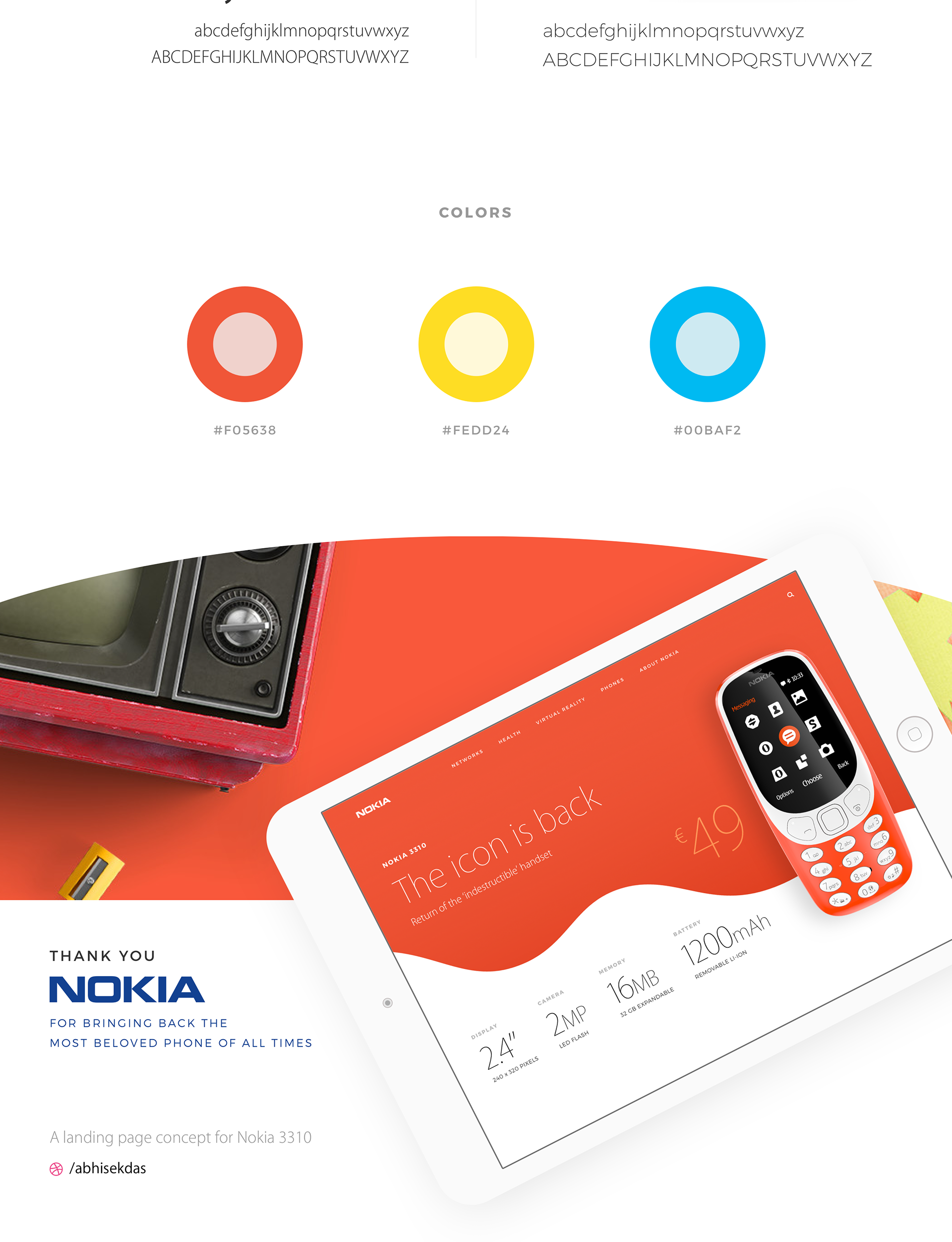
To give the new Nokia 3310 the promotion it deserves, Behance user Abhisek Das has created an Apple-themed concept landing page for the new phones. Complete with cartoony waves of colour and dynamic photographs of the products themselves, this concept adds a vibrant design twist that brings back memories of that other turn of the millennium design favourite: the iMac.
"When Nokia unveiled the comeback of the indestructible handset, I wanted to give a retouch to the landing page with the Apple design style," explains Das. His new concept focuses on better readability, a reduced design pattern, larger typography and a neat user interface.
It remains to be seen if the 2017 Nokia 3310 will spearhead more yesteryear-themed tech products, but if the design concept below is anything to go by, retro goods can be made to look both modern and desirable.
Related articles:

Thank you for reading 5 articles this month* Join now for unlimited access
Enjoy your first month for just £1 / $1 / €1
*Read 5 free articles per month without a subscription

Join now for unlimited access
Try first month for just £1 / $1 / €1
Get the Creative Bloq Newsletter
Daily design news, reviews, how-tos and more, as picked by the editors.

Dom Carter is a freelance writer who specialises in art and design. Formerly a staff writer for Creative Bloq, his work has also appeared on Creative Boom and in the pages of ImagineFX, Computer Arts, 3D World, and .net. He has been a D&AD New Blood judge, and has a particular interest in picture books.
