Concept art for Phase II: the Star Trek series that never was
#StarTrek50: Illustrator Mike Minor created glorious concept art for Star Trek: Phase II.
Today is the 50th anniversary of Star Trek, the science fiction phenomenon that has enchanted television viewers and movie-goers in its various forms and spin-offs for five decades. You don't have to be a sci-fi fanatic to know something about the Star Trek universe, but you may not be aware of the series that never was – Star Trek: Phase II.
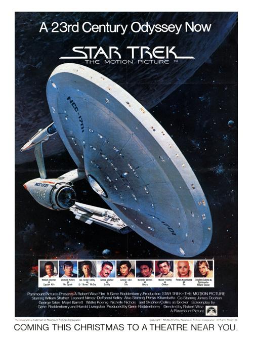
Star Trek: Phase II was devised in 1977 to be a sequel to the original Star Trek – the TV series featuring William Shatner as Captain Kirk, Leonard Nimoy playing Spock, and so on. Although the series was canned, some of the design themes were adopted by the 1979 movie, Star Trek: The Motion Picture (including the redesigned Starship Enterprise art used in the movie poster, above), and storylines in the 1987 television series, Star Trek: The Next Generation.
As Star Trek: Phase II reached a fairly late stage in production before its cancellation, there is some awesome concept and production art for the sequel that never was, all created by Mike Minor. Trekkies and concept artists alike are sure to enjoy the images below – scroll through them to get a glimpse of what you missed on the small screen.
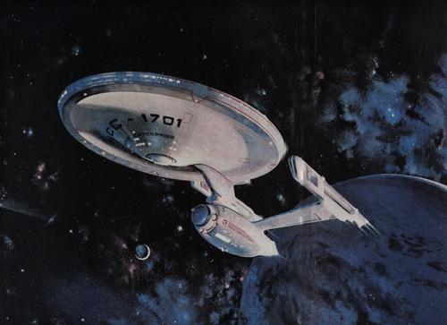
Redesigned Enterprise
Star Trek original series set designer Matt Jefferies redesigned the USS Enterprise for Phase II, with the saucer remaining relatively unchanged but the engine nacelles becoming upright with flat sides and tapered supports, streamlining the shape of the distinctive starship. Mike Minor illustrated the new Enterprise for Phase II and the following motion picture poster.
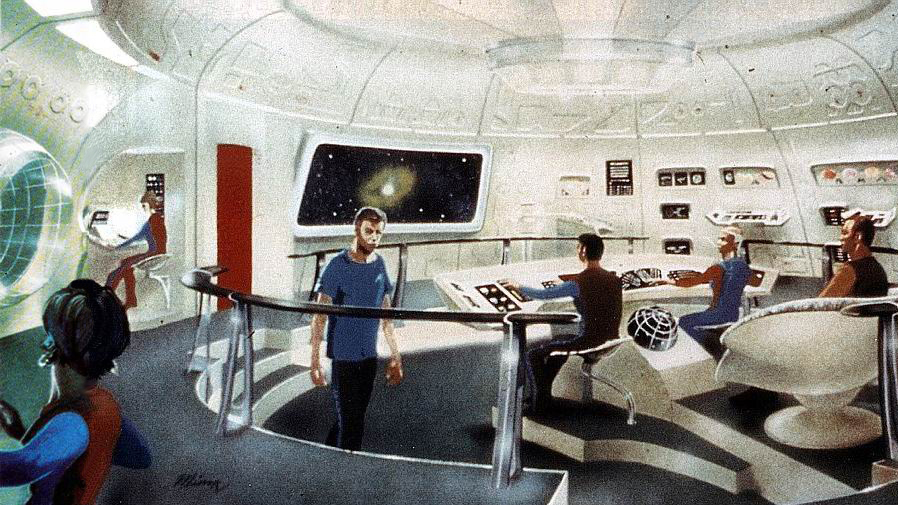
Bridge
The bridge set used in the original series was again redesigned for Phase II – as illustrated here by Minor – and almost exactly the same set ended up featuring in the motion picture, with some small differences.
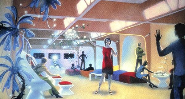
Recreation deck
In this drawing of the USS Enterprise's recreation deck, crew members can be seen playing three-dimensional chess and a more athletic game (or dancing?), as well as relaxing in hollowed-out loungers.
Sickbay
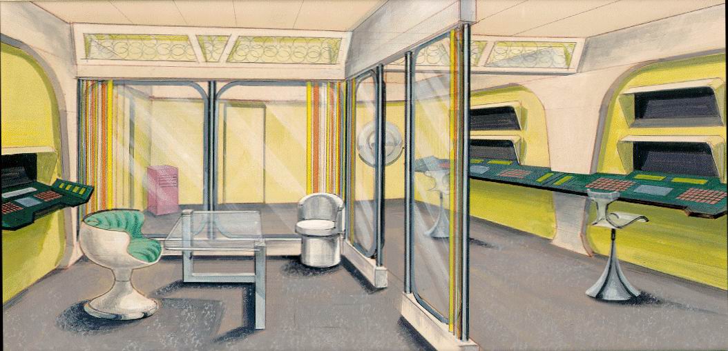
This Mike Minor illustration depicts the clinical surroundings of the Enterprise's sickbay, which is an evolutionary update of that featured in the original series. You can imagine the walls ringing to the frequency of Dr "Bones" McCoy's frustrations at Spock's logic…
Recreation deck
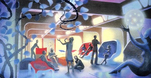
Back in the recreation deck, Minor depicts some anti-gravity fun in amongst some tree-like features.
Captain's quarters
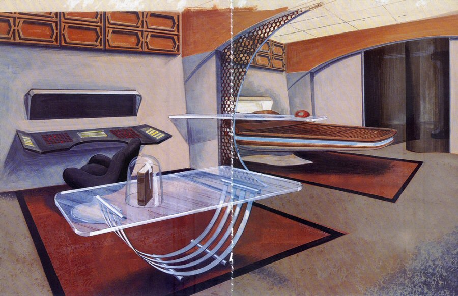
The redesigned Captain's quarters illustrated for Star Trek: Phase II will be slightly familiar to fans of the motion picture, and clearly were an influence on the design of those in Star Trek: The Next Generation.
Travel pod
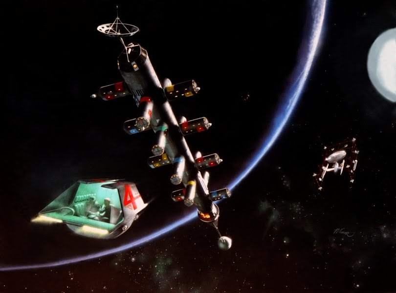
Here is a more unusual illustration, this time of a travel pod flying past a space station with the Enterprise in the background.
Discover much more about Star Trek: Phase II on the brilliant and comprehensive Star Trek fan site, Memory Alpha.

Thank you for reading 5 articles this month* Join now for unlimited access
Enjoy your first month for just £1 / $1 / €1
*Read 5 free articles per month without a subscription

Join now for unlimited access
Try first month for just £1 / $1 / €1
Get the Creative Bloq Newsletter
Daily design news, reviews, how-tos and more, as picked by the editors.

Craig Stewart is a writer, SEO strategist and content marketer, and is a former editor of Creative Bloq. Craig has written about design, typography, tech and football for publications including Creative Bloq, T3, FourFourTwo and DSG, and he has written a book on motoring for Haynes. When he's not writing, you'll usually find Craig under his old car learning about DIY repairs the hard way.
