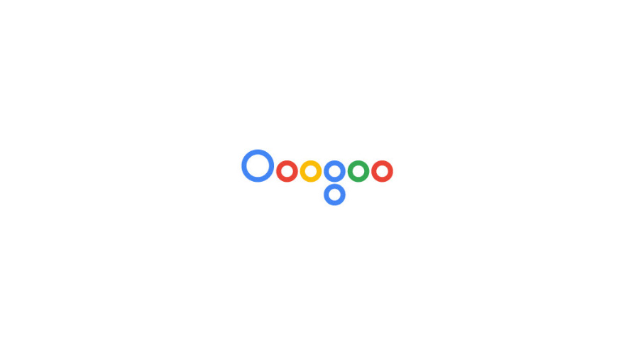
Can you identify the brand from these ultra-minimalist logos?
Project illustrates the power of a strong brand.
Is it still possible to identify a brand when its logo has been stripped back to just block colours and simplified shapes? Lisbon-based graphic designer Pedro Almeida has created a range of ultra-minimalist logos to explore just that.
The best logos become so ingrained in our consciousness that in theory, you should be able to remove a lot from them before they become unrecognisable. And of course, a key logo design rule is to keep things simple in the first place.
Almeida began this personal project as a way of illustrating the importance of visual communication for businesses. "I wanted to emphasise the value of creating a logo that would leave a memorable impression," he explains on his site. "Visual communication is the easiest and most important way to communicate, it should be easy, that is the graphic designer's role."
So if you're designing a logo, perhaps a good exercise might be to strip it back to just the key colours and primary graphic element, and see if it still makes sense. You might also want to check out these 7 famous logos that pass the silhouette test, to see what happens when you remove colour from the equation too.

This big brand has been feeding our binge-watching habits this year.

We're lovin' this minimal look for a major fast food chain.

You might head to this site to pass on that dodgy Secret Santa gift.

Time for a trickier one – this British brand is known for its four wheel drive vehicles.

Having trouble identifying the brands above? This search engine might help you.
Take a look at the full selection of minimalist logos on Pedro Almeida's website, and see how many you can name.
Read more:

Thank you for reading 5 articles this month* Join now for unlimited access
Enjoy your first month for just £1 / $1 / €1
*Read 5 free articles per month without a subscription

Join now for unlimited access
Try first month for just £1 / $1 / €1
Get the Creative Bloq Newsletter
Daily design news, reviews, how-tos and more, as picked by the editors.

Ruth spent a couple of years as Deputy Editor of Creative Bloq, and has also either worked on or written for almost all of the site's former and current design print titles, from Computer Arts to ImagineFX. She now spends her days reviewing small appliances as the Homes Editor at TechRadar, but still occasionally writes about design on a freelance basis in her spare time.
