10 indie mags you should read this summer
Stay inspired with these diverse reading recommendations.
If you’re in search of some fresh and inspiring reading material to take on holiday this year (or to read in office with a coffee if you're not going away), then look no further than these gorgeous magazines.
Large-scale commercial magazine publishing houses may be under pressure from every angle these days, but the independent design magazine scene has never been so exciting, with new titles launching regularly on every esoteric topic you can think of, from tennis, to poetry to the migrant crisis.
We’ve gathered a sterling selection of magazine recommendations from those in the know. So here are ten magazines for you to check out while the sun is still shining...
01. Migrant Journal
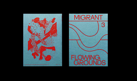
Launched in 2016 in response to the migrant crisis that rocked Europe from 2015 onwards, Migrant Journal is a six-issue publication that considers the complex phenomenon of migration with a nuanced and artistic sensibility.
Issue one focused on the countryside as the setting for many types of migration, from Syrian refugees trekking across the Balkans and South American ‘illegals’ passing through Mexico into the USA, to the movable border that runs between Austria and Italy high up in the Alps.
Text is accompanied by detailed maps, charts and graphs to bring these complex stories into sharper view, alongside photography that shows the different types of migration first-hand. Each issue uses a single metallic colour profile to unify its many disparate stories as well as give an other-worldly sheen.
Migrant Journal’s designers Isabel Seiffert and Christoph Miller created a distinctive typeface for their new magazine. “We wanted something contemporary, tough and serious, but strange and kind of odd at the same time,” explains Seiffert. “The hard edges we use on some of the letterforms come from the idea to have some sort of resemblance to borders, and these characters are then combined with more humanistic shapes like the lowercase ‘a’.”
02. Berlin Quarterly
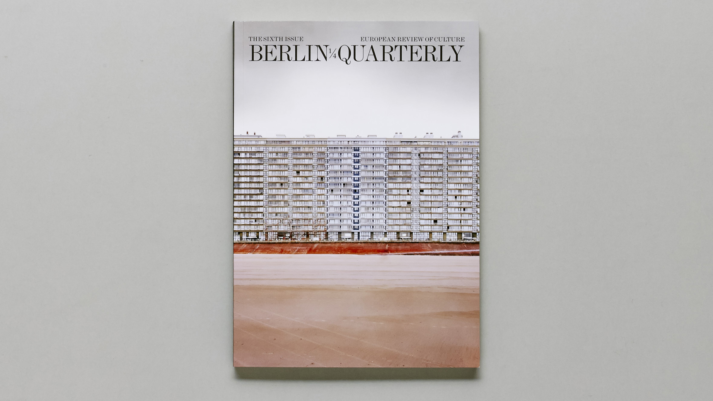
Calling itself a “European review of long form journalism, literature and the arts”, Berlin Quarterly is a fascinating blend of in-depth reportage, literature and visual culture that Steve Watson, creator of indie mag subscription service Stack, firmly recommends.
“It’s a heady mix of essays, fiction, poetry, photography and artwork,” Watson enthuses. “Based out of the German capital, it wears that city’s bohemian reputation on its sleeve.”
It's definitely worth slipping into the suitcase for when you fancy getting stuck into some meatier content.
03. Buffalo Zine
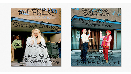
Buffalo Zine is a fashion title that satirises the world it celebrates. Each issue takes a completely different format – for example, one was in the shape of a hardback Victorian children’s book, and a recent issue was released as a series of pastiches on interiors magazines.
The issue that won Magazine of the Year at the Stack Awards in 2017 was a relatively large format publication, and all of it was produced in and around the team’s office in Hackney.
That meant persuading cover star Pamela Anderson to pose in the alleyway behind the office, and also gave the team licence to explore the place from every conceivable perspective, for example drafting in Iain Sinclair to write an essay on the history and psychogeography of the building and its surroundings.
The hand-drawn masthead on the cover speaks to Buffalo Zine’s fun, free-wheeling energy. One of the editors, David Uzquiza, notes that while the team thought this would be the simplest issue so far, because they didn’t have to go anywhere, it actually ended up being the hardest as they tried to work around the constraints of the building.
04. Racquet
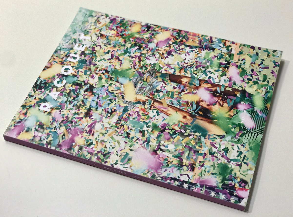
Racquet is “one of those indie titles that purports to be about one thing (in this case, tennis) but in fact uses that as a prism through which to explore all sorts of things. You’re never quite sure what you’re going to turn the page and read about,” says Rob Alderson, former editor-in-chief of Printed Pages, who now heads up WeTransfer’s editorial division, This Works.
A quarterly title that celebrates the art, ideas, style and culture that surround tennis, Racquet “fondly remembers the swashbuckling sport of the tennis boom of the 1970s and ’80s” and aspires to “restore some of that swagger to today’s game.”
“It looks and feels beautiful – as a lot of indie titles do – but the writing is exquisite and it’s edited really well too, which makes for a perfect print experience,” adds Alderson.
05. Shelf Heroes
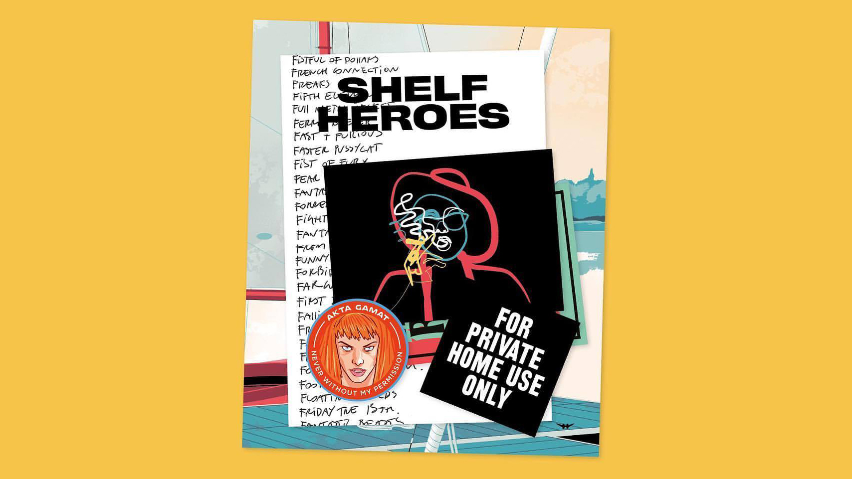
A wonderfully simple editorial premise lies at the heart of the intermittently printed fanzine Shelf Heroes, the magazine 'created by people who love cinema'.
It’s working its way through the alphabet, and celebrating a diverse batch of films that start with each letter: 'Some great, some not so great.' Issue one, as you might expect, was A – with films including Alien, Apocalypse Now, Avatar and American Ninja 3: Blood Hunt.
Shelf Heroes has now reached the letter 'G', which riffs on Groundhog Day, Ghost in the Shell and The Godfather, among others.
06. hotdog
One of the most exciting things about independent magazines today is the speed and energy with which rules are being broken, as people who have no background as editors or art directors stumble across this newly democratised form of print.
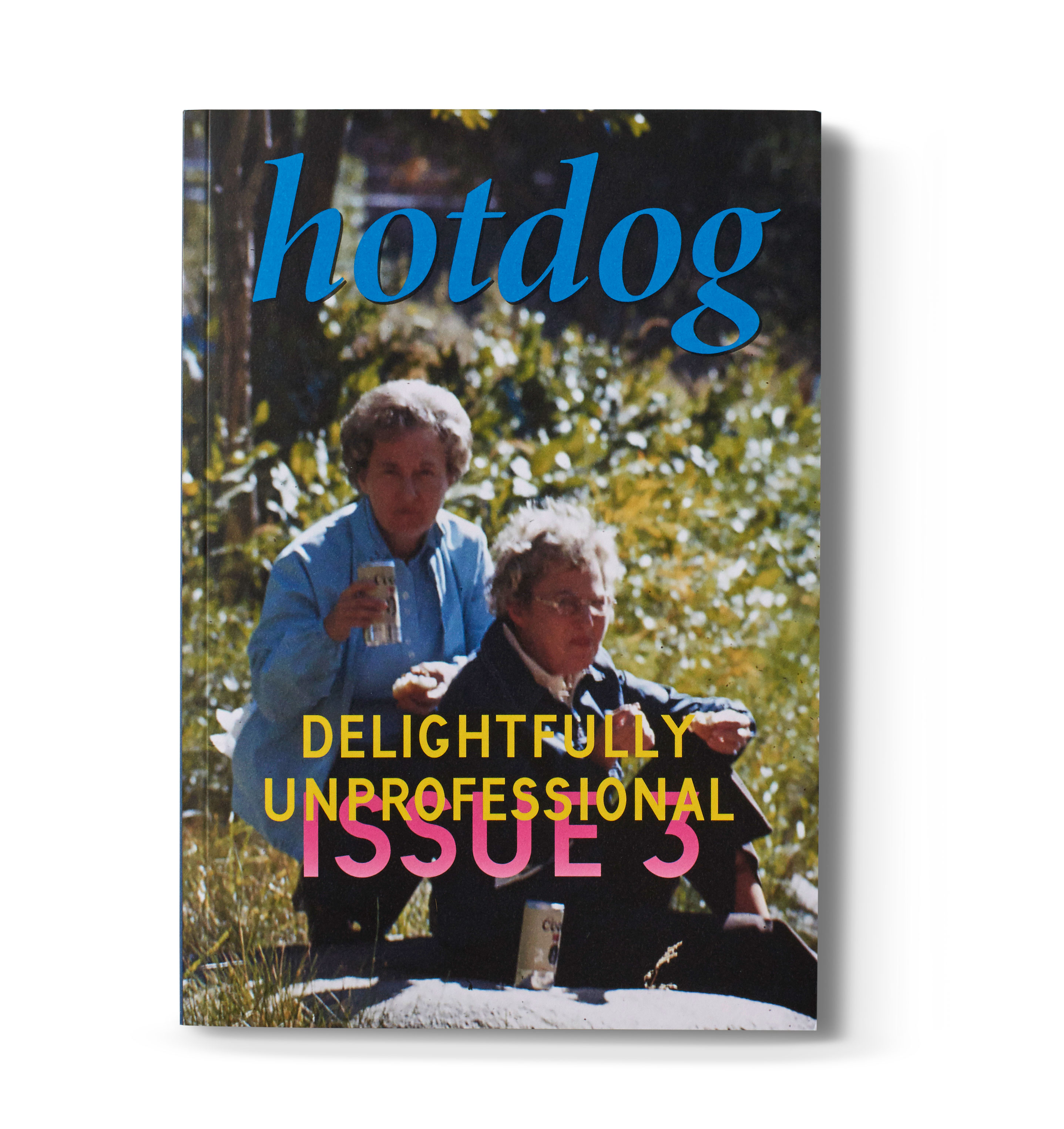
Megan Conery and Molly Taylor are two such magazine makers, and it has been brilliant to watch the rapid evolution of hotdog, the poetry magazine they launched at the start of 2016. That first issue was published in newsprint (the cheapest, simplest way of putting ink on paper), while issue two took the step up to a glossy cover and staple binding, and the third issue emerged bigger and better than ever, with its perfect bound spine and literary journal format.
The theme of this latest issue, ‘delightfully unprofessional’, is splashed across the cover in pure yellow block capitals, and throughout you’ll find an excess of colour gradients, InDesign grid lines and desktop iconography. It’s all there to emphasise the fact that the makers are outsiders – feeling intimidated and excluded by the poetry establishment, Conery and Taylor turn instead to the sort of pieces that mean something to them. It’s brilliantly unassuming, as well as being fresh and profound.
Also notable is the fact that hotdog only publishes work by female-identifying, non-binary and transgender writers, though that is not made explicit anywhere within its pages. Instead Conery and Taylor prefer to let the work speak for itself, allowing readers to find their own way through the art and imagery.
07. The Exposed
Augmented reality in a printed magazine sounds like an odd concept. You point your phone at the page and suddenly photography springs to life or illustrations chase each other around the place. This might be good for a brief diversion, but is generally useless for taking you deeper into the story, as the screen becomes a glowing barrier between the reader and the stuff actually printed on the page.
The Exposed is a brilliant exception to this rule, and it succeeds by building augmented reality into the storytelling itself. For example, its opening story is a report from Masdar City, the ambitious development in Abu Dhabi that is seeking to become the world’s most sustainable eco-city. A series of pictures by photographer Etienne Malapert show gas-guzzling supercars standing outside eco buildings, and deserted dusty streets in the would-be metropolis.
Point your phone at the pages and an audio narration begins by Malapert, giving more context and personal recollections on his trip and the strange world he found there. The experience is something like listening to a podcast while also browsing through a collection of associated photographs, and draws the reader/listener deeper into the story.
Elsewhere in the mag, video is used to similar effect, with the extra layer of media always adding to, rather than distracting from, the experience. Beautifully simple and completely engrossing, The Exposed is one of the most innovative titles around.
08. Real Review
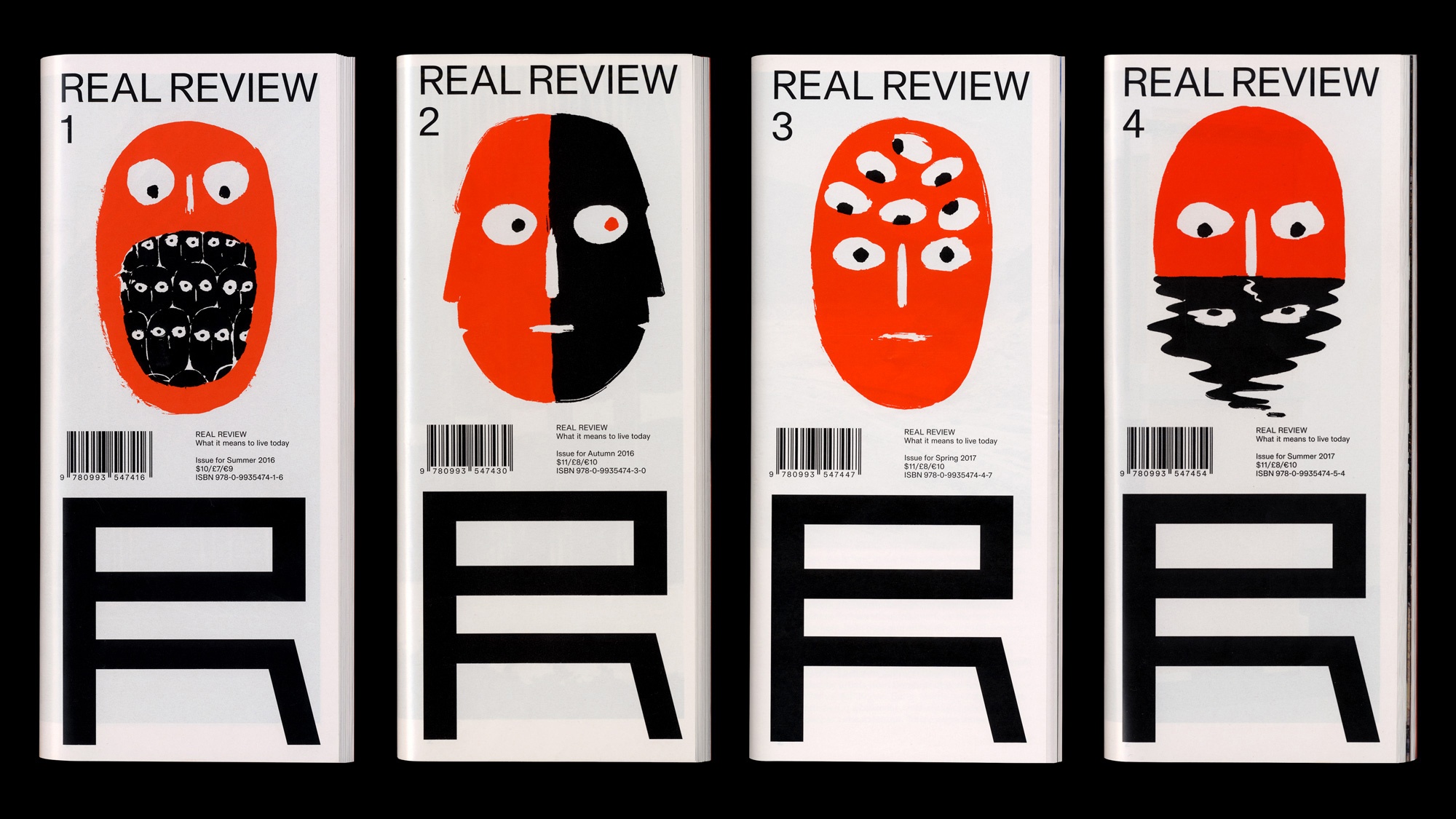
The quarterly flagship publication of the Real Foundation, Real Review was named Launch of the Year at the 2016 Stack Awards. Since then, according to Watson, it has gone from strength to strength.
“Its roots are in architecture, but this ingenious review ranges far and wide to challenge the way we see the world,” he explains.
Jeremy Leslie from magCulture is also an advocate, drawing attention to the title’s unique format: square, with a vertical fold.
“Real Review deserves praise too for its editorial design and content,” argues Leslie. “It examines contemporary life with a spare and intelligent vocabulary that both tests and thrills. Content and form that should be at utter variance somehow complement each other perfectly.”
09. NXS
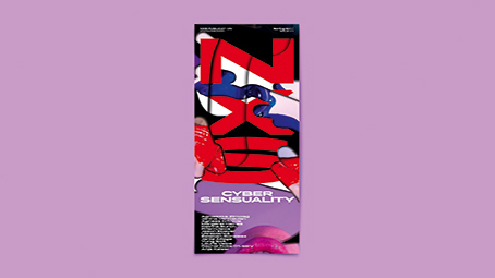
Pronounced ‘nexus’, NXS launched last year as a meeting place for different perspectives arranged around a single theme. The launch issue investigated the sexy meeting place of people and machines with its theme of Cyber Sensuality, expressed on the cover with a collection of glistening and rumpled CG textures. Another issue is themed around Synthetic Selves, digging down into the competing ideas of self in the 21st century and represented on the cover with a Rorschach test inviting the reader to see what they will.
Tall and thin, it stands out above other titles on the newsstand, and is intended to replicate the long screens we spend so much time scrolling through online. The two issues so far have switched up everything from the mastheads to the fonts and graphic design in order to create a completely different look and feel for each issue.
“When we started the magazine, we decided that every issue will have its own identity and graphic style that best suits the subject,” explains NXS co-founder Monika Grūzīte. “All contributors are asked to respond to the essays, interviews, illustrations or stories that came before their own, and we’re aiming for a design that reflects on the created network of contributors and communicates a specific mood related to the topic that is addressed in each issue.”
10. Lost
There’s a huge interest in independent magazines across Asia, and it’s growing particularly quickly in China. Chinese versions of independent favourites like Kinfolk and Drift are distributed throughout the country, and while censorship laws forbid unlicensed individuals from producing their own magazines, there’s a growing community of independent publishers who are groping their way through the grey areas to find their way to print.
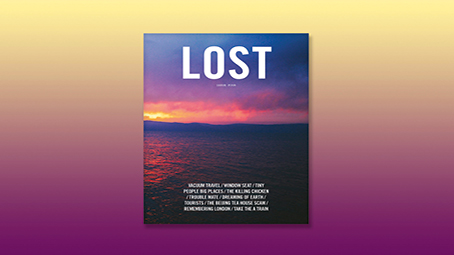
Lost is a travel magazine published in Shanghai that tells first-person stories from travellers all around the world. This isn’t a Chinese travel magazine, it’s a travel magazine that happens to be made in China. The stories are presented in both English and Mandarin, and founder, editor and art director Nelson Ng does a beautiful job of presenting the texts alongside each other, describing them as being like instruments in a band.
Often the temptation with translations is to give the languages equal space and prominence on the page as a way to please both sets of readers, but as Ng says, “Sometimes you want the keyboard to stop, and just let the guitar solo for a while.”
His musical interpretation allows the Chinese and English texts to flow through the magazine, advancing or retreating in response to one another and set over lovely photography that places the reader at the heart of the travel experiences. And the exposed binding means that every spread in this big, thick magazine opens fully flat to show the lovely, balanced layouts to full effect.
Related articles:

Thank you for reading 5 articles this month* Join now for unlimited access
Enjoy your first month for just £1 / $1 / €1
*Read 5 free articles per month without a subscription

Join now for unlimited access
Try first month for just £1 / $1 / €1
Get the Creative Bloq Newsletter
Daily design news, reviews, how-tos and more, as picked by the editors.

Nick has worked with world-class agencies including Wolff Olins, Taxi Studio and Vault49 on brand storytelling, tone of voice and verbal strategy for global brands such as Virgin, TikTok, and Bite Back 2030. Nick launched the Brand Impact Awards in 2013 while editor of Computer Arts, and remains chair of judges. He's written for Creative Bloq on design and branding matters since the site's launch.
