9 great uses of travel photography in web design
These sites all harness big and beautiful imagery effectively to draw the visitor into their content.
With desktop screens getting larger and wider, and more of us accessing the web on our smart TVs, big, bold and beautiful images are a great way to grab a website visitor’s attention.
The tourism industry is among those taking full advantage of this trend, and these sites all make the most of stunning, high-resolution travel photography to lure in potential customers.
Of course, there are plenty more sites out there making great use of travel photography. If you’ve spotted one, please let us know about it in the comments!
If you're hitting the road, see our guide to the best travel laptops.
01. Wonderfully Wild

Wonderfully Wild is a company in Anglesey, Wales that offers glamping (luxury camping) holidays, and there’s a suitably luxurious look to the epic, full-screen landscape photography that dominates its website. These imposing natural panoramas are balanced beautifully by the bright colours and hand-drawn style typography, giving a friendly, magazine-style feel to the overall design.
02. Travel Alberta Trip Planner

Travel Alberta’s site has a ton of information about the Western Canadian province for tourists. But if you just want to plan a single trip, this elegant mini-site makes that task elegantly quick and simple. The design is suitably minimal, with bold, in-your-face travel image dominating each section, and selling the story far better than mere words could. And as you click through each stage of the process, there are some lovely slideshow transitions to make it a pleasurable experience. The site was created by Dutch agencies Build in Amsterdam and Eigen Fabrikaat.
03. Another Escape

Created by a small dedicated team in Bristol, England, ‘Another Escape’ is a magazine focusing on outdoor lifestyle, creative culture and sustainable living. With its print publication boasting high quality production values, the website ploughs much the same visual furrow. Gorgeously art-directed, the site gives a glimpse into the contents of the magazine by bringing together fullscreen, epic landscape photography with chunks of text in inventive, delightful ways as you scroll through the content.
04. Red Rock Ranch

The Red Rock Ranch is a vacation centre in Wyoming, USA, that offers the authenticity of a “true western dude ranch” with many modern amenities. Its website combines imposing full-screen images of the area’s dramatic landscapes with short bursts of video and smaller, inset snaps, literally swinging on an imaginary wall to instil an added sense of homeliness. The site was built by Idaho-based design and advertising agency Motive Media.
05. 12hrs

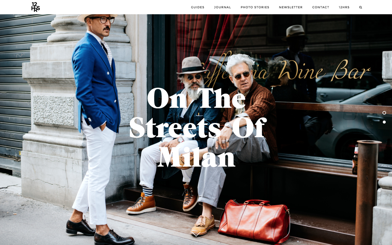
12hrs is a travel website for people who “love to travel, but also love design, and fashion, and art, and want to discover more of it while on the road”. All this is clearly reflected in the arty feel of the website’s design, with quirky yet quality photography is brought to the fore throughout. Created by Anna Peuckert from Germany and Søren Jepsen from Denmark, it’s all unmistakably European and seems squarely aimed at the Instagram generation. That’s most evident in the ‘Photo Stories’ section, which puts 99 per cent of bog-standard travel blogs to shame with its stylish sense of verve and confidence.
06. Traveldose

‘Made with love in NYC’, Travel Dose makes use of parallax scrolling, outsized imagery and an elegant design to bring the feel of a hip, high-end travel magazine to the web. Giving the stunning photography full room to breathe, these deceptively thoughtful, art-directed layouts really suck you into the equally high quality writing throughout.
07. Marco Art Hotel

The Marco Art Hotel in Munich distinguishes itself through its stylish, modern design, and its website doesn’t waste any time introducing you to some attention-grabbing shots of its sumptuous interiors. Keeping the text to an absolute minimum (the amount you’d expect from a mobile app, even on the full desktop site), allows the pictures to do all the talking.
08. Art City

Art City Worldwide is an event company that produces one-of-a-kind experiences based around art, design and fashion, each of which will be documented by award winning photographers and filmographers. Only launched this summer, its website does a brilliant job at conveying just what kind of spectacular street art customers can expect to enjoy, up close and personal, with a carefully considered choice of impactful, full screen imagery.
09. The Fella

The personal website of photographer and web designer Conor MacNeill, aka The Fella, focuses on his travel photography, and each post’s mood fits with that of the image it features. It’s super-easy to navigate and the whole feel of the site is as relaxed as the stunning scenes it features. You can learn more about how the site was built here.

Thank you for reading 5 articles this month* Join now for unlimited access
Enjoy your first month for just £1 / $1 / €1
*Read 5 free articles per month without a subscription

Join now for unlimited access
Try first month for just £1 / $1 / €1
Get the Creative Bloq Newsletter
Daily design news, reviews, how-tos and more, as picked by the editors.

Tom May is an award-winning journalist and editor specialising in design, photography and technology. Author of the Amazon #1 bestseller Great TED Talks: Creativity, published by Pavilion Books, Tom was previously editor of Professional Photography magazine, associate editor at Creative Bloq, and deputy editor at net magazine. Today, he is a regular contributor to Creative Bloq and its sister sites Digital Camera World, T3.com and Tech Radar. He also writes for Creative Boom and works on content marketing projects.
