9 great uses of illustration in logo design
These classic logos make great use of inspiring illustrations.
There’s a big trend in logo design these days towards simplification and minimalism. This trend is all about paring your logo down to the minimum, which may mean using typography alone, or just simple vector graphics... but certainly nothing as fussy as an illustration.
Some classic logos, however, still include detailed and beautiful illustrated elements, which bring an extra dimension to the design and truly make it stand out. Here are some of our favourites. Let us know yours in the comments below!
01. Guns n Roses
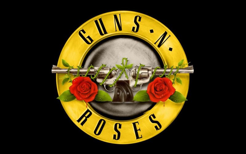
Formed in 1985, the rock band behind hits like Sweet Child O’ Mine have had a number of logos over the years. But our favourite has to be this classic design, depicting the two elements of the band’s name literally, against the background of a silver bullet... and with a couple of subtle drops of blood to ram home the point.
What’s known by fans as the ‘bullet logo’ has adorned T-shirts, posters and tickets across multiple decades, and was revived for last year’s Coachella appearance. The origins of its design are unclear, though, with a disputed claim that it was drawn by drummer Steven Adler. Learn more about the evolution of the GnR logo here.
02. Malibu
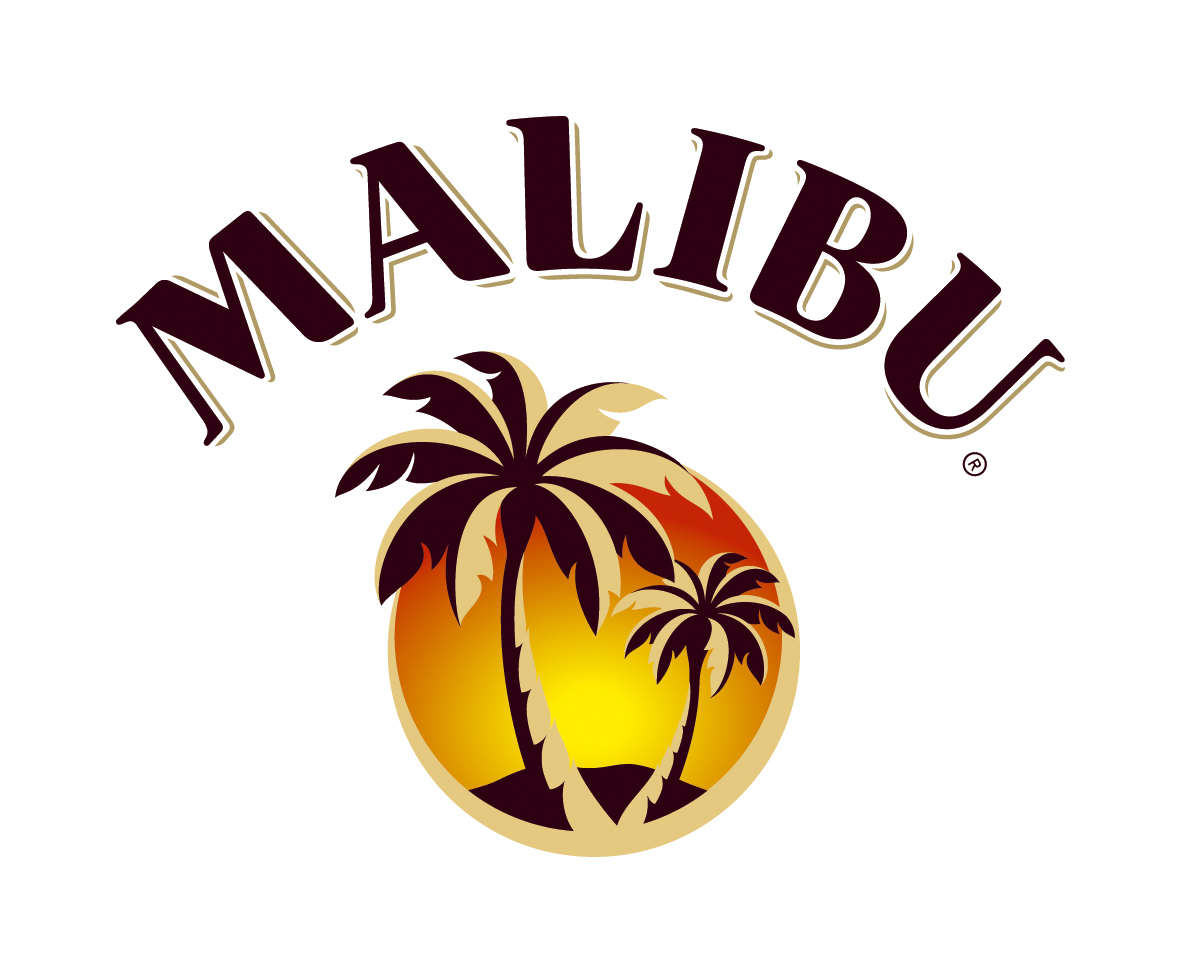
A rum cocktail that’s 42 per cent proof, Malibu instantly sums up images of laid-back island living, and that’s thanks in no small part to its famous illustrated logo.
Featuring serene palm trees set against a golden sunset, the illustration effortlessly conveys the warmth and energy of Barbados life.
The logo design has remained largely unchanged over the years, last receiving a refresh in 2013, when The Absolut Company refined both the illustration and typography. You can learn more about that revamp here.
03. MailChimp

An email newsletter company doesn’t sound like something that could ever become hip. But that’s just what MailChimp, founded in 2001, has achieved, in part through a strong focus on design. Central to that effort has been the loveable cartoon monkey that’s become synonymous with the brand and its handwritten wordmark.
The original MailChimp logo was designed by MailChimp founder Ben Chestnut in 2001; in his words it was “hacked together” in Firefox and he was never really happy with it. So in 2008, he commissioned Jon Hicks (who also created the Firefox logo) to design a new version, featuring a 3D illustration of the monkey, and the rest is simian history.
You can learn more about how the illustration was made in this blog post.
04. Toblerone
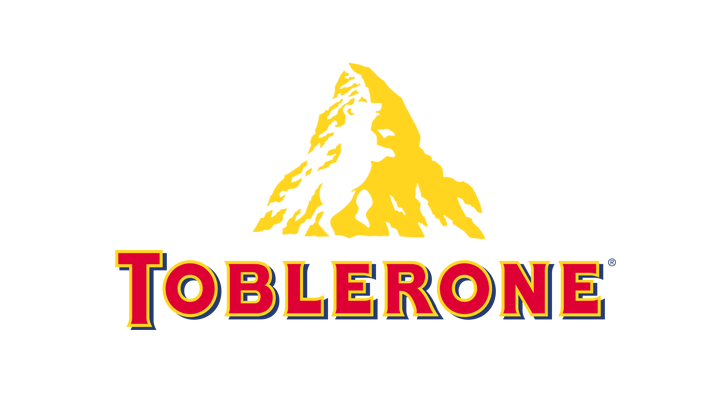
People hate change, and right now fans of Toblerone are up in arms about the slimming down of their favourite Swiss chocolate bar (the packet is still the same size, but inside there are fewer triangles).
At least some things in life stay constant, though, and that includes the brand’s iconic logo. It depicts the Matterhorn mountain, a famous landmark in Switzerland, and if you look closely it also contains the outline of a bear. That’s no coincidence; it was incorporated into the design as a symbol of the city of Berne, where Toblerone is produced.
Oh, and in case you were wondering, the name of the brand is a play on the Italian words for honey (Tobler) and almond nougat (Torrone).
05. KFC
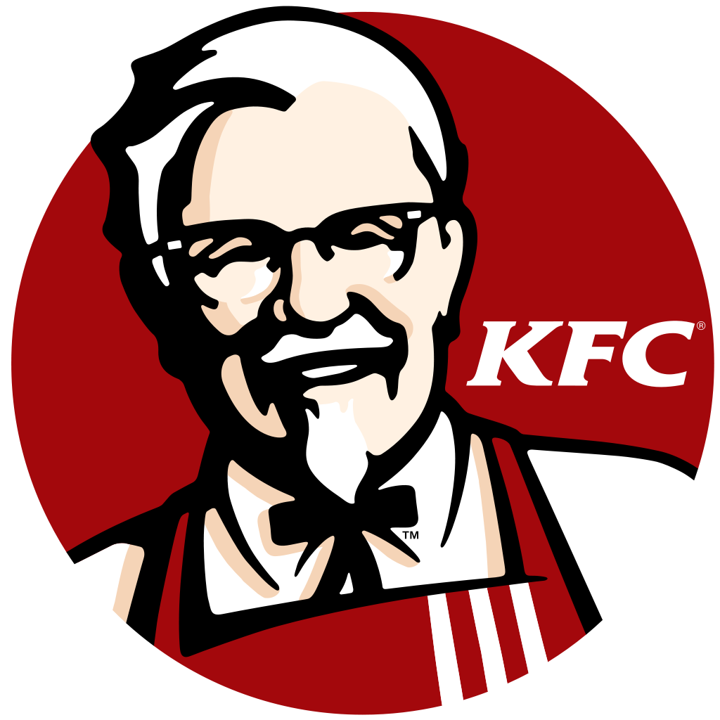
On its own, the KFC wordmark is a perfectly executed piece of logo design. But in no way is it likely to get your mouth watering like the full version of the logo, featuring a grinning Colonel Saunders in chef’s apron.
This latest version of the logo was created by branding company Tesser in 2007, whose clients also include Popeye’s, Wendy’s, I Hop and Domino’s. The new design softened the artwork with soft, organic linework, making the Colonel appear more youthful and energetic without substantially altering his appearance.
You can learn more about KFC’s logo history here and more about the Tesser redesign here.
06. Wendys
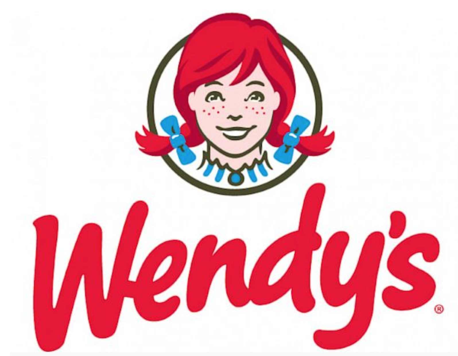
Fast food chain restaurants are always keen to emphasise they’re a place for families. And for decades Wendy’s has placed that message at the heart and centre of their logo, with a happy, smiling all-American girl.
The drawing in the original logo was a stylised portrait of Melinda-Lou "Wendy" Thomas, the freckle-faced eight-year-old daughter of the chain’s founder, R. David Thomas.
The latest iteration appeared in 2013, now featuring a more grown-up and less cartoon-like version of Wendy. This update was widely applauded and some even spotted a ‘hidden message’ in it. People commented that the collar looks like it’s spelling out the word ‘Mom’, although Wendy’s responded that this was unintentional coincidence.
You can see the full evolution of the Wendy’s logo here.
07. Hooters
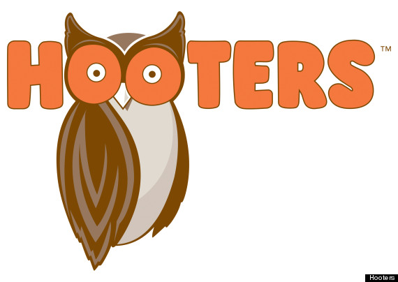
Let’s face it, no one goes to Hooters, a restaurant chain whose main attraction is its large-chested waitresses, because of the brand’s design sensibilities.
Even so, after 30 years, its incoherent and amateurish owl logo – originally traced from an illustration found on a dictionary – was a bit of an embarrassment. So in 2013, Atlanta studio Sky Design gave it a more modern streamlined look, while retaining the essential details, including the cartoon typography, the owl and the double-entendre use of the bird's eyes.
It may still strike you as old-fashioned and tacky, of course, but the brand’s target audience is unlikely to be greatly offended by that.
08. Firefox

Beautifully integrating the ideas of ‘fox’, ‘fire’ and the worldwide web, the colourful Firefox logo is one of the most regularly viewed pieces of design in the world, and for good reason.
Although it’s been tweaked many times over the years, the central illustrative concept remains as powerful and eye-catching as ever. The original logo was based a concept from Daniel Burka that was sketched by Stephen Desroches and then rendered by Jon Hicks using Fireworks MX.
You can read more about how the Firefox logo was created here.
09. Penguin Books
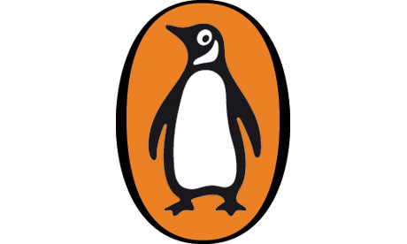
For more than eight decades, Britain’s best-known publishing houses has been inextricably linked in people’s minds with a cute flightless bird.
The first iteration of the emblem came in 1935, when Edward Young, a 21-year-old office junior, was dispatched to London Zoo to spend all day sketching penguins. His amateurish logo was then modified in 1946 by German typographer Jan Tschichold, who gave Penguin a more uniform aesthetic. The latest version was created by Angus Hyland in 2003, who made the bird ‘15 per cent slimmer’ so he could fit better on the book’s spine.
You can learn more about the creation of the Penguin logo here.

Thank you for reading 5 articles this month* Join now for unlimited access
Enjoy your first month for just £1 / $1 / €1
*Read 5 free articles per month without a subscription

Join now for unlimited access
Try first month for just £1 / $1 / €1
Get the Creative Bloq Newsletter
Daily design news, reviews, how-tos and more, as picked by the editors.

Tom May is an award-winning journalist and editor specialising in design, photography and technology. Author of the Amazon #1 bestseller Great TED Talks: Creativity, published by Pavilion Books, Tom was previously editor of Professional Photography magazine, associate editor at Creative Bloq, and deputy editor at net magazine. Today, he is a regular contributor to Creative Bloq and its sister sites Digital Camera World, T3.com and Tech Radar. He also writes for Creative Boom and works on content marketing projects.
