9 brilliant uses of 3D in web design
Check out these brilliant implementations of online 3D.
3D on the web truly arrived in 2011 with the launch of WebGL, a JavaScript API for rendering 3D graphics within a compatible browser without the use of plugins. And the following years saw a lot of excitement for the possibilities of 3D amongst web designers.
That initial hype may have died down in recent years. But the development of online 3D has continued apace, and there are some pretty impressive implementations out there; from ‘wow factor’ visuals that act mainly as proof of concept, to thoughtful uses of 3D squarely aimed at crafting a great web experience.
In this post, we list some recent uses of 3D on the web (some small and subtle, some flashy and epic) to inspire your own projects. Oh, and if there’s a great use of 3D you’ve spotted out in the wild, please do share a link in the comments.
01. Acko.net
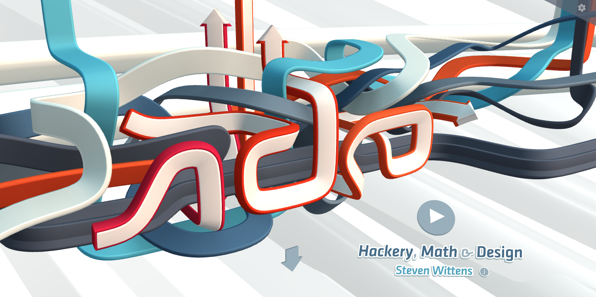
If you’re looking for an example of what browser-based 3D can bring to the web, you need look no further than Acko.net, the personal site of web developer Steven Wittens. It features a beautiful animated header inspired by street art; it’s a simple idea but wonderfully executed.
Wittens created it using a combination of CSS 3D and WebGL. “The twisting of each ribbon is not generated arbitrarily, but mathematically derived,” he explains. “It embodies the differential principle of parallel transport. The up direction changes parallel to each curve, which means the ribbons never rotate in place. They only turn when they naturally want to. Hence, the design kind of has a will of its own.”
You can read the full story of how he put it together in this blog post. And if the animation isn’t working in your browser, you can check it out in this video.
02. Campo Alle Comete
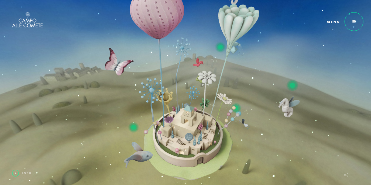
Since it launched in February this website has already won a ton of awards, and it’s not hard to see why. Created to promote the Italian wine Campo Alle Comete, it depicts a 3D floating city, “where dreams and magic can finally meet”. The imaginative qualities of the design, married with the smoothness of the implementation, are quite staggering, and it’s truly a joy to whizz around this fantastical world using your mouse.
Built by Italian studios AQuest and Monogrid, this brilliant use of 3D on the web was created using WebGL and GSAP along with three.js and AngularJS.
03. Stripe.com
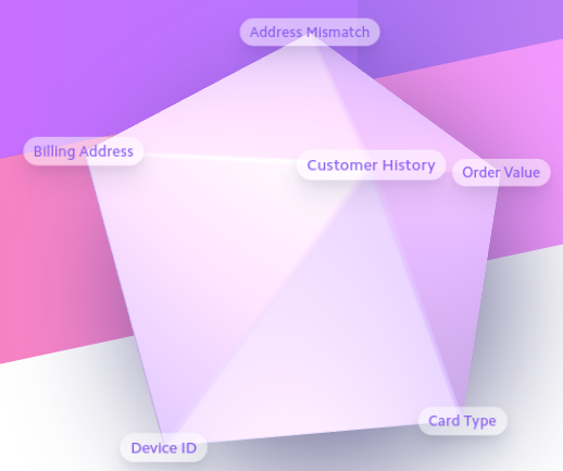
A much simpler implementation of 3D, this interactive, rotating icosahedron is nonetheless very effective in presenting a range of menu options in a cool and original way. Featured on payment platform Stripe’s site, it was designed by Bill Labus, based on an idea on Krithika Muthukumar, who works on product marketing at Stripe.
“She was envisioning a way to visually represent a Stripe charge from the perspective of Radar, which uses machine learning to score incoming charges and predict the likelihood that they’re legitimate or fraudulent,” Labus explains. “Machine learning is fairly abstract by its nature, so a 3D object seemed an effective way to make the concept more tangible.”
Machine learning is fairly abstract by its nature, so a 3D object seemed an effective way to make the concept more tangible
Bill Labus
The primary technology used for this is WebGL, although it’s a fairly low-level API, says Labus. “We chose three.js as a higher-level framework that abstracts over WebGL and makes it simpler to load objects, setup lighting and materials, and more. As a matter of fact, we were lucky enough to find that three.js includes an icosahedron by default as one of its built in primitives.
“The initial version simply used the built-in primitive. However, we decided later that we wanted rounded edges on the shape to better match the existing 3D aesthetic use elsewhere on stripe.com, so we rendered a rounded icosahedron in Cinema4D and loaded it as an object into three.js. The vertex labels that represent the various attributes of a charge are not rendered in the 3D environment, but as normal HTML elements above the 3D canvas. This was to ensure the highest quality rendering for text and also to make localisation easier.
“When animating the icosahedron, we calculate the positions of the vertices, as well as whether or not they’re currently visible or obscured behind the object, and then use that information to position and show/hide the label elements.
“Another element that is not rendered in the 3D environment is the shadow cast by the object. Because it’s sufficiently diffuse, we were able to simply blur a <div> behind the 3D canvas, without it being noticeable that the shadow’s shape does not perfectly match the shape of the icosahedron. This was done primarily for performance reasons, as large, diffuse shadows are typically one of the more expensive effects to render, especially within an animation loop.”
04. Diane Martel

We’ve seen web text in the style of the Star Wars opening credits before, but never like this. The website of American music video director and choreographer Diane Martel (best known for the ‘Blurred Lines’ video) uses the device to great effect to showcase the titles of her work across her homepage.
Use your mouse to twist and rotate them as they scroll, hover over a title to reveal more stills, or click through to the full page. This colourful and impressive site was designed by Ben Wegsheider, whose own website features some pretty nifty 3D tricks too.
05. OS Maps
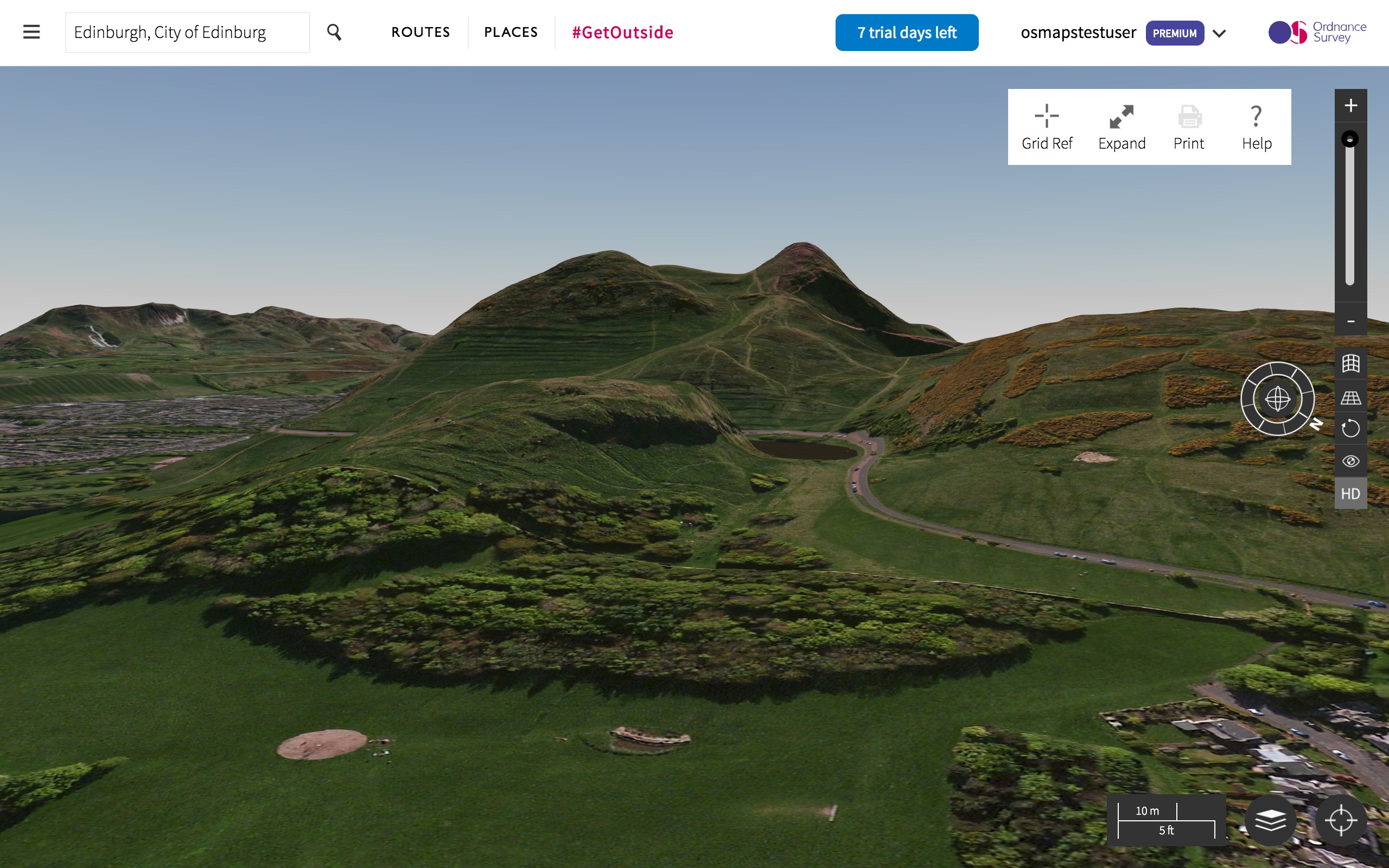
From a fun and frivolous use of 3D to a full-on, functional one. Yesterday, Ordnance Survey, the UK’s national mapping agency and one of the world's largest producers of maps, gave its award-winning OS Maps a major update, introducing accurate 3D mapping of the British countryside.
Beloved by walkers, cyclists and others traversing the hills and valleys of the UK, OS Maps is available through the web and as an app. “It has in excess of 750,000 routes stored in it and the 3D element will mean you can better see the routes and get an idea of whether the route is achievable,” reveals press officer Keegan Wilson.
The 3D mapping, which has been constructed in spectacular detail using incredibly accurate lasers, is available through the web to OS Maps subscribers only. However, anyone wanting to investigate and have a look round can do so through a seven-day free trial.
06. Earth 2050
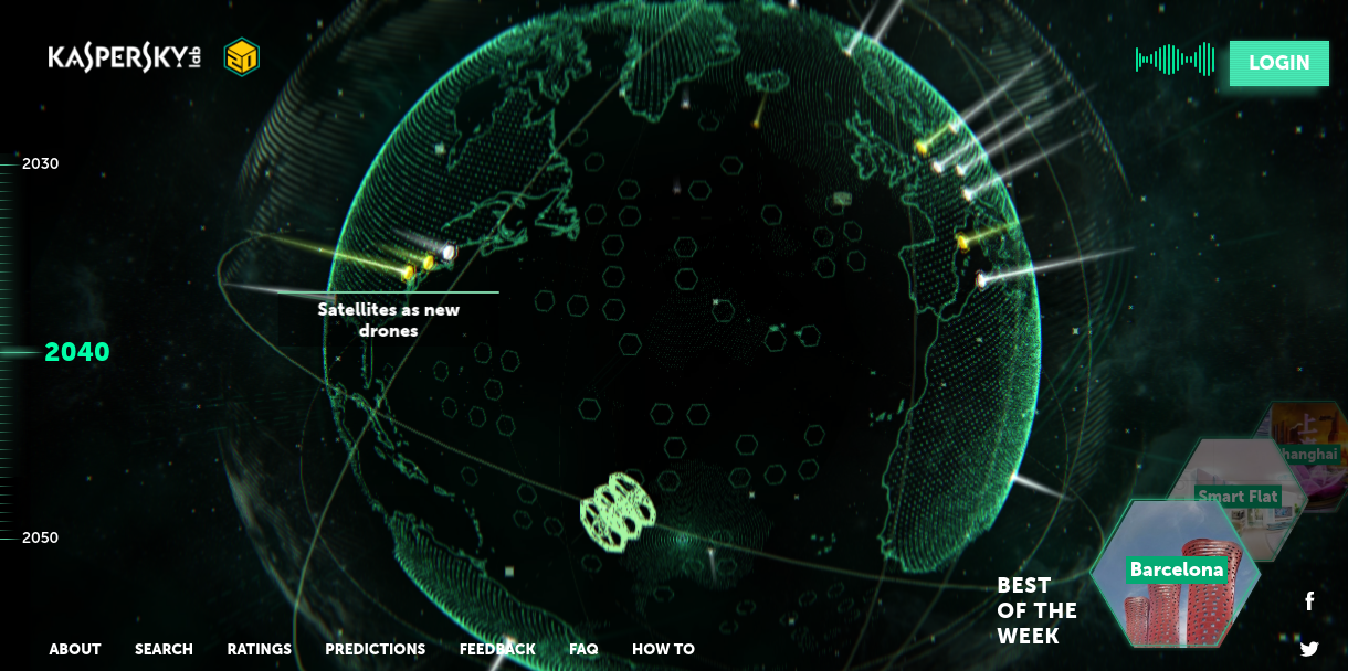
To celebrate its 20th anniversary, security giant Kaspersky has launched an interactive project that invites users to discuss the world of the future, the opportunities it brings and the threats it might cause. At its centre is Earth 2050, a cool site built by Moscow studio Possible that invites designers and illustrators upload their visions of the future via an interactive portal.
The homepage features a rotating planet Earth divided into geographical areas, with each including a forecast on a certain aspect of 2050 life. Any designer, illustrator or artist can upload their work, and members of the public can comment on whether they believe certain predictions will come true.
“Our concept was inspired by Google Street View and PC games like UFO and Civilization, as well as the futuristic outlook of Kaspersky Lab themselves,” explain the team at Possible. “The globe was creating using native WebGL, HTML5, CSS3, JS, WebGL and PHP 7. Building the frontend involved bandwidth optimisation and standard browser caching, content modules, coding, WebGL modules with the planet, browsing and panorama editing.”
07. Titouan Mathis
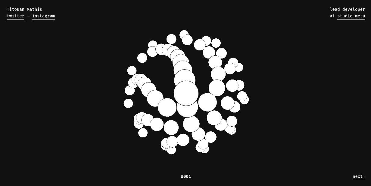
Titouan Mathis, a web developer based in Strasbourg, France, has a very simple website that he uses to link out to his Twitter, Instagram and employer Studio Meta’s site. But he livens it up with an amusing splash of interactive, animated 3D: three constantly spiralling patterns that look super-stylish, and which you just can’t help but play around with.
“The inspiration mainly came from things I come across during my day,” Mathis explains. “Sometimes all these things mix themselves and an idea pops in my head. I'll try to recreate it and play around with the shapes to find nice ways to interact with them.”
The three animations were all created with HTML, CSS and JavaScript, with Vue.js helping out in terms of structure, and the code is available on GitHub if you want to check it out. “The biggest technical challenge was performance,” Mathis adds. “My familiarity with HTML, CSS and JavaScript allows for rapid prototyping of ideas, but animating lots of DOM elements can quickly become quite heavy on the browser. My next animations will certainly be created with Three.js or a similar library.”
08. The Magicians Season 2
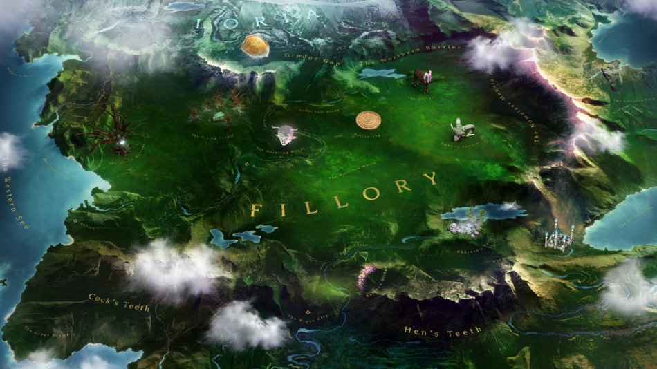
On to another interactive map, this time for the fictional world of hip TV fantasy show The Magicians. UK agency Unit 9’s team of programmers used Three.js, WebGL and GLSL to develop this brilliantly interactive map, where users can embark on quests and discover more about season two. From fantastical creatures to ancient Gods, each weekly quest mirrors the theme of each episode. Even if you don’t watch the show, this immersive use of web 3D is still very much worth a visit.
09. Pursuit of Sound
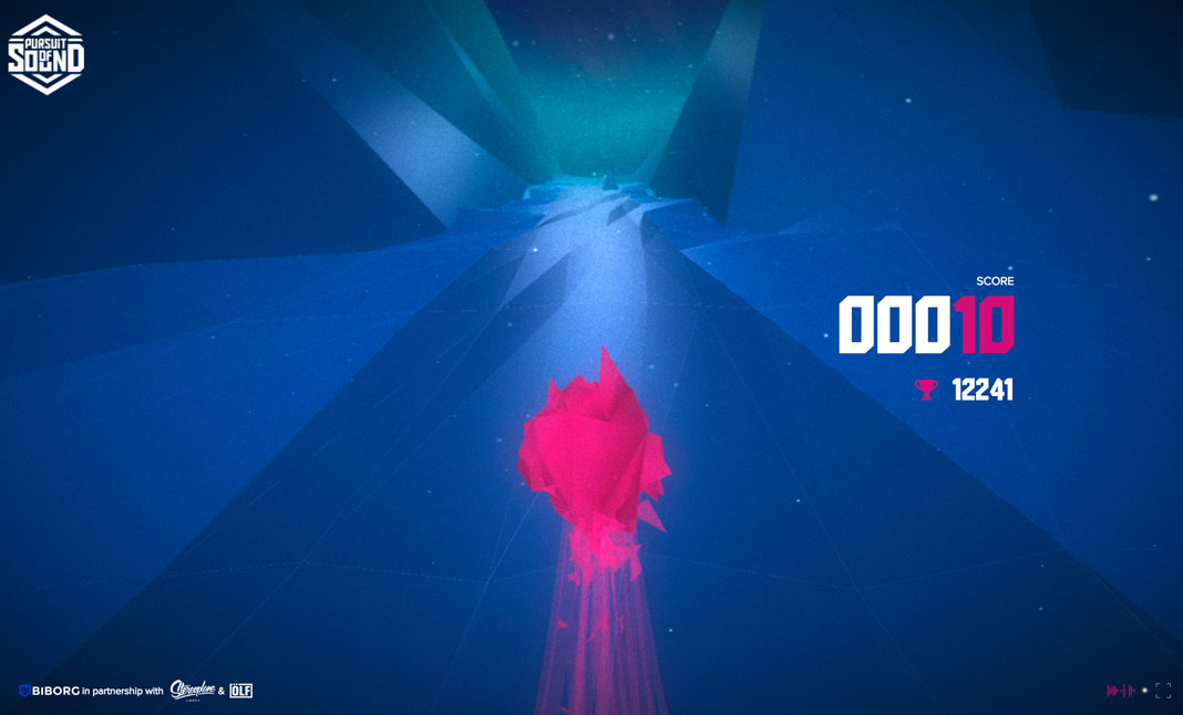
We’ll end with something that’s just plain fun. Avoid obstacles, catch the items and create your own soundtrack through your mad musical run, in this crazy WebGL experiment. Aimed at both the casual desktop/mobile user and the VR enthusiast (it’s compatible with Google Cardboard), this is a great showcase for the 3D smarts of Paris creative agency Biborg. Every time you play it, the environments are different, and it’s very addictive... be warned!

Thank you for reading 5 articles this month* Join now for unlimited access
Enjoy your first month for just £1 / $1 / €1
*Read 5 free articles per month without a subscription

Join now for unlimited access
Try first month for just £1 / $1 / €1
Get the Creative Bloq Newsletter
Daily design news, reviews, how-tos and more, as picked by the editors.

Tom May is an award-winning journalist and author specialising in design, photography and technology. His latest book, The 50th Greatest Designers, was released in June 2025. He's also author of the Amazon #1 bestseller Great TED Talks: Creativity, published by Pavilion Books, Tom was previously editor of Professional Photography magazine, associate editor at Creative Bloq, and deputy editor at net magazine.
