8 inspiring digital art portfolios and why they work
These sites are examples of how online portfolios should be done.
Having an organised digital art portfolio on a single, central website is a great way to promote your work.
Many digital artists share their work online in scattershot ways: a few images on ArtStation here, a Facebook post there, a random series on Instagram or Tumblr... These may excite fans and potential clients at time of posting, but a few months down the line, it’s often impossible to find them again.
Having a website with your artworks in one place will help people to keep finding you. You can still post elsewhere, but link back to this main portfolio site. And services like Squarespace or Wix make it easy to design your own professional-looking site.
If you are considering creating your own portfolio website, here are eight great examples of how to do it right. And even if you’re not thinking of making your own, they’re worth checking out for the fabulous art alone!
01. Jon Foster
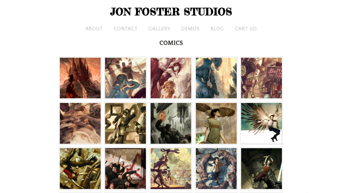
Based in Providence, Rhode Island, Jon Foster is an award-winning sci-fi and fantasy artist. Best known for his covers for DC Comics and Dark Horse Comics, his work has also featured in National Geographic, Teen Wolf and on a number of book jackets.
In short, Foster’s website has a lot of ground to cover. So to make it easier for visitors to find what they’re looking for, his art is all divided up into different section headings, including book covers, comics, sketches, concept work and digital sculpture.
It’s a great example of how to present an extensive body of work in a way that doesn’t feel overwhelming. It encourages visitors to just keep clicking around and discovering more.
02. Nathalia Suellen
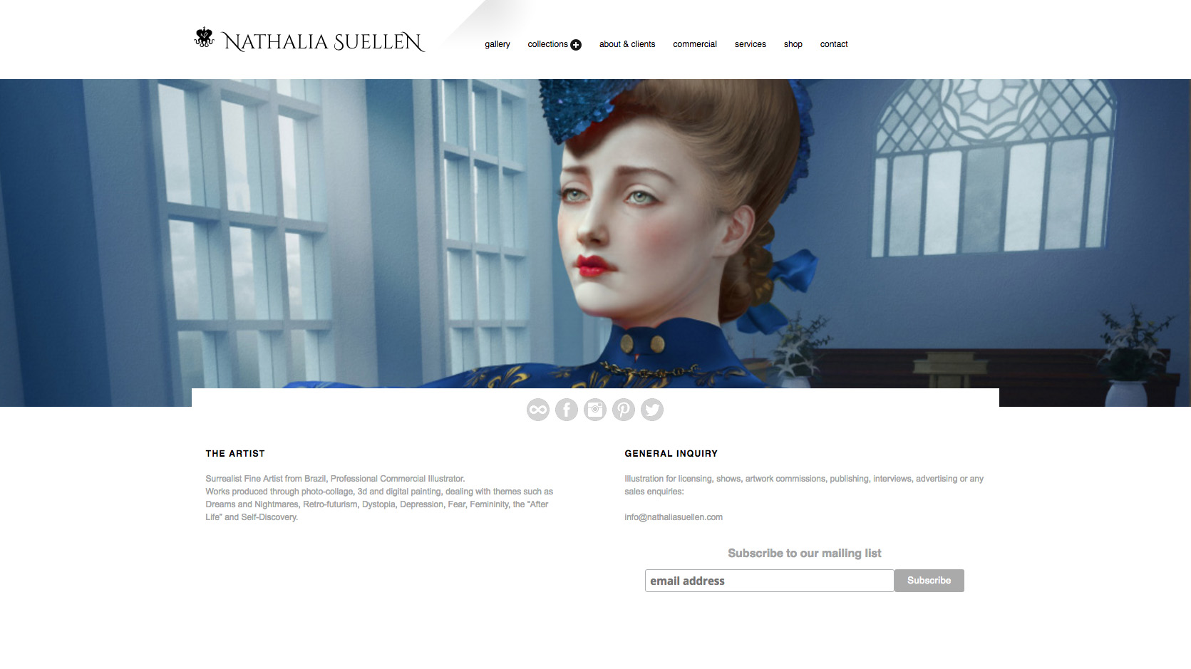
Nathália Suellen is an artist and illustrator based in Rio de Janeiro, Brazil who combines dark art and pop-surrealism using photography, 3D and digital painting. Symbolism, retro-futurism, classical art and dystopia are all common themes in her art.
She presents her unique and original work online within a classy, sophisticated-looking website, which benefits from elegant use of whitespace, refined typography and even a laid-back jazzy soundtrack (which, like her art, subtly veers off into the surreal).
As well as a general gallery, pieces are listed by collection, plus there’s a useful range of information for anyone who wants to hire her or buy her prints.
03. Raphael Lacoste
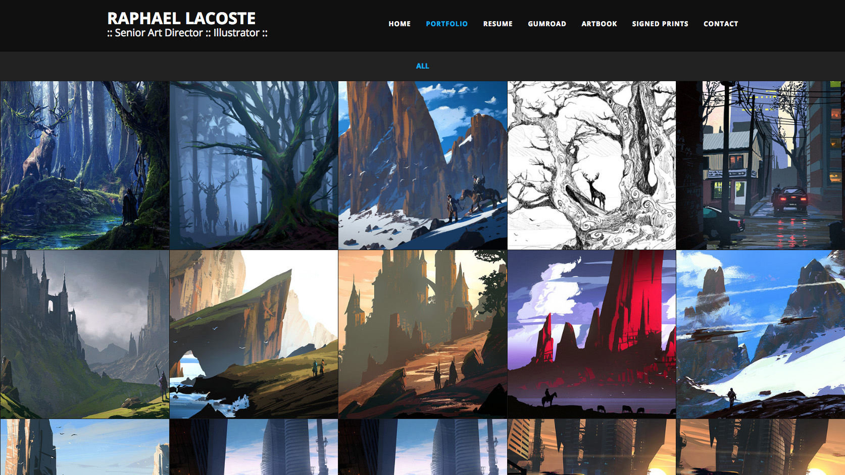
Previously the award-winning art director at Ubisoft on titles such as Prince of Persia, art director Raphael Lacoste stepped away from the games industry in 2007 to work as a matte painter and senior concept artist on such feature films as Terminator Salvation and Jupiter Ascending. Two years later, he came back to games, and currently works in Montreal, Quebec, as brand art director on the Assassin’s Creed franchise.
Lacoste’s grid-based online gallery showcases his concept art beautifully, and we love how clicking through on individual paintings brings you not just a larger version of the image, but a few friendly words about what it is and how it was put together. There are some choice video tutorials included in the mix, too.
04. Todd Lockwood
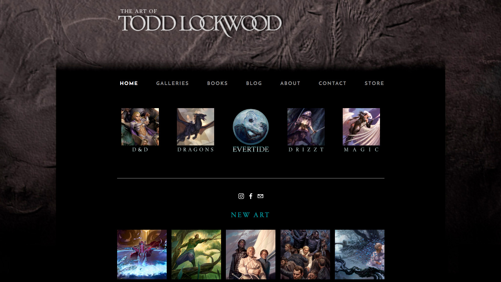
Working as a digital artist for more than 30 years, Todd Lockwood is probably best known for his artwork for the Dungeons & Dragons table-top games, and the books of R.A. Salvatore. Born and raised in Colorado, he currently lives in Washington State and works as an illustrator and author, specialising in sci-fi and fantasy.
Not every artist needs their own logo, but the fact that Todd has given his name a cool typographical treatment is a nice touch, and a sign of attention to detail that emanates throughout the site. Hs extensive portfolio is neatly divided into 10 categories, shown in a dropdown menu that appears when you hover over ‘Galleries’.
In general, the cleverness of this site’s layout lies in presenting a diverse range of activities and media without ever feeling cluttered. It’s not often, for example, that an artist will include a drawing video on their homepage. But a two-minute clip of Todd drawing Dragon’s Pavilion slots in effortlessly to this elegantly modular design, encouraging you to say on the site for longer than you anticipated.
05. Loish
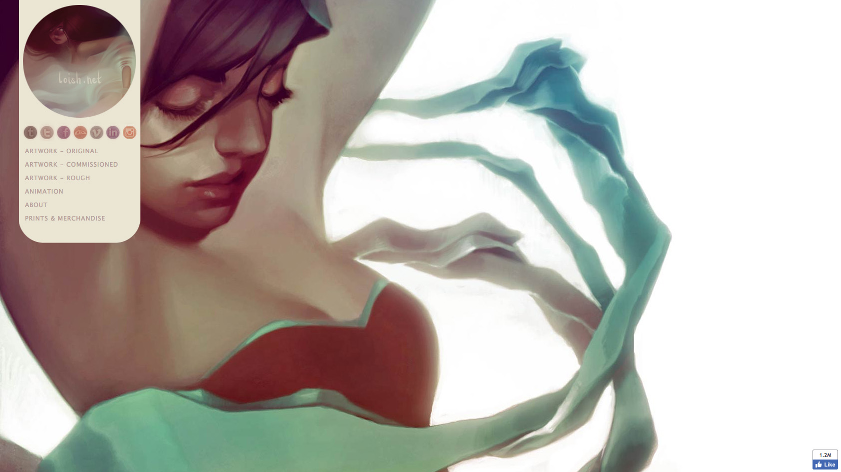
Loish, aka Lois van Baarle, is a Dutch freelance illustrator and animator with a beautifully distinctive style and a penchant for drawing breathless, wide-eyed young women. With clients including Lego, Autodesk and Guerrilla Games, she recently launched her first book, The Art of Loish, which we reviewed.
It’s not often you see a digital artist’s portfolio site that’s actually art-directed: most are pretty standard, grid based offerings. But Loish’s site boasts an original and attractive design that both reflects her own style and feels light and contemporary, never overpowering the actual art.
It’s great, too, to see Loish sharing not just final versions of original and commissioned work on her site but also roughs, as well as her animation showreels. And the fact she has a cool website certainly hasn’t discouraged people from following Loish on Instagram: she has 863,000 followers there, and more than a million on Facebook.
06. Kate Pfeilschiefter
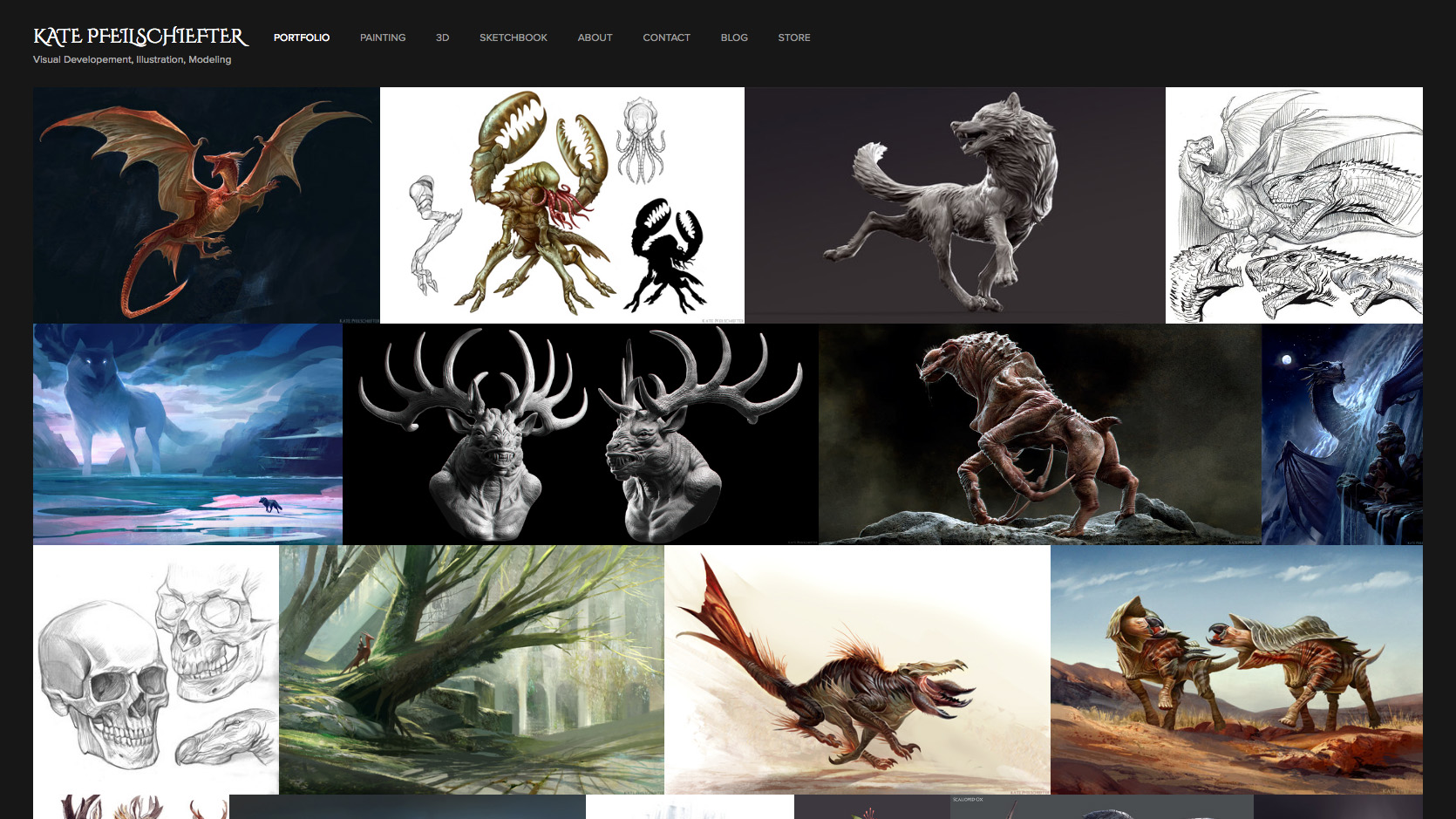
Kate Pfeilschiefter is a freelance concept artist and illustrator currently living and working in Redmond, Washington State. She specialises in creature design and visual development, and clients include the likes of Paizo Publishing, Wizards of the Coast, Digital Double and Ember Lab.
Other than the ‘About me’ page, her site is purely about the art, and the design is pretty simple. But that still makes it a darn sight more attractive and enjoyable to peruse than just chucking it all on DeviantArt.
We like how you can view either the overall portfolio or smaller selections of work under the headings ‘3D’, ‘Painting’ and ‘Sketchbook’. It also links out to a pretty cool blog, showing behind-the-scenes stuff that gives useful extra insight into her work.
07. Noah Bradley
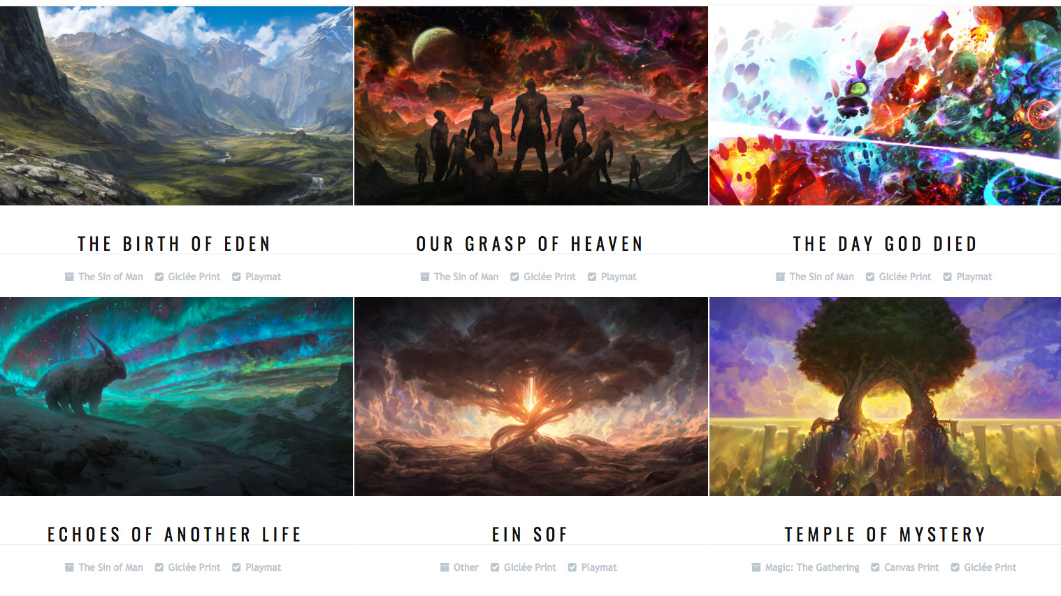
Best known for his art for Magic: The Gathering cards, Noah Bradley is a concept artist and illustrator based in Virginia. He’s currently working on his own creation, The Sin of Man, which he describes as “a primal fantasy world, full of sombre mystery, faceless giants, and wandering nomads”.
Bradley left social media in early 2015 and “never missed it”, instead using his own website to showcase his work. The top half of his homepage is a Reddit-style, text-heavy rundown of what he’s been up to, including an audio and video course entitled ‘The Art of Freelancing’. Scroll down, and you’re greeted with a gorgeous selection of concept art that will clean take your breath away. Click through to his store to see the grid-style layout pictured above.
We like the fact that Bradley makes full use of the browser width to give his work the epic, panoramic framing it deserves on the homepage. And we love that you can click through to a 4K version, which you can zoom in so close on, it feels like your nose is pressed up against it.
08. Calum Alexander Watt
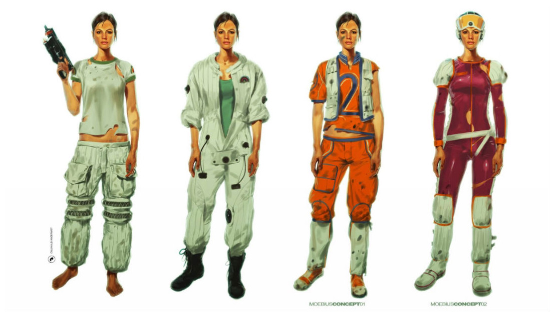
Calum Alexander Watt is a freelance concept artist working for the film, TV and games industries. Based in the UK, his clients include the likes of Creative Assembly/SEGA/Fox, Framestore and Blackrock/Disney
Watt does something a little different on his website homepage: he presents his character designs as cutouts on a white background. Although the idea is not exactly earth-shattering, it’s also not something you often see with artist websites. And the way it’s executed is pretty eye-catching and alluring.
It’s a shame that this is, essentially, a one-page website: the links are all through to other media, and there aren’t even expanded versions of most of the artworks. But as one-page portfolios go, it’s a very nicely presented example of the genre, with a nicely curated selection of impressive work.

Thank you for reading 5 articles this month* Join now for unlimited access
Enjoy your first month for just £1 / $1 / €1
*Read 5 free articles per month without a subscription

Join now for unlimited access
Try first month for just £1 / $1 / €1
Get the Creative Bloq Newsletter
Daily design news, reviews, how-tos and more, as picked by the editors.

Tom May is an award-winning journalist and editor specialising in design, photography and technology. Author of the Amazon #1 bestseller Great TED Talks: Creativity, published by Pavilion Books, Tom was previously editor of Professional Photography magazine, associate editor at Creative Bloq, and deputy editor at net magazine. Today, he is a regular contributor to Creative Bloq and its sister sites Digital Camera World, T3.com and Tech Radar. He also writes for Creative Boom and works on content marketing projects.
