The best graphic design portfolios from around the web
These graphic design portfolios hit all the right notes.
Sign up to Creative Bloq's daily newsletter, which brings you the latest news and inspiration from the worlds of art, design and technology.
You are now subscribed
Your newsletter sign-up was successful
Want to add more newsletters?
Creating stunning graphic design portfolios is a task open to interpretation. There's no one single way to lay a portfolio out. In a way, that's good as it means you're free to experiment and showcase your creativity when designing your website. But because it opens up so many avenues, it can create a tyranny of choice making it difficult to find the perfect direction for you.
It can be useful to look at the graphic design portfolios created by your peers, not only to get inspiration from their work, but also to discover the self promotion methods they've used. Looking at those portfolios can help you decide what you do and don't like, which will clarify what you want yours to achieve.
If you need even more ideas, head over to our more comprehensive list of design portfolios that's sure to inspire you. And here are some top tips for content to include on your brand new portfolio website.
Article continues below01. Alex Coven

Alex Coven, in his own words, “wears three hats”, as a freelance graphic designer, letterer and front end developer based in Chicago, USA. He illustrates those hats literally on the homepage, which is a brilliantly simple way to convey the depth of his skills and experience.
Scroll down on his site to see his work, and across on each one for more information about that project. Clever use of colour overlays again acts as a simple device to keep things distinctive and interesting.
02. Rafael Kfouri
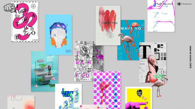
Rafael Kfouri is an award-winning graphic designer currently working for AlmapBBDO. He previously worked at Wieden+Kennedy Portland.
The one-page portfolio site is a tricky thing to pull off, but Kfouri succeeds well in giving his colourful and impactful visuals – including single images and collages – room to breathe. Giving them almost the entire width of the screen, with just a couple of slim sidebars for context, allows visitors to enjoy and appreciate the wide scope of his work at a leisurely pace.
Sign up to Creative Bloq's daily newsletter, which brings you the latest news and inspiration from the worlds of art, design and technology.
There’s only the barest of information about each project, and to be honest, we’d like to have seen more. But as a way of showcasing graphic eye-candy smartly and with minimal (if any) clicks needed to get to the goodies, this portfolio offers a lot of inspiration.
03. Heather Shaw

With almost 20 years' experience in design, Heather Shaw designs brochures, menus, business cards, books, annual reports, Powerpoint and Keynote presentations, responsive websites, applications… anything her clients need, in short. And her impressive portfolio site marshals all this diverse work with simplicity and elegance.
Overlaying photos of each project with a block colour provides an element of visual consistency. Meanwhile, the big, bold typography and simple but effective design make it all very easy to navigate.
04. Stefanie Bruckler
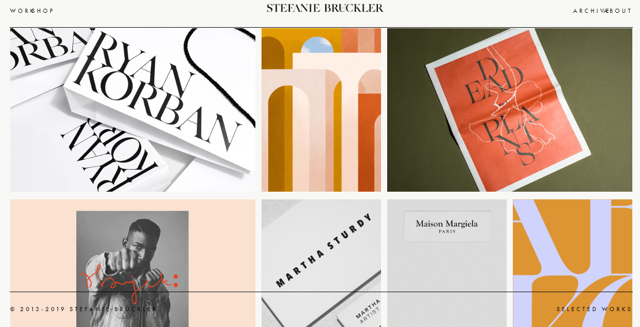
Based in New York, Stefanie Bruckler is an Austrian designer and illustrator with a particular interest in branding and editorial design. Passionate about building cohesive and strong brands as well as typography and packaging, she’s applied a touch of old-fashioned elegance to her website. Its minimalist, grid-based layout, muted colour palette and restrained use of type are all enclosed within a fixed, single-line frame.
05. Peter Komierowski
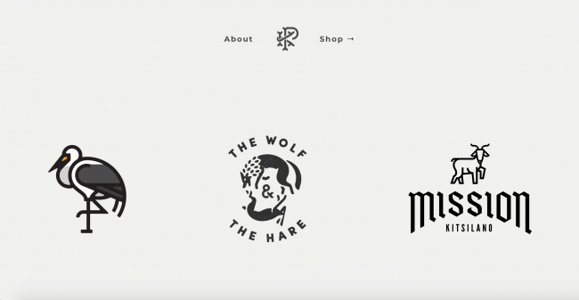
Peter Komierowski is a visual designer working in Vancouver, British Columbia who specialises in illustration, branding and identity design, and interface design. With many high-profile clients, including The Huffington Post, NBA, Telus, and YouTube, there’s a lot to fit in here.
Komierowski’s homepage takes a quite radical approach, featuring just a small number of logo designs, surrounded by acres of white space. It’s a strategy born of (justified) confidence in the high quality of his designs, and it works brilliantly.
06. Tobias Van Schneider
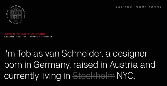
Tobias van Schneider is a multidisciplinary designer and creative director born in Germany, raised in Austria and currently living and working in New York. Focused on branding and interactive design, he’s had some big-name clients including Red Bull, BMW, Google, Wacom, Sony, Toyota and Ralph Lauren.
When you’re working at this level, the work tends to be beautifully photographed. Schneider takes full advantage of that, with a portfolio design that contains plenty of beautiful images. Plenty of lovely typography ties everything together – there is an unusually large amount of text here for a graphic design portfolio – and overall this site succeeds in conveying the breadth of Schneider’s experience and the depth of his work.
07. Grant Burke
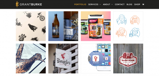
Grant Burke heads up an Ottawa-based branding and web design studio specialising in logo design, brand identity and illustration. In the past he’s worked both as an in-house designer for large corporations and at an agency.
Like van Schneider's, Burke's homepage proves that you can use a lot of text in a portfolio, however if you scroll down or click on Portfolio in the top menu you’re greeted by a strong selection of work in a picture-grid format.
Hover over each square for a brief summary, and click through to a full case study. These serve as a model for sharing the right amount of information about a project on a portfolio site; not too little that it leaves you hanging, not too much that it overwhelms.
08. Alessandro Scarpellini
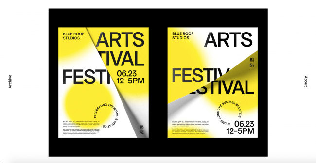
Italian designer Alessandro Scarpellini has worked for a wide range of clients around the world in the fields of art direction, branding and visual identity, magazines and packaging design. He’s also the curator of Visual Journal, an inspirational blog about the best in branding and graphic design, so you’d expect him to know a thing or two about curating great work. And his portfolio doesn’t disappoint.
There’s a real air of sophistication to its design, which showcases examples of his work in a restrained sideshow and offers a personal biography in bold type below. Comprehensive it is not, but you certainly get a clear sense of this creative’s personality and approach to his design work from this minimalist portfolio.
09. Nicolas Paries
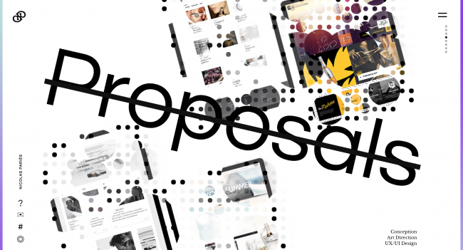
Nicolas Paries is an interactive art director who’s been working since 2008 with premium brands such as Chanel, Lancôme, Dior and Nespresso. The layout of his portfolio site is quite original, and the graphic effects as you scroll down are visually spectacular and hugely impressive. In short, this portfolio website is a real one-off.
10. Jennifer Heintz

Jennifer Heintz is a designer and illustrator living in Boston, USA. She was creative director of the Northeastern University Political Review, and is currently founding partner at creative studio, Self Aware.
Careful curation and imaginative presentation is paramount for Heintz. Her site scores highly on both, with a great use of colour, delightfully smooth scrolling and a snazzy eye motif.
These work together to make each individual project much more enticing than it might have seemed on a more cookie-cutter site.
Related articles:

Tom May is an award-winning journalist specialising in art, design, photography and technology. His latest book, The 50 Greatest Designers (Arcturus Publishing), was published this June. He's also author of Great TED Talks: Creativity (Pavilion Books). Tom was previously editor of Professional Photography magazine, associate editor at Creative Bloq, and deputy editor at net magazine.
