8 great business cards for UX designers
You’ll definitely want to keep these fabulous business cards.
Given that UX is all about simple usability and accessibility, it’s not surprising UX designers often opt for minimal, monochrome designs when it comes to business cards.
The problem is, the simple approach runs the risk of just looking boring when applied to a business card. And given that most people don’t really have room in their wallets anyway, why give them another reason to ditch your card the moment you’re out of sight?
Instead, these UX designers have all designed business cards that potential clients and collaborators are very likely to hang on to...
01. Masanori Mitsuhashi
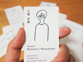
Masanori Mitsuhashi is a UX designer based in Tokyo, Japan. He currently works for Goodpatch, a global UI design company with studios in Tokyo and Berlin. Here, Mitsuhashi has used an elegant yet fun doodle to bring his design to life, and it works a treat.
Printed on a traditional Japanese paper known as Washi, this is a delightful business card you’d be loathe to get rid of, however full your wallet was.
02. Sarah Nohe
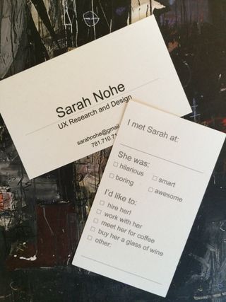
Sarah Nohe is UX designer currently working for Nebular in Florida. She used to be an anthropologist, and when she moved to her current profession, she obviously needed new business cards. Given that her new calling was focused on considering the user, she decided to put that principle into practice when designing them.
As she recounts in this blog post, she decided she’d try to generate some ‘user feedback’ by including a tongue-in-cheek user survey on the back of the cards. In a field where people often take themselves very seriously, this clever and humorous business card is a welcome breath of fresh air.
03. Lo Min Ming
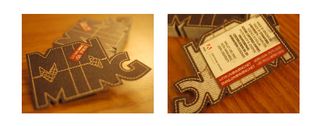
Based in California, Lo Min Ming is a designer and engineer at Dropbox, and the co-founder of Pixelapse, a visual version control platform. He’s all about combining the functionality of UX with aesthetic appeal, and this denim themed business card certainly fits into that mould.
It’s not actually made of denim, though, but was printed on textured paper. “I arranged the letters (especially the 'G') in such a way that it would still be strong enough after the die-cut,” he explains.
04. Ueno
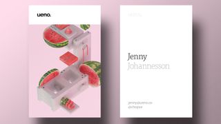
Ueno is a global digital agency offering web and UX design to clients including Airbnb, Medium, Cisco, Lonely Planet, Google, Reuters, Fitbit and Dropbox. These original and attractive business cards are bright, colourful and nicely convey the agency's quirky sense of humour.
05. Gustavo Youngberg
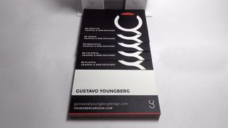
Gustavo Youngberg is a graphic and web designer in the San Francisco Bay area specialising in brand identity, web design, and UX design. He’s currently working as a senior digital specialist at real estate consultants Cushman & Wakefield.
These cool business cards show how you don’t need to spend a lot of time and money on extravagant printing techniques, just a good, solid design. Youngberg got these cards printed by Moo using it Luxe Business service. “Love the quality and workmanship of their paper products and packaging,” he says. “The colours pop and their black is true. Love it.”
06. Adnan Puzic
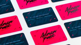
Adrian Puzic is a UI/UX designer based in Sarajevo, Bosnia and Herzegovina. New for 2017, his latest business cards are beautifully clean, bright and bold, and feature embossed elements.
We particularly like the signature-style script lettering, which helps to distinguish these designs in an arena where bland and functional typography is the norm.
07. Marcelo Graciolli


Marcelo Graciolli is a Brazilian UI/UX designer with 12 years’ experience in the web industry. Now based in London, he specialises in email marketing. In the gallery above you can see the front and back of his new business cards, which use colourful graphics to display what it is he does simply and delightfully.
He’s clearly keen to get you to visit his Instagram page, and we love how the eye-drawing device on the front side gets the message across.
08. Max De Mooij
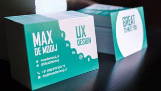
Max de Mooij is based in Amsterdam, where he works for software company Recognize. As a UX designer, he wanted his business cards to leave a positive experience (what he calls “a delighter”) on the person he hands them out to.
“So I left some space on the back where I can write someone's name on,” he explains. “The card's back then says: "Great to meet you, John!". That way, my business card is more personal, and not just about me. It emphasises the connection between you and me.”

Thank you for reading 5 articles this month* Join now for unlimited access
Enjoy your first month for just £1 / $1 / €1
*Read 5 free articles per month without a subscription

Join now for unlimited access
Try first month for just £1 / $1 / €1
Get the Creative Bloq Newsletter
Daily design news, reviews, how-tos and more, as picked by the editors.
Tom May is an award-winning journalist and editor specialising in design, photography and technology. Author of the Amazon #1 bestseller Great TED Talks: Creativity, published by Pavilion Books, Tom was previously editor of Professional Photography magazine, associate editor at Creative Bloq, and deputy editor at net magazine. Today, he is a regular contributor to Creative Bloq and its sister sites Digital Camera World, T3.com and Tech Radar. He also writes for Creative Boom and works on content marketing projects.
