7 ways illustration can help brands stand out
Illustration can make or break a brand: here's how to get it right.
Illustration can help give a brand personality. It can make a brand more playful, more charming, more accessible or more beautiful – perhaps even all of the above. But unfortunately, brands don't always get it right.
Embracing the latest illustration trends is rarely enough to achieve standout – if anything, it'll achieve the opposite. And while more timeless illustration styles can be effective for some, it's all about picking what's appropriate for the brand.
Read on for seven examples of brands that absolutely nailed it for different reasons, and how they used illustration to emphasise their own unique brand values...
01. Google shows its playful side

When it comes to product design and UI, Google is the master of simplicity. Form follows function: it's primarily the effectiveness and ease of use of its now ubiquitous search engine that people love, after all, rather than its visual design per se.
However, illustration has long played a role in giving Google a playful personality that goes beyond that trademark functionality. Google Doodles, for instance, have marked major holidays, events and achievements in a broad range of colourful, creative ways for years now.
It's only within the last five years, however, that the brand has clarified its various illustrative expressions with a more coherent 'Google style' of art direction – demonstrating products and services in a colourful, playful way, while still keeping things beautifully simple and accessible.
The charming example above, created by Bee Grandinetti in 2016, relates to Google's Trusted Contacts app – which helps you stay connected with your loved ones in case of an emergency.
02. Anna makes finance more fun
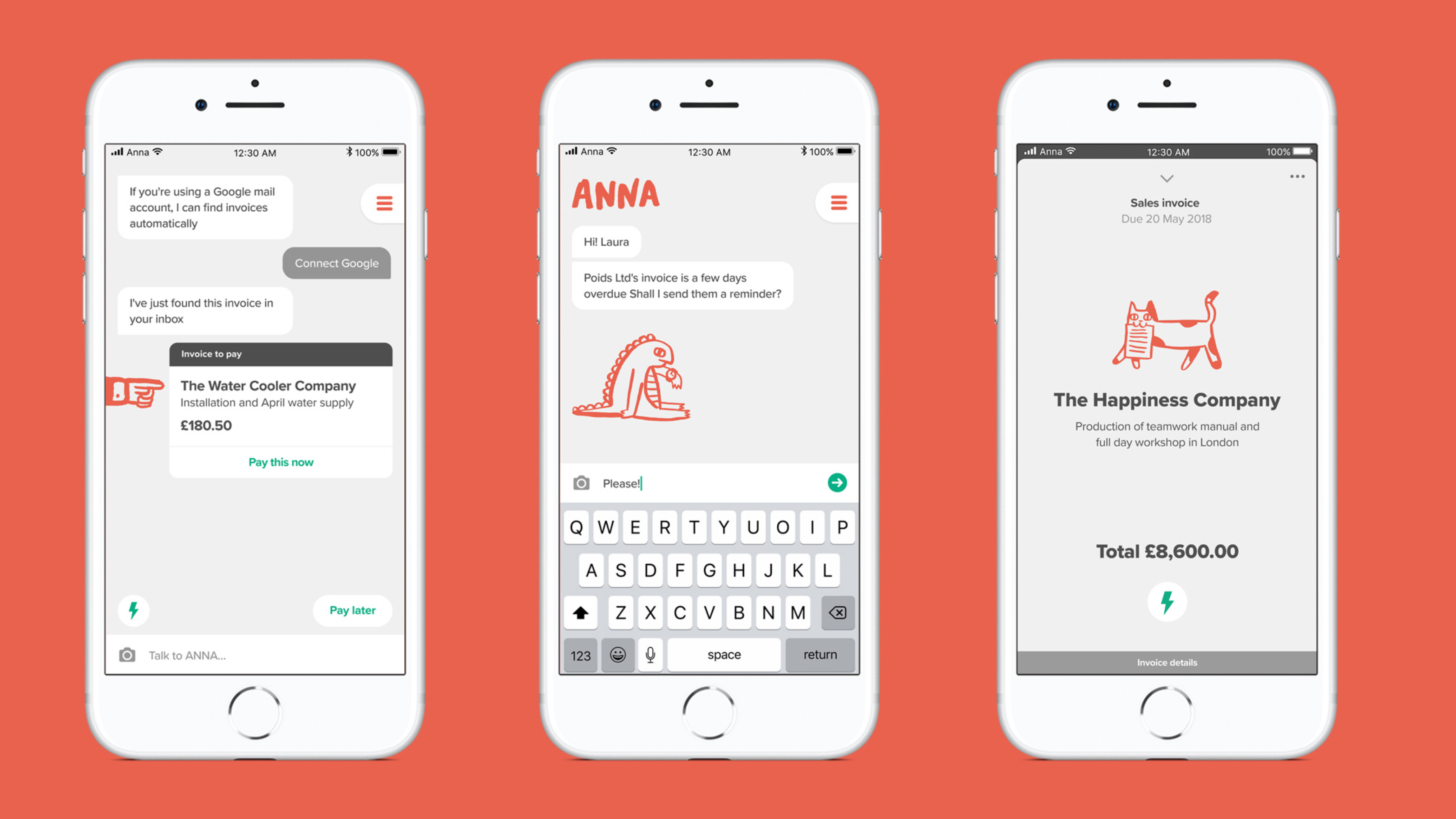
Currently in beta, Anna – which stands for Absolutely No Nonsense Admin – is a fintech service unlike any other. A hybrid digital assistant geared specifically at taking the headache out of admin and financial management for creative people, it combines an app, a bank card and a business account. In the pipeline are useful tools to send invoices, chase payments, analyse expenses and predict cashflow.
NB Studio and Michael Wolff created an illustration-led brand for Anna that's perfectly balanced: playful yet practical, entertaining yet restrained. Charming, decidedly un-finance-like illustrations of various animals by Alice Bowsher lend a unique personality to the service, while the warm, terracotta brand colour challenges the conventions of the sector.
03. Battersea warms the heart
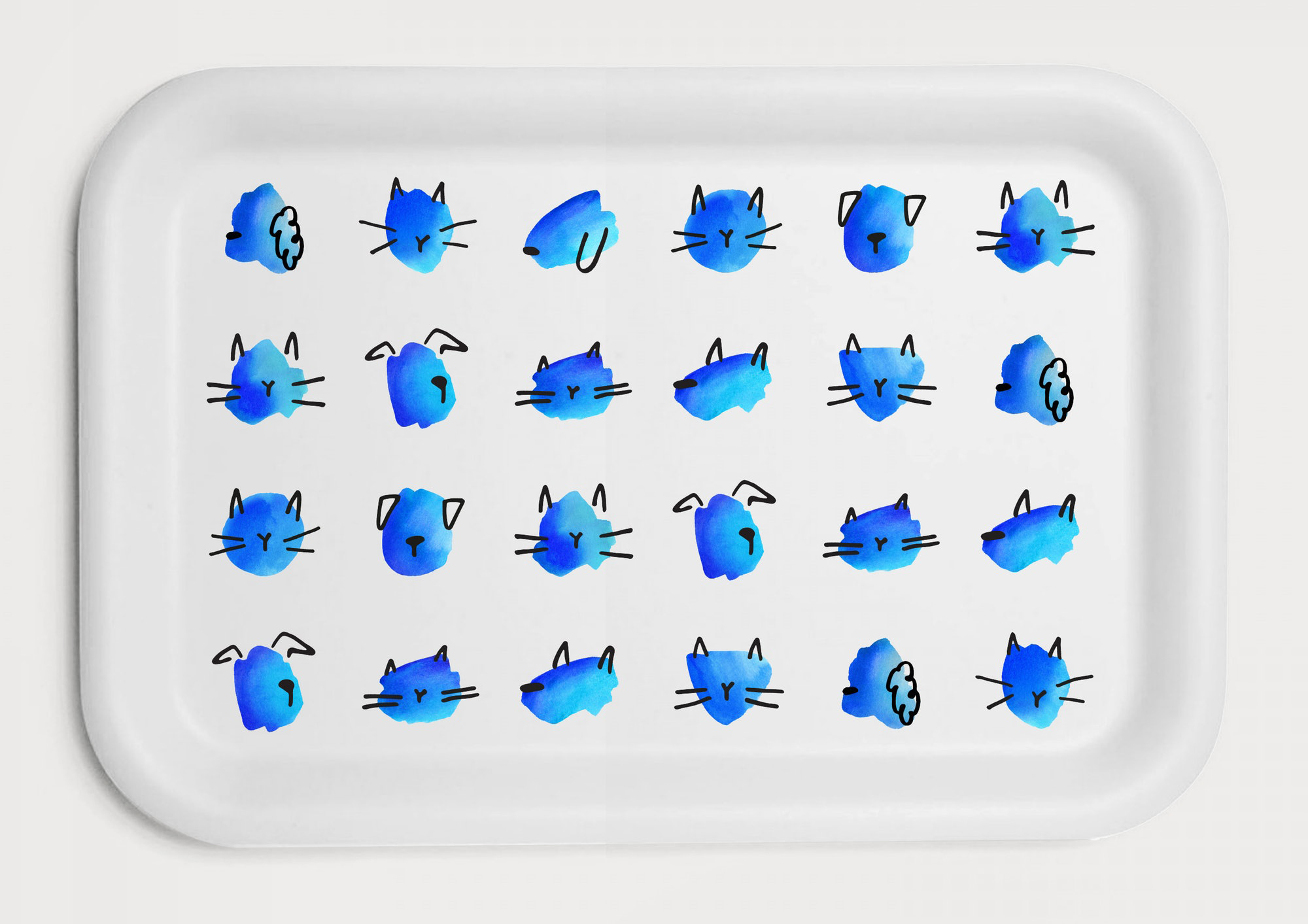
Many charities already occupy a place in people's hearts by virtue of their activities, and the social good they do – but their branding often struggles to match that sentiment. Pentagram's rebrand of Battersea Dogs & Cats Home has a unique and very special charm to it, however.
The 'family' of delightfully messy, hand-drawn watercolour illustrations at the heart of the identity feel warm, humane and, like the animals that the shelter rescues, packed with different personalities. That their expressiveness is achieved with just a few simple flicks of a pen makes them all the more appealing.
04. Fanta goes handmade
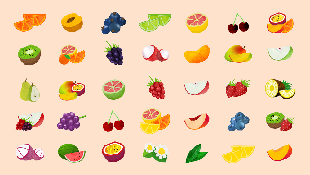
Koto's global rebrand of Fanta was one of the studio's major breakthrough projects, and illustration was at the core of the new identity – in this case, a distinctive hand-constructed paper-cut style, which was then digitally recreated.
Where the illustration really came into its own was when the two orange segments that accompanied the classic Fanta logo were expanded to cater to no less than 34 more fruity combinations, as shown above. Maintaining such a stylised approach across so many applications is no mean feat, but Koto nailed it, giving the brand a coherent, distinctive look and feel across all markets worldwide.
05. Dropbox raises a smile

Dropbox has maintained savvy use of illustration since it was founded in 2007, using a loose, hand-drawn approach to add wit and warmth to its file-sharing and storage service. Over the years, these have included a range of different styles, often using simple characters to demonstrate particular features or benefits of the service in a charming, relatable way.
Dropbox's 2017 rebrand – completed by its in-house team in conjunction with design studio Collins – gave the service a much bolder, more vibrant look, with photography juxtaposed with illustration in strikingly unusual colour palettes.
However, the hand-drawn style remained – albeit in a slightly different guise. In examples such as the one above, rough graphite sketches meet colourful, abstract shapes to symbolise bringing the creative process to life. It's a brave evolution of a much-loved style that has helped define the brand over the past decade.
06. Piccolo has the artisan spirit
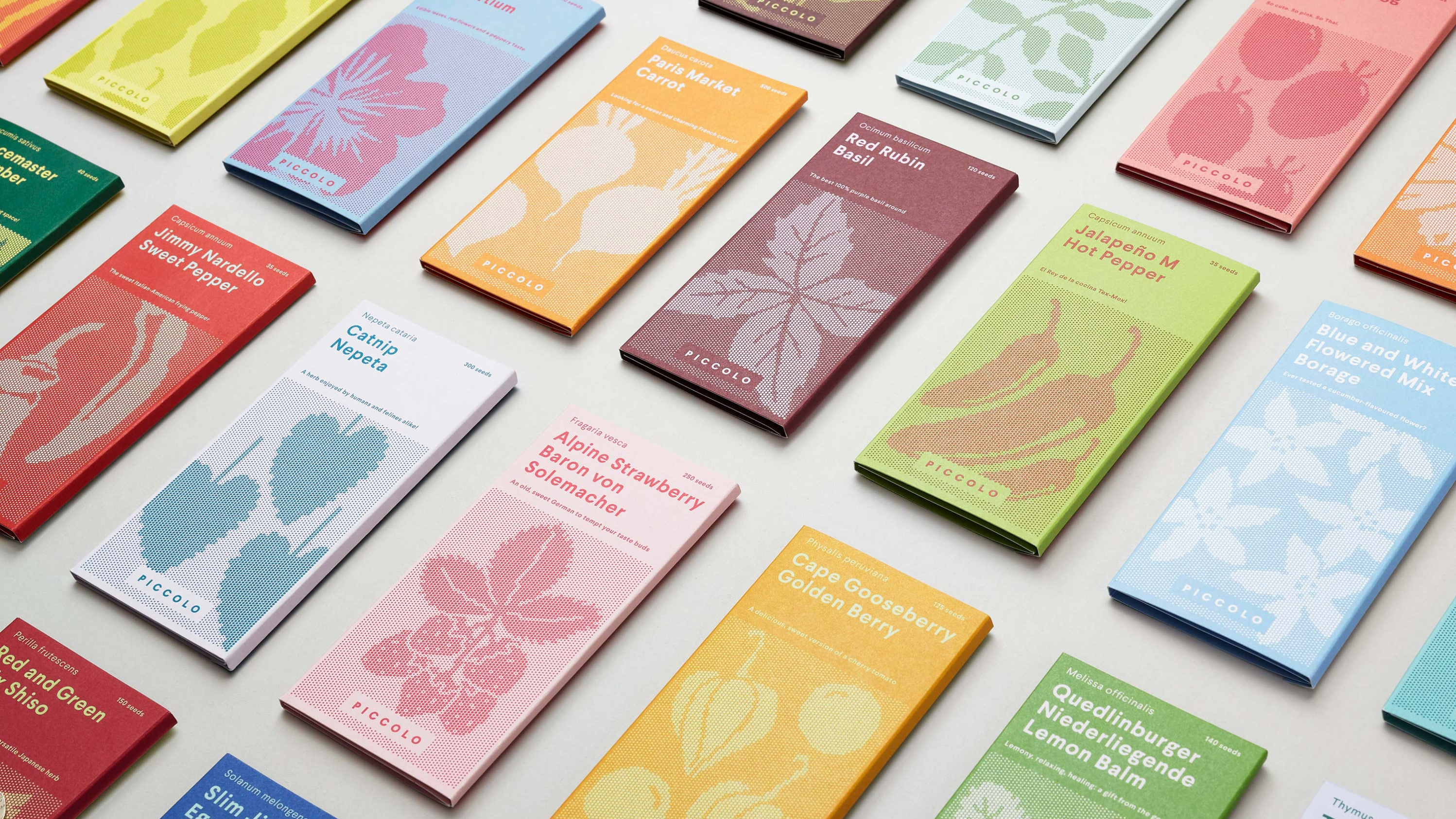
Specialising in "select seeds for the space-limited", Piccolo's range includes the Slim Jim Aubergine and Spacemaster Cucumber, both ideal for city balconies. The Italian company brought Here Design on board to appeal to a new generation of urban gardeners.
Good things come in small packages, and Here's illustration-led branding scheme for Piccolo treats the seed packets like a collection of beautiful miniature books. In a fresh, contemporary way that's unique in the gardening sector, they're all tied together by a system of seed-like dots. The project was recently Highly Commended in the Artisan category at the Brand Impact Awards.
07. Ugly rebels against the system
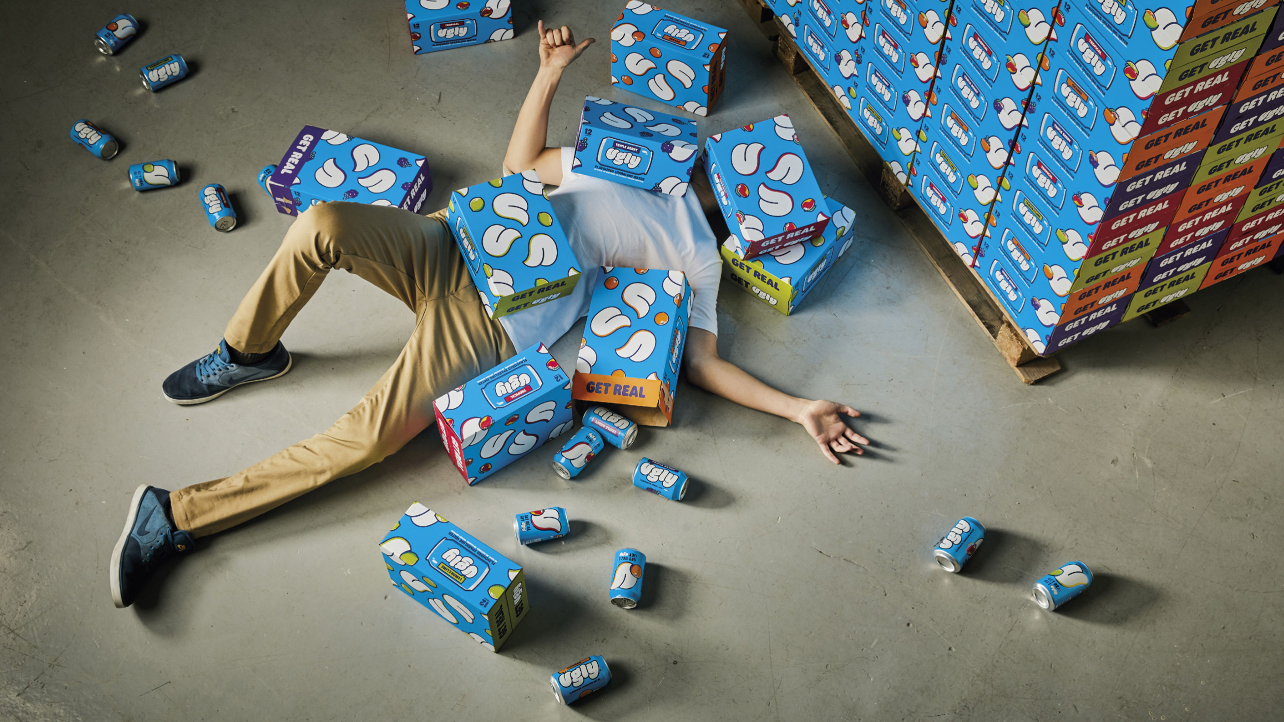
Last but not least is jkr's D&AD Pencil-winning branding scheme for Ugly Drinks, the first 100 per cent natural, fruit-infused sparkling water. Flicking the finger at its artificially sweet mass-market competitors, the playful and provocative brand relies heavily on cheeky character illustration by H.Y.T. Studio to carry its message.
Working with type designer and letterer Rob Clarke, jkr crafted a logo in which the 'U' of 'ugly' doubles as a stuck-out tongue, a motif that translates seamlessly across a whole family of characters that are fruity in both name and nature.
In a campaign dubbed The Ugly Truth, the brand's rebellious spirit is expressed through slogans such as 'contains no ridiculous promises' and 'contains no unattainable lifestyles', all accompanied by those cheeky characters. This is a great example of illustration and copy going hand-in-hand to get a brand's values across.
Related articles:

Thank you for reading 5 articles this month* Join now for unlimited access
Enjoy your first month for just £1 / $1 / €1
*Read 5 free articles per month without a subscription

Join now for unlimited access
Try first month for just £1 / $1 / €1
Get the Creative Bloq Newsletter
Daily design news, reviews, how-tos and more, as picked by the editors.

Nick has worked with world-class agencies including Wolff Olins, Taxi Studio and Vault49 on brand storytelling, tone of voice and verbal strategy for global brands such as Virgin, TikTok, and Bite Back 2030. Nick launched the Brand Impact Awards in 2013 while editor of Computer Arts, and remains chair of judges. He's written for Creative Bloq on design and branding matters since the site's launch.
