7 logos we all love to hate (and lessons we can learn)
These logo designs have faced plenty of backlash and criticism: what can we learn from them?
Releasing a new high-profile branding project into the wild can be a daunting experience. Emotions and opinions run hot on social media, and sometimes criticism can be brutal and unrelenting – even the best logos have their haters.
Over the years, some of the most hated logos have won people over as the rest of the branding scheme rolls out. Others, like Gap and Tropicana, were canned almost as soon as they were released.
Read on for our guide to seven other logos we all love to hate. Some have since evolved or been dropped. And some are still very much alive and kicking...
01. Yahoo
Yahoo's logo isn't necessarily a car crash, in the grand scheme of bad logos over the years. But it arrived in a fizzle of disappointment following the PR frenzy that the company tried to whip up. Back in 2013, a different 'new logo' was unveiled every day for a month to build the drama, and then the final reveal was... well, arguably the least exciting of all of them.
Unlike other high-profile rebrands, it didn't make any significant alternations to the brand positioning or even the way the logo was used: it was just a skin-deep change. The fact that it was 'designed' by Yahoo's non-designer CEO, Marissa Mayer (with Yahoo's in-house design team) over one weekend makes it worse, particularly given what Mayer said on her blog: "I love Adobe Illustrator. I'm not a pro, but I know enough to be dangerous." Well, quite.
There are several lessons here. Get a designer to do it, rather than your "dangerous" CEO, and spend enough time on the design. Smashing it out over a weekend isn't a badge of honour when you're a global brand. But also, make sure there's something worthy of a dramatic reveal before planning a month-long PR countdown – you'll only draw more attention to its inadequacies otherwise.
02. Kraft Foods
In 2009, Kraft Foods changed its logo twice. First, it ditched Kraft's well-known red, white and blue 'race track' logo – still in use on consumer packaging – in favour of lowercase type, with a red swoosh that ended in a burst of random shapes at the top right. Just five months later it changed its mind, because bursts of colours should always occur on the left-hand-side, and swooshes should be light blue.
Kraft Foods' initial rebrand announcement stated that the new logo "signals to employees, consumers and investors what the new Kraft Foods is all about.” The fact that it was binned within a matter of months doesn't bode well for clarity on that point, and as the changes were purely cosmetic – swapping one bad logo for another – it all seems a rather futile exercise.
Again, there are a few lessons here: if you're going to rebrand, do it confidently, and for the right reasons. Save the cosmetic tweaks for the design process before the launch, not after. And don't chuck out a strong, well-recognised logo unless you've genuinely got something better.
03. Bing
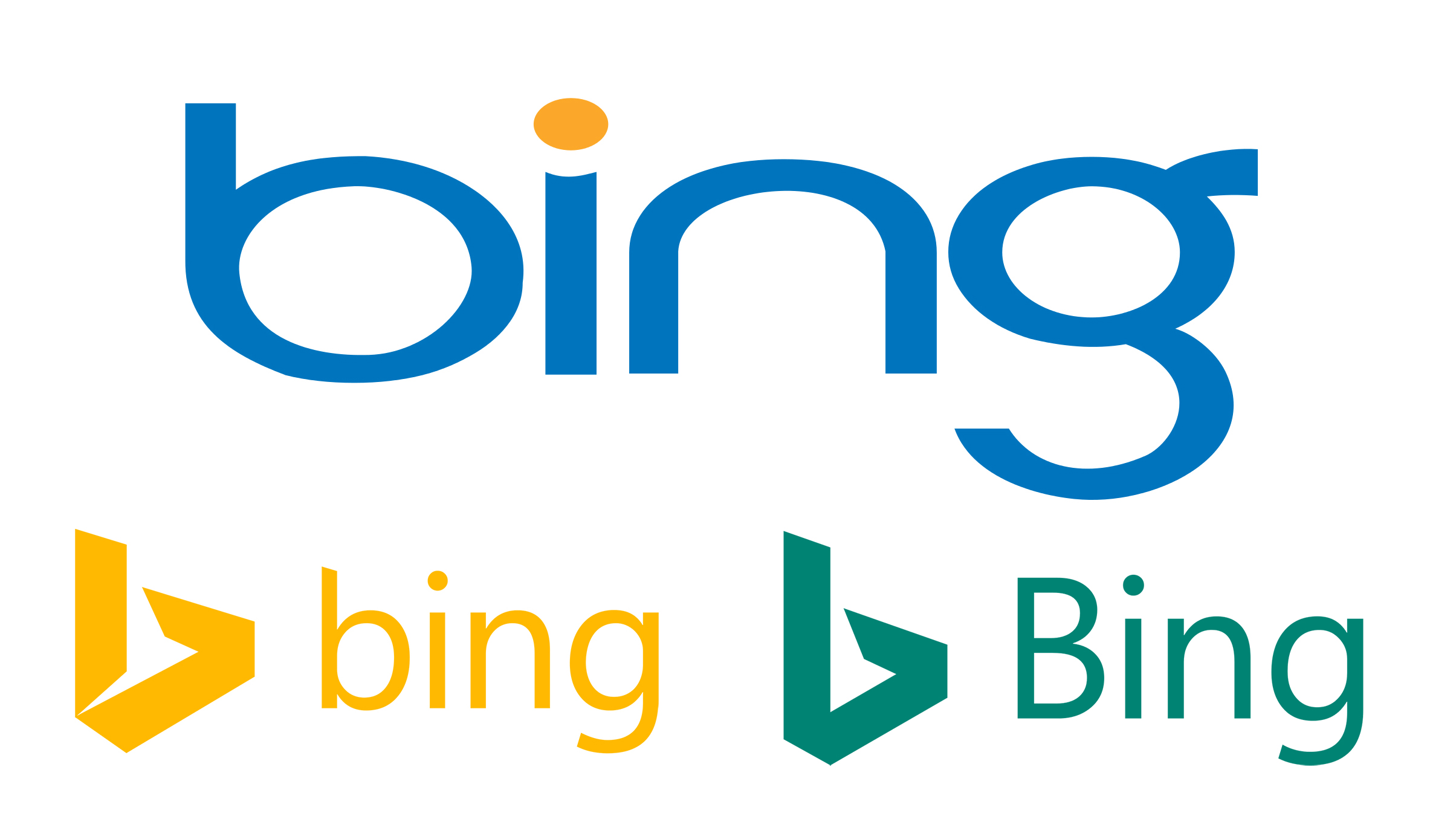
Where to start with Bing? In a way, it's not really fair that the world's number-two search engine is always going to be compared to Google when it comes to branding and UX, just as Microsoft as a whole will to Apple. But this aside, the original Bing logo is a visual disaster by anyone's standards.
It feels uncomfortably stretched and distorted horizontally, almost like the client accidentally used the 'what not to do' version out of the branding guidelines, and no one had the guts to tell them. The letterforms are ungainly and out of proportion to each other – which makes the fact that they were drawn from scratch even more head-scratching, as these decisions were all made deliberately.
Of course, Bing has rebranded twice since that fateful blue-and-yellow mark first reared its head. First came the folded 'b' symbol and achingly neutral, 'Microsofty' typeface, picking out the yellow from the original logo. Then it went teal green, with a capped-up 'B' to match Microsoft's other brands. It's still pretty dull, but anything would be an improvement on the original version.
04. iTunes 10

Never let it be said that Apple is untouchable when it comes to branding. When its new icon for iTunes 10 was unveiled, the loss of the CD was understandable. As well as having a good crack at killing off the format for real, alongside streaming services such as Spotify, iTunes has evolved into a full-blown entertainment destination – a portal to movies, TV shows, apps and games as well as music.
So... why the glowing, bevelled music note, rather than something more all-encompassing to represent entertainment? The backlash went far beyond that, though. The internet exploded with hate for the new icon, with many attempting their own versions – and the tradition of fake Twitter accounts for logos was born with @itunes10icon.
Subsequent revisions in 2014 and 2015 killed the much-hated glowing blue bevel in favour of soft orangey-red, and finally the three-colour orange, purple and cyan outline gradient that's still used today. But the music note still stands alone as the symbol for iTunes' wealth of multimedia content – time for a rethink?
05. JCPenney
Although its current logo looks like it did back at the start of 2011, JCPenney would no-doubt like its customers to forget what happened in between. From 2011–2013, the US department store chain mismanaged its brand (and its business) so comprehensively that it needed a 30-second TV apology.
Dubbed “the most meaningful update to the company’s logo in 40 years”, JCPenney's 2011 rebrand came at the end of a highly convoluted 200-logo competition, won by a University of Cincinnati student. JCPenney became lower-case, the 'jcp' in a red box.
Just a year later, it changed again, dropping the rest of the name altogether. The 'jcp' sat in a blue box at the top-left of a red outline box, evocative of the US flag. It was heralded as a new dawn for the store, but what followed was one of the worst performances in retail history, with mass layoffs, confused and upset customers, and a loss of almost a billion dollars, culminating in that televised apology.
Clearly branding was only one of JCPenney's problems during that period. But its application was woefully inconsistent and confusing. Most stores still used the old logo. Some used the 2011 one, and a definite minority had the up-to-date 2012 logo. In a poll of logo awareness, the brand went from 84 per cent before the 2011 rebrand, to just 56 per cent for the latest one. By 2014, JCPenney shrugged its shoulders and gave up, returning to its original logo.
The lessons here are numerous, but they include avoiding radical changes to a well-known brand in quick succession without a strategy in place, and always rolling out a rebrand confidently and coherently to avoid confusion. The whole affair stands as a cautionary tale for how not to manage a brand.
06. Olive Garden
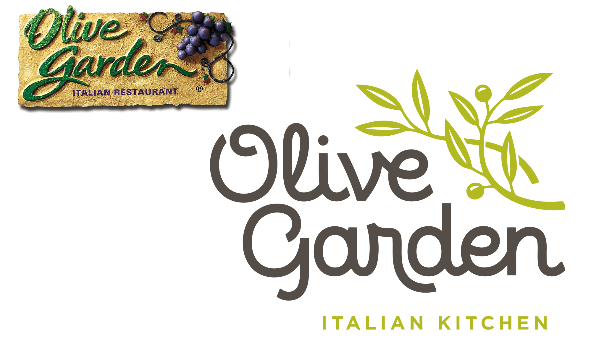
US restaurant chain Olive Garden would never claim to offer the authentic experience of enjoying al fresco pasta in Italy. Its old logo wasn't going to win any branding awards, but in a way it was a good fit – the faux-stucco texture, giant grapes and swirling, larger-than-life script type lending the 3D signage an almost theme-park-like feel.
It was the 2014 rebrand's totally failed attempt to become fresh, contemporary and artisan – replacing 'restaurant' with 'kitchen', for instance – that grated with so many. In the place of the grapes are generic olive branches that could have been pulled straight out of a Clip Art library, and the rough, scrawling type has morphed into an unsettlingly digital-looking, awkward script font.
No one would deny that the old logo was in need of a shake-up, but it had some personality at least. The lesson here: don't sacrifice the soul of a brand in an attempt to feel contemporary, especially if you miss the mark with that too.
07. Uber
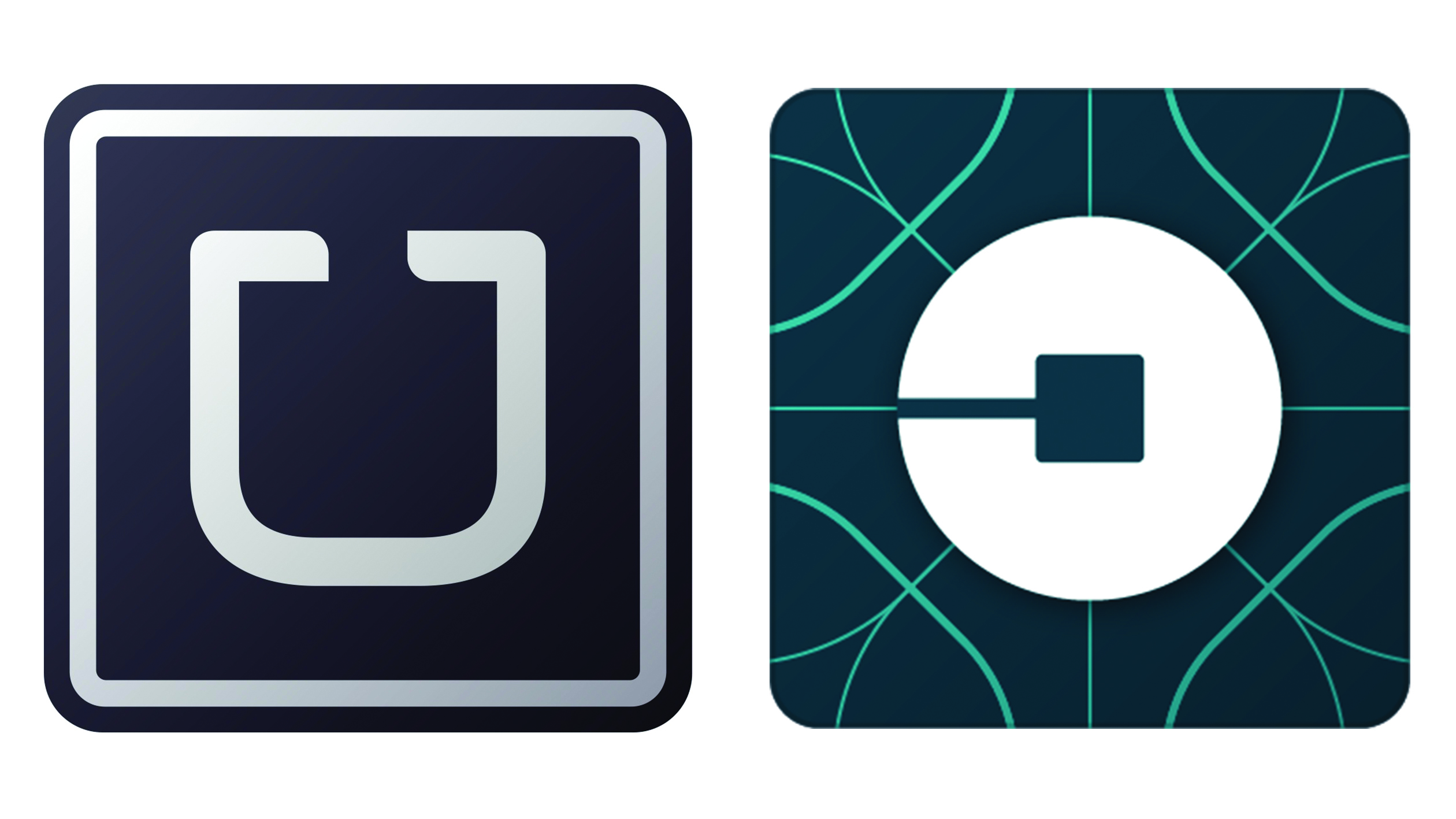
While Uber may well have been in need of a branding update to make it fit-for-purpose for its relentless global expansion, the rebrand it received in 2016 left people dazed and confused.
In place of the bold, confident 'U' was the so-called 'atom and bit', designed to reflect how Uber's network was woven into the fabric of the cities in which it operates. It's a nice thought, but the main pay-off was millions of Uber users suddenly struggling to find the app on their phone as it lost its stand-out overnight.
The lesson? If you're on the cusp of 'owning' a letter in a crowded, space-restricted environment like a mobile screen – 'U' for Uber could have achieved the kind of recognition that Facebook has built for its 'f' icon, for instance – then try not to fumble that opportunity.
Uber has since rebranded – to a wordmark – which also left many users angry and confused. Perhaps it'll eventually drop the 'ber' and become 'U' again.
This post was originally published in August 2018 and has since been updated.
Related articles:

Thank you for reading 5 articles this month* Join now for unlimited access
Enjoy your first month for just £1 / $1 / €1
*Read 5 free articles per month without a subscription

Join now for unlimited access
Try first month for just £1 / $1 / €1
Get the Creative Bloq Newsletter
Daily design news, reviews, how-tos and more, as picked by the editors.

Nick has worked with world-class agencies including Wolff Olins, Taxi Studio and Vault49 on brand storytelling, tone of voice and verbal strategy for global brands such as Virgin, TikTok, and Bite Back 2030. Nick launched the Brand Impact Awards in 2013 while editor of Computer Arts, and remains chair of judges. He's written for Creative Bloq on design and branding matters since the site's launch.
