7 great infographics by graphic design agencies
Top-class data visualisations from leading studios.
At Creative Bloq, we get sent a lot of infographics by PRs in the hope that our coverage will help them go viral. There’s nothing wrong with that, but in all honesty, most of them aren’t particularly well designed. And with the increasing availability of easy-to-use infographic tools we suspect some have been created by marketing folks with no actual design training.
To right the balance and show the world what the best infographics actually look like, we’ve rounded up seven brilliant examples of the discipline created by leading design agencies.
01. Flag Stories by Ferdio
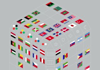
Copenhagen design studio Ferdio is seriously into its flags. So it decided to let its data visualisation skills loose on a side project, and Flag Stories is the result. This mega-infographic compares the design of the world’s flags according to a variety of criteria, including colour choices (and what they symbolise), shapes (used and their complexity), age, similarities and more.
These carefully considered visualisations are simple, imaginative and in places quite beautiful. After all, who wouldn’t love ‘Flag Tetris’?
02. The Evolution of Hip-hop by Sub Rosa
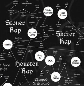
Sub Rosa is an independent strategy and design practice based in New York that produces a biannual publication called La Petite Mort, which receives a small print run of 5,000 as well as appearing online.
For last year’s edition, junior designer Jessi Brattengeier showcased her smarts by mapping out the 37-year history of hip-hop. The result is a striking monochrome infographic that makes perfect sense of all chaos and complexity that story entails.
A great example of how to harness visual hierarchy to make complex information easier to navigate, you can view the chart in full on page 54 of the magazine, which can be downloaded for free here.
03. Call to Prayer by Corporation Pop
![This striking but effective infographic was created for Channel 4 [click the icon in the top right to enlarge the image]](https://cdn.mos.cms.futurecdn.net/dERuzX82vXeqFxp7BSwCSm-320-80.jpg)
Infographics don’t have to be complex or information-heavy to be effective, and here’s a great example. With Channel 4 running a special season to mark the Muslim festival of Ramadan, it asked Manchester-based digital agency Corporation Pop to create suitable branding. This included an infographic highlighting the dos and don’ts of the festival, which is shown in its entirety above.
Okay, this is certainly the simplest infographic on this lust. But it’s also an eye-catching, upbeat and strikingly original design, which makes clever use of colour and Islamic-inspired, geometric art to draw the viewer in.
04. A Month in a Design Agency by Paper Leaf
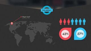
Now for an infographic by an agency, about an agency. Paperleaf is a design firm based in Edmonton, Canada who describe themselves as “big proponents of open, honest communication”. So much so that they created this revealing infographic about how they operated across a typical month in business.
Stats covered include how many billable hours the team put in, what proportion of their time was spent on breaks, and the value of contracts they won and lost. And it’s all gorgeously designed, with big, bold typography and a striking red, blue and black colour scheme.
You can view the infographic in full here.
05. Waste Matters by Pentagram
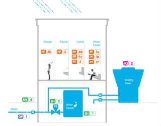
Global design studio Pentagram is known for its award-winning work for glamorous clients and big brands. So you wouldn’t necessarily expect them to be the people behind an infographic about urinals and sewage. But when they were approached by the New York City Department of Design and Construction (DDC) to visualise guidelines for efficient water use throughout the city, they took the challenge head on.
The result is Water Matters: A Design Manual for Water Conservation in Buildings. This crams a ton of information into its 289 pages, but thanks to clever use of colour coding and beautifully designed infographics, all that information is easy to find and to digest. A masterclass in rendering a dull subject engaging and enlightening.
You can download the PDF for free and check it out here.
06. USAFacts by Artefacts
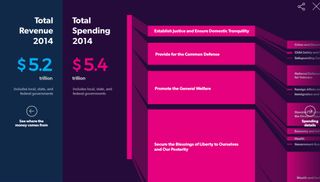
It’s difficult to hold your government to account unless you’re able to effectively work out what it’s doing. That’s the thinking behind this $10 million project from Steve Ballmer and Seattle design studio Artefact. USAFacts sets out to convey big government statistics in a way that’s easy for a normal person to understand.
The visualisations on the site use bright colours, highly legible typography and basic charting structures that the average person can follow, and the result is a great deal more engaging and user-friendly than most government websites we’ve experienced. Anyone planning to visualise a large amount of data online would be well advised to check it out.
07. The Happy Chart by Sagmeister Inc
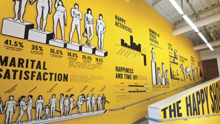
So far we’ve covered infographics that appear online, in PDF form and on the printed page. But we’ll finish with one that covered the wall of an exhibition. Curated by Stefan Sagmeister, CEO of New York studio Sagmeister & Walsh, the Happy Show was held at the ICA Philadelphia, and billed as an in-depth exploration of the nature of happiness. Illustrated by Verena Michelitsch under the creative direction of Sagmeister and the art direction of Jessica Walsh, these oversized vinyl prints share facts and figures about happiness and relationships across age groups, genders and sexual orientations.
The retro feel and tongue-in-cheek attitude strike the perfect tone, and help to convey a series of quite serious points in a fun and accessible way. You can see the infographic’s constituent parts in detail here.

Thank you for reading 5 articles this month* Join now for unlimited access
Enjoy your first month for just £1 / $1 / €1
*Read 5 free articles per month without a subscription

Join now for unlimited access
Try first month for just £1 / $1 / €1
Get the Creative Bloq Newsletter
Daily design news, reviews, how-tos and more, as picked by the editors.
Tom May is an award-winning journalist and editor specialising in design, photography and technology. Author of the Amazon #1 bestseller Great TED Talks: Creativity, published by Pavilion Books, Tom was previously editor of Professional Photography magazine, associate editor at Creative Bloq, and deputy editor at net magazine. Today, he is a regular contributor to Creative Bloq and its sister sites Digital Camera World, T3.com and Tech Radar. He also writes for Creative Boom and works on content marketing projects.


