6 great logo ideas that break the mould
These smart logo designs show the power of original thinking.
Making a good logo great is about taking the brief that one step further. Nicely crafted, fit-for-purpose designs that meet, rather than confound, expectations risk blending into the background. It takes that extra spark for a logo to really stick in the mind – and a killer idea is everything.
The very best logos use intelligence, wit and unconventional thinking to find that hidden gem that makes them special. Sometimes the solution seems so perfect, it should be obvious – the trick, of course, is making sure you thought of it first.
Read on for six examples of logos that eschewed the obvious, took a sideways glance at a design brief and definitely stick in the mind as a result...
01. London Symphony Orchestra
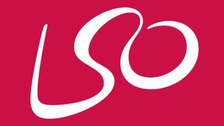
Designed by The Partners (now part of Superunion) in 2001 – and brought to life with multi-award-winning campaign imagery in 2017, to celebrate Simon Rattle joining the orchestra – this inspired logo takes advantage of typographical serendipity, but it's the kind of charming association that many agencies would miss.
Defined by a single flowing line, the initials L, S and O trace the shape of an orchestra's conductor in full passionate flow, baton in mid-air – an elegant, simple solution that conveys the joy of live classic music.
02. The Guild of Food Writers
Smart use of negative space can certainly take a logo from good to great – FedEx's arrow being a case in point – but it's hard to get right. As a rule, it works most effectively when it's simple and elegant, and doesn't labour the point too much.
Widely regarded as a standout example of negative space done right, this logo for The Guild of Food Writers by 300 Million achieves just the right balance of graphic restraint and creative wit, with its inspired combination of pen nib and spoon.
03. Agatha Christie Ltd
No list of smart, witty logos would be complete without an inclusion from Studio Sutherl&: Jim Sutherland is a true master of finding a deceptively simple solution right underneath all our noses, and executing it so effectively that you can't believe no one else thought of it.
Studio Sutherl&'s recent rebrand of Agatha Christie Ltd starts with the realisation that a monogram of the much-loved author's initials can also incorporate a question mark – the universal symbol of mystery – and expands into a versatile branding system that defines Christie's most iconic characters using only punctuation marks.
04. Spartan Golf Club
When negative space gets more complicated and multi-layered, it takes some careful refinement and true design craft to carry the logo through, and avoid it becoming messy and confusing. Spartan Golf Club nails it.
It's fair to say that not many design briefs require a seamless blend between an Ancient Greek soldier and a golfer in mid-swing. Designer Richard Fonteneau must have been through his fair share of iterations before finding the perfect solution, with the golfer's body forming the profile of a Spartan soldier, and the arc of his swing defining the plume of his helmet.
05. VAIO
With a few notable exceptions – Apple, anyone? – technology firms aren't famed for thinking outside of the box when it comes to their logo design. But when faced with a brief to design a logo for its 'Video Audio Integrated Operation' (later changed to 'Visual Audio Intelligent Organizer', but much better known simply as 'VAIO'), Sony chose a different tack.
The logo nods to both analogue and digital technology in a stylish, subtle way – the smooth curve that defines the 'V' and 'A' represents an analogue wave; the 'I' and 'O' become the binary '1' and '0' that are the foundation of all things digital. It could have been a simple typesetting job: instead, it's a logo that keeps on giving.
06. Horror Films
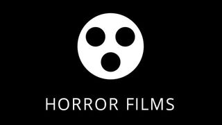
You'd think a genre as evocative as horror would be a gift for logo designers. That's the danger: going all out for dripping gore and distressed, fragmented type – maybe some slashes, bites and claw marks for good measure – would feel tired, predictable and overworked.
It's partly the admirable restraint that makes Siah Design's Horror Films logo stand out in the sector. A simple idea – that a simplified silhouette of a film reel looks remarkably like a screaming face – carries it. Sometimes, that's all it takes.
Related articles:

Thank you for reading 5 articles this month* Join now for unlimited access
Enjoy your first month for just £1 / $1 / €1
*Read 5 free articles per month without a subscription

Join now for unlimited access
Try first month for just £1 / $1 / €1
Get the Creative Bloq Newsletter
Daily design news, reviews, how-tos and more, as picked by the editors.

Nick has worked with world-class agencies including Wolff Olins, Taxi Studio and Vault49 on brand storytelling, tone of voice and verbal strategy for global brands such as Virgin, TikTok, and Bite Back 2030. Nick launched the Brand Impact Awards in 2013 while editor of Computer Arts, and remains chair of judges. He's written for Creative Bloq on design and branding matters since the site's launch.

