6 brilliant uses of 3D in brand campaigns
3D and VR are becoming a big part of the branding mix right now, as these 6 brilliant examples show.
If you’re looking for new arenas to put your 3D skills to productive use, have you considered the world of branding?
Right now, creative and design agencies are at the forefront of developing innovative 3D apps and experiences for brands, not least in the rapidly expanding VR and AR space.
Here we bring you 6 cool branding campaigns that make full use of the latest 3D technologies, and chat to the people behind them to discover how they were put together.
01. Vodafone
Vodafone wanted to say ‘thank you’ to its channel partners at Christmas, so onebite created an immersive environment where they could all get into the Christmas spirit and win a night out for their team.
“Cross-browser functionality was key, so we needed to use software that would work across multiple devices and all screen sizes as a VR experience, and give a good experience in the major browsers if accessed on desktops,” explains developer George Anderson.
“We decided to use krpano,” continues developer Marcela Bohorquez. “It’s a very flexible VR web development platform that supports high quality rendering and great performance in the web. The panorama viewer allows you to see the experience in HTML5 as well as a VR experience on mobile.
"It also allowed exporting the final experience for desktop as a standalone application, so it can be distributed and viewed without an internet connection as well.”
They also provided the Vodafone partners with mobile VR headsets
that were compatible with their smartphones to view the full VR
experience.
Browser testing
Throughout the development of the projects, the design team constantly tested the experience in the browser and in VR headsets to make sure that all was functioning correctly.
“Then once we had fully built each environment, we user-tested on fellow onebiters and family members of all ages, to make sure they were simple enough to use and worked as expected in both browser and VR experiences,” says Anderson.
“As the Vodafone experience was a find and point-style game, we simply asked users to play the game and to let us know if they experienced any bugs or difficulty.”
Technical challenges
The biggest technical challenge the onebite team faced was making realistic-looking 3D environments work with interactive 3D elements within krpano. “We ended up building each of the environments as 3D models that we could then take a 360 degree photo of from points within each of the rooms to create each of the ‘scenes’ in our virtual experience.
And the biggest lessons learned? “Looking back now,” says Bohorquez, “we think that one of the challenges with VR is that it is all very new (although more literature is coming up now), it is still a world to be discovered and at every step of the project there will be lots of uncertain elements and findings, making it very exciting to work with but also difficult to predict the results.
“Modern day web users expect extremely fast load times, so this needs to be taken into consideration when developing rich immersive experiences like this for the web.”
02. Bayer: A Journey around the Human Body
Polish creative agency Immersion creates 360 degree VR and AR experiences for the likes of Samsung and HBO, as well as working with museums and heritage sites to create immersive experiences for its visitors. In a recent project, pharmaceutics giant Bayer asked them to create an informative and immersive presentation of the human body and the processes that happen inside it.
“We created realistic 3D models of the human eye, heart, brain and stomach, and created interactive experiences that explain various conditions that are linked to each body part,” explains Piotr Baczyński, CEO of Immersion. “This enabled Bayer to have discussions around its products in a more engaging way.”
Immersion’s graphic designers and programmers worked closely with a group of doctors from different specialisations to build the 3D representations. “This close relationship ensured that the look, scale and movement of each body part was as accurate as possible,” says Baczyński.
“3D was extremely important for this campaign as the primary goal was to enable users to get a lifelike visualisation of the human body – this was only possible in 3D.”
Interface and storyline
And that was just the beginning. “After developing the models, textures, animations, special effects and sounds, the biggest challenge lay within the interface and storyline,” he continues. “It was important that the interface was not only visually pleasing but also intuitive and easy to use.
“This is a particular challenge when working with VR as it could be people’s first experience of VR. For example, doctors sometimes struggled to understand how to operate the controls, or couldn’t grasp the fact that they could move freely and look around to discover the whole area.
The app guides the user, using movement of the environment, voiceovers and highlighting certain areas. “For this, the user must understand that objects can be picked up, buttons pressed and so on. Quite often a first-time VR user expects to see the action only in front of them, so they're not actively exploring the space.”
Despite the teething problems, Baczyński believes the benefits of VR for branding are significant: “particularly in an industry that requires technical or sometimes difficult discussions. When placed inside of a VR representation of the human body, the user gets a strong sense of presence and understanding, that allows for better explanation of key processes that happen inside.”
03. Ballantine’s

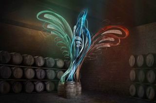
Here’s a sneak peek at a campaign that hasn’t even launched yet, but looks like being very cool from where we’re standing… This promotion for a new whisky series makes innovative use of a series of 3D VR sculptures.
The campaign aims to promote the three single malts from Ballantine’s and reinforce their relation to the original blend. So Cubo worked with award-winning illustrator Si Scott to created a range of 3D VR sculptures, each representing the energy and heart of Ballantine’s original blend ‘escaping’ into the new range.
Polish and magic
“We loved the idea of mixing a traditional artist with the latest tech – this is how the idea originated,” explains Jonathan Sant, creative director at Cubo. “As a traditional illustrator, normally using just pen and ink, Si Scott was the perfect person to match with Google Tilt Brush – technology that lets you paint in a virtual space – for this campaign.”
Cubo hired a studio in London for a couple of weeks and set up the Tilt technology for Scott to work his magic and design a sculpture.
“We imported the virtual shape into Cinema 4D, and spent a lot of time crafting textures, transparencies and luminosities,” says Sant. “For the stills, we worked into Photoshop and added extra polish and magic. We wanted the sculpture to look like is was emitting light into its surroundings: this was all done in Cinema 4D.”
Technical challenges
As you’d expect in such an innovative space, it wasn’t all plain sailing. “As we were working with the first version of Tilt, we encountered a few technical issues along the way,” says Sant. “Some of the functions are quite restrictive.
“Transferring the artwork from Tilt to Cinema 4D, for example, isn’t as easy as you think. The line work also transfers only as a single line of data, so line weight, colour, thickness and stroke angles all had to be recreated.
“Additionally, as you can only see the sculpture through the headset, providing feedback to Si – who wasn’t wearing a headset and therefore viewed things differently – was also slightly challenging. The sculpture looks so different depending on how and where you are viewing it from.
"You can look very silly flapping about and providing comments and feedback to someone who can’t see the same things as you.
“The bird was very beautiful in the virtual space and it’s a shame that more people couldn’t have seen it. It was an intense project, but a very rewarding one and everyone is delighted with the results.”
So how will the VR sculptures be shared with the target audience? “We’ve created a toolkit to be activated globally by local markets,” says Sant. “There’s an 80-second launch film made to be shown in airports and also at point of sale to feature wherever Ballantine’s Single Malt Whiskies are sold. It will also be available to view online on the Ballantine’s website.”
04. Ford Performance
Burrows, a creative design and production agency based in Essex, was asked by Ford Performance to produce some enticing content made up of 360-degree footage, 3D graphics and also a variety of historical footage, all stitched together into a 360-degree/VR experience.
You can see the full 360 footage here, but not everyone has a VR viewer yet, so Ford also asked VR experience company Igloo Vision to build a 360-degree dome and took it to Le Mans and Shanghai to let fans experience the footage in a shared environment.
The key to utilising 3D content in brand campaigns is not just about the content itself but more about how it’s delivered to the viewer. VR headsets by their nature make the experience isolated, so we’d expect physical solutions like this to become an increasingly important part of the branding mix in the months and years to come.
05. Audi’s virtual showroom

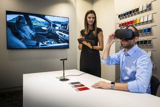
It was only a matter of time before car manufacturers started grasping the VR nettle. And so this September, Audi was the first to announce it is rolling out a VR experience to its showrooms across the UK and Europe.
These days there are so many different options when it comes to your car, including exterior paint finish, interior surfaces, seat leather, stitching, alloy wheel styles, and more. But most drivers don’t feel comfortable looking through material swatches and colour charts; they just want to see for themselves what the car will look like.
Working with digital retail specialist ZeroLight, Audi has developed a system that it says will allow you to view “an extremely realistic experience of your individually configured car, down to the last detail”.
And that’s not all. You’ll also be able to take your virtual car out for a spin, and see how it handles in virtual locations, such as the pit stop at the Les Mans race track.
To allow the complex data models to be processed for virtual reality, Audi worked with its strategic visualisation partner ZeroLight to develop an especially high-performance graphics engine.
More than 400 “Customer Private Lounges” – its term for a digital consulting suite – are already in use, and more are coming soon.
06. FGM campaign

Each year Within Design takes on at least one charitable project. Past campaigns have included: UN: No Man Is An Island. And Alzheimer’s Society: A Cure for Derek.
This year it has teamed up with Leyla Hussein, a campaigner and survivor of FGM (female genital mutilation) to demonstrate the shortcomings of the 1985 UK FGM Act, which has not secured a single conviction in over 30 years.
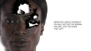
Within Design created a dramatic video, entitled #ActOnFGM (which is still in its early stage and has not yet been released) that aims to highlight the impact that FGM really has on a woman and how it affects seven different parts of her body.
“First we filmed the mannequin, shooting it with a paintball gun to create our ‘holes’,” Will Hambling, creative director at Within Design explains. “We then filmed our model in 4K looking directly down the camera lens for a few minutes to get our foundation shot for the film.
“As we were unable to directly shoot our model (without being sued) we took the footage from the mannequin shoot and overlaid it over the footage of the model."
Hambling continues: "We then motion tracked our model to attach the paint to her movements, before enhancing the colour of the paint to create a bright green that we then ‘keyed out’ of our image, thus creating a hole in our model.
“To create the illusion of depth in the footage, we took the footage, multiplied many layers of it on top of each other and then spread them out in 3D space. With this applied, when an internal virtual camera is used the hole suddenly has depth. And after randomising the position of each layer behind the hole, this creates a rather interesting look and feel.”
Related articles:

Thank you for reading 5 articles this month* Join now for unlimited access
Enjoy your first month for just £1 / $1 / €1
*Read 5 free articles per month without a subscription

Join now for unlimited access
Try first month for just £1 / $1 / €1
Get the Creative Bloq Newsletter
Daily design news, reviews, how-tos and more, as picked by the editors.
Tom May is an award-winning journalist and editor specialising in design, photography and technology. Author of the Amazon #1 bestseller Great TED Talks: Creativity, published by Pavilion Books, Tom was previously editor of Professional Photography magazine, associate editor at Creative Bloq, and deputy editor at net magazine. Today, he is a regular contributor to Creative Bloq and its sister sites Digital Camera World, T3.com and Tech Radar. He also writes for Creative Boom and works on content marketing projects.
