5 unusual uses of colour in logo design
These five brands buck the trend when it comes to colour.
Research shows that colour is registered by the brain before images or type, which means brushing up on colour theory for branding is well worth your time.
Successful 'ownership' of a colour in any given sector is the holy grail, and there are many outstanding examples of colour in branding that prove how effective that can be.
Certain sectors have familiar colour palettes associated with them. The calm, stable, trustworthy reassurance of blue crops up frequently in the financial services and communications sectors, for instance; while attention-grabbing, energising reds and yellows are key colours in many major fast-food chains.
Sometimes a brand strikes off in a totally different direction. McDonald's, long the figurehead of that zingy red-and-yellow palette, went green in many of its European branches. And Apple's white products cut through the black, grey and beige of the technology sector like a hot knife through butter.
Guinness' total ownership of black is hugely distinctive within a wine, beer and spirits sector filled with greens, reds and blues. And EasyJet brings a flash of orange to the overwhelmingly red-and-blue dominated airline sector.
When it comes to logo design, sometimes it pays to embrace the familiar as a visual shorthand for what you do – but stand-out will always be more challenging as a result. Read on for five examples of brands that think differently about colour...
01. Monzo
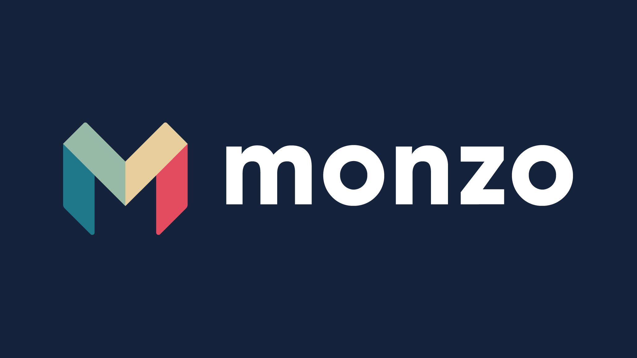
Blue can be found all over the financial services sector. Bank of America, Barclays, American Express, VISA... the list goes on. Throw in HSBC, NatWest, Santander and MasterCard, and there's also a fair bit of red.
Founded in 2015, Monzo totally bucks that trend – combining teal, coral, sage green and golden beige in its in-house-designed 'M' logo.
It's fitting that a "smart bank" founded with "the new generation" in mind should have a different perspective on colour, too. Digital flexibility was the key, and physical branches and cheque books went out the door – along with those ubiquitous blues and reds.
According to Monzo, designer Sam Michael was looking to combine the strength and confidence that customers want in a bank, with a more friendly, colourful and human vibe. The softer, more subtle colour palette makes it more informal, and less officious compared to its establishment rivals.
02. Lufthansa
We've mentioned how EasyJet cuts through the sea of blue and red airline liveries with a bright orange that defines the entire 'easy' franchise. Hungarian airline Wizz Air adds a dab of purple and pink to the budget end of the spectrum.
But when it comes to the big national carriers – American Airlines, British Airways, KLM, Qantas, Emirates – there are relatively few outliers for whom red and blue don't dominate in the logo and livery.
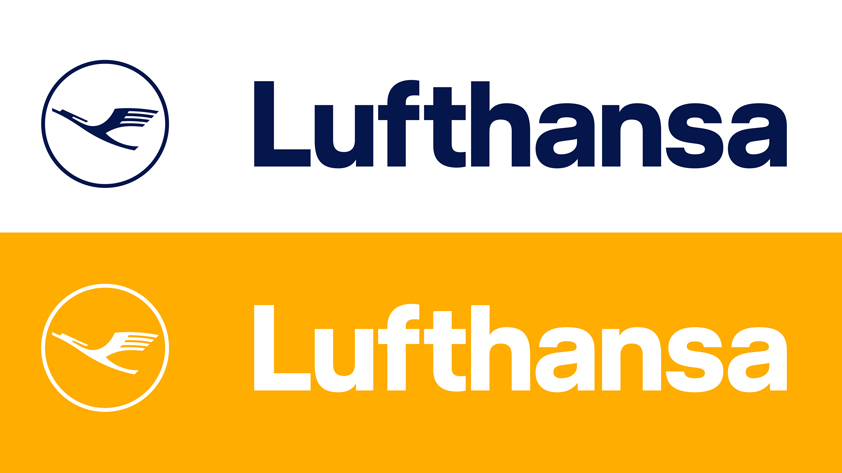
Step up Lufthansa. Sure, navy blue is a significant feature of its branding, but what has always set it apart is the rich ochre yellow that complements it.
The German carrier's distinctive crane emblem was originally designed a century ago by graphic artist Otto Firle, and adapted into a comprehensive identity program in the 1960s by Otl Aicher – who introduced the blue and yellow combination.
Lufthansa's recent in-house refresh brings it into the digital age, refining the marque and making the main blue darker and more elegant. Crucially, that distinctive yellow remains a distinguishing factor across its various touchpoints.
03. Eir
Another sector awash with blue is technology and telecoms. Think: IBM, HP, AT&T, O2, Intel, Samsung, Nokia, Facebook, Twitter...
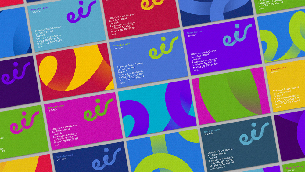
We've already mentioned how Apple defies its sector in more ways than one, but another, lesser-known brand to have done so is Irish telecoms provider eir, which was given a wholesale overhaul by Moving Brands in 2015.
The bold, organic and flowing marque – which, like Monzo, feels much more human and approachable than the rest of its sector – was given a vibrant, fluorescent colour palette that fizzes and pops across digital and print alike.
This was the brand's biggest shake-up in 20 years, and Moving Brands explored unexpected colour combinations to match the dynamic, unconventional logo.
04. Taco Bell
Red (often paired with yellow) is, quite simply, the colour of fast-food. McDonalds, Burger King, Denny's, Pizza Hut, KFC and many more use it as their main brand colour.
It grabs attention, feels bold and urgent, and according to some researchers, may even increase your appetite – so it's no real surprise.
For McDonald's, reinventing itself in a more sophisticated shade of green in its European branches was about changing brand perceptions in the face of a childhood obesity crisis – and appealing instead to a lucrative market of young professionals who prefer coffee to Happy Meals.
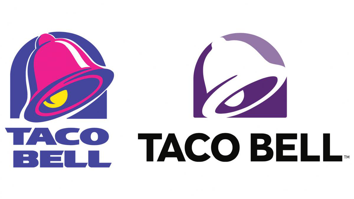
But one fast-food giant changed its stripes significantly earlier. From the mid-80s until the mid-90s, Taco Bell was red and yellow too. Then the bell went pink and purple: a combination that totally bucks the fast-food trend.
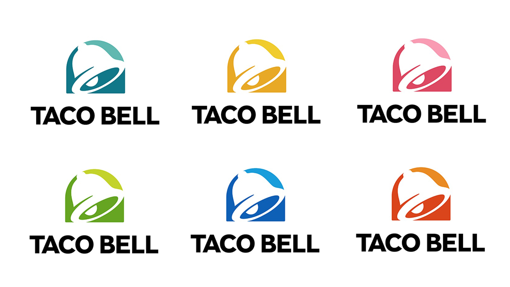
Its minimalist 2016 rebrand by Lippincott stripped out the pink and left a pared-back two-tone purple logo marque, although this is also available in six more colour combinations: teal, gold, coral, light green, blue and orange.
As well as a broader colour palette, Lippincott also opened up the iconic bell shape as a container device for a potentially endless array of patterns, textures and image, making it much more flexible across all manner of applications.
06. Veuve Clicquot
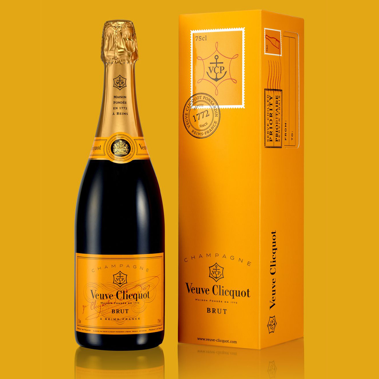
Tattinger, Moët & Chandon, Bollinger, Krug: all world-renowned champagne brands, but they share something else in common: the combination of a green bottle and gold foil, often with a touch of red, in their packaging.
This is where Veuve Clicquot has colour recognition sewn up: its highly distinctive yellow label has been synonymous with the brand for almost 150 years.
Back in 1850, Veuve Clicquot could be distinguished by its minimalist pure white label, but as the global popularity of dry champagnes grew, it sought ownership of a brighter colour. In 1877, the first yellow label was born.
Over the following decades, the yellow became richer, deeper and more orange in hue, making it easy to spot in a dark, crowded wine cellar. That brand association remains strong to this day, and bucks the trend of its sector.
Related articles:

Thank you for reading 5 articles this month* Join now for unlimited access
Enjoy your first month for just £1 / $1 / €1
*Read 5 free articles per month without a subscription

Join now for unlimited access
Try first month for just £1 / $1 / €1
Get the Creative Bloq Newsletter
Daily design news, reviews, how-tos and more, as picked by the editors.

Nick has worked with world-class agencies including Wolff Olins, Taxi Studio and Vault49 on brand storytelling, tone of voice and verbal strategy for global brands such as Virgin, TikTok, and Bite Back 2030. Nick launched the Brand Impact Awards in 2013 while editor of Computer Arts, and remains chair of judges. He's written for Creative Bloq on design and branding matters since the site's launch.
