5 things we loved about Wix Design Playground
Top creators reveal how the programme has helped them improve.
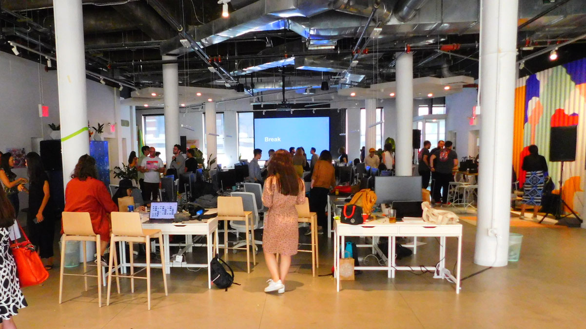
Earlier this month, we jetted off to New York to watch the culmination of Wix Design Playground. If you’re not familiar with it, this three-month programme sees lucky participants tasked with creating a non-profit site, developing an online marketing campaign, and building their own portfolio.
In other words, it’s a fantastic way for budding designers to expand their design skill set, get familiar with web design tools, and kick-start their careers.
Now in its second year, the Wix Design Playground continues to deliver. During the programme’s final presentation, we saw how multidisciplinary designers had worked together to revolutionise the websites of non-profit organisations.
This inspiring demonstration was the result of months of workshops, and sessions taught by industry-leading designers. Seeing the finished sites, and the looks of amazement on the faces of the website owners, was a proud moment for all involved.
We already spoke to Wix head of design and branding, Hagit Kaufman, to hear about how the company is helping designers and clients to create better sites. But what about the designers themselves? What have they got out of the Design Playground?
We caught up with creators from this year’s programme, as well as the inaugural course, to hear how it aided their development.
01. Participants learn how to tell a story
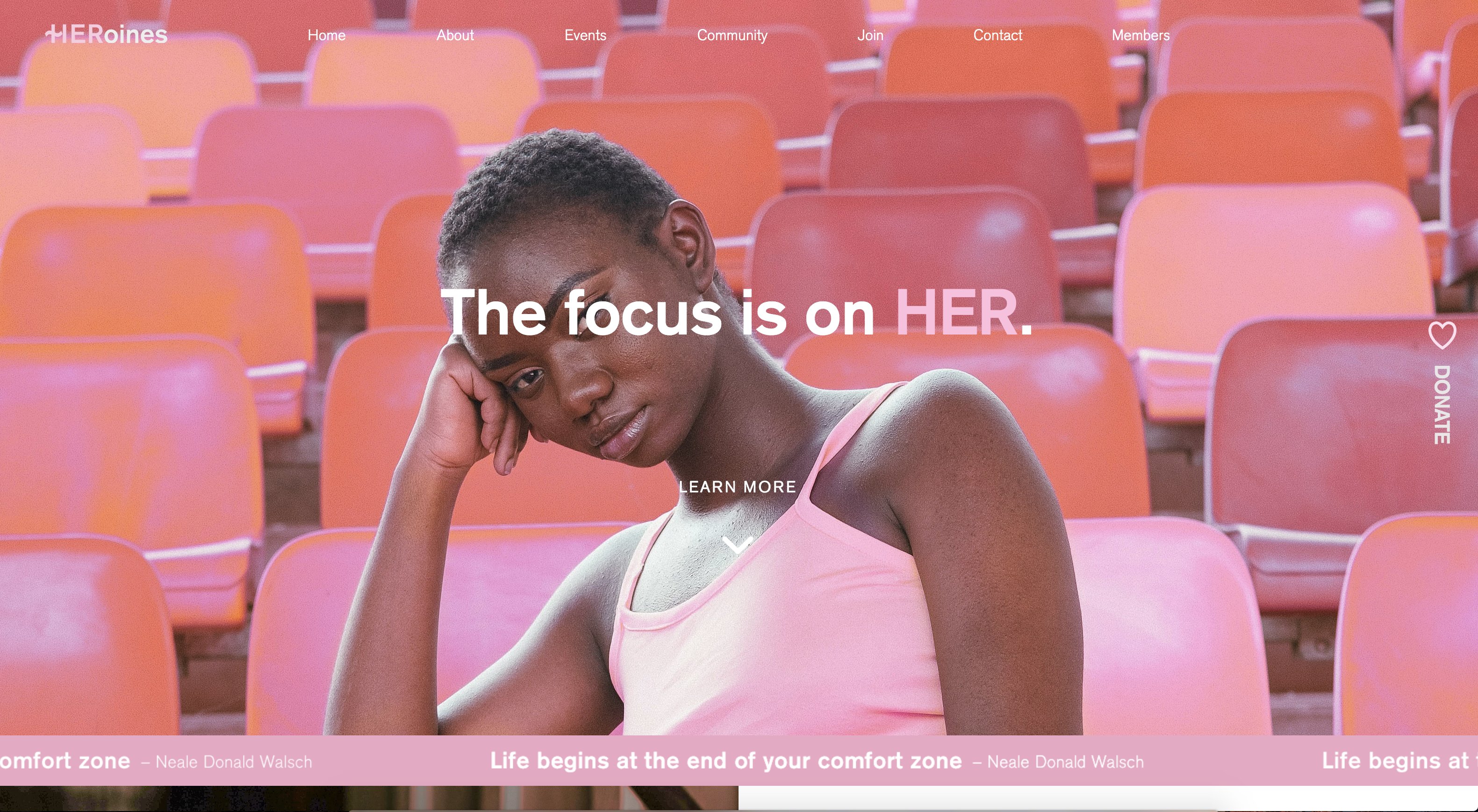
One of the fundamental things to keep in mind when creating a brand is its story. And nowhere is this more true than when it comes to non-profits. A story is a way to put a company’s values front and centre, which was one of the biggest realisations for Wix Design Playground 2019 student Valerie Trisnadi.
“It was important not to focus on just the aesthetics of the website, like making it look nice or just cleaner,” explains Trisnadi, who worked with Qiuyu Guo to reimagine Jolaubi Osho’s organisation, HERoines,inc.. “Portraying the values of the site was something huge. It was fundamental to making sure that its message would get across, and that would lead to getting more membership for the organisation.”
02. Creators are paired to promote growth
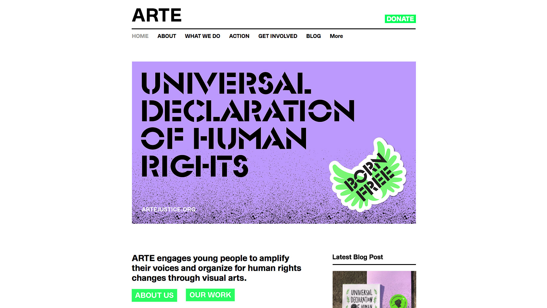
By working with other designers, creators are able to share their skills and learn something new. This is because they are carefully paired so that everyone is in a position to be exposed to new techniques. Take illustrator and designer Kristina Filler, who took part in the 2018 Wix Design Playground to design the ARTE website.
“The Wix team did a really good job of pairing artists together,” she reveals. “I have very strong illustration skills and client relations skills, but I don't have very strong typographic skills. So they paired me with typographers who were really great at developing the structure of the website, and I interspersed some illustrations into it.”
03. Designers are encouraged to play
This mingling of skills and personalities means that the Wix Design Playground lives up to its name. “The whole theme of the programme was to encourage play,” adds Filler, who tends to usually work with small teams.
While this allows her to have a hand in all parts of the process, it comes at a cost. “The downside is that you don't have a big budget to mess around and experiment,” she says. “And if you do that, it's kind of on your own time.” With the Design Playground though, she had more opportunities to try out new tools and approaches. “It reminded me of the value of that, and how I need to do more of it.”
04. It reinforces the value of design
One recurring theme at the Design Playground presentation was that non-profits can overlook the importance of good design. However this programme does an amazing job of demonstrating how valuable it is, and why non-profits and other businesses should invest in design.
“A lot of companies undermine the importance of design,” says Trisnadi. “For them, as long as there’s a logo and some information, they’re good. They don’t realise how visuals can impact a person and make them reach out or donate. And if there’s no interest, that pro-activism won’t continue. And that’s what design does, and organisations can undermine that.”
05. The course isn't the end
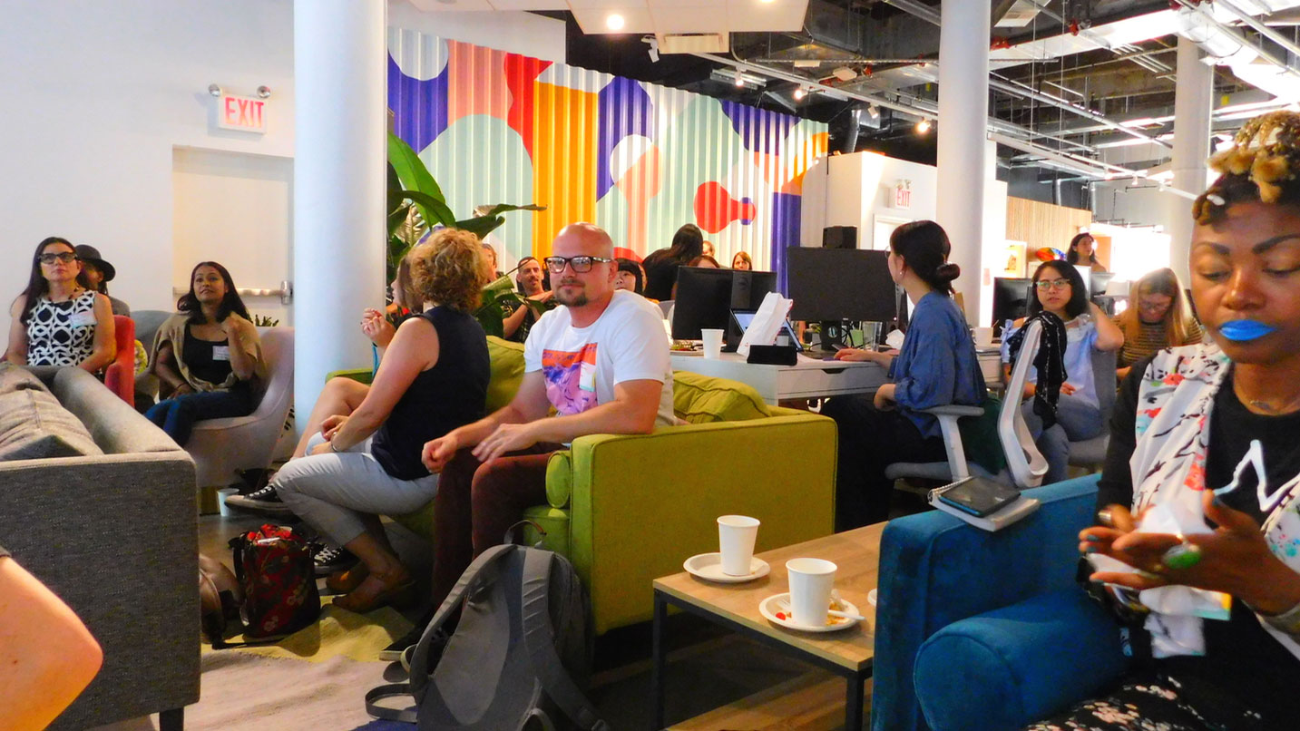
Graduating can be a scary moment, suddenly you find yourself adrift in the ‘real world’. This isn’t the case for the Design Playground attendees though. “It didn’t end when the Playground ended,” says Filler, “I really feel like they are genuinely interested in seeing us grow.”
It’s more than Wix just wanting to create something that reflects well on them, too. For Filler, the connections that she made at the Design Playground resulted in the sponsorship of her social good and feminist podcast, Women Crush Weekly.
If you want to get involved with the Wix Design Playground 2020, click here to be taken to the application page. Good luck!
Related articles:

Thank you for reading 5 articles this month* Join now for unlimited access
Enjoy your first month for just £1 / $1 / €1
*Read 5 free articles per month without a subscription

Join now for unlimited access
Try first month for just £1 / $1 / €1
Get the Creative Bloq Newsletter
Daily design news, reviews, how-tos and more, as picked by the editors.

Dom Carter is a freelance writer who specialises in art and design. Formerly a staff writer for Creative Bloq, his work has also appeared on Creative Boom and in the pages of ImagineFX, Computer Arts, 3D World, and .net. He has been a D&AD New Blood judge, and has a particular interest in picture books.
