5 small-client rebrands that attracted big attention
Discover how these small-scale projects ended up in the limelight.
In recent years, a whole string of rebrands for major companies have made the internet fizz with discussion. DesignStudio's work for Airbnb and Premier League, for example, got legions of fans frothing at the mouth with both glee and rage.
More recently, North's new identity for London's Science Museum and W+K's rebrand of Formula 1 were the talk of the design industry – in the latter case, for litigious reasons as well as aesthetic ones.
But we're not here to talk about those today. Small businesses are the bread and butter of the design industry, but they often fly under the radar of the design press – with some notable exceptions. Read on to discover five small-scale rebrands that received a disproportionate amount of attention, and what you can learn from them.
01. The Butcher The Baker
Relatively small-scale rebrands that are pitched at niche markets, or highly location-specific, are unlikely to garner widespread attention unless they're covered by the design press, or fare well at the major design awards.
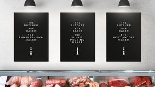
Unless you were based in Dundee, Scotland, or prepared to travel a few hundred miles for a string of sausages and a freshly baked loaf, you wouldn't think a merger between a third-generation artisan baker and a local family owned butcher would be big news.
Step up The Partners (now Superunion). The fact that a butcher and a baker were involved was almost too good to be true. The children's rhyme Rub-a-dub-dub provided the perfect creative copywriting opportunity, with the third line ("The butcher, the baker, the candlestick maker") playfully conveying relevant brand messages.
The logo resembles a candlestick but, on closer inspection, is constructed from inverted silhouettes of a butcher and a baker. The branding is beautifully clever and stylishly simple, and picked up gongs from D&AD, the Brand Impact Awards and more – showing how, with the right investment in smart design, a tiny artisan producer can punch above its weight.
02. Hidden Characters
Public relations has had its reputation tarnished over recent years. In the era of incessant media spin and 'fake news', the gloss and glitz have definitely dulled somewhat. Consumers increasingly want authenticity and substance, and brands have had to respond accordingly.
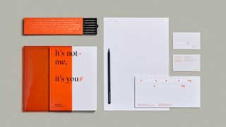
For its rebrand of Bang PR, Australian studio Re: repositioned the agency's offering as a more thoughtful, strategic beast – a far cry from the champagne-quaffing, red-carpet-rolling hedonism of old-school PR. In short, the rebrand put the focus on the clients' needs, not the PR firm itself.
Hidden Characters was the perfect name to express how the firm works behind the scenes to offer value. Using the unseen typographic symbols in programmes such as Word and InDesign as a graphic device, Re: built a simple but effective branding system, using print finishes and folding techniques to play with the viability of different aspects.
All in all, it's a great example of branding that practices what it preaches, putting a smart, thoughtful twist on a sector not renowned for its subtlety. Like The Butcher The Baker, Hidden Characters was noticed at the design awards – picking up a Graphite Pencil at D&AD, amongst others.
03. Boxes In Boxes
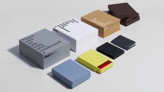
Showing off a series of different sized cardboard boxes may not seem like a dream design brief at first glance, but Studio Sutherl& founder Jim Sutherland has a knack for finding joy and playfulness in the most unlikely places.
Like The Partners with The Butcher The Baker, Sutherland found the perfect source of inspiration in a children's nursery rhyme for this project for London-based printing and packaging firm Boss Box, using lines from 'There was an old lady who swallowed a fly' to express the idea of progressively smaller objects fitting inside each other.
Like the previous two examples, wit and simplicity is crucial for the impact of this project. The concept is conveyed entirely through different weight, size and playful placements of type, which also highlights the format and construction of each box.
Another D&AD success – this time with a Yellow Pencil – Boxes In Boxes reinforces the importance of a strong idea for turning even the most potentially mundane brief into a major talking point.
04. Mr Cooper
Johnson Banks is well known for its smart, high-profile branding programmes for clients in the cultural, not-for-profit and education sectors in particular. Its work for Cystic Fibrosis, Unicef UK and the University of Cambridge cleaned up over three successive years at Computer Arts' Brand Impact Awards.
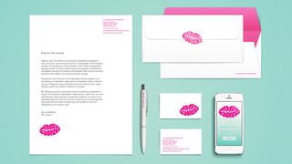
The world-class consultancy is perhaps less known for working with artisan startups. But its cheeky, stylish and colourful brand identity for Mr Cooper – an 'adult' ice-cream brand specialising in alcoholic and gourmet flavours – was splashed across the design press, even while the product was still in its testing phase.
Johnson Banks expressed the hedonistic nature of Mr Cooper's product through a beautiful hand-lettered mark, produced in collaboration with copywriter Rob Clarke. The mark utilises positive and negative space to spell out the brand name within the shape of a pair of lips. The logo can be rubber-stamped directly onto cups and napkins, as if a cheeky kiss had recently been planted there.
Designers love a clever application of negative space, as well as a playful, versatile brand mark – and the design press lapped it up like it was ice cream.
05. Penstripe
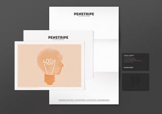
Taxi Studio's rebrand of Leeds Booklet Printing Company shows that a twist of creative genius can turn a middleman service business into an 'event' brand in its own right. Taxi ditched the perfunctory name and replaced it with the more stylish, location-agnostic Penstripe – all part of a strikingly creative, highly versatile brand identity that blends traditional typography with a contemporary pinstripe pattern.
At its heart is a series of line drawings of visual metaphors that sum up creativity, efficiency and innovation. There's a rabbit being pulled from a hat, with a tagline about quick, clever solutions to challenges; a lightbulb filament inside a head, communicating bright ideas and market-leading solutions; an alarm clock being slotted into a piggy bank, with a tagline about saving precious time.
Penstripe went on to win multiple awards. And like the other examples on this list, it goes to show that if you treat every design brief with the same level of rigour and creative expression – regardless of the size of the client – it can pay off in the long run.
Related articles:

Thank you for reading 5 articles this month* Join now for unlimited access
Enjoy your first month for just £1 / $1 / €1
*Read 5 free articles per month without a subscription

Join now for unlimited access
Try first month for just £1 / $1 / €1
Get the Creative Bloq Newsletter
Daily design news, reviews, how-tos and more, as picked by the editors.

Nick has worked with world-class agencies including Wolff Olins, Taxi Studio and Vault49 on brand storytelling, tone of voice and verbal strategy for global brands such as Virgin, TikTok, and Bite Back 2030. Nick launched the Brand Impact Awards in 2013 while editor of Computer Arts, and remains chair of judges. He's written for Creative Bloq on design and branding matters since the site's launch.
