5 sensational new websites to be inspired by
These sites push the boundaries of web design.
The world of web design never stands still, with innovations constantly spicing up what's possible online (we're currently getting excited by the opportunities variable fonts offer to website layout, not to mention what's now achievable with a website builder). But while we've been excited by some web design tools that are still in their infancy, practices that have been around for a while are also finding new leases of life.
To give you a taste of how designers are finding creative ways to make the web a more enjoyable place to be, we've rounded up five sensational new sites that are sure to inspire you (to make your site the best it can be, ensure your web hosting is up to scratch). These are all platforms that are shaking up the status quo, as well as proving to be useful and informative.
01. WWF Australia
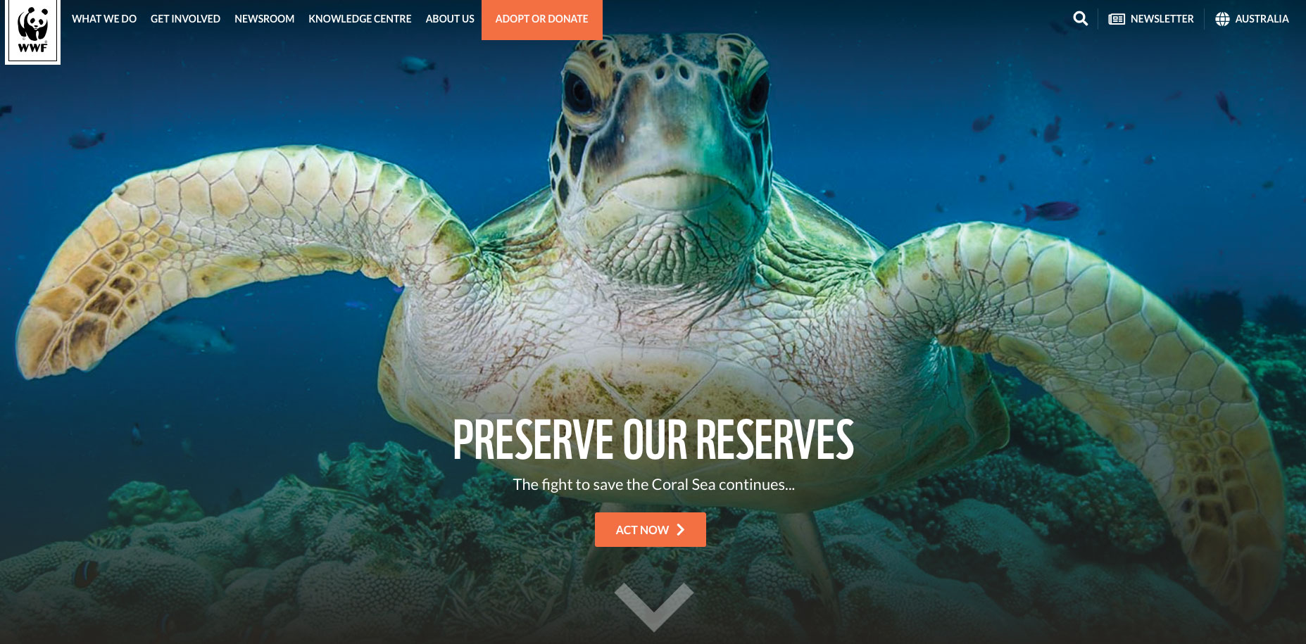
WWF Australia boasts a website worthy of its reputation. Celebrating wildlife and nature, the bold, colourful site invites users to become completely immersed in the natural world. Vibrant images showcase the beauty of amazing wildlife, and invite users to learn about different species. Videos enable visitors to understand the links between modern behaviours and the damage to some of the world’s most beautiful habitats.
The website also sheds light on conditions of those working within the natural world. One video in particular opened our eyes to illegal fishing practices. We learnt about how common illegal, unregulated fishing vessels are and or how the food we eat may have been sourced through one of these practices.
As we begin to gain awareness of the issues surrounding the world we live in, it’s great to see an organisation using its website to educate the public.
02. Sundae
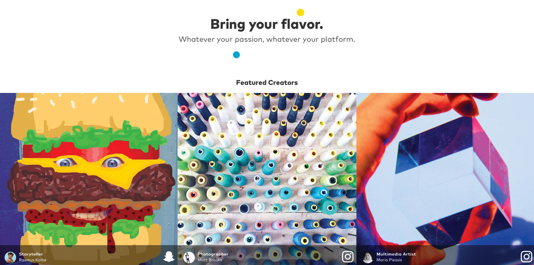
The variety of websites and services available for recruitment today is extraordinary. However, in the creative sectors where freelancing is widespread, it can be difficult to find opportunities that enable you to pursue your interests and passions with other like-minded folk.
Sundae is a platform that aims to enable creators to collaborate with brands and other makers to bring ideas to life. Whether you’re a choreographer, chef, mixologist, filmmaker, illustrator, coder or blogger, if you create, then this hub is for you. The concept itself is great, and the website quite simply makes you want to become part of a vibrant, creative community.
The homepage video is a celebration of all things creative, and communicates the vast range of talent and possibility available within the creative industries. You’re invited to share details of what you care about, including issues such as education, equality, sustainability and health, in order for Sundae to connect you with the most suitable collaborators.
As if that wasn’t enough, Sundae’s service also makes it possible for creators to connect with brands that share similar values. Sundae positions itself as a place ‘where creators and brands mix to make positive impact’. At a time where global issues are at the forefront of our minds, this is a fantastic opportunity for people in the creative industries to work together to drive positivity and change where it matters the most.
03. Fonterra: From here to anywhere
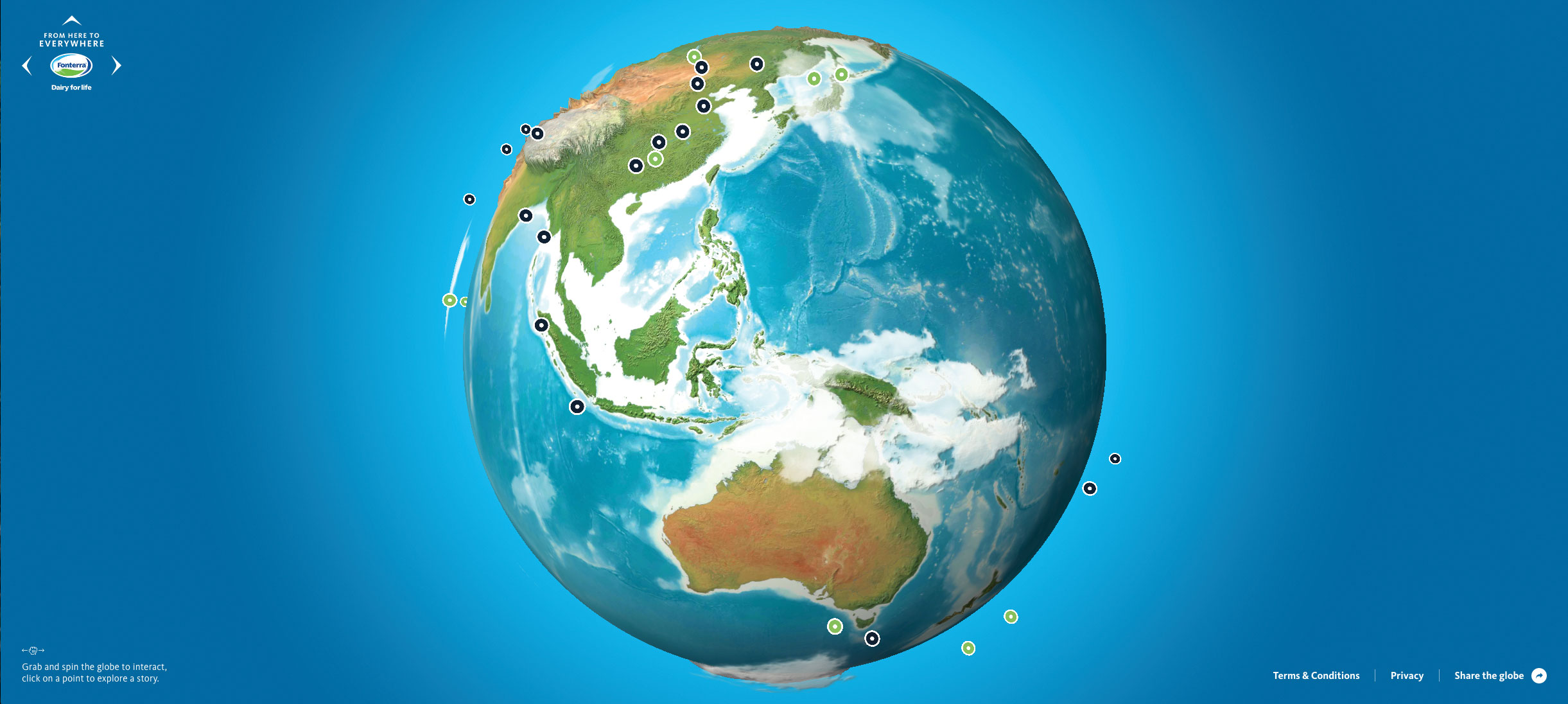
Fonterra created a 3D experience using WebGL, to show how New Zealand dairy innovation has improved health and nutrition around the world. Visitors can explore the world by spinning and clicking the globe, to fully understand the ‘everywhere’ nature of Kiwi dairy innovation.
It’s slick, easy to navigate, and most importantly, provides users with an interesting way of understanding more about global distribution. As well as providing a unique and creative way of engaging users, I think it’s a brilliant way to educate students and young people about the global economy.
The UX is the best element of this platform. Giving users the choice of which countries to explore makes the experience more memorable. It’s grabbable, spinnable and zoomable – everything you need for a fully immersive experience.
04. Bitter Renter
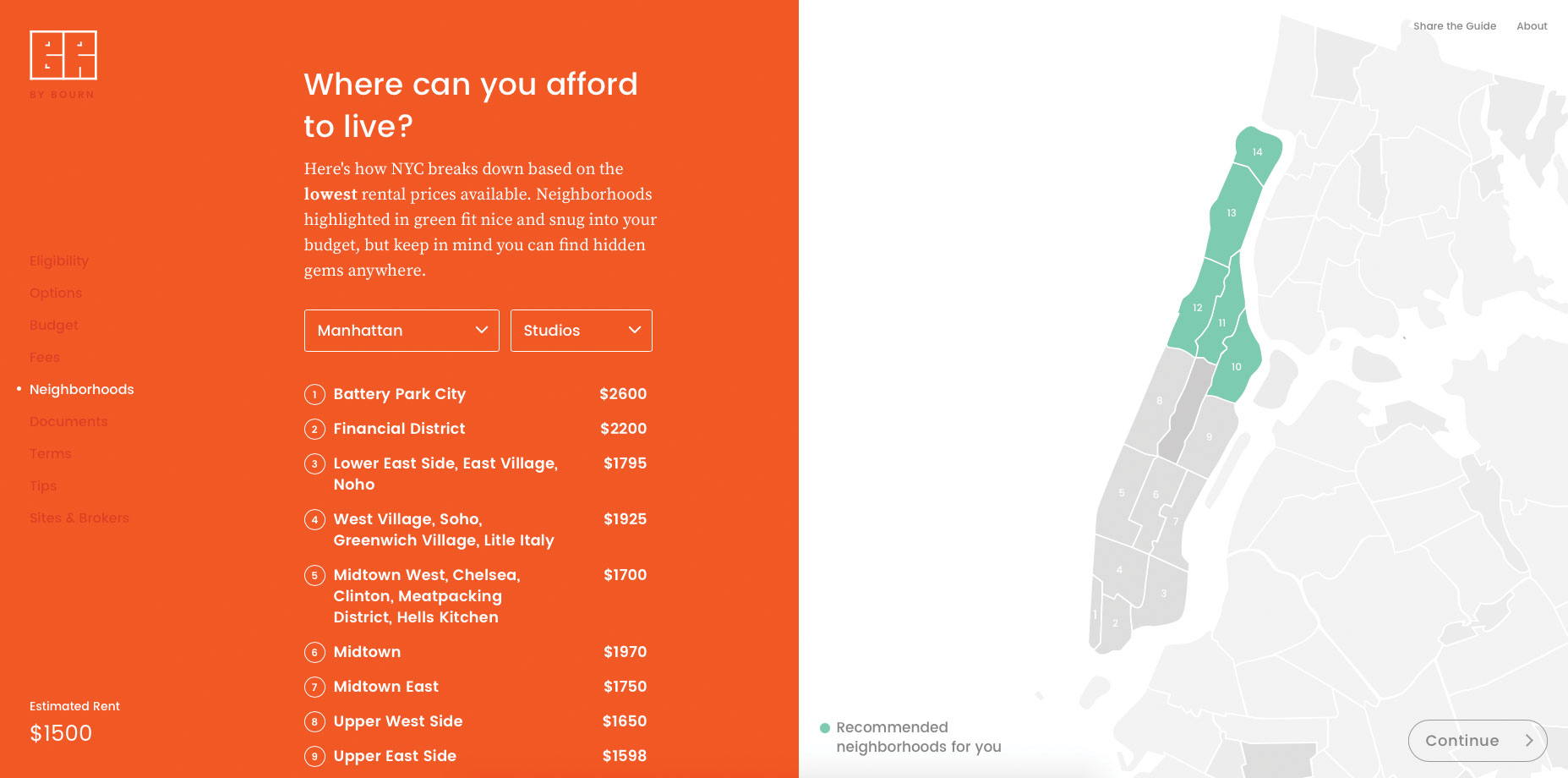
The journey from teenager to adulthood is a rollercoaster of emotions. Before you know it, it’s time to start looking for your own place. It’s an exciting time, gaining independence and imagining all the fun you can have without anyone to nag you to clean up after yourself.
But where do you start? Which area of your favourite city can you realistically afford to live in? Do you need to consider sharing for a while? There are so many questions in the minds of young property hunters. Luckily, for those in New York City, there’s a platform that takes the hassle out of the process.
Bitter Renter is an interactive guide built by a New Yorker who had experienced the disheartening nature of apartment hunting in the city, from broker’s fees to surprise last-minute increases in rent. With a clean, user-friendly interface, the step-by-step guide carries the user through each stage of finding the ideal apartment.
From starting at the very beginning at eligibility and sublet options, to working out your budget and finding a neighbourhood, narrowing down your options couldn’t be easier. You’re even invited to enter your expenses for consideration, to ensure the suggestions are as realistic as possible. An ‘Application Checklist’ is also provided, along with a list of property terms that are worth knowing.
By the time you’re finished, you’re armed with an impressive selection of knowledge to impress any property manager or broker. We think this is a real gem in the world of renting, and hope something similar appears in the UK.
05. Essentially Geared Wine Co
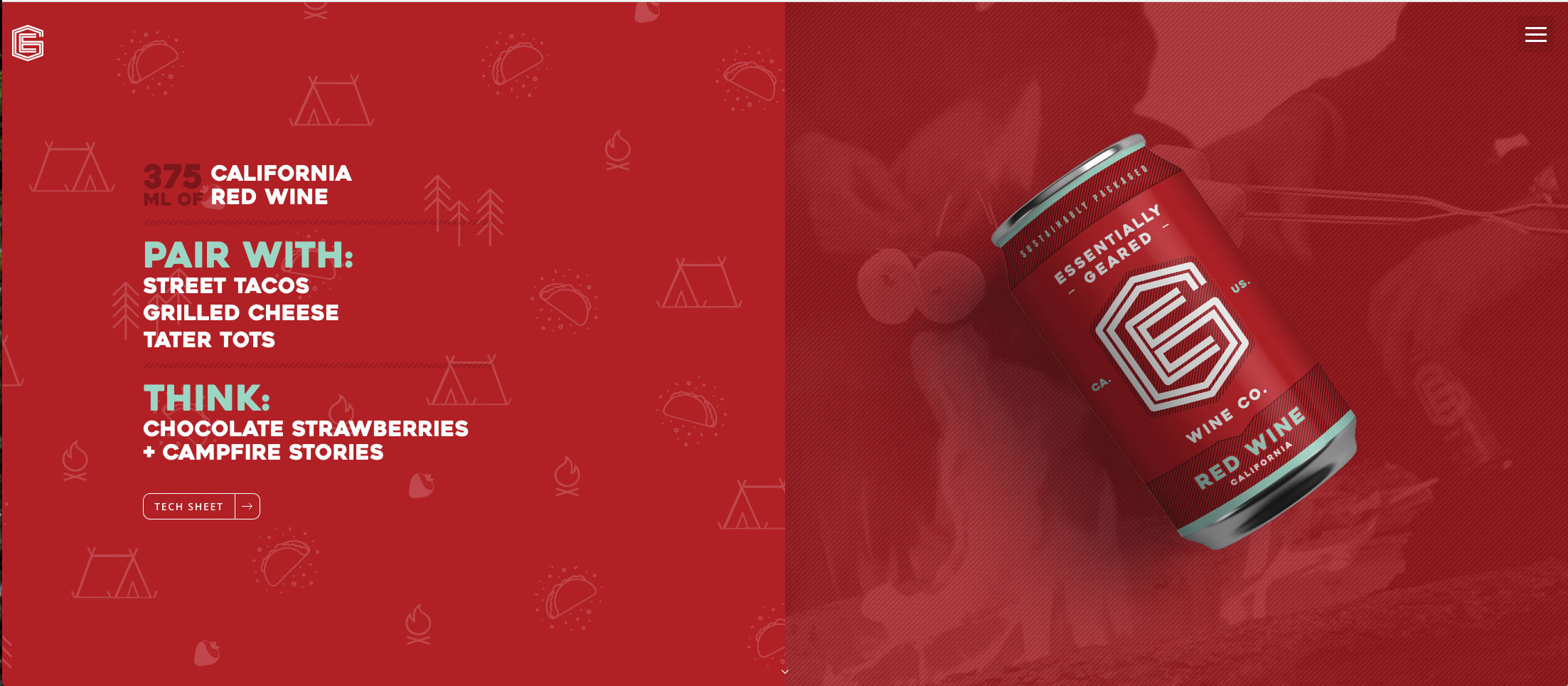
Personality is one of the things you remember most prominently when you first meet someone, and it’s similar when you visit a website for the first time. The site for Essentially Geared Wine Co. makes a great first impression, using vibrant colours, bold fonts and videos to engage its audience within seconds of entering the site.
The brand leverages its site to be the key communicator of its ethos: ‘We’re inspired by Mother Nature’. Packaging the wine in sustainable cans, Essentially Geared Wine Co. carries its ‘no fuss’ ethos through the site, implementing beautifully shot videos featuring people enjoying outdoor activities, quality time with friends or family, and the beauty of nature.
A light-hearted and humorous persona is also evident through the way it recommends food pairings for the wines. Unlike many brands who might automatically attempt to name the most expensive-sounding dish on the planet, the suggestions appeal to the down-to-earth, unpretentious nature of the product and brand values. California Sauvignon Blanc with corn dogs? Okay!
What’s most enjoyable about this website is how relaxed the experience makes you feel. Slow-motion videos with low saturation offer an almost nostalgic sense of longing for the simple pleasures life has to offer. The brand’s strapline – ‘Crafted to keep up with your everyday adventures’ – couldn’t be better illustrated. The selection of beautifully shot videos enable visitors to view how perfectly this product would fit into that idyllic lifestyle.
Feeling inspired? Why not make a mood board and store it in reliable cloud storage?
This article was originally published in issue 305 of net, the world's best-selling magazine for web designers and developers. Buy issue 305 here or subscribe here.
Related articles:

Thank you for reading 5 articles this month* Join now for unlimited access
Enjoy your first month for just £1 / $1 / €1
*Read 5 free articles per month without a subscription

Join now for unlimited access
Try first month for just £1 / $1 / €1
Get the Creative Bloq Newsletter
Daily design news, reviews, how-tos and more, as picked by the editors.
