5 quick and easy ways to fix your portfolio
Simple ways to smarten up your portfolio site in no time at all.
Giving your portfolio a quick once-over to freshen it up is always a great idea, even if you're not actively looking for a job. We've made it dead easy for you, by having a look at the portfolios of some fantastic designers to see what they do particularly well.
So here are five quick – genuinely quick – tips to smarten up the way you present your work to the world. And if this post whets your appetite for more portfolio porn, then don't miss our selection of great portfolio examples.
01. Cut, kill, destroy

This is one of the tougher tips to follow, but it's possibly the most rewarding. If you've got your portfolio looking pretty lean as it is, further cutting is going to be hard, hard graft. Do it anyway.
Cut, kill and destroy 10 per cent of whatever you think of as being finished. Portfolio 20 pages long? Get it down to 18. Got 40 projects on your website? Make it 36. You have to exercise caution here, as you don't want your body of work to appear too light. But, generally speaking, give your portfolio one last brutal edit and it'll really sing.
Check out the portfolio site of Shelby Hipol, an NYC designer: there's no wasted word or image here. We're guessing Hipol could easily triple the content on his portfolio. But he mirrors its minimal design by only including his very best projects.
02. Tell a story

The simplest way to refresh your portfolio without adding any new work to it is this: rearrange what you've already got. Think of it like a film. Screenwriters talk about 'plot points' – the tent poles upon which they hang their story. You can tell a new story by simply moving around your plot points, which are your projects.
This method works particularly well with physical portfolios, but the principles work just as well online. Should your career-defining work go first or last? Do you really want your favourite project lost in the middle? What's the very last thing you want the reader to see?
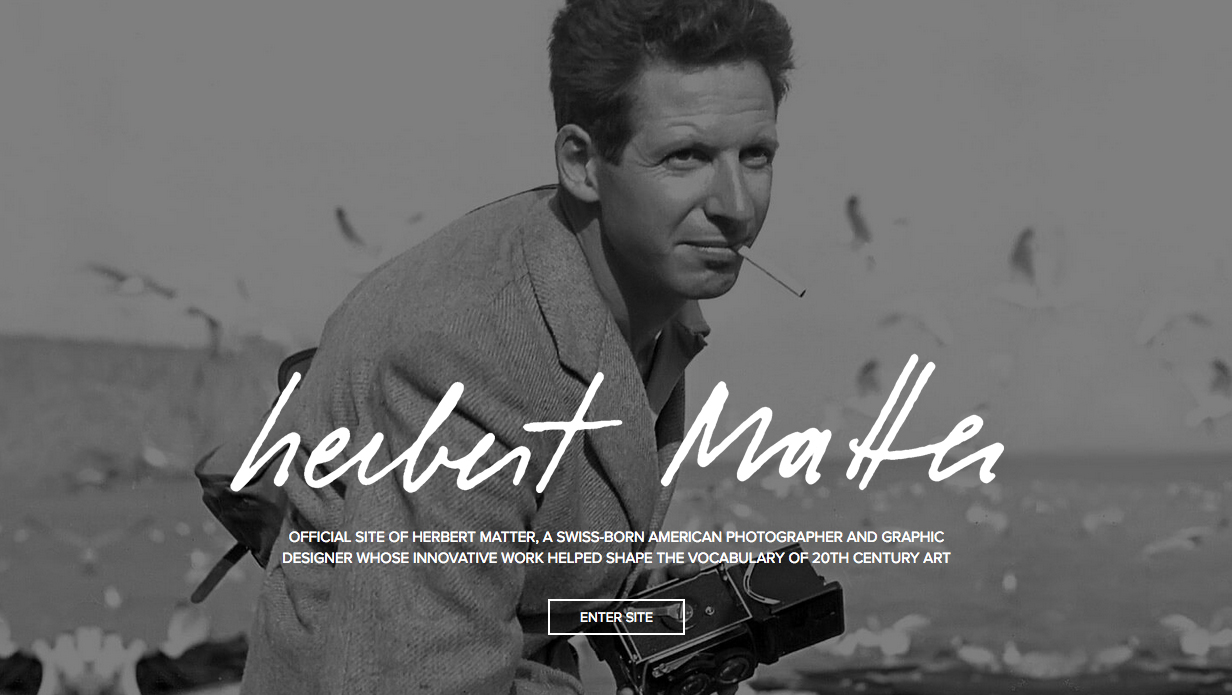
Check out the portfolio site for the late Herbert Matter. It starts with a big, bold intro page. You enter and then land on a video about his visual language. It's the story of his life and his work.
03. Use quotes

It doesn't get much quicker than this: make a list of your most satisfied clients, your favourite commissions, the design teacher who gave you the best grades. Email them and ask for a recommendation, a quick quote explaining how creative you are, or how you brought the project in under budget, or how you never missed a lecture and smashed all of your exams.
Go steady with it. You definitely don't want to overdo this. But the odd recommendation can make a big difference to a potential client or possible employer.
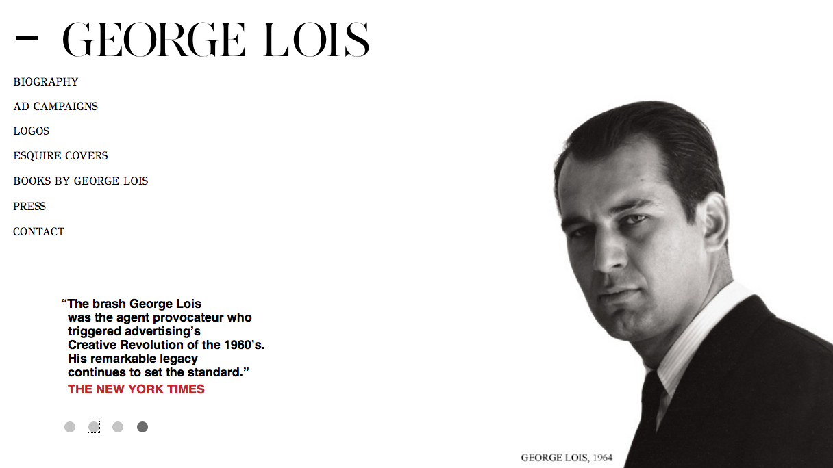
Check out the portfolio site of the legendary designer George Lois: "the agent provocateur who triggered advertising's Creative Revolution," goes one quote on his front page. How could you resist looking through his stuff after reading that?
04. Make it easy to use

You could have a lean, well-organised portfolio, complete with plenty of great recommendations from clients. But one really obvious thing could be letting you down: is your portfolio easy to navigate?
If your portfolio is online, don't sacrifice usability for overly convoluted or gimmicky design. If you have a print portfolio, think about page numbers, chapter headings, colour co-ordination, maybe even a ribbon bookmark, anything that helps the reader out. Hopefully, whoever's reading it will be looking at your work more than once, flicking from this project to that one and back again. Do them a favour. Make it easy to read, chronologically or otherwise.
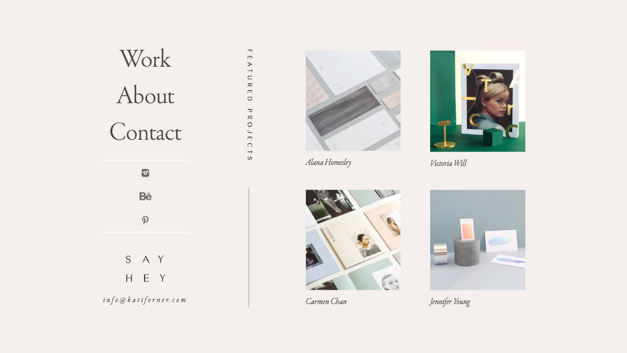
Have a look at how Kati Forner Design does it, with Work, About, Contact the only options available in the menu. Contact details are also displayed clearly. This makes it easy to navigate and tells you everything you need to know without getting lost in a sea of pages or animations.
05. Include a photo of you

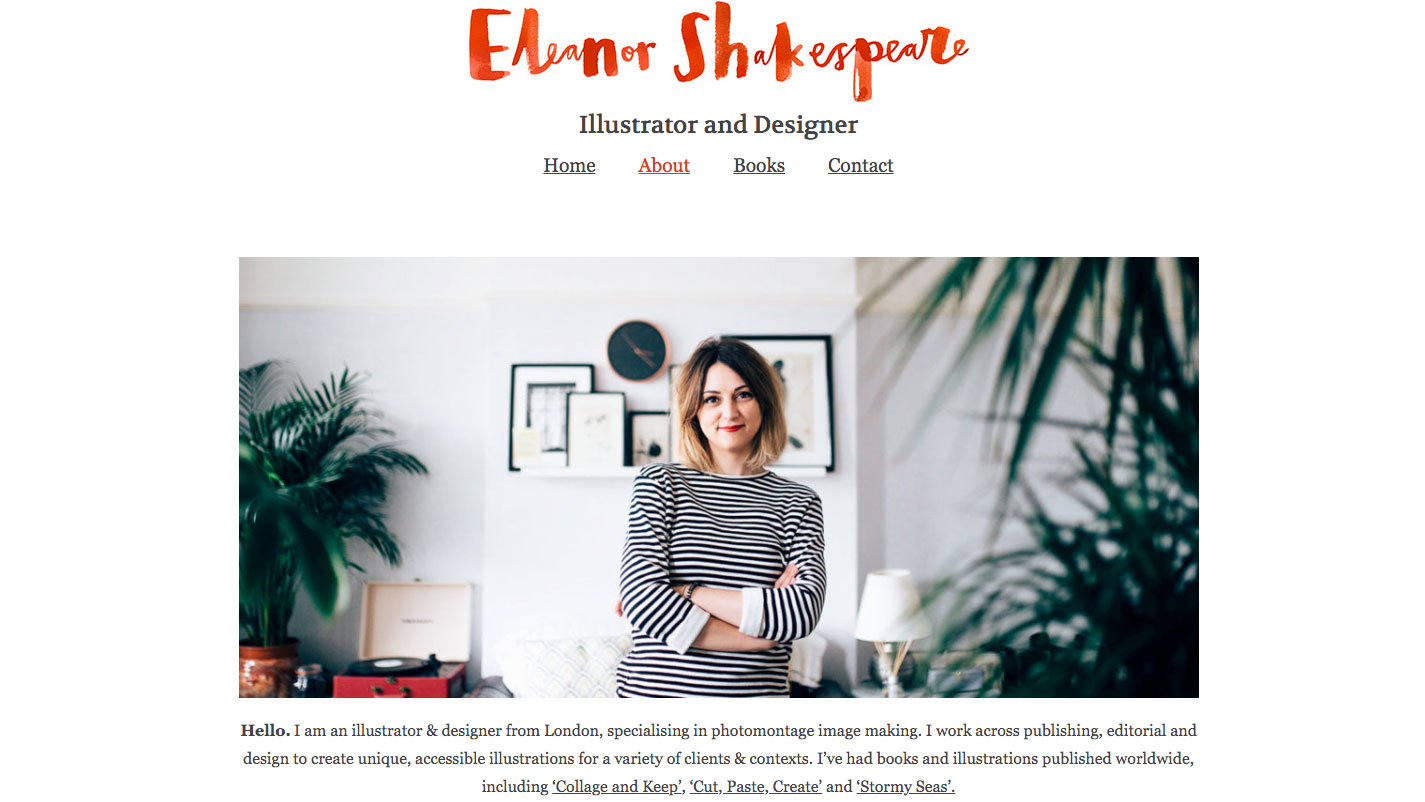
This one's open to debate. But, at time when more people are familiar with our Twitter name than they are with our face, a photo could make all the difference. A proper photo, that is. Not an illustration. Not a multilayered photo-manipulation thing. And definitely not some arty, clipped, black and white shot in which you look like your dog's just died. A portrait – head and shoulders, or a bit more.
A photo can stop your portfolio looking cold and clinical, and help the reader get a feel for who you are. Eleanor Shakespeare does this well on her site, and her photo arguably helps with this.
Read more:

Thank you for reading 5 articles this month* Join now for unlimited access
Enjoy your first month for just £1 / $1 / €1
*Read 5 free articles per month without a subscription

Join now for unlimited access
Try first month for just £1 / $1 / €1
Get the Creative Bloq Newsletter
Daily design news, reviews, how-tos and more, as picked by the editors.
Gary Evans is a journalist with a passion for creative writing. He's recently finished his Masters in creative writing, but when he's not hitting the books, he loves to explore the world of digital art and graphic design. He was previously staff writer on ImagineFX magazine in Bath, but now resides in Sunderland, where he muses on the latest tech and writes poetry.
