5 clever Instagram layouts you must see
Be inspired by these highly creative banner layouts on Instagram.
As the social platform of choice for many designers and illustrators, Instagram demands a creative eye and an innovative touch for a profile to really stand out. And ever since its website redesign in 2015 – much larger images, in crisp, clean rows of three – people have been taking advantage of the canvas it offers.
Breaking out of the constraints of the grid layout, creatives are developing expansive photo-led designs and scrolling banner artworks. The designs interact playfully with the standard Instagram layout, raising a smile in the viewer and achieving much greater impact than individual images alone ever could.
Sometimes you can attract attention by going the other way, of course. US rap star A$AP Rocky was a leading exponent of this approach, having collaborated with artist Robert Gallardo on a work of abstract Insta art. But he hit the headlines in January 2018 by wiping the slate clean, replacing his entire feed with a single image, captioned 'REVIVAL', before his new album release.
There are many ways to approach your Instagram layout, but the most impressive see the whole feed as one canvas. Read on to be inspired by five particularly clever and creative Instagram layouts...
01. rickandmortyrickstaverse
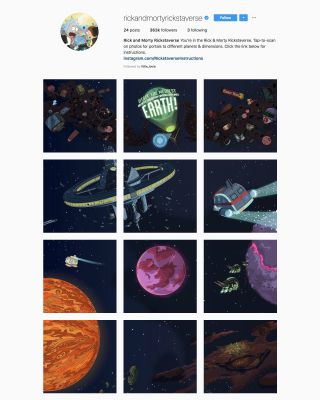
An expansive banner canvas is one thing, but Rick and Morty's 'Rickstaverse' takes things to the extreme. Kicking off with a macro, outer-space view of a scene, featuring planets, spacecraft, an orbiting medical centre and more, things really get interesting when you tap through to different sections of the artwork.
Zoom in to explore different areas, and use 'warp' links within the images to jump to different locations. The image captions provide instructions, as well as maintaining the surreal, quirky Rick and Morty tone of voice throughout. This is a work of Insta genius, and well worth the considerable effort it clearly took to build.
02. micahnotfound
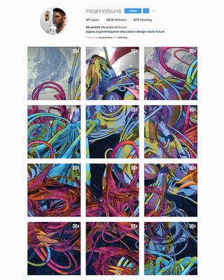
When it comes to expansive, continuous artistic canvasses on Instagram, you won't find many better examples than Micah Milner, aka micahnotfound – a VR artist, and member of the collective ART404. Milner's clients include Adobe, Pantone and Google, and his inspiring Instagram layout shows what attracted them.
There are over 400 posts at the time of writing, presented as one continuous piece of artwork – a broad range of styles and compositions, seamlessly integrated into a huge vertical canvas. It's not quite infinite-scrolling, but give the man time...
03. mishanonoo_show
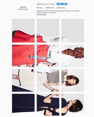
Tall and thin canvasses such as micahnotfound's can be tricky to work with, especially when you're telling a photographic story that works best in landscape, rather than blending together different artworks. Step up Misha Nonoo, who provides a fresh perspective on banner-style Instagram layouts.
Fashion designer Nonoo used her Instagram account to present her S/S '16 Collection as a continuously scrolling look book, with 180 images presented over 60 rows. The first two rows simply say 'Turn your device horizontally to view the Insta-show'.
It's a smart, eye-catching, but also extremely simple approach. Nonoo didn't stop there, and went on to present her subsequent Fall '16 Collection as Snapchat's first-ever 'Live Lookbook', translated to her Insta feed as a series of video demos.
04. anderson._paak
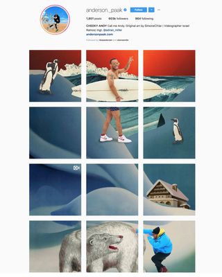
Like fellow US rapper A$AP Rocky (pre-deletion), Anderson Paak collaborated with an illustrator to create an expansive visual canvas for his Instagram layout – in this case, collage artist Simone Cihlar, who was tasked with incorporating various images of the singer/songwriter into the artwork.
There are plenty of tongue-in-cheek touches – at points, Paak is riding a turtle, patting a polar bear, surfing with penguins, and reclining naked on a tiger-skin rug, with a fistful of dollars and a glass of bubbly. It's a treat to scroll through, and shows the value that a close collaboration with a talented illustrator can have for a brand or celebrity engaging with social media.
05. nubleys
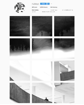
Our final example on this list of inspiring Instagram layouts is this enchanting black-and-white feed from Canadian web designer, "community-drive wordsmith" and communication strategist Nick Hubley.
Hubley's business offering may seem complex, but his Insta biog is enigmatically simple – and scrolling down the feed takes your through various monochrome, collaged scenes, both rural and urban, interspersed with phrases such as 'try something new', 'just hit go' and 'believe in yourself'.
It draws you in and piques your curiosity as a piece of experimental artwork in its own right, and with over 500 posts in total you'll feel like you're sucked down a conceptual rabbit hole by the end.
Related articles:

Thank you for reading 5 articles this month* Join now for unlimited access
Enjoy your first month for just £1 / $1 / €1
*Read 5 free articles per month without a subscription

Join now for unlimited access
Try first month for just £1 / $1 / €1
Get the Creative Bloq Newsletter
Daily design news, reviews, how-tos and more, as picked by the editors.

Nick has worked with world-class agencies including Wolff Olins, Taxi Studio and Vault49 on brand storytelling, tone of voice and verbal strategy for global brands such as Virgin, TikTok, and Bite Back 2030. Nick launched the Brand Impact Awards in 2013 while editor of Computer Arts, and remains chair of judges. He's written for Creative Bloq on design and branding matters since the site's launch.
