5 brands so strong they don't need a logo
The right brand assets can get a message across without a logo.
A strong, memorable, self-contained marque just isn't enough in our increasingly multi-channel world. While logo design remains important, brands also need to develop a toolkit of equally distinctive parts.
Colour in branding can have a strong impact, and a truly 'ownable' palette is the holy grail. A bespoke branded typeface can also work wonders, as can a distinctive brand voice, or unique approach to art direction or illustration.
With all this in mind, read on for five examples of brands whose assets make them recognisable even when the logo is removed...
01. O2: bubbles and blue gradients

Provided you're already familiar with the O2 brand, air bubbles rising through a simple vertical gradient of sky blue to royal blue will be enough to distinguish the brand from its competitors. And that's a powerful position to be in.
Oxygen bubbles say 'O2' in more ways than one, and their use in the telco firm's branding has symbolic significance too: a breath of fresh air. Their size and position is variable, so they're not a brand marque in any conventional sense.
The 'bubble' motif translates into any kind of circular application, such as the enormous O2 Arena in London, formerly known as the Millennium Dome.
O2's long-running 'Be More Dog' campaign by VCCP added a playful, life-affirming twist to its marketing. And its more recent Follow The Rabbit ads keep that quirky, character-driven edge alive, but the bubbles and blue gradient remain constant.
02. Virgin: scarlet red and cheeky wit

For a vast holding company like Virgin Group, whose diverse ventures span the globe and include gyms, airlines, trains, holidays, telecommunications, media, banking, retail and even space travel, brand coherence is an interesting challenge.
Although the scrawled Virgin logo ties all of these organisations together, its distinctive scarlet is a powerful element that helps make the brand, in its own words, "sophisticated yet playful, glamorous yet cheeky, stylish yet flirty".
That brand voice cuts through the competition wherever it appears. According to Virgin Mobile's guidelines, it's about cheeky wit, being friendly and natural, and keeping it fresh, simple and positive.
"Our humour should be based on honest, insightful observations of human behaviour, not cheesy gags of randomness just for the sake of standing out," explain the guidelines. "We want to be witty, not weird." Combine that tone of voice with Virgin's distinctive red, and the logo becomes almost secondary.
03. IKEA: pure Swedish simplicity

When your packaging and communications are as brutally simple as IKEA's, you need a distinctive brand toolkit to tie it all together. Its logo is distinctive, but the proudly Swedish blue-and-yellow palette is much more so.
If you see a blue bag with yellow handles – or while in-store, a yellow bag with blue handles – it's pretty unmistakable which brand you're dealing with. Its choice of typeface alone is never going to punch through. For 50 years IKEA used Futura, before controversially switching to the even more ubiquitous Verdana in 2010.
But a bold, all-caps treatment of a quirky, distinctively Swedish-sounding name – next to a simple line drawing of the product it describes, and step-by-step infographic instructions – doesn't need an IKEA logo next to it. It's a gloriously pared-back aesthetic that has been much aped, but never bettered.
04. Coca-Cola: blend of shape, colour and form

That Spencerian script logo, which has remained relatively unchanged since the 19th century, is unmistakably Coca-Cola – and it's one of the most iconic American logos.
But Coke has also laid claim to a handful of equally strong brand assets, as demonstrated by its recent CokexAdobexYou campaign, which invited the public to reinterpret those assets in new ways.
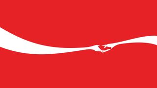
They include the iconic glass bottle silhouette, the dynamic wave shape, and of course the red-and-white colour palette. Any combination of two or more of those assets screams Coca-Cola with no logo in sight.
A strong demonstration of this was Ogilvy & Mather Shanghai's 2012 poster, designed by Jonathan Mak – who had previously risen to global fame for his 'Steve Jobs silhouette' Apple logo. Mak combined the red-and-white palette, bottle shape and wave form to create a strikingly simple graphic of two hands sharing a Coke.
05. Macmillan: distinctive type and intimate tone

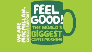
Sometimes a typeface and smart use of language can be enough to define a brand. When Wolff Olins rebranded cancer charity Macmillan, the agency embraced a much more personal approach that reversed its formerly 'institutional' vibe.
Rather than a corporate stamp, the new branding – 'We are Macmillan. Cancer support' – felt like the start of a conversation. The accompanying communications, set in the irregular, handmade-looking typeface in two distinctive shades of green, continued in that vein by using the 'We...' construct to feel inclusive and friendly.
The highly distinctive combination of type and colour does all the heavy lifting in terms of brand recognition, to the extent that the logo could easily be removed without any doubt of what brand is represented.
Related articles:
- 5 times brands shook up their logo to create a powerful message
- These big-brand logos all pass the silhouette test
- 5 small-business rebrands that got big attention
- Empty list

Thank you for reading 5 articles this month* Join now for unlimited access
Enjoy your first month for just £1 / $1 / €1
*Read 5 free articles per month without a subscription

Join now for unlimited access
Try first month for just £1 / $1 / €1
Get the Creative Bloq Newsletter
Daily design news, reviews, how-tos and more, as picked by the editors.

Nick has worked with world-class agencies including Wolff Olins, Taxi Studio and Vault49 on brand storytelling, tone of voice and verbal strategy for global brands such as Virgin, TikTok, and Bite Back 2030. Nick launched the Brand Impact Awards in 2013 while editor of Computer Arts, and remains chair of judges. He's written for Creative Bloq on design and branding matters since the site's launch.