4 iconic beer logos (and why they're so effective)
What we can learn from these four world-famous beer brands.
Beer branding is a hugely competitive sector, and achieving shelf stand-out in this area is no mean feat. The surge of small-scale craft producers shows no sign of waning, and these new breweries are keeping the big global brands on their toes.
In an attempt to stay fresh and relevant, many of the biggest household names have enjoyed major rebrands in recent years, often emphasising the richness of their heritage in their respective countries to differentiate them further from these young pretenders.
With this in mind, read on to discover four of the world's best logos for beer brands, which have all enjoyed recent rebrands to reawaken their heritage, plus why they're so successful...
01. Carlsberg
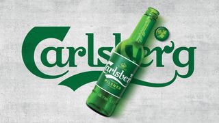
Launched September 2018, Taxi Studio's overhaul of Carlsberg, one of Denmark's best-loved brands, is designed with timelessness in mind – with a pared-back confidence that balances form and function in trademark Danish style.
After extensive research into Carlsberg's 171-year heritage, Taxi found countless subtly different iterations of Thorvald Bindesbøll's original logo had been employed over the years. Drawing on 2.5km of archives, the agency worked closely with lettering specialist Tom Lane to craft a new logo that remains faithful to the brand's heritage, while being timeless enough to be fit-for-purpose in the long-term.
While it retains the brand DNA of its predecessor, the new logo is more streamlined and elegant, and the various other brand assets – including the crown, hop leaf and signature of Carlsberg founder JC Jacobsen – were painstakingly re-crafted too.
This included the shape and placement of the swoosh beneath the logo, which was reworked so that typography could be locked up beneath the logo for the first time in its history, enabling the branding system to work effectively across all of Carlsberg's many global variants.
Sustainability was a key part of the brief, and in a market where rebrands often ride the waves of design trends and are obsolete within a few years, Taxi created a distinctively Danish aesthetic that's designed to last.
02. Budweiser
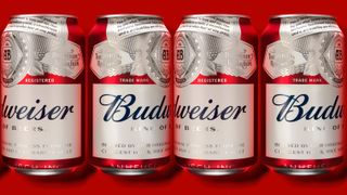
Budweiser enjoyed a major global rebrand from JKR New York in 2016 that celebrated the quintessentially American beer's heritage, and reinforced it as a US icon. Every detail was hand-crafted: while the distinctive 'bow tie' logo was retained, JKR pared back to its purest red-and-white form, flattening it down and removing the gold detailing and 3D shadow effects.
The original script logo from 1860 was carefully redrawn for timeless appeal, and is incorporated on cans and bottles (such as those above) in a simple navy blue form, accompanied by a crest and earnest written manifesto at the top of the label, an approach that evokes the spirit of the 19th century.
Channelling the message that the beer is ‘brewed the hard way’, this includes the promise: "We know of no brand produced by any other brewer which costs so much to brew and age, [resulting in] a taste, a smoothness and a drinkability you will find in no other beer at any price."
In 2016, limited-edition bottles and posters also featured the Statue of Liberty, as well as American Olympians and Paralympians from that year's Summer Games, to emphasise the beer's American credentials – and this proud association with its country of origin remains front-and-centre in Budweiser's branding.
03. Guinness
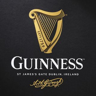
Another much-discussed 2016 project, Design Bridge's Guinness rebrand centres around an intricately detailed harp, and like the previous two examples, celebrates heritage and craftsmanship in a genuinely authentic way.
Over the course of the brand's 250-year history, the Guinness harp had lost its depth and character, and Design Bridge set about breathing new life into the emblem. Historical letterpress labels found in the archives, making reference to Dublin's River Liffey, provided a useful starting point, as did industrial and architectural features of the Guinness Storehouse itself.
Guinness' new identity is packed with heritage details, including wavy lines evocative of the Liffey, hand-drawn type inspired by the original labels, and metal-stamped lettering from inside the brewery. Design Bridge also collaborated with letterpress specialists to create a three-dimensional relief of the harp, adding an extra layer of richness to the rebrand.
04. Miller Lite
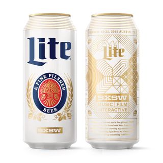
Miller Lite is the USA's third-largest beer brand, and has the claim to fame of inventing 'light beer' back in 1975. Following a dramatic decline in sales in the face of increasing competition, MillerCoors brought Turner Duckworth on board to for a radical rebrand, in a bid to attract new drinkers.
The existing packaging didn't live up to the original promise of 'great tasting beer with half the calories', and felt like it was following rather than leading the sector. Inspired by the history of the brand, the agency redesigned its distinctive 1970s packaging in a contemporary way.
Custom typography, a new monogram logo and a range of illustrated elements added depth and versatility, ensuring the design was fit for purpose in the modern world. The rebrand was immediately successful, reversing Miller Lite's fortunes and bringing its forgotten heritage to light.
Related articles:

Thank you for reading 5 articles this month* Join now for unlimited access
Enjoy your first month for just £1 / $1 / €1
*Read 5 free articles per month without a subscription

Join now for unlimited access
Try first month for just £1 / $1 / €1
Get the Creative Bloq Newsletter
Daily design news, reviews, how-tos and more, as picked by the editors.

Nick has worked with world-class agencies including Wolff Olins, Taxi Studio and Vault49 on brand storytelling, tone of voice and verbal strategy for global brands such as Virgin, TikTok, and Bite Back 2030. Nick launched the Brand Impact Awards in 2013 while editor of Computer Arts, and remains chair of judges. He's written for Creative Bloq on design and branding matters since the site's launch.

