4 design trends we're all tired of hearing about
These movements may be influential, but it's time to ditch the buzzwords.
Design trends are like viruses. They can spread globally almost overnight thanks to the proliferation of design blogs and social sharing platforms.
Trends can be inspiring and influential, but in the wrong hands run the risk of homogenising design and diluting fresh, exciting ideas.
Meaningful, lasting design movements are built on substance. The forward-thinking designers driving them do so because it makes sense to their creative process and is appropriate for a particular client's needs – not because it's on-trend.
Which makes it all the more maddening for everyone involved when buzzwords and bandwagons take over. Read on for the four biggest offenders of the last decade...
01. Authenticity

'Artisan', 'heritage' and 'retro' can join 'authentic' on the list of most over-used buzzwords in design and branding. It's exhausting, particularly if the brand in question doesn't actually have much history to speak of.
Sometimes, such as with Design Bridge's beautiful rebrand of Guinness, there's heritage in abundance, brought to the surface with craft and authenticity. But 'authenticity' has become an insufferable catch-all not just for how something was made, but also purely what it looks like.
A distressed texture doesn't make something more 'real', and adding the date a brand was established doesn't automatically give it more gravitas. You can whittle a piece of packaging out of a hunk of foraged driftwood with your bare hands if you want, and it might be authentic in its own way, but you have to ask yourself: why?
Do your research. Be rigorous. Dig up meaningful stories about the brands you're working for – where they're from, who their founders are, how they've evolved and developed, what genuinely makes them special. There's your 'authentic' starting point. Find that gem, and build from there. Hint: it doesn't have to be about the past.
02. Play

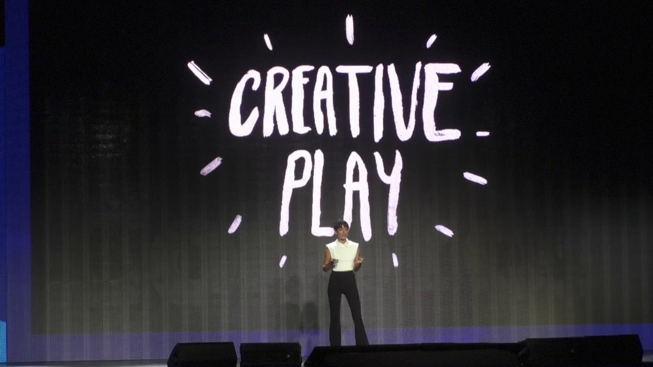
We get it. Designers and creative people of all kinds love the opportunities that play affords, and sometimes it leads to beautiful, serendipitous creativity that takes your work in fresh, unexpected directions.
Jessica Walsh has long been an advocate of this, making it the subject of many of her design conference talks. And Jim Sutherland's multi-award-winning, much-revered work bears testament to the value that everyday joy and curiosity can have.
This is all enlightening and exciting. But 'play' has become a buzzword, and we'll be brutal: if you want to make it integral to your process, focus your energy. Don't just make it an excuse to feel like you're 'being creative', and avoid the necessary rigour involved to solve a brief.
Designers like Walsh and Sutherland turn messing around with paint or playing with cardboard boxes into world-class work, because it fuels how they think. Make sure you learn from your play if you want it to be a useful exercise.
03. Storytelling
Done right, storytelling can be powerful. It encompasses the voice a brand uses to communicate; the values it wants to portray – and how; and the emotional response it evokes in doing so. It doesn't have to be a literal narrative, although it might be.
TSB's charmingly animated campaign after the bank split from Lloyds (above) is one such example. It told the story of how the Reverend Henry Duncan pioneered the savings bank movement, and emphasised that, at a time when trust in the banking system had been badly shaken post-crash, this "new" bank is actually 200 years old.
But the story must be meaningful, skilfully told, and relevant. Bear that in mind before throwing yourself, and your client, onto a potentially rickety bandwagon. As with authenticity, do your due diligence and find a story that resonates.
Forcing the wrong story onto a brand because 'telling stories is cool' is like handing a terrible script to a great actor, or casting a third-rate actor in a movie with great potential. It wastes everyone's time.
In short, make sure it's a story that's actually worth telling – and indeed, that storytelling is even the right approach to take in the first place.
04. Failure

The idea that failure is a positive thing has really gained traction in recent years across the design spectrum. It made the cover of WIRED UK in 2011, which helped catapult the concept into mainstream consciousness.
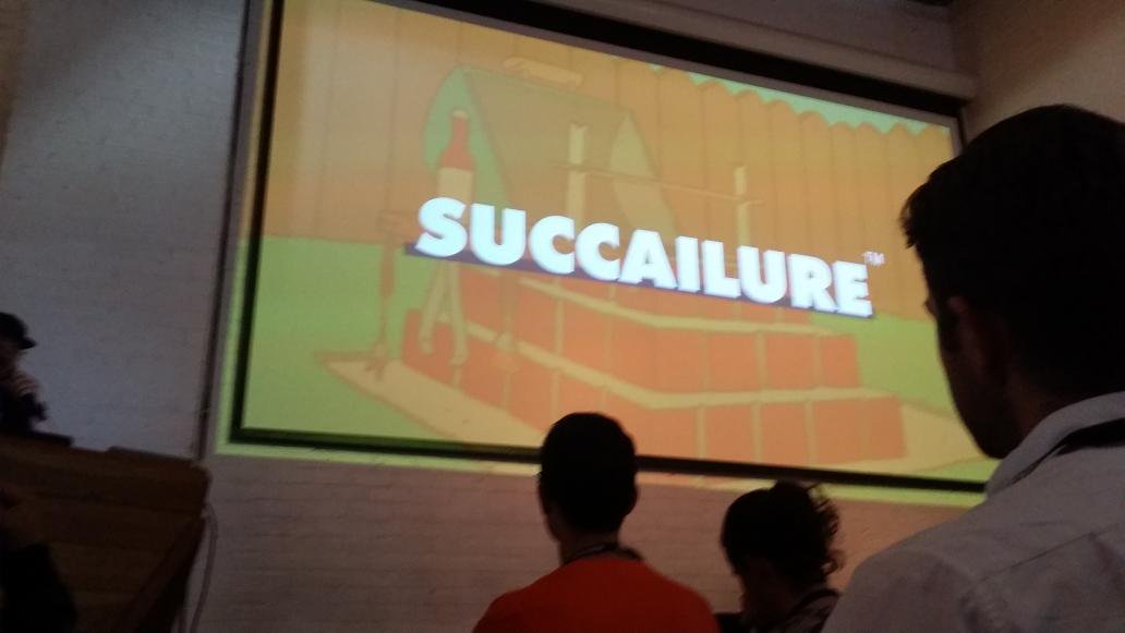
ustwo has coined its own portmanteau term – 'succailure' – to describe what the agency believes is the ultimate success to be found from trial, error and constructive failure. Many start-ups are successful because they fail fast, and keep innovating.
'Failure', like 'play', has become a buzzword that describes an on-trend creative process, rather than the eventual outcome necessarily, although glitch art and other 'deliberate mistakes' abound in some sectors.
Once again, though, to turn failure into success you need the right attitude. Innovation is often about trial and error, and learning from mistakes quickly. It's not cool to fail on purpose, or because you didn't have a strong enough motivation, and shout about it because you're on-trend. It's cool to innovate, and treat failure as a necessary byproduct of that.
Related articles:

Thank you for reading 5 articles this month* Join now for unlimited access
Enjoy your first month for just £1 / $1 / €1
*Read 5 free articles per month without a subscription

Join now for unlimited access
Try first month for just £1 / $1 / €1
Get the Creative Bloq Newsletter
Daily design news, reviews, how-tos and more, as picked by the editors.

Nick has worked with world-class agencies including Wolff Olins, Taxi Studio and Vault49 on brand storytelling, tone of voice and verbal strategy for global brands such as Virgin, TikTok, and Bite Back 2030. Nick launched the Brand Impact Awards in 2013 while editor of Computer Arts, and remains chair of judges. He's written for Creative Bloq on design and branding matters since the site's launch.
