4 brilliant personal logos – and why they work
Boss your brand: pro advice to create a stunningly effective personal logo.
As a designer, you ultimately live or die by the quality of your work – but some careful self-branding can do wonders to make you more memorable. Crafting your own identity is often the first step in setting up a design agency, but it can be a useful exercise for freelancers too.
Self-branding can add personality to your services, or authority to your work, by positioning you as an expert in your field. As a freelancer, branding yourself can also make you appear bigger and more versatile.
If you work in branding, it will also show what you're capable of, and it’s good to practice what you preach. It's not essential by any means, but if you're going to do it, make sure you do it right.
Read on to discover four freelance creatives who have nailed their personal branding, and what you can learn from them to create your own brand...
01. Studio Juli-ette
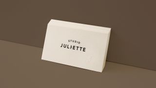
Sometimes a simple exercise in restrained, skillful typesetting is all you need to develop a distinctive personal brand. One great example is Juliette Kim.
Although born in Seoul, South Korea, the founder of Studio Juli-ette has lived globally – including Indonesia, Australia and most recently, the United States. "Multicultural personality has always been one of the biggest characteristics of my work. So I wanted to communicate that in my logo in a subtle way," she says.
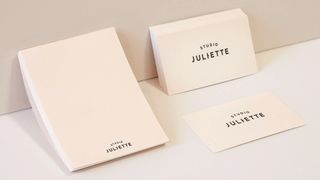
A subtle typographical twist combines the English spelling of her name with its Korean equivalent – Nahyeon, or 나현. "That’s why I have the little dash in Juli-ette," Kim explains.
Studio Juli-ette's wordmark is supplemented by a J-shaped marque that resembles a treble clef. This is embossed onto Kim's business cards, and she has plans to expand the studio's offering in the future by launching a line of products under this more playful sub-brand.
02. Manon Gabriëls
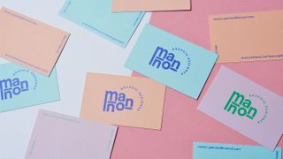
Where Juliette Kim chose to combine subtle typography with a cool, neutral shade of cream, Manon Gabriëls opted for a more colorful approach in his personal branding. Keen to convey a sense of fun, the Belgian designer chose complementary pastel colors – including peach, sky blue and lilac – for his business cards.
For the logo itself, Gabriëls rearranged the letters of his name into a stylish composition, which combined with chunky, rounded underlines beneath the 'm' and 'n' forms a distinctive logo marque.
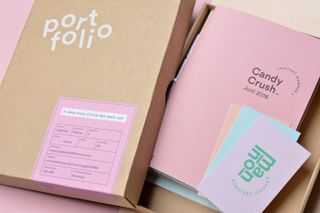
Finally, 'graphic designer' is curved around a path to complete a typographical lock-up with the main marque. "The half circle has become a useful graphic element," adds Gabriëls, who has also used the logo on the cover of his case study booklets, which continue his pastel palette and are contained within a portfolio box.
03. Lindsey Kugler
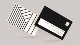
Personal branding is a great way to practice what you preach in terms of style and approach and show clients what you're capable of. LA-based designer, Lindsey Kugler, developed a cohesive identity system with this in mind.
"I wanted something edgy and eye-catching, but also sophisticated and a bit constrained," she explains. "The design is simple but bold, and the straight and diagonal lines have a strength to them, yet they are still traditional in form."
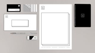
Kugler's minimalist logo is based on her initial, L and K – but rather than simply applying the logo to everything, she treated each piece of stationery as its own canvas, demonstrating how her flexible identity system works in practice across different materials.
"When those lines are combined to create the pattern on the back of the letterhead, that's where I was able to bring in that edge and playfulness," Kugler continues. "The black and white palette was an obvious choice because I'm obsessed with all things black-and-white, but I love the rawness it conveys, and the contrast."
04. Joy Li
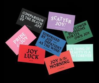
Sometimes it takes a little more creativity and conceptual thinking to turn a self-branding exercise into a campaign in its own right. Sydney-based Joy Li is a great example, having created an eye-catching campaign as a third-year student.
"I was lucky in that my name lends itself to multiple meanings and contexts, as well as for good copy puns," she smiles. "My purpose and process as a designer is to bring a little bit of ‘joy’ to everything I create, so I looked at meshing my name to create partial insights into my personality and interests."
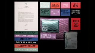
Li's business cards use the word 'joy' in the context of memorable quotes from authors and artists. "Design trends come and go, so I wanted my identity to be built on a concept rather than a certain aesthetic," she explains. "I wanted something that could be updated, without compromising the core idea."
For a typeface, she chose Harbour by Gareth Hague as she was impressed by its blend of modern and medieval lettering influences. "It's sort of contradictory to set such delightful copy amongst moody tones and gothic-style type," she admits. "But I think it’s what makes it more engaging, and a bit unexpected."
Once you've nailed your personal branding, it's time to put it into action to wow potential clients and collaborators – and digital print and design company moo.com can help. You’ll find a wealth of fun, affordable, easy-to-use tools for creating premium business cards, postcards and other stationery to really do your brand justice.
Related articles:

Thank you for reading 5 articles this month* Join now for unlimited access
Enjoy your first month for just £1 / $1 / €1
*Read 5 free articles per month without a subscription

Join now for unlimited access
Try first month for just £1 / $1 / €1
Get the Creative Bloq Newsletter
Daily design news, reviews, how-tos and more, as picked by the editors.

Nick has worked with world-class agencies including Wolff Olins, Taxi Studio and Vault49 on brand storytelling, tone of voice and verbal strategy for global brands such as Virgin, TikTok, and Bite Back 2030. Nick launched the Brand Impact Awards in 2013 while editor of Computer Arts, and remains chair of judges. He's written for Creative Bloq on design and branding matters since the site's launch.