4 awesome examples of handmade type in branding
These designers pulled out the stops to create standout branding.
As we explored in our feature on bespoke type, the branding trend for embracing a handmade aesthetic to lend your brand an air of authenticity is still going strong. However, in the onslaught of handwriting fonts taking over branding, how do you make sure your design stands out (and for the right reasons)? Here, we take a look at four creatives that used bespoke typography the right way on their packaging designs.
01. Grand Cru
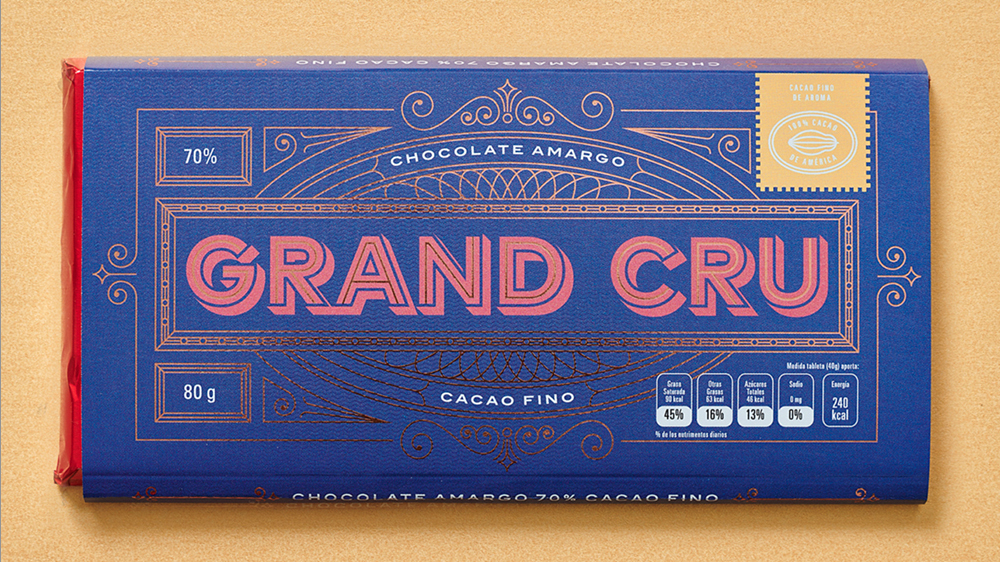
Monterrey-based design studio Parámetro was approached by chocolate brand Grand Cru’s founders to create playful branding that playfully reflected the company’s artisanal origins.
The team wanted to create a feeling that emulated the world of Willy Wonka, as well as the joy of finding that golden ticket. The aim was to “capture all things magic for the packaging,” explains lead designer Debbie Kennedy.
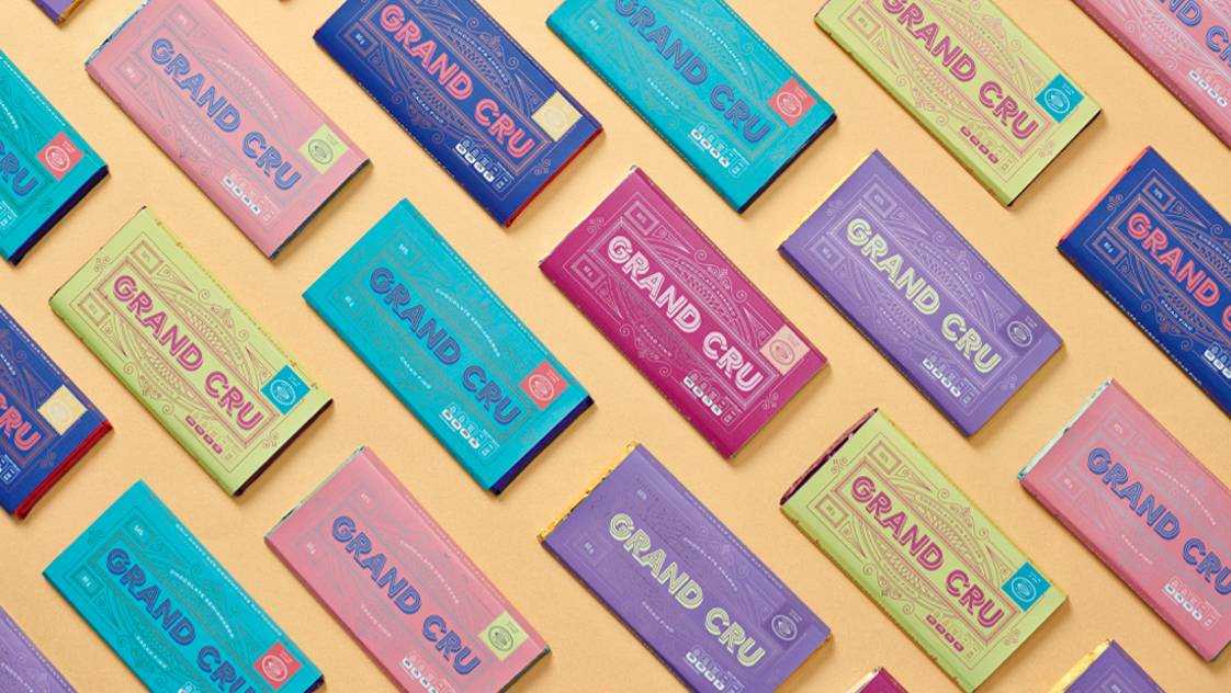
The branding takes vintage sweet designs as a reference point. Parámetro worked closely with the printer to find the perfect finish, and used spot UV to create a glossy feel, along with colour foils and special Pantone colours.
“That’s part of what gives the packaging this different and fun feeling,” says Kennedy. “Those sort of finishes help the consumer’s mind wander, and make them feel like they’re not just getting chocolate but a complete experience. The designs looked to position the brand somewhere between premium chocolate and something a little more approachable,” she continues.
The process was entirely created by Parámetro and began with hand sketching before moving into Illustrator, with the type based on existing typography that was then customised “to give it the kind of vintage candy, nostalgic feeling”, by adding 3D effects and foil detailing.
02. RedLeg
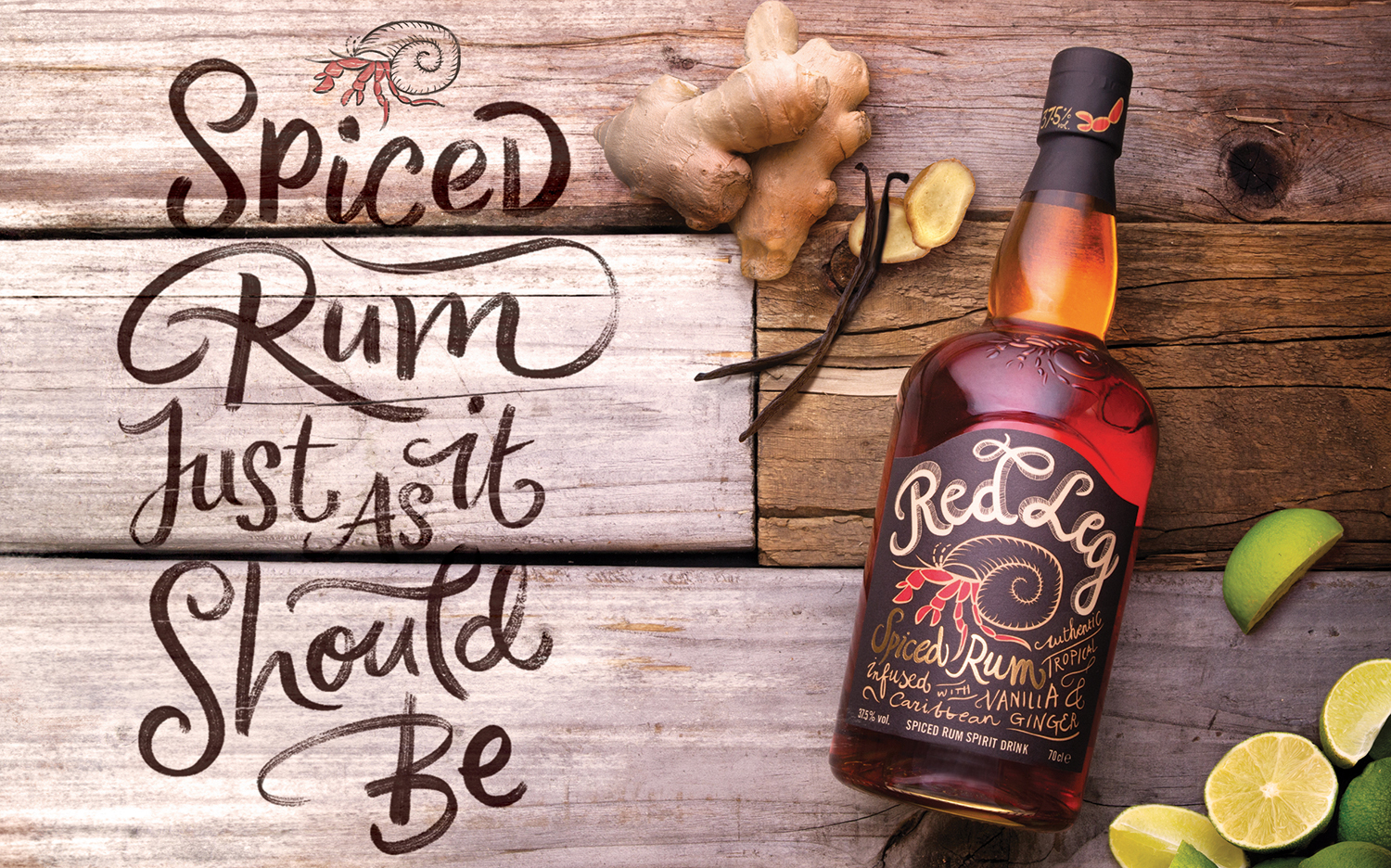
The work above for RedLeg came about when the brand wanted to celebrate its recognition at industry awards. The brief was to showcase the brand’s provenance and Caribbean spice with campaign imagery, which was loosely themed around a laid-back, Caribbean beach theme.
Kyle Wilkinson hand-painted signs with a scripty brush type. “It’s popular and on trend at the minute, but it matched the brand and tone they wanted to send out,” he says. “We built the set and photographed the type as if it had been painted on the wood. They’re keen to capitalise on the trend of brushy script everyone loves; it’s ‘rough around the edges’ type, not too pristine and perfect.”
The campaign imagery for RedLeg was created with a mixture of the hand-made, physical type, and digital solutions for the faster-paced applications, such as online campaigns.
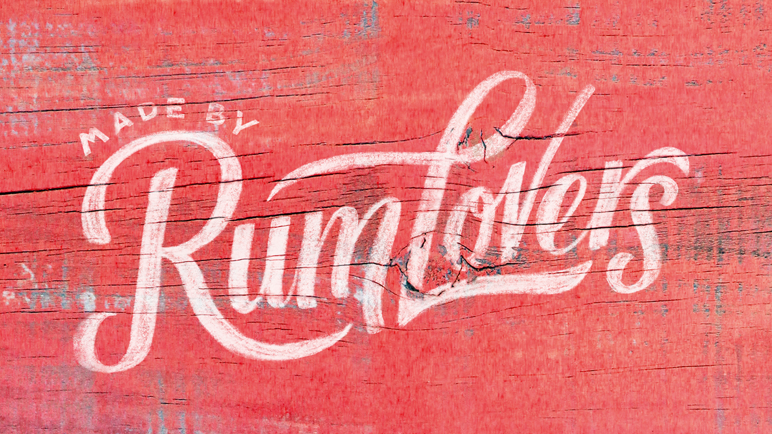
“We went out to a timber merchant and asked for the most knackered pieces of wood we could find,” says Wilkinson. “I didn’t want pretty wood that was well presented, I wanted stuff that had been soaked in the rain and had a bit of weathering to it. Then it was a mixture between painted type and some of the type being done digitally.”
The imagery was entirely created by Wilkinson, including all typography, art direction, photography and set build.
03. Williams Sonoma
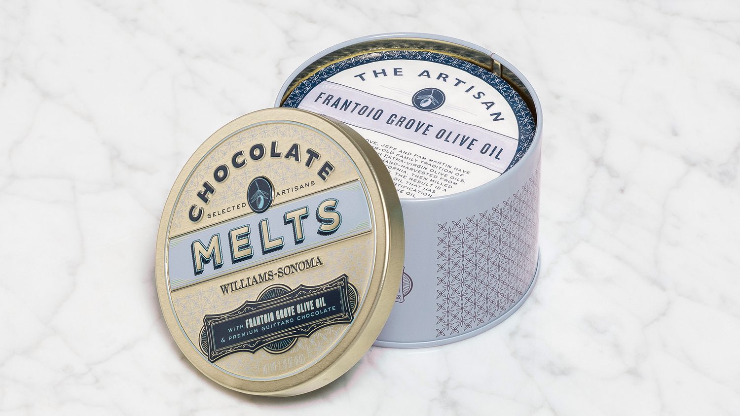
Here Design was commissioned by American kitchenware company Williams Sonoma to design a seasonal collection of tins for a new range of artisanal chocolates. Each tin celebrates a different traditional artisan, such as the bourbon distiller and the honey maker.
The designs merge influences from vintage American packaging, Victorian chocolate designs, historical typographic designs with ornate patterns (a honeycomb design for the Pretzel Peanut Butter Honey Truffles, for instance) and specialist finishes such as stamps of approval and fine embossing.
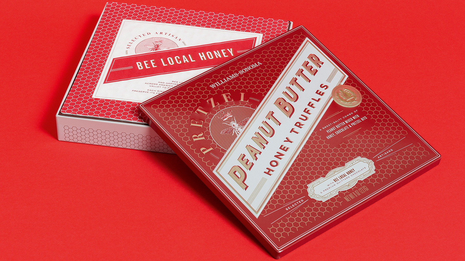
Attention to detail allowed Here Design to elevate the everyday, in the same way that each product had been crafted with a special uplifting ingredient. All type design was created using existing typefaces, which were extruded by adding textures where appropriate and the use of drop shadows to give a three-dimensional effect.
“The products have really good backstories, which lent themselves really nicely to how we might use exuberant, flamboyant, typography,” says creative partner Kate Marlow.
04. Mahonia Vineyard
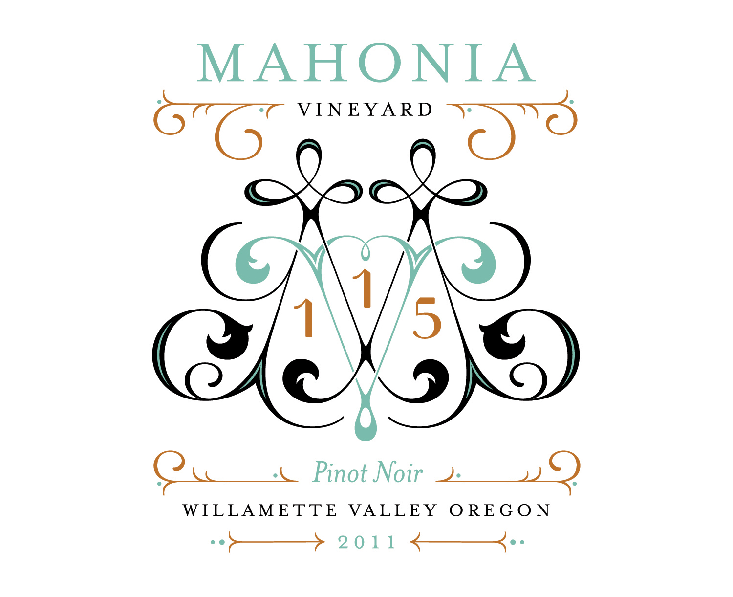
Jessica Hische was approached by client Travis Henry to create something “really special” for the limited-edition wine range, and briefed to create designs that felt premium, “like a high-end gift”.
The project started with two wines, a chardonnay and a pinot noir, “and I gave myself the limitation of designing with one foil colour plus 2c letterpress (black, plus a secondary colour),” she explains. “The label designs remained the same apart from the colour change and the custom monogram I created for each wine. I tried to have the monogram inform the tasting notes, to have a conceptual tie in, but also tried to make sure there was a lot of variety to each of the designs so that they all felt unique.”
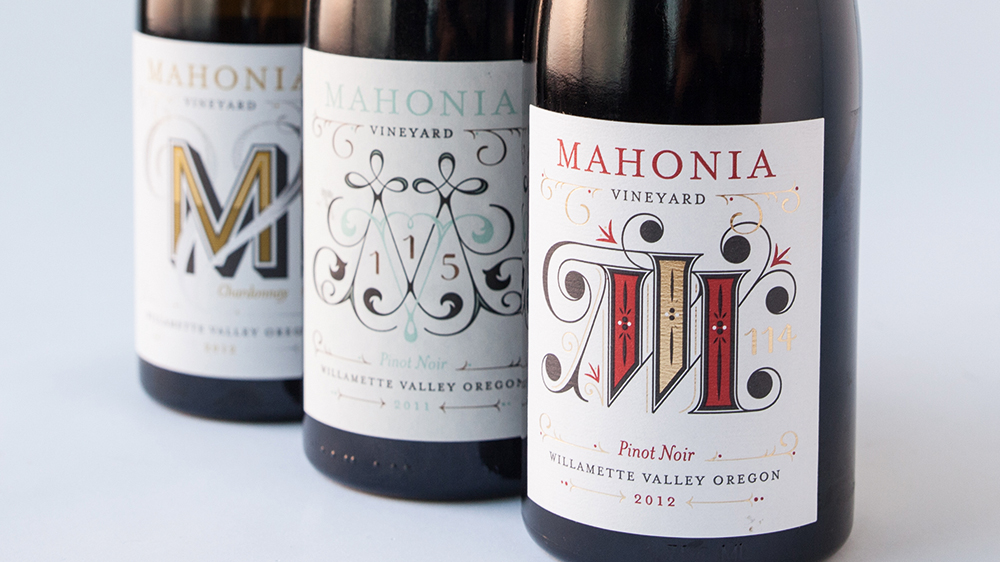
According to the designer, the brief was “fully open, they just loved my work and wanted me to make some fancy labels for the limited edition clonal varietals they were releasing. I had the idea of working with their existing branding or label layout and making a custom monogram for each wine. The system ended up being really fun and easy to expand upon.”
This article was originally published in Computer Arts, the world's best-selling design magazine. Buy issue 278 or subscribe here.
Read more:

Thank you for reading 5 articles this month* Join now for unlimited access
Enjoy your first month for just £1 / $1 / €1
*Read 5 free articles per month without a subscription

Join now for unlimited access
Try first month for just £1 / $1 / €1
Get the Creative Bloq Newsletter
Daily design news, reviews, how-tos and more, as picked by the editors.
Emily Gosling is a freelance art and design journalist currently writing for titles including Creative Review, Eye on Design, Creative Boom and People of Print. She’s previously worked at Elephant magazine, It’s Nice That and Design Week, and was editor of Type Notes magazine. Her book Creative Minds Don’t Think Alike was published by Ilex Press in 2018, and she also plays bass as one-quarter of the eight-titted beast, Superstation Twatville.
